Narrative Illustration Lectures and Examples
Hello Class, below is a ton of information! Pace yourself. Its all important, but just check out a couple of these posts and Lectures at a time, and then give yourself some time to consider the material before you continue.
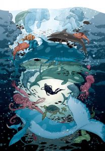
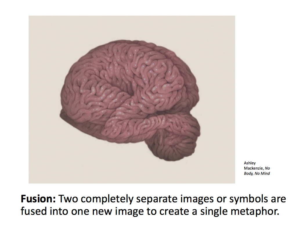
- NARRATIVE ILLUSTRATION LECTURE
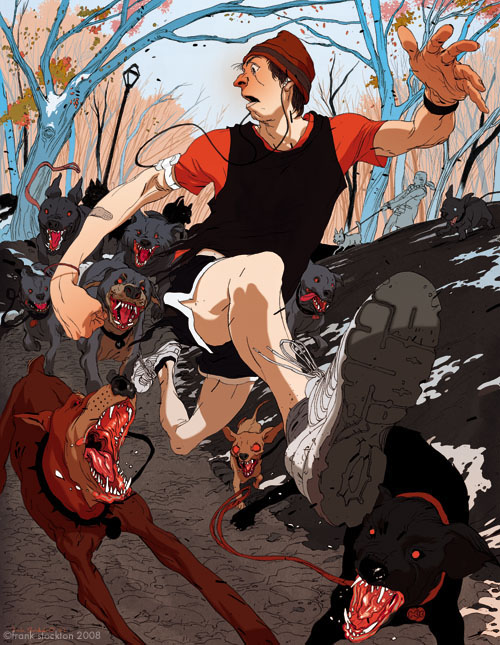
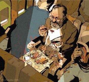
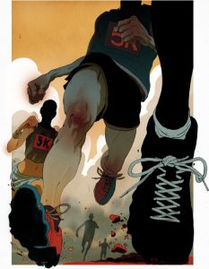
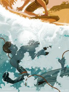
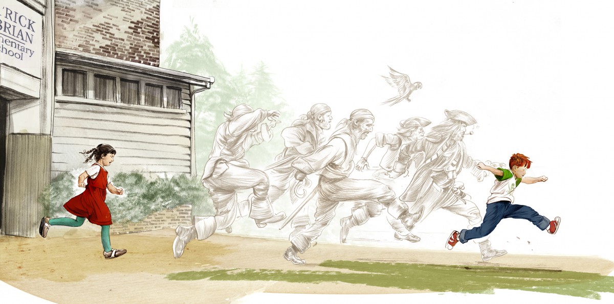
- Frank Stockton & Point of View
- POINT OF VIEW LECTURE
- READ Stories: A Love Letter
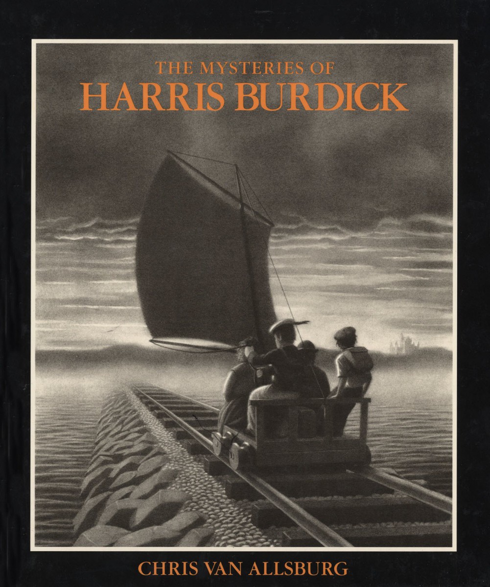
- The Mysteries of Harris Burdick
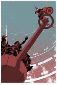
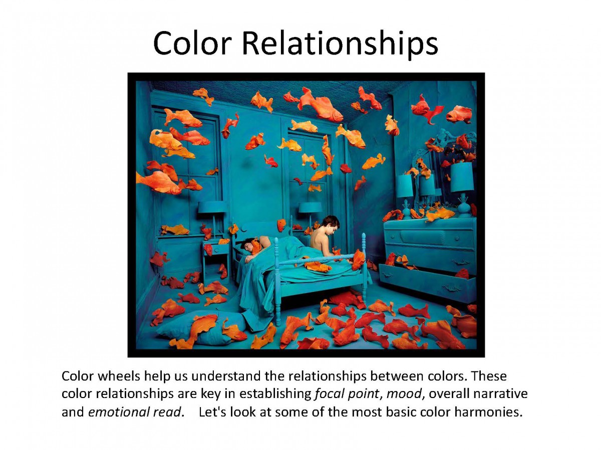
- Focal Point Through Color: Direct Your Viewer with Contrast
____________________________________________________
In this multilayered assignment you will reinterpret a classic folk tale or fairy tale through your own creative lens. You will, through the course of the assignment develop characters, setting, and finalize illustrations featuring the same character in two very different settings and situations.
DUE: DEC 18 | Week 15
Final project will be reviewed during Individual In Class 5 minute Presentations
A complete project will include:
- 1 FULL COLOR ILLUSTRATION (Book Cover or Interior Illustration Full Bleed )
- 2 FINISHED Pencil Drawings
- Story Description
- Process Work including: Character Sketches, Reference Sketches, Photo Reference*, Color/ Value Studies.
Final Art can be made using any combination of traditional drawing / inking skills and digital coloring. Final art must make full use of value and read as a finalized piece of art work. Choosing a limited palate is highly recommended.
BRING A PRINT OF FINAL ART FOR CRITIQUE
GRADING BREAKDOWN:
50 % project grade Submit a PDF PROCESS BOOK guiding us through the project from inception to conclusion.
- Carefully SCAN your process work. This should include : Your brief Story Proposal, Brainstorm, Character Designs, Thumbnails, Concept Sketches, Value Roughs, Related Sketchbook Work, and Final Art.
- Carefully Label all of your work so that your thought process is CLEAR. Be sure all of it is presented well: facing the right way, no shadows in the picture, good contrast, etc.
50 % project grade Submit a publication ready 300 DPI JPEG of Final ART
_____________________________________________________________________________
SUBMIT YOUR WORK