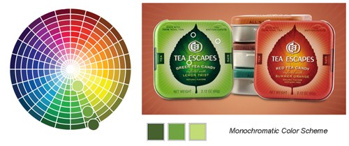
It isn’t always necessary to use many colors in order to achieve a colorful image — the monochromatic color scheme consists of one color plus black and can be very powerful. A monochromatic color scheme has one principle color and in all it’s various tints, shades, and tones.
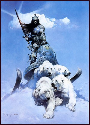
1980s fantasy illustrator Frank Frazetta whose work we’ve looked at in previously, makes great uses of a monochromatic color scheme in this illustration, Silver Warrior.
Note the tiny dabs of warm color he uses to create high contrast focal points within this otherwise completely monochromatic composition. Those warm spots stand out due to color temperature.
Tony DiTerlizzi’s Monochromatic Palate
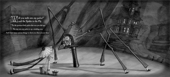
Illustrator Tony DiTerlizzi often works in a monochromatic palate. For his book The Spider and the Fly he chose a metallic silver and. The beautifully rendered drawings are printed in black against a silver printed page. Silver is a gray and not, therefore, really a color. But because it’s metallic, it contributes more than a standard gray. Though DiTerlizzi’s color solution may seem basic, it is unique in children’s picture books and greatly enhances the mood of his illustrations.
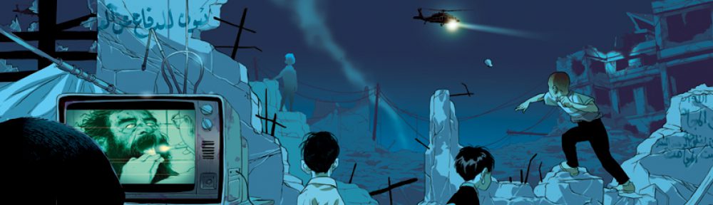
For his more recent series of chapter books, The Search for Wondla, DiTerlizzi chooses a different approach. Here, there are no contrasting dabs of warm color like there were in the Frazetta piece.
DiTerlizzi again works monochromatically, but in this case he chooses a two color printing process, meaning he chooses a principle color and the illustrations are all formed by the various combinations of this ink and black 2 along with the white of the paper.