Frank Stockton & Point of View

Shaping the Scene: Layout and Action

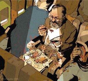
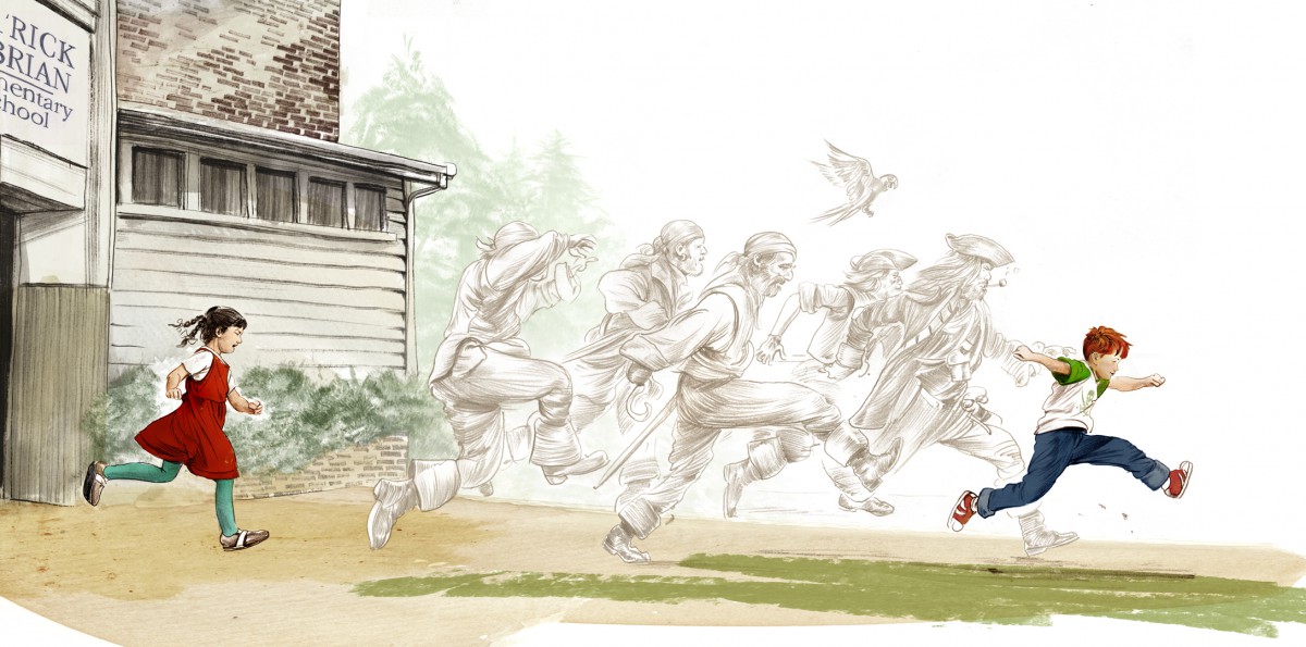
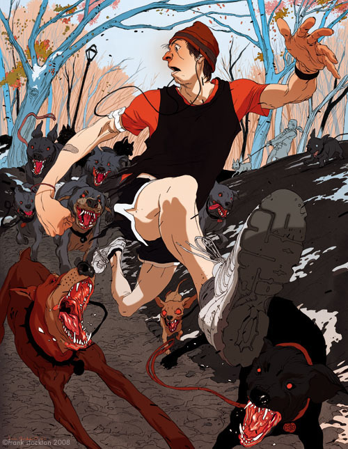
Action can often suggest the layout and framing of a shot. As always we go back to our story. Ask yourself: What is the character doing? How do they feel about it? How should the viewer feel looking at this scene? How can I make this action totally clear to the viewer? These questions will help to dictate your layout (another word for composition) as well as help you choose your POV.

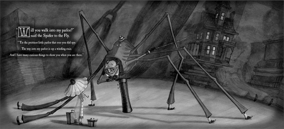
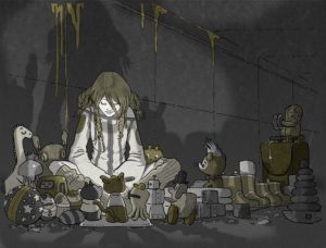
In this illustration by Frank Stockton notice how the action and feeling have dictated many of these decisions.

ill_232_v9_m07_p7_stockton_10

The Moving Camera

The world you see in an illustration can be very compelling, inviting you in for deeper analysis. Or not. Much of this depends of the point of view you see it from. After all, seeing a concert or play or a game from the nosebleed seats is not the same experience at all as being up close and personal with the action. Since in illustration you can choose your viewer’s vantage point, take the time to really consider it.

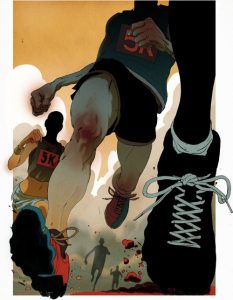
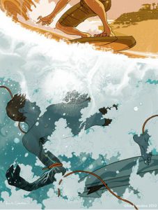
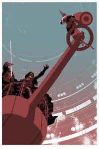
Frank Stockton is a comic book artist and illustrator who is known for using point of view like a boss! We just examined one of his images in detail on the previous page for exactly that reason.

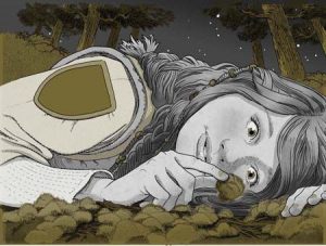
As you look at the next series of images ask yourself once again: the illustrator could choose any point of view from which to show this scene, so why did he choose this one?

Stories: A Love Letter

greg ruth

Greg Ruth, A Pirate’s Guide To Recess

Is there any aspiration more human, and more powerful, than the art of storytelling? As illustrators, we are admittedly very biased! After all, what is illustration if not the art of visual storytelling?

Some people are naturally adept at storytelling. They will captivate a room and have their audience hanging on every word. They know just the right moments to pause, to hush their voice, to yell, to inject tension or humor. But another person can tell the exact-same story and clear the room out!

Visual storytelling is no different. A thousand illustrators can approach the same work, each with their own unique storytelling voice (again the idea of personal vision), and each one will come out with a different interpretation, a different read on the story. Some of these reads will invariably be more successful than others. The ideas we will be approaching in this module will help us to be sure our interpretations work. We examine the intimate relationship between story and visual art, and look at how our all our artistic decisions affect our ability to tell a great story in our own unique voice.

You’ve heard the old saying “a picture is worth a thousand words?” In great narrative illustration it’s absolutely true!

––Illustrator Greg Ruth, from Stories: A Love Letter

source: Muddy Colors

The Mysteries of Harris Burdick

ill_232_v9_m06_p9_vanallsberg_1The Mysteries of Harris Burdick is a fascinating and unusual book. It opens with an introductory letter from Chris Van Allsburg himself, explaining the book’s origins. “I first saw the drawings in this book a year ago, in the home of a man named Peter Wenders,” Van Allsburg begins. He goes on to explain that many years earlier, a man called Harris Burdick stopped by the office of Peter Wenders, who then worked for a publisher of children’s books, choosing stories and pictures to be made into books. Burdick brought one drawing from each of fourteen stories he had written as a sample for Mr. Wenders. Fascinated by the drawings, Wenders told Burdick he wanted to see the rest of his work as soon as possible. Promising to bring the stories in the next day, Burdick left—never to be seen again. The fourteen pictures he left behind—and their accompanying captions—remained in Wenders’s possession until Van Allsburg himself saw them (and the stories that Wenders’s children and their friends had long ago been inspired to write by looking at them). The mysterious pictures, writes Van Allsburg, are reproduced for the first time in the hope that they will inspire many other children to write stories as well.

Synopsis from the Houghton Mifflin Harcourt Teacher’s Guide

Chris Van Allsburg’s celebrated and thought-provoking illustrations in The Mysteries of Harris Burdick have intrigued readers of all ages for the past 25 years. Each illustration highlights a critical moment of a story, accompanied only by a single line of text and a title, forcing the readers to create the rest of the tale for themselves. This book is a stunning case study in the power of using the technique of freezing a moment in time coupled with picking the right event, the right critical moment in the narrative, to drive forward the drama and storytelling of the image.

View the video and consider what techniques Van Allsburg uses in each of the illustrations to heighten the story. Why are the moments he chooses so effective?


Focal Point Through Color: Direct Your Viewer with Contrast


We already know that great composition will guide our viewer, allowing us the illustrator to direct the overall read of the image. We’ve also looked at how strong value contrast establishes clear focal points. Contrast and intensity in color works exactly the same way.

Strong differences in color and highly saturated color will pull your viewers eye, every time. Remember you are making deliberate choices to tell the best story you can.  Using color to both tell the story by establishing mood and setting, and creating places of emphasis to guide your viewer is critical.


Color used for emphasis can be very dramatic.


But contrast can be used to guide the viewer subtly too.

Consider this image called Camouflage by James Gurney, creator of Dinotopia. Take a good look and be aware of where your eyes travel.


1472599517687 

Gurney conducted an experiment concerning focal points and how different people look at the same image. By adding together the eye movement data from a group of test subjects, he was able to observe where people look in a given picture.

1466101426426

To create the image below, eye-tracking technology recorded the data of sixteen different subjects and compiled the information into a composite image, called a heatmap. The red and orange colors show where 80-100% of the subjects halted their gaze. The bluer or darker areas show where hardly anyone looked.

The heatmap for Camouflage shows that everyone noticed the dinosaur’s face. They also quickly spotted the hidden man and the small pink dinosaur.  According to data connected to timing, these three faces drew almost everyone’s attention within the first five seconds. The dinosaur’s face was statistically the first thing most people looked at, followed quickly by the hiding man.

1472599528886

Why do we look the same way at this image? As humans we are drawn to faces. This is a given. However, though the contrast is subtle, the only pink things in all that foliage, (remember green’s complement is red) are the hidden man’s skin and the small pink dinosaur.


FINAL Project: Narrative Illustration

Featured

Narrative Illustration Lectures and Examples

Hello Class, below is a ton of information!   Pace yourself. Its all important, but just check out a couple of these posts and Lectures at a time, and then give yourself some time to consider the material before you continue.


____________________________________________________


FINAL PROJECT

In this multilayered assignment you will reinterpret a classic folk tale or fairy tale through your own creative lens.  You will, through the course of the assignment develop characters, setting, and finalize illustrations featuring the same character in two very different settings and situations.

DUE:  DEC 18 | Week 15

Final project will be reviewed during Individual In Class 5 minute Presentations

A complete project will include:

  • 1 FULL COLOR ILLUSTRATION (Book Cover or Interior Illustration Full Bleed )
  • 2 FINISHED Pencil Drawings
  • Story Description
  • Process Work including: Character Sketches, Reference Sketches, Photo Reference*, Color/ Value Studies.


Final Art can be made using any combination of traditional drawing / inking skills and digital coloring. Final art must make full use of value and read as a finalized piece of art work.  Choosing a limited palate is highly recommended. 

BRING A PRINT OF FINAL ART FOR CRITIQUE


GRADING BREAKDOWN:            

50 % project grade Submit a PDF PROCESS BOOK guiding us through the project from inception to conclusion.

  • Carefully SCAN your process work. This should include : Your brief Story Proposal,  Brainstorm, Character Designs, Thumbnails, Concept Sketches, Value Roughs, Related Sketchbook Work, and Final Art.
  • Carefully Label all of your work so that your thought process is CLEAR. Be sure all of it is presented well: facing the right way, no shadows in the picture, good contrast, etc.

50 % project grade Submit a publication ready 300 DPI JPEG of Final ART

_____________________________________________________________________________


SUBMIT YOUR WORK


Editorial Illustration Resubmission

Featured

Hey Class-


If you wanted a second shot at Editorial Illustration here it is.  You all received a class wide, week long extension.  If you have the time to apply the critique you received, please do! Even if you do not make changes, be sure to submit the project for grading!


Editorial Submission – Submit Your Work


Project 3 – Editorial Illustration

Featured

EDITORIAL ILLUSTRATION

Hello Class!  Here is the Lecture on Editorial Illustration and Visual Metaphors.


Project 3: Editorial Illustration Overview:

For the next project you will be creating an editorial illustration for use to accompany an article in a magazine, printed or online.

The illustration must be created using a limited palate of black, white, and 1 other color and should be made using a combination of traditional drawing / inking skills and digital coloring.  Final art should be made to fit the real magazine’s specs. (Approx 9” x12”)

Final work will be judged on the uniqueness, clarity and cleverness of overall the concept, utilization of composition, skillful use of media, use of a full range of value, and of course overall technique.


IMPORTANT You MUST post your article and response in OPENLAB in order to meet project deadlines. 


Editorial Assigment PART 1


Simple Digital Coloring

Class-

There is no hard and fast rule on HOW to digitally color.  Digital coloring in infinite and there as many different methods to work as there are artists out there.  I wish you the best of luck in finding the method that works for you.

Here are a few tutorials just to get you started.  If you find some good tutorials, please share them in the class resources!


Coloring Line Art in Photoshop…

Simple animated painted style in Adobe PS:

Heres one for Procreate:

Monochromatic Palate

1466095712889

It isn’t always necessary to use many colors in order to achieve a colorful image — the monochromatic color scheme consists of one color plus black and can be very powerful.  A monochromatic color scheme has one principle color and in all it’s various tints, shades, and tones.


1466095729362


1980s fantasy illustrator Frank Frazetta whose work we’ve looked at in previously, makes great uses of a monochromatic color scheme in this illustration, Silver Warrior.

Note the tiny dabs of warm color he uses to create high contrast focal points within this otherwise completely monochromatic composition. Those warm spots stand out due to color temperature.


Tony DiTerlizzi’s Monochromatic Palate

1466095750736

Illustrator Tony DiTerlizzi often works in a monochromatic palate. For his book The Spider and the Fly he chose a metallic silver and. The beautifully rendered drawings are printed in black against a silver printed page. Silver is a gray and not, therefore, really a color. But because it’s metallic, it contributes more than a standard gray. Though DiTerlizzi’s color solution may seem basic, it is unique in children’s picture books and greatly enhances the mood of his illustrations.


For his more recent series of chapter books, The Search for Wondla, DiTerlizzi chooses a different approach. Here, there are no contrasting dabs of warm color like there were in the Frazetta piece.

DiTerlizzi again works monochromatically, but in this case he chooses a two color printing process, meaning he chooses a principle color and the illustrations are all formed by the various combinations of this ink and black 2 along with the white of the paper.