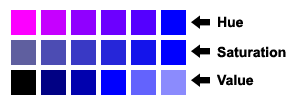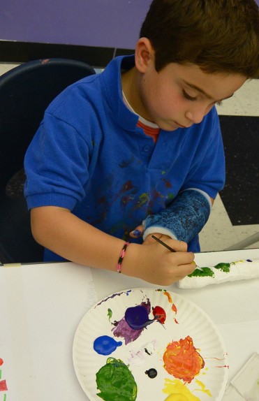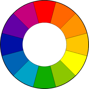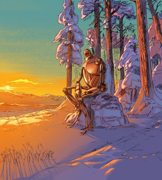
We already know that great composition will guide our viewer, allowing us the illustrator to direct the overall read of the image. We’ve also looked at how strong value contrast establishes clear focal points. Contrast and intensity in color works exactly the same way.
Strong differences in color and highly saturated color will pull your viewers eye, every time. Remember you are making deliberate choices to tell the best story you can. Using color to both tell the story by establishing mood and setting, and creating places of emphasis to guide your viewer is critical.
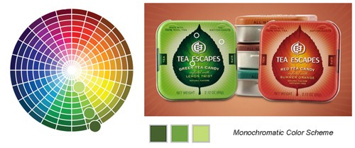
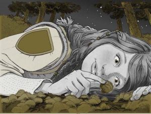
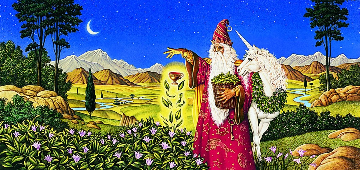
Color used for emphasis can be very dramatic.
-
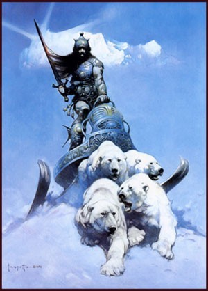
- Tomer Hanuka, Overkill Using contrast to create emphasis can be very dramatic.
-

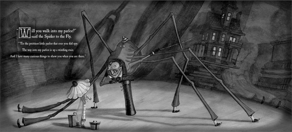
- Frank Miller, The 300 – It can guide your viewer, even through multiple scenes.
-

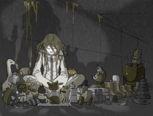
- David Shannon No, David! – It can imply tension and danger.
But contrast can be used to guide the viewer subtly too.
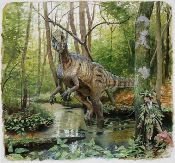
Consider this image called Camouflage by James Gurney, creator of Dinotopia. Take a good look and be aware of where your eyes travel.
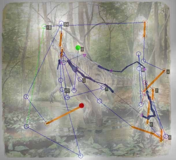
Gurney conducted an experiment concerning focal points and how different people look at the same image. By adding together the eye movement data from a group of test subjects, he was able to observe where people look in a given picture.
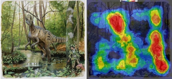
To create the image below, eye-tracking technology recorded the data of sixteen different subjects and compiled the information into a composite image, called a heatmap. The red and orange colors show where 80-100% of the subjects halted their gaze. The bluer or darker areas show where hardly anyone looked.
The heatmap for Camouflage shows that everyone noticed the dinosaur’s face. They also quickly spotted the hidden man and the small pink dinosaur. According to data connected to timing, these three faces drew almost everyone’s attention within the first five seconds. The dinosaur’s face was statistically the first thing most people looked at, followed quickly by the hiding man.
Why do we look the same way at this image? As humans we are drawn to faces. This is a given. However, though the contrast is subtle, the only pink things in all that foliage, (remember green’s complement is red) are the hidden man’s skin and the small pink dinosaur.