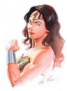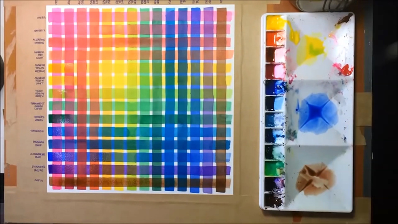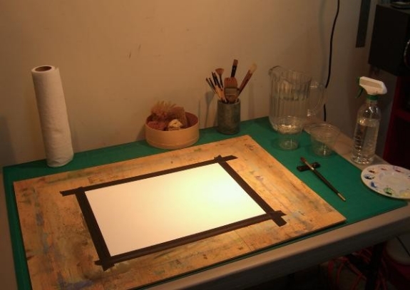
Color is one of the most powerful aspects of making art. Almost everyone who loves to create can remember the childhood excitement generated by a brand new box of crayons!
Everyone has a favorite color, artists and non-artists alike. Our relationship to color is one of the most powerful relationships we have as a species. It is intrinsically connected to how we relate to our world. And so of course it is one of the most powerful aspects to consider when making art.
Color Temperature
Much of our relationship to color is based on instinct. For example, we see colors as warm or cool based on our physical response to them.
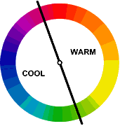
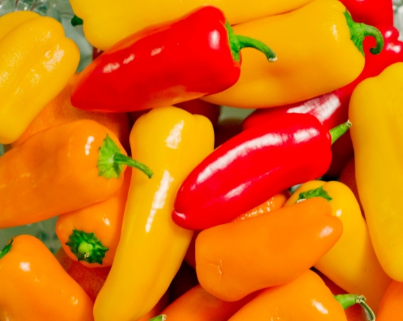
Warm things are warm colors (such as fire, the sun, hot coals, and in this case hot food.)
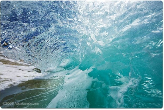
and cool things are cool colors (such as water and ice, which as blue or bluish).
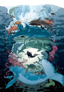
Interestingly warm and cool colors also create a sense of perspective and depth when we look at an image. Warm colors tend to advance towards us, whereas cool colors tend to recede away from us.
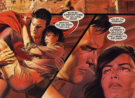
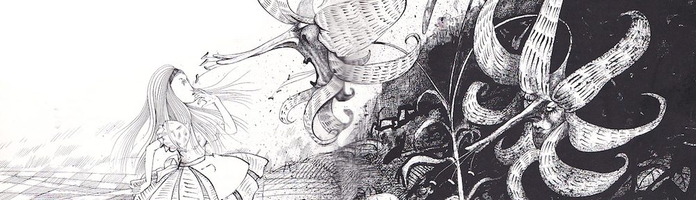
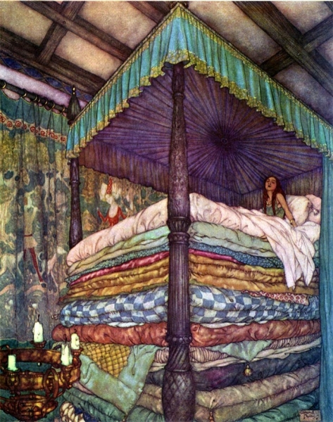
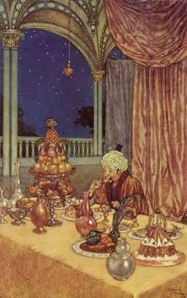
In these two images note how early 20th-century illustrator Edmund DuLac uses this trick. In the first image of The Princess and the Pea he creates a sense of incredible height, as the cold blue-purple recedes from the viewer, effectively raising the height of the bed canopy. And in the second one, A Palace of Wonder, a sense of depth is created between the warmth of the interior space and the cold dark outside.
COLOR AND CULTURE
However, a great deal of our reactions to color are not innate, they are in fact cultural. For example Black and Death are associated in many Western cultures, in many Eastern cultures it is associated with white—its direct opposite.
Take a look at this info-graphic. Note how many color associations change, depending on where you are in the world. However also note how HOT and COLD or Color’s Relationship to Temperature do not.
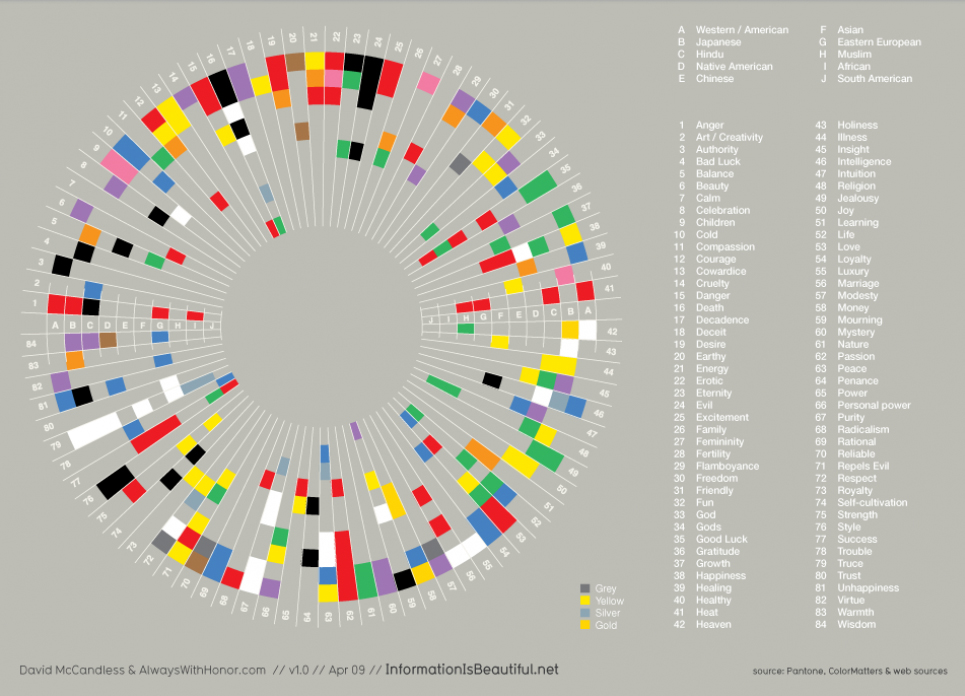
It is however important to understand your target market and the culture that they come from, because culture has a strong influence on the development of cultural-color associations in childhood building the adults eventual perceptions of color.
Throughout this module and the next we will look at these basic reactions we all have to color and learn to compose in color effectively. We will build on what we have learned regarding composition, concept, point of view, and value and we will see how we can use these reactions to color to aid us in our ultimate goal, telling a great story through narrative illustration.
However, before we can do that lets be sure we have down the basics.