The Big Duck: Part Two

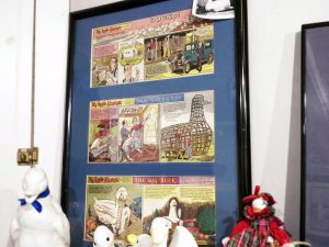
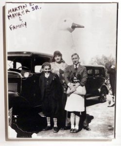
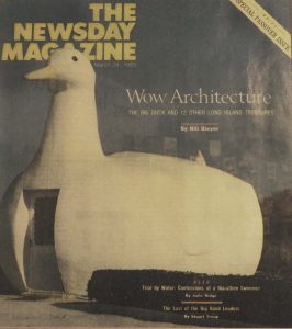
After vacationing in California and driving by a coffeehouse in the shape of a coffeepot in order to draw in the driving public, Martin Maurer and his wife Jeule brought back a piece of that philosophy with them. They thought it would help their 27-acre duck farm business and bring more customers to their store. So in 1930 they set out to achieve this goal and hired George Reeve, a carpenter, and brothers William and Samuel Collins, set designers. Together, they fabricated something that would later be called the “decorated shed”. The wooden frame was set, creating a functional interior while starting the overall shape of the Duck. After the structural frame was assembled they began the skeletal work with mesh wire. Then, commenced the process of ferro-cement which entails the placement of a thin veneer of concrete over some type of reinforcement; various forms of concrete can be used, for example, mortar or plaster, in this case they chose cement plaster. The ferro-cement development was completed with the support of the Smith and Yeager Builders. It was then painted; the body an angelically light white, the beak a bright yellow, and the eyes were engineered to glimmer red in the nighttime from the Model T taillights that were placed in each socket. It was completed in 1931 and became the jewel of Flanders, Long Island; standing (…or in this case sitting) at 20 feet high, 30 feet long, and 15 feet wide.

Personally, I was excited to research this structure since it influenced an entire style of architecture coining the term “Duck Architecture” and was one of the major driving forces for the widely used style, Post-Modernism. As me and my mother pulled into the small parking lot adjacent to the Duck, I was immediately overwhelmed; “Do I just walk in?” “What do I say once I go in?” “Do I ask questions?” “Better yet, what are my questions?” I wondered. After quickly chipping away at my mother’s patience, she forced me to go inside. Greeted by warmth, a man, who I’d proclaim to be the Big Duck historian and went by the name of Mr. T, welcomed us and started to give us a briefing of the history of the Duck. From the day it was created to today the Duck has migrated to three times before making its final trip back to its nest also known as Flanders, Long Island; with each move marked a change in ownership. Mr. T and other locals told us that moving the Big Duck threw off navigation for many as the term “Turn left/right from the duck” was depended on, heavily.

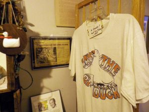
After facing the risk of demolition on the last move, the Big Duck was saved by its supporters, fighting for it to be recorded in the national historical landmarks. “Some Brooklyn kids fought to keep it in the ‘80s.” is the way Mr. T put it. In December of 1987 the last owners of the Duck, Kia and Pouran Eshghi, made a crucial decision and donated the Big Duck to the county of Suffolk. Now it’s a gift shop and is managed by the Friends for Long Island Heritage.

Overall it was a great experience and I feel like it was the most fun I have ever had doing research. I think it would be fun for anyone who likes learning about historical landmarks or just loves exploring roadside attractions. Try it out and visit the Big Duck, it might be tiny but it’s packed with lots of history.
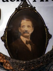
George Reeve. 1864-1943. Local Carpenter, Farmer, and Architect of the “Big Duck”. Photo donated by his grand-daughter, Rose Kreh Bernosky

The Big Duck: Part One

For a two-week special edition to my historical architecture theme, I decided to deviate from my initial plans of staying within the boundaries of the five boroughs of New York City. Instead, I have made a crucial decision to focus on a landmark housed practically on the tip of Long Island (near the Hamptons) by name of The Big Duck. This monumental building was very important to modern architecture (which years range from the 1800’s to the early 2000’s) since it possibly could have been the beginning of a major style in the 1980’s, called Post-Modernism. Personally when I think of the beginning of Post-Modernism, I think of the infamous married architectural duo, Robert Venturi and Denise Scott-Brown. This couple was like the Mom and Dad of this movement since they practically created it and were the key figures in making it popular.

There’s an architectural philosophy that many modern architects, as well as in many other professions of the design world, strongly applied to their work, “Less is more…” by Ludwig Mies van der Rohe. This is a term commonly used in describing modern architecture since it was more common for structures to be honest and functional, leaving elaborate exterior adornments in the past. Venturi later coined his own term, “Less is a bore…” meaning that we should bring back some of the characteristics that we have already parted with; in a dire attempt to reestablish personality in structures since he thought that every building looked identical and they all took the form of boxes.

After Venturi and Scott-Brown traveled in various parts of America they noticed something, a trend. They found that roadside attraction businesses were something to be studied and analyzed. They found them to be the most honest pieces of architecture since they were not hiding what they were selling or what they truly were. They created their chain of analytics by using a structure called the Big Duck. The Big Duck is a 1930’s house that was built to sell duck influenced items to the driving public. People would drive by this oversized duck and want to pull over since they know what they are selling and what they were expected to purchase. From this Long Island distributor is where most people in 1932-1984 bought the infamous Pekin Duck and specialty items like duck eggs. They appreciated the different form of honesty and started basing their other structures on this billboard building. Others started to formulate their work on this philosophy and it soon became a trend. Which gives us buildings like The Longaberger Company building which literally  looks like an oversized basket.

Even if certain parts of these buildings didn’t have any structural or operational reasoning, it was still considered important since it had stylistic necessity.

Tune in next week to see more of the historical side of the Big Duck now that I have explained why I find it so interesting that something so architecturally important is housed in New York.

The Flatiron Building

On the opposite side of Madison Square Park is the pinnacle of the Flatiron district in Lower Manhattan. Built in 1902, it remains a major tourist spot for its oddly picturesque features. Back in a time where skyscrapers were virtually unheard of, New Yorkers thought that it was impossible to have a structure amount to that particular grandeur of height. Although the building is only 22 stories high and doesn’t really seem to be very tall compared to other, more contemporary, skyscrapers, The Flatiron Building was quite baffling for the people of that time.

The 307 foot building was built by a Chicago native, Daniel Burnham. He was born in New York and raised in Chicago. As most of us can empathize with, he didn’t start out his career as some noble architect who was extremely dedicated to becoming an amazing mentor and creator of beautiful structures all over the world. His story began with failed attempts of admission to Harvard and Yale then to unsteady career decisions until the opportunity of architecture came along; almost like he was called to the drafting table, the urban civilization needing him to be a part of something great, something that would eventually be historical and loved. He would eventually be trained under a remarkable Chicago architect, William Le Baron Jenney; he shared this incomparable experience with other great historical figures of the modern era like Louis Sullivan and Martin Roche.

Upon the completion of the Flatiron Building, some New Yorkers fell in a complete and utter dislike with the skyscraper and others were amazed. With the wonky angular building, people were concerned with the possibility of it falling; structures weren’t meant to be that tall and look so unstable on a 25 degree angle base. Eventually they learned to accept the building; it wasn’t going to fall down like so many thought, it actually became an attraction, another reason to come to New York.
Burnham should be a symbol for all of us; that sometimes life doesn’t go your way but it doesn’t mean that you’re not destined for greatness. Maybe people won’t notice how great you are now, but we all have the potential to be or do something significant. Sometimes it’s the “Burnham’s Follies” in life that can completely change and enrich your life.

The Evolution of the New York City Housing Authority

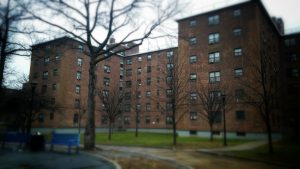
NYCHA (New York City Housing Authority) started in the Modernist era of architecture. The concept was something new and unheard of, rent controlled housing for the city’s inhabitants. It started in the year 1934 marking the completion of New York City’s first urban complex. The very first complex was in the Lower East Village of Manhattan by architect Frederick L. Ackerman. The first in Brooklyn resides in Williamsburg called the Williamsburg Houses; it was built in 1938 consisting of 20 apartment buildings. The Red Hook East Houses complex remains the largest in Brooklyn with a whopping 27 buildings housing an estimate of over 2,500 inhabitants; the complex was established in 1939.


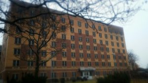
Since they all were supposed to be cost efficient, it resulted in them all looking the exact same way or something similar. The red, brown, and tan bricks would create an optical stereotype in the later years serving as a tell-tale sign of a proclaimed “project”. These buildings would be marked by a highly urbanized group of people; doused in, what I call, a true melting pot of cultures. Although these old buildings have a lot of history tied to them as various families once lived in them; serving as the only means of home for many childhoods, new government owned buildings are now hitting the public. Other than NYCHA the rent-controlled aesthetic in New York City is now considered outdated. So these new buildings are either called “senior living” or transitional housing for less fortunate families.


Since I lived in Brooklyn my entire life, I have been exposed to many iterations of these complexes. Seeing the new building in progress makes me see how the means of sustainability has severely changed over the years. It’s amazing to see what the new standard is for the current era of time. The older buildings’ were well equipped with updated programs like central heating and elevators for the elderly, disabled, and popular convenience. Now, the new technology being implemented is trendy alternatives of energy used from solar panels, and central air which eliminates the need for bulky air conditioners.


Looking at the new developments makes time seem very apparent as there is also a major change in overall look. The contemporary style has been carried out making the buildings not look like the same typical complex housing. I find it extremely fascinating how it’s so blatantly visible how time changes as the buildings stand adjacent to each other; an old veteran showing the rookie the new surroundings and what it has to offer. I guess sometimes you really can find the most intriguing subjects in your own backyard.

South Street Seaport

South Street Seaport has seen both good and bad days but it continues to flourish as a major tourist spot. Located in the lower section of Manhattan, next to the Fulton Subway stop, is a place in which embodies a different form of New York City. It seems so detached from the busy Manhattan essence; as if it is controlled by Manhattan’s predecessors. Cobblestones are laid on the streets where no cars or trucks can disrupt their constant peace. Salt fills the air as small shops stand in its midst; bringing back a retrospective feeling of what a town square would feel like in the 18th or 19th century. Before cars were invented and people gathered in a community of shops to buy, sell, trade, and converse with fellow neighbors; it claims the same historical value of new faces and togetherness.

Throughout the Seaport’s history it has seen its fair amount of ups and downs but it continues to persevere through time with the help of the people. Once the Battle of Long Island concluded in Brooklyn (as I explained in a previous post), British soldiers took hold of the port, taking away New York’s safest port for incoming merchants. They occupied this space for eight long years (1776-1784) before the New Yorkers regained claim to the beloved port.

Then in 1835 there was the great fire of Manhattan that ruined blocks and blocks of homes, businesses, and nature itself. Since all structures were built with wood, something as simple as one ember of fire created a domino effect to the closely knitted buildings; like an urban forest fire. The tragedy consumed 50 acres and over 550 buildings. The inhabitants regrouped and through years of pure dedication and financial struggle they pieced lower Manhattan back together.

Leading onward to October of 2012, a time in which hurricane Sandy tremendously created a major disaster. She tore apart New York City borough by borough and street by street. She showed no mercy; washing away a beautiful piece of history like the Seaport. With her deathly blows of intense winds, the Seaport that we all knew and loved was obliterated in one devastating night. But just as the population in the 18th and 19th centuries, the New Yorkers recollected and worked immensely to rebuild the Seaport. At a point in time the entire street was filled with shipping containers, serving as pop-up shops, which quickly revitalized the business and trading aesthetic back to the Seaport. This was an act of defiance against nature showing our enduring allegiance to our city, doing whatever it takes to see it flourish. Over four years later, we have almost rebuilt the seaport, not back to the way it was, but to something better by adding up and coming businesses making an eclectic hang-out spot for both tourists and city-dwellers.

20170109_170510-2

20170109_171151-2 20170109_171105-2

20170109_171050-2

20170109_171010-220170109_170849-2   20170109_172156-220170109_172317-2


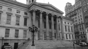
Borough Hall is not alone…. It never was

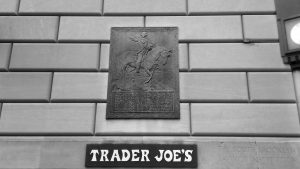
In August 1776, the summer the Declaration of Independence was established, the American Revolution was still in effect. The battle of Long Island, better known as The battle of Brooklyn Heights, took place in all parts in Brooklyn extending all the way towards Long Island. This infamous fight is still popular and a beloved story by many Brooklynites. Retrospectively, the city was not modernized yet and cornfields overtook what is now buildings and roadways. George Washington led his soldiers through the vast fields and was later flanked and outnumbered by the redcoats (British and German army) nine hundred ninety-three was injured and three hundred sixty-four sacrificed their lives for this battle. Although the Americans was defeated in the end of this battle, the legacy still lives on. In the busy area of Court Street one can find a placard with the date, description, and quotes from the battle on what is now a Trader Joe’s establishment.

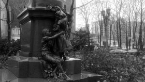
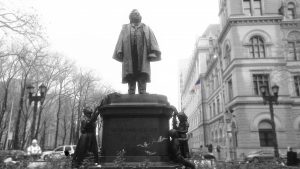
Although the park juxtaposed Borough Hall’s State Government Office is named Columbus park celebrating Christopher Columbus and his achievements, the most important part of the park that epitomizes Brooklyn , in my opinion, is the the statue of Henry Ward Beecher. The bronze and granite statue stands fourteen and a half feet tall created by John Quincy Adams Ward, who sculpted the figures, and Richard Morris Hunt, an architect who contributed the pedestal to the project. Beecher, a Connecticut born pastor was very radical person for his time. In 1847 he moved to Plymouth Congregational Church in Brooklyn heights which became the largest church and congregation in the United States  with a 3,000 congregational following. He had very strong views that was not always recepted by the main public. Beecher was an abolitionist, supporter of women’s suffrage, and protector of children in a time where people were regularly undermined, violated, and oppressed. Beecher wasn’t ashamed of his opinions and voiced them through writings, sermons, and other lectures. The statue was dedicated to him by showing his main objectives in life. An African-American girl places leaves at his feet on one side to represent his strong anti-slavery dynamic. On the other side depicts a boy aiding a girl as she places garland, also, at his feet to show his protection of children. The statues holds a great deal of poeticism by showing Beecher’s greatest achievements and how they influenced an entire community.

photo-3 photo-4 photo-5 photo-6 photo-1 photo-2

Ironically, on this Thursday Borough Hall will be hosting a gathering for a campaign labeled National Day of Healing aka #Youarenotalone. As another Buzz blogger, Amanda,  mentioned last week the gathering is for peace, love, and contentment. In a time of so much hate and loneliness we have the ability to give back some love in the form of fellowship. As we congregate by 209 Joralemon (State Government Office) sharing peace and words of respect, we will also be overlooked by an influential respecter of people, Henry Ward Beecher.

Center For Architecture… and it’s not only for architects

The Center For Architecture, otherwise known as the CFA is New York City’s chapter representing the AIA (American Institute of Architects). This chapter dates all the way back to when the AIA was first founded in 1857. It started with a small group of thirteen architects, creating a professional quota of what every architect should implement in his/her work. Before this means of declaration, anyone could proclaim themselves architects without “proper” training or schooling since there weren’t any schools for architecture or official licensing that architects face today. Like the Founding Fathers, these architects established standards and their own set of laws creating a documented beginning to a culturally dense practice of architecture. The declaration that they made changed over the years as architectural natural selection took place. Actually, just two years after they formed they added sixteen more architects to their group ultimately adding the new incite to the decree; one of the architects being Calvert Vaux, as I mentioned him in a past post.

The very first president of the AIA was Richard Upjohn, an England born architect known for Gothic Revival style and cathedrals. His son would later be a partner in the group as well continuing his legacy. The main AIA headquarters was later stationed at The Octagon House, Washington D.C. in 1898. Now the president is Elizabeth Chu Richter, with Robert Ivy as acting CEO.

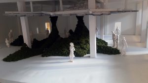
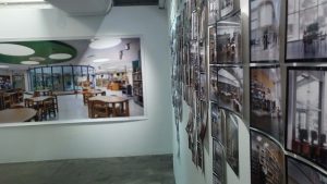
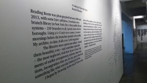
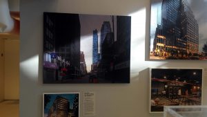
New York City’s chapter of the AIA (CFA) is now in Greenwich Village on West 3rd street. Each chapter’s main focus is on public areas and community outreach. The architects find new and improved ways to enrich the community. By going to the CFA you can be able to see history of NYC and the plans to improve it while keeping the culture. Everything that is shown in the exhibit is new or upcoming projects, the building filled with gallery style renderings and photographs.

This exhibit is not only for architects since it is open to the public and costs nothing to visit (some of their programs/conferences that are held can cost money; some are cheaper than others, from 10$+). Just as an art gallery, I feel that anyone could enjoy the Center since it shows new projects that could potentially feel personal as they may be close to where you work, study, or live. It’s very interesting to see what’s going on in your neighborhood almost like having a sneak peak into the future.

Plan your visit to the Center For Architecture and maybe catch a function that normally is scheduled for after or before work hours.

gallery the-lowline

Inside a displayed corner is a constantly changing sub-exhibition. The most current showcase is of kid's architectural work.

Inside a displayed corner is a constantly changing sub-exhibition. The most current showcase is of kid’s architectural work.

photos reading-room stage

Uncaging The Bronx Zoo

The Bronx Zoo provides us with a very important and sometimes forgotten piece of architecture; Landscape design and development. Landscape architecture is relatively as important as other buildings and structures. It is a lot quieter and more subtle than monstrous skyscrapers or massive cathedrals. Landscape architecture portrays the purest form of the environment, nature, and seasons. The trees, flowers, and various other plants bloom in Spring and flourish in the Summer, then become dormant and beautifully desolate in the fall, and snow-capped in the winter. We are in the season of the diminished vibrant greens and other colors that we cherished in the Summer as the cold naturally washes upon us like a massive wave; leaving us with beautifully calm, serene, and peaceful environments.

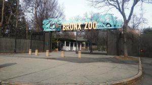
The Bronx Zoo that we all know and love unlocked its glorious gates of curiosity to the public 118 years ago on November 8 1898, giving 843 animals a controlled environmental home on 250 acres of land which is equivalent to 250 football fields or 4,000 tennis courts. The land was sold to the city for one thousand dollars from Fordham University, their only demand in closing the deal was that the land had to be turned into some sort of zoo/park/conservatory. Now the Zoo houses over 4,000 animals.

The Wildlife Society wanted to implement a new and more animal oriented style of zoo, so in 1940, when the “Lion Island” exhibit open, began a new trend of uncaging the animals. These changes happened gradually but the Zoo found funding to give the animals a comfortable and less confined space, much like their natural habitats; this zoo was the first to have this concept. The Zoo’s general planning was fixed to uncage the animals and somehow gracefully cage the spectators to keep us safe. We are enveloped by the comfort and safety of restraints and gates; the animals getting most the acreage which is how it should be, in order to make the animals more comfortable and ultimately reduce stress.

Plan your next voyage to The Bronx Zoo. They have special waives in prices if you are a student or if you plan your trip on a certain day that they only accept donations at the admission office.


gate bench20160122_140525meander

creek 20160122_161521

ice

Feelings of Home

20160914_120820-2

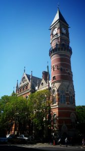
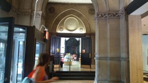
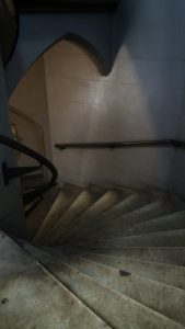
In the spirit of the Thanksgiving Holiday, reminding us of family and our childhoods. I thought it would be a good idea to take a trip down memory lane to a building that I hold near and dear to my heart. When I was a young child my grandmother used to take me and my sisters to this magical library in Greenwich Village known as The Jefferson Market Library. Before I even knew the correct terms to describe a building, I grew to love this structure not only because it automatically symbolized togetherness and family but it also amazed me how greatly defined the structure was; almost like entering those doors was synonymous to stepping into an entirely different era.

20160914_121005-2 20160914_121012-220160914_121105

The Victorian Gothic Building started construction in 1875 by architects Calvert Vaux and Frederick Clark Withers and was completed in 1877. The project was funded by the city since the building’s main use was for government and community purposes as The 3rd Judicial District  Courthouse. Vaux and Withers budget for the project was 3.6 thousand dollars, which does not seem like a lot of money in present day, but in the time period was a massive fortune. With a conversion of inflation, 3.6 thousand dollars in 1875 is equivalent to about 7.8 million dollars in 2016 (present day).

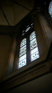
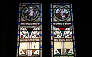
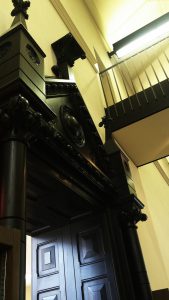
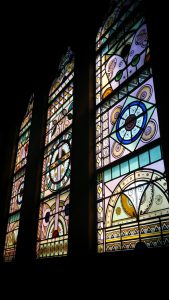
They masterfully crafted the place in a Victorian Gothic style which celebrates pointed arches in any form of entrances, stained glass, and other means of ornamentation. The courthouse had three different main floors; the top (second floor) was used as a civil court which now houses DVDs, adult and young adult literature, and CDs, the floor below it (first floor) was a police court and is now the specified children’s area, and lastly the basement (sub-level floor) was used as a holding space for criminals and prisoners, waiting to be transferred to jail is now used for resources. The bell tower was juxtaposed the main floors and was utilized by the community fire department as a watchtower. Also, the large clock that adorns a facade of the building was a necessary means for everyone in the community and all who used the courthouse.

20160914_121130-2-120160914_121340-220160914_121355-220160914_121411-220160914_121237-220160914_121602-2

20160914_123119-220160914_124332-220160914_123857-2-1

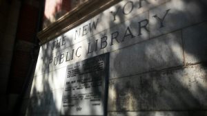
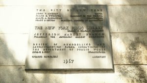
In 1927 the courthouse was solely used for women’s trials, dismissing its co-ed method of before and only settling women’s cases. After a series of changes of usage came upon the courthouse, it finally discontinued its use for court due to redistricting in 1945 (which was 75 years after it was built). The building was then used by various community agencies; including the police academy, at one point. Slowly the need for the building dwindled as architectural natural selection took place. In 1959 the once, one of the top ten most beautiful buildings in America in the 1880’s, was now completely unused and became a home to the city’s creatures. Something that used to be so beautiful was dejected to the pressure of being demolished to build a new apartment building. The area’s population thought the aging courthouse was an eyesore and depreciated the value of Greenwich Village. But the community officials did not allow this grim fate to occur and fought to keep the previously beloved courthouse. In 1961, it was later announced that the courthouse would be preserved and used as a public library. So under architect, Giorgio Cavaglieri’s supervision, the courthouse was spared and opened for business as a library in 1967; which is how we know the Jefferson Market Library today.

Now, every time I go to The Jefferson Market library, I think of my grandmother and how we would connect through literature and other discoveries. So on this holiday I will happily reminisce of the great times I had with my family in New York City.20160914_121029-220160914_121222-220160914_121418-2

Join in on the holiday memory lane fun. What places in New York City makes you think of family or gives you the feeling of home?