Letterform Abstraction

The letterform abstraction was an assignment that required the class to look at the letters of the alphabet and find interesting compositions. We produced multiple draft evaluating them in class critiques. Our objective was to get the strongest composition without taking away from the structure of the letter.
This project seemed easy in the beginning but soon became kind of tedious. I started out with a group of different letters and eventually ended up on the lowercase letter m. I enjoy the fact that it kind of cheats the viewer into thinking its an uppercase B. The most challenging part of producing this composition was finding a font to match my thumbnail drawing. I bounced back and forth between InDesign and Photoshop before finalizing the design.
Letterform Grid
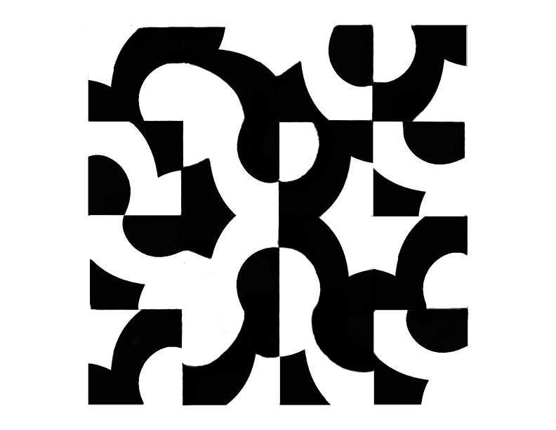
This was the second step in the letterform abstraction assignment. The objective was to take our finished letterform and create a grid. I started with about 2 or 3 drafts creating the compositions with cutouts by hand. When i reached the final stage I refined my grid in Adobe Photoshop to get a cleaner design.
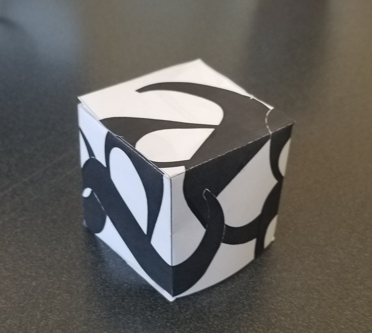
Letterform Exhibit
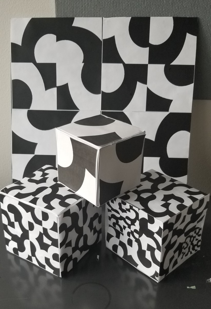
The final step of our letterform assignment was to create boxes with our grids and original letterform for the student show.
Icon
![]()
Our next assignment was to create an icon that incorporated a letter of the alphabet. I chose to continue using the m from my previous assignment. We started by writing out a list of things starting with our letter. Using the mouse for my design seemed a little obvious but in the end I finished with a creative design. The challenging part of this assignment was to decide just how much of the mouse to include without taking away too much of the m.
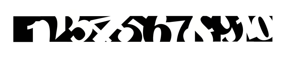
1-10 Book
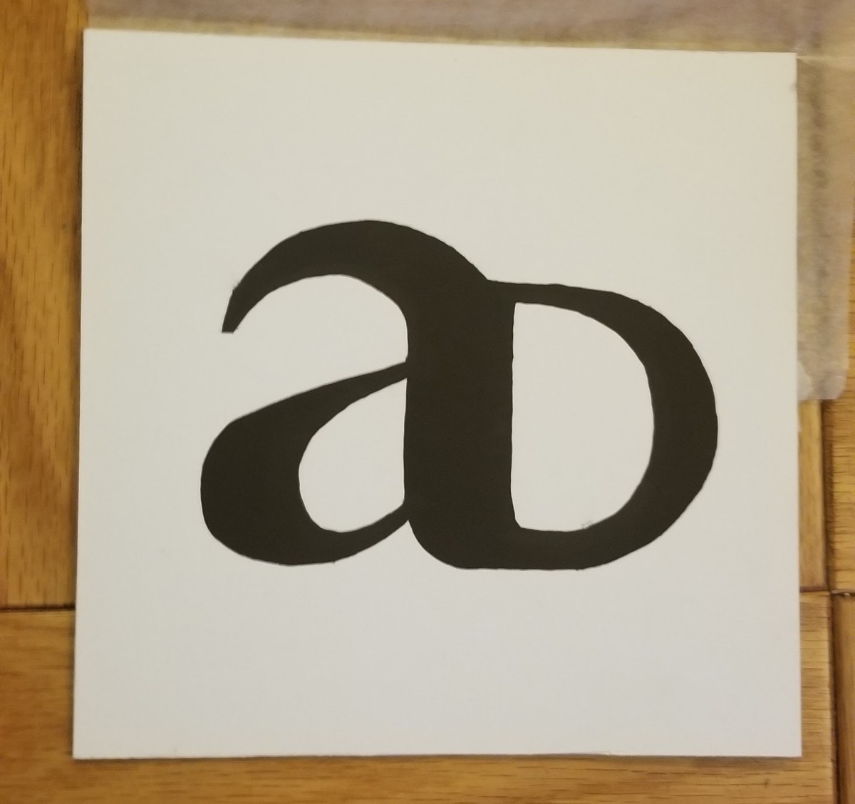
Ligature
Ligature Cube
Design Poster
![]()

