Pattern Design
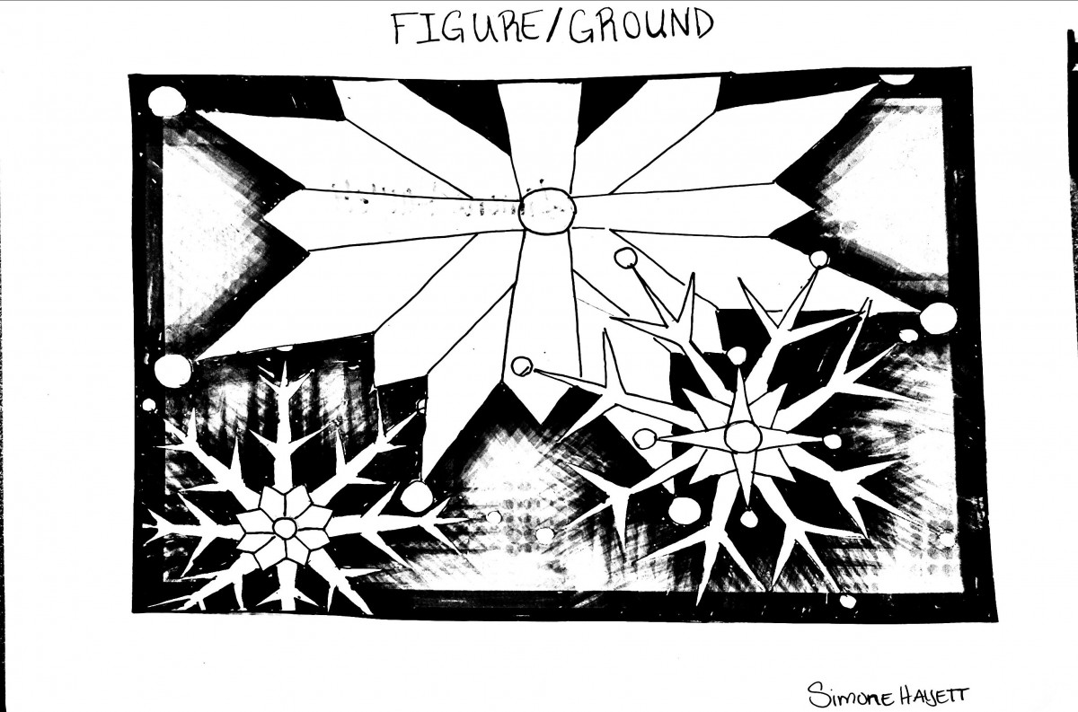
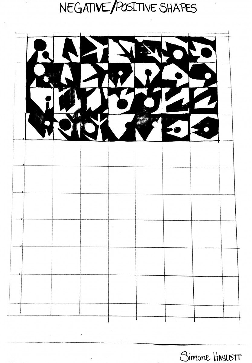
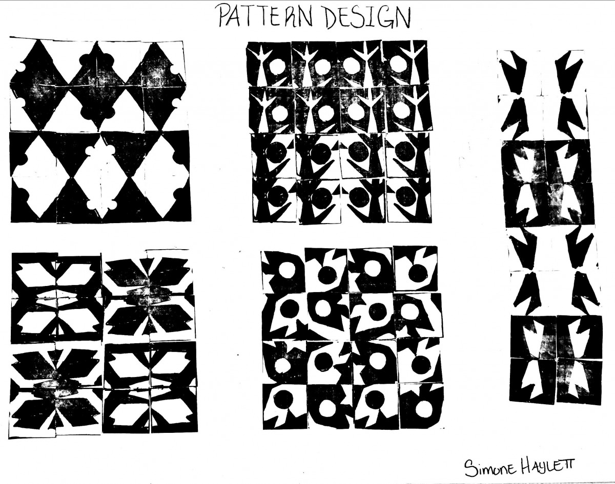
The pattern design assignment was given to the class early in the semester and consisted of three parts. Step 1 was to draw an organic or mechanical image in black and white which then became our figure ground image. Step 2 was to find interesting positive and negative shapes within our drawings and trace them out on a grid using tracing paper. The final step as to make copies of the positive/negative grid cut out the shapes and make new pattern compositions with the pieces.
During this project, I was frustrated because when it was first explained I didn’t feel like I understood the concept. Step 1 was easy enough, but I couldn’t visualize how my snowflake figure ground drawing could transition to make a consistent pattern. Moving on to Step 2 I was just going through the motions, still trying to figure out how a pattern was going to come out of what was now a positive/negative shape grid. When I got to the final step I was worried that I wouldn’t be able to make a pattern or find a rhythm to my piece that would fit the assignment and be aesthetically pleasing to the eye. Eventually, I got into the rhythm and found an order that I could work with. After I finished I felt like the project wasn’t nearly as bad as I was making it out to be in my head. When I was able to get to a clear path of thinking and visualize the rhythm the process became much easier to follow.
Texture Collage
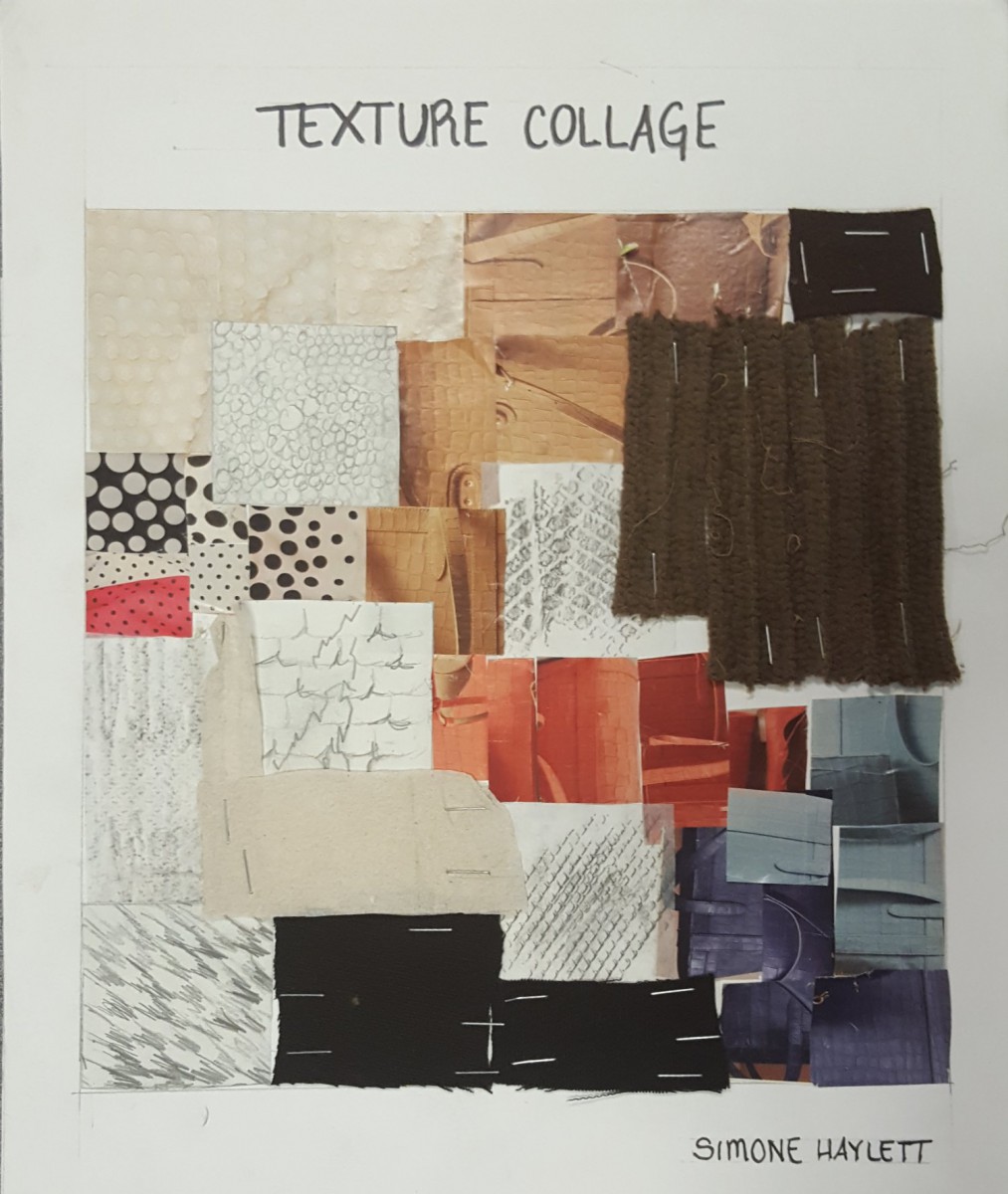
In this assignment we were introduced to texture. We were told to gather material from magazines, rubbings from surfaces we found in and out class and physical textures from clothing or anywhere in life. Working with these materials we were then asked to make a collage showing the mix of these textures.
This assignment was kind of challenging for me trying to gather material like magazines or physical texture. I got an idea to use an old hat that I wasn’t wearing, napkins and old rags or scraps of material from another class that weren’t being used. My next challenge after gathering the material was placing it on the page in a way that made sense to me and flowed together following a type of order. Because I wasn’t a big fan of working with texture I was really concerned with how I wanted my piece to look and that it came together in harmony. I grouped each piece together based on my rubbings and which material I felt best matched the texture created by them. After finding the placement that I liked the only thing I had left to worry about was getting the fabric to stay on the page. After finishing the assignment I realized I liked how everything came together between my rubbings, magazine cut-outs, real textures and the color palate I created with it.
Simultaneous Color
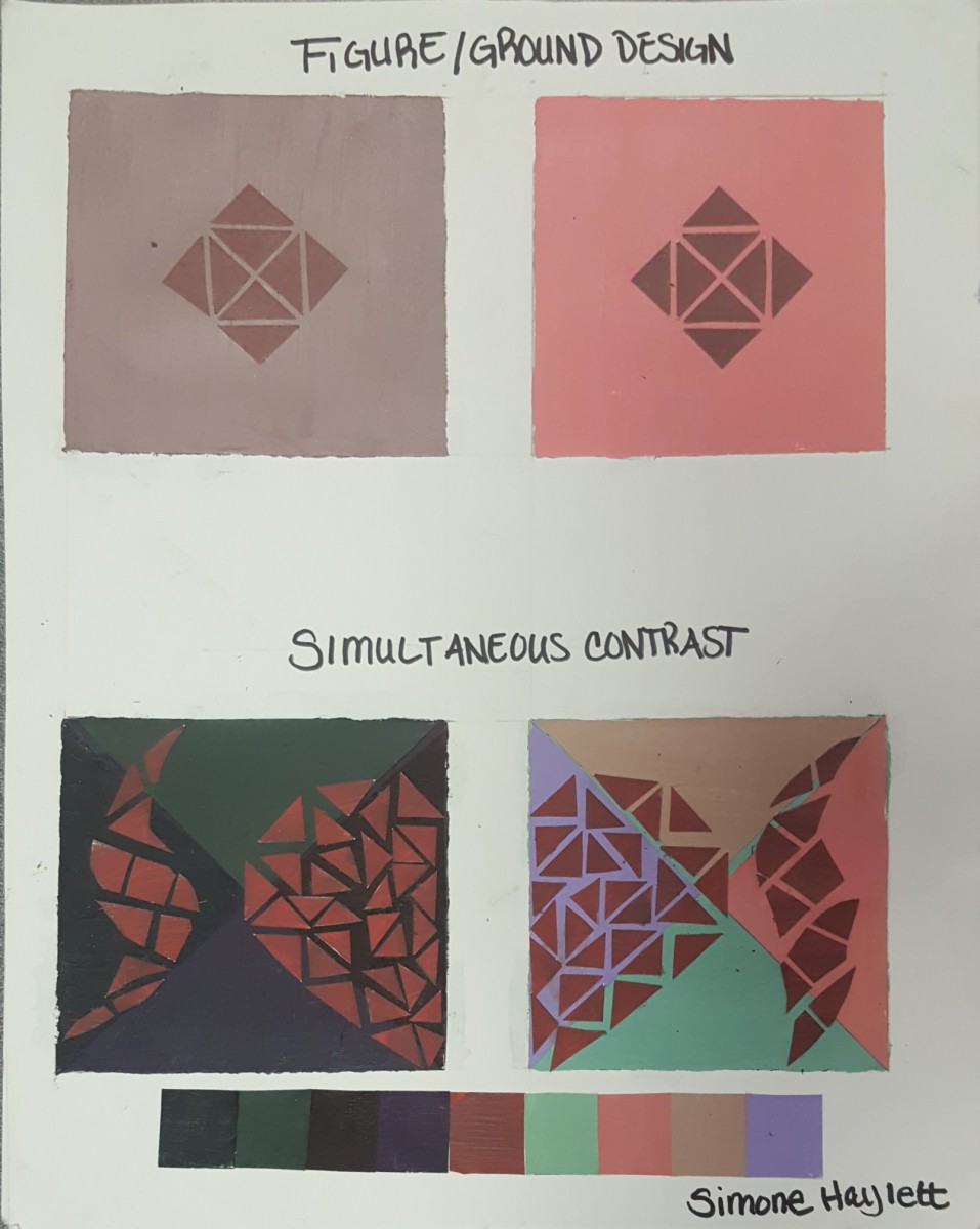
In this assignment we were working with paint and color mixing to create a simultaneous color effect. This is when a middle value color appears to be darker when put against a light contrasting background and lighter when put against a dark contrasting background. The middle value remains the same but the contrasting background brings out different qualities to the eye. For this project we had to mix light, dark and middle colors then create a simple design in the first row and a more complex design in the second row. At the end we would make a color palate showing which color was the same but created the simultaneous color effect.
During this project, I was exited to be working with paint ans mixing the colors to create a design. The thing that I payed the most attention to was finding a middle value that was just right to create the effect I wanted. Once I found the color the next challenge was creating a design that would show the effect through all the light and dark colors being used in the second row. At first I didn’t see the effect right away an then I took a picture and was able to see it. I was happy with the outcome and found the process and painting very therapeutic despite being messy.

