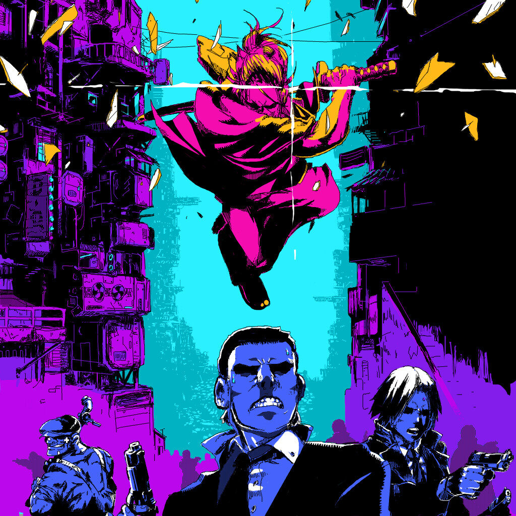
The artwork above is the official box art for a game called Katana Zero. The artist for all the official art is David Zhang. Zhang’s signature style is to incorporate neon colors in his work. He is mostly well known for his impressive use of warm and cool colors. Zhang’s color pallet usually consists of 4-6 colors ranging from the darkest purples to the brightest of oranges. His technique for color is to use 2 shades of each cool color followed by 2 shades of each warm color and often states that in order to have good understand of color, artists should research and practice with different swatches and tints that fit the theme they are going for. He often emphasizes the important of complementary and analogous colors if he wants his work to really pop and give off a neon/vaporwave atmosphere, which he excels at.
I chose this piece in particular not only because it was an eye-catching piece but it has one of the best examples of color usage. It also is an excellent series for story-telling, dynamic art and excellent music. Some techniques I can learn from Zhang are his color studies and use of coloring of shadows to create expression or setting. I high recommend looking at Zhang’s official artwork for Katana Zero if people are interested in Neon- Future colors and dynamic character design.


This is pretty awesome! I love how he chooses a daring “neon-future” color palette as you mentioned. It really creates both symmetry and allows the eye to establish the hierarchy of the characters in the piece. Thanks for sharing!!