Professor Schoenbrun | COMD3313 OL74| FA21

Category: Discussions (Page 1 of 18)

Discussion Week 2: What makes memorable packaging?

Can you think of any other illustrated or designed packaging that you feel connected to? This could be from your childhood, teenage years, or time
as an adult.

Write a Discussion post. For example, “My childhood memories are filled with the images of the friendly and cheerful Keebler Elves for the Fudge Stripes cookies and the Rice Krispies characters, Snap, Crackle, Pop. Perhaps, this connection reflected my early interest in character design in children’s media.”

Discussion 4

This piece “Noir Femme Fatale” by Rob Levin is an example of an illustration that makes great use of composition. Levin uses color and light to create somewhat of a minimalist realism. His technique is effective because by using only four colors, he manages to convey the entire tone of piece. I love the simplicity of the composition and the fact that it was created entirely in photoshop is equally impressive.

Discussion 1-Why Keep a Sketchbook

According to the author, 5 suggestions to keep a sketchbook are:

  1. Find time to draw

2. Just draw, even if it isn’t perfect.

3.Don’t obsess over the perfect materials. It’s not about the pen, it’s about the inspiration.

4. Don’t confuse the objects in the drawing for the subject of the drawing. Gather some junk and draw.

5. Draw what you see, not what you know.

Although I’ve never kept a routine or regular sketchbook, I’ve always tried to practice sketching/drawing periodically as inspired. Time was primarily what kept me from being consistent with a sketchbook. I hope that by weekly practice, I can improve any artistic skill that I have and possibly acquire a few new ones.

Discussion 6

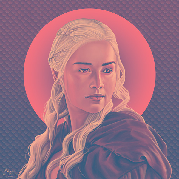
This piece was created by Hiyasmin Mithi Laya DeGuzman, a web designer, graphic artist and illustrator from Dasmarinas, Phillipines. I was drawn to this artwork because it is a stylized limited palette print of Daenerys Targaryen (a character from Game of Thrones). While I’ve never watched Game of Thrones, I enjoy simplicity in art that can bring art to life by giving it a personality, and I think DeGuzman has captured that with this piece.

DeGuzman uses traditional media as well as photoshop and Illustrator. She uses color theory in her piece by drawing the viewer with the single character and background. The color technique of color harmony balances out the crimson background with lighter shading and subtle elements, making the piece more interesting. I think the color technique is effective because it, not only makes the piece look like an actual painting, but the colors give a unique balance to an otherwise stoic frame.

More of her work can be viewed in the link below:

https://www.behance.net/gallery/18284191/Limited-palette-art-prompts

« Older posts