Please visit
Category: Uncategorized (Page 1 of 2)
I have a formal background in graphic design and photography, and my career has revolved around these fields in various capacities.
Upon completing art school, I designed an identity and brochure for the now-closed New Lincoln School, a private institution on Manhattan’s Upper East Side. Interestingly, I had to take a break from my book design assistant job at Viking Press/Penguin Books to attend my graduation.
During my time at Viking/Penguin, I secured a NYSCA grant to document the architecture of Queens Cemeteries, with the resulting images exhibited at the Queens Historical Society. This project was followed by another funded by the NEA, focusing on similar subject matter, and displayed at the Municipal Art Society in New York.
Following my tenure at Viking, I took a significant step by opening my photography studio, where I pioneered a location in Chinatown. Within the studio, I shot several national advertising campaigns, one of which featured my images in prestigious magazines like Vogue, Mademoiselle, Vanity Fair, Elle, and Seventeen. My clients included advertisers and publishing houses, and I successfully managed the studio for 15 years.
While commercial photography was exciting, I eventually felt the urge to create more personal work. Consequently, I closed the studio and began working on my art from my apartment. There, I produced prints for installations showcased across Europe. My innovative work led to grants for a residency in Cologne, Germany, and my most experimental pieces were exhibited in Amsterdam. Despite my international experiences, I eventually found myself missing New York and returned home.
The harsh reality of installation work in the US is that experimental projects struggle to secure funding. To support my installation endeavors, I worked as a production color analyst for commercial printers and utilized the income to continue exhibiting my work. Over time, I worked my way up to the position of manufacturing director for two consumer publications.
While I continued my photography, I received a grant to create a substantial body of work centered on the instability of life in the declining industrial Midwest region of the United States. This project led to a commission from a museum in upstate New York to document industrial structures in Columbia County. The result was a solo exhibition at the Columbia County Historical Society Museum in Kinderhook, NY.
One day, I came across a teaching opportunity at City Tech, and that’s how my journey into academia began.
Please visit anitagiraldo.com to see my artwork.
Teaching a course early in the program often goes unnoticed by the students. While some students see me in the hallway and ask questions or chat about how something they learned in my class positively affected their work later on, most identify with what they learn when they’re at the precipice of graduation.
Nonetheless, many students have returned to say know that they realize that their success stood firmly on the foundation I taught them.
Some success stories:
a) Amera Rime Lulu, one of my COMD 1200 students, excelled as a designer and is currently teaching COMD 2300, Communication Design I.
b) Zanetta Bowen, a CDMG student, went from producing a book of illustrations she’d drawn to animating the images. She furthered her education and was awarded an Master of Fine Arts in animation from The Fashion Institute of Technology. She is currently a Talent Acquisition Professional at New York Times Marketing and Creative.
c) Al-Amir Jordan, a CDMG student went on to graduate school, his degree awarded by New York University in Media Management. He is currently at the New York Times, coordinating advertising and editorial content for digital publication.
Student Evaluations of Teaching
Spring 2023
COMD1340 – Digital Photography 1
Class Mean: 4.41 | Department Mean: 4.45
Fall 2022
COMD1200 – Graphic Design Principles II
Class Mean: 4.65 | Department Mean: 4.50
Spring 2022
COMD1200 – Graphic Design Principles II
Class Mean: 4.64 | Department Mean: 4.47
Fall 2021
COMD1200 – Graphic Design Principles II
Class Mean: 4.06| Department Mean: 4.44
Spring 2021
COMD1200 – Graphic Design Principles II
Class Mean: 4.17 | Department Mean: 4.49
COMD3504 – Communication Design Theory
Class Mean: 4.18| Department Mean: 4.49
Fall 2020
COMD1200 – Graphic Design Principles II
Class Mean: 4.35 | Department Mean: 4.51
COMD3405 – Communication Design Theory
Class Mean: 3.91 | Department Mean: 4.51
Spring 2020
COMD1200 – Graphic Design Principles II
No data
COMD3405 – Communication Design Theory
No data
Fall 2019
COMD1200 – Graphic Design Principles II
Class Mean: 4.75 | Department Mean: 4.58
COMD1340 – Digital Photography 1
Class Mean: 4.64 | Department Mean: 4.58
Spring 2019
COMD1200 – Graphic Design Principles II
Class Mean: 4.50 | Department Mean: 4.52
COMD4801 – The Portfolio
Class Mean: 4.92 | Department Mean: 4.52
Fall 2018
COMD1200 – Graphic Design Principles II
Class Mean: 4.78 | Department Mean: 4.54
Spring 2018
COMD4801 – The Portfolio
Class Mean: 4.54 | Department Mean: 4.52
Fall 2017
COMD1200 – Graphic Design Principles II
Class Mean: 4.36 | Department Mean: 4.49
COMD2330 – Digital Photography 1
Class Mean: 4.56 | Department Mean: 4.49
Spring 2017
COMD1200 – Graphic Design Principles II
Class Mean: 4.33 | Department Mean: 4.52
Fall 2016
COMD1200 – Graphic Design Principles II
Class Mean: 3.80 | Department Mean: 4.43
COMD2330 – Digital Photography 1
Class Mean: 4.41 | Department Mean: 4.43
Spring 2016
COMD1200 – Graphic Design Principles II
Class Mean: 4.46 | Department Mean: 4.43
COMD2330 – Digital Photography I
Class Mean: 4.76 | Department Mean: 4.43
Fall 2015
COMD1200 – Graphic Design Principles II
Class Mean: 4.57 | Department Mean: 4.51
Spring 2015
CDMG 3515 – Production Management Systems II
Class Mean: 5.00 | Department Mean: 4.42
Fall 2014
COMD1200 – Graphic Design Principles II
Class Mean: 4.05 | Department Mean: 4.69
CDMG4800 – Production Team
Class Mean: 4.82 | Department Mean: 4.45
Spring 2014
ADV1200 (COMD 1200) – Graphic Design Principles II
Class Mean: 4.36 | Department Mean: 4.68
CDMG3515 (GRA3515) – Production Management Systems II
Class Mean: 4.62 | Department Mean: 4.36
Fall 2013
COMD2330 (GRA2330) – Digital Photography I
Class Mean: 4.53 | Department Mean: 4.51
CDMG3515 (GRA3515) – Production Management Systems II
Class Mean: 4.62 | Department Mean: 4.36
Spring 2013
GRA4715 – Project Management/Workflow Analysis
Class Mean: 4.66 | Department Mean: 4.56
GRA3515 – Production Management Systems II
Class Mean: 4.95| Department Mean: 4.56
GRA2330 – Digital Photography I
Class Mean: 4.73 | Department Mean: 4.56
Fall 2012
GRA4800 – Production Team
Class Mean: 3.98 | Department Mean: 4.49
Spring 2012
GRA4715 – Project Management/Workflow Analysis
Class Mean: 4.82 | Department Mean: 4.52
Fall 2011
GRA3515 – Production Management Systems II
Class Mean: 4.80| Department Mean: 4.59
Spring 2011
GRA3515 – Production Management Systems II
Class Mean: 4.87| Department Mean: 4.57
GRA2330 – Digital Photography I
Class Mean: 4.58 | Department Mean: 4.57
Fall 2010
GRA3515 – Production Management Systems II
Class Mean: 4.88| Department Mean: 4.51
GRA 4800 – Production Team
Class Mean: 4.38 | Department Mean: 4.51
Spring 2010
GRA 3515 – Production Management Systems II
Class Mean: 4.36 | Department Mean: 4.68
GRA 4800 – Production Team
Class Mean: 4.15 | Department Mean: 4.68
GRA 4715 – Project Management and Work Analysis
No data
• COMD Curriculum Proposal, 2021: Five new courses were submitted for consideration to College Council. The courses reflect the alignment of our advertising concentration with professional practices. Strategy Courses COMD 3402 Brand Strategy for Creatives, COMD 3420 Storytelling for Creatives COMD 3520 Principles in Motion Design and COMD 3507 Creative Project Management were introduced .
Role/Responsibilities: Curriculum Committee Member. Wrote and researched the new COMD 3507 Creative Project Management and updated COMD 1200 Graphic Design Principles II. Edited the courses in the proposal and the Chancellor’s Report. Please see page 60 of the document below:
• Course Descriptions, Summer 2022: With the chair, Prof. Daniel Wong, tabulated, wrote and edited the COMD course descriptions to focus on student engagement.
Role/Responsibilities: Proposer, researcher, writer, editor.
• Curriculum Modification Proposal, 2021-2022. COMD 3513 Narrative Illustration and COMD 3613 Professional Practices for Creatives.
Role/Responsibilities: Editor.
• Curriculum Modification Proposal, 2014. The Communication Design Management Curriculum to represent the current trend toward digital communication.
Role/Responsibilities: Researcher, writer, editor. Please visit CDMGcurriculumpro
• Within the proposal above, I developed Course Grids, rationales, wrote new courses and rewrote others.
Role/Responsibilities: Researcher, writer, editor. Please visit CDMG_Course_Grid_2015
• Proposed and wrote a new course, GRA/CDMG 1230, Print Tech, featuring a new approach to print media: including fine art print applications, a history of printing and a writing component to a previously craft-oriented course.
Role/Responsibilities: Proposer, researcher, writer, editor. Please visit CDMG1230
• Proposed and wrote a new course, GRA 4600. Topics in Media Management, a course focused on the data and asset management servicing the communication design industry. The highlight is the final assessment: students are required to present their project dossier to an industry professional in a monitored meeting. Please see GRA4600_v9r1
In every course I’ve taught at City Tech, students are required to create a process book. It’s more than just a paragraph summarizing their work in a brief four-month semester. It’s a crucial part of their learning process. Since many of our students lack prior experience with archiving, presenting, and defending their work, I guide them in organizing their achievements over the 15-week semester. They learn to create a tangible representation of their work that can be shared with their peers, who ultimately become their colleagues.
In art school, critiques can be brutal, but I emphasize a different approach. I teach students how to evaluate and offer constructive feedback on their classmates’ work. I stress that in the industry, job opportunities often come through connections with peers. This reality has held true for me and many colleagues in the field.
My expectations for process books are high. They need to serve as mini-portfolios suitable for presenting to potential employers or clients. Even in courses that focus on project management and production, the ability to present ideas and information effectively is a valuable skill in our industry. The process books I receive often come in various formats, from PDFs to links on platforms like ISSUU.
https://issuu.com/morganjeong/docs/comd1200_processbook_morganjeong
https://issuu.com/tabzhoujake1/docs/issuu3
https://issuu.com/itanriqui/docs/floresita_comd1200_issuu_finalwebsave
Process Books for COMD 1340/2330, Digital Photography

To see the process book above, please visit: https://issuu.com/kzcomd1340/docs/finalize_book
Other process books:
http://issuu.com/jessicahernandez22/docs/photography_final_porfolio_final
http://issuu.com/inhisimagephotography/docs/comd2330
Course: COMD 1200 Graphic Design Principles II
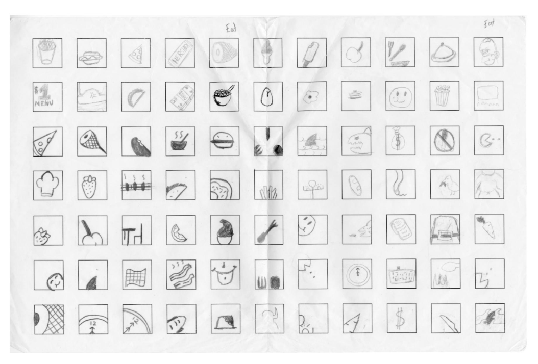
Assignment: Create an image suitable for use as a digital property icon.
Background: With the shift to mobile media usage across cultures, the need to convey information visually, rather than through text, has grown. Designing icons to represent objects, actions, or concepts has become a crucial skill for students as more interactions are condensed into taps.
To succeed in this task, students must learn how to craft an image that embodies an idea rather than merely illustrating it. They need to consider whether their visual representation can evolve into a universally understandable symbol, avoiding clichés or confusion.
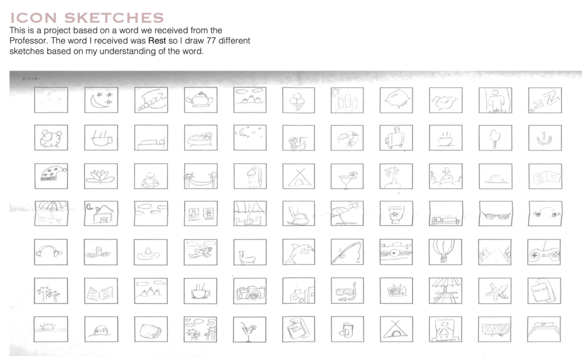
I initiated the process by assigning students different words from a list. These words included nouns and verbs, which served as the foundation for their icon designs.
Some of the students’ brainstorming grids:
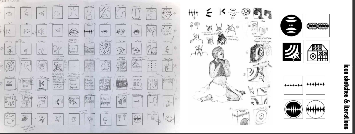
Further, they developed a black and white version
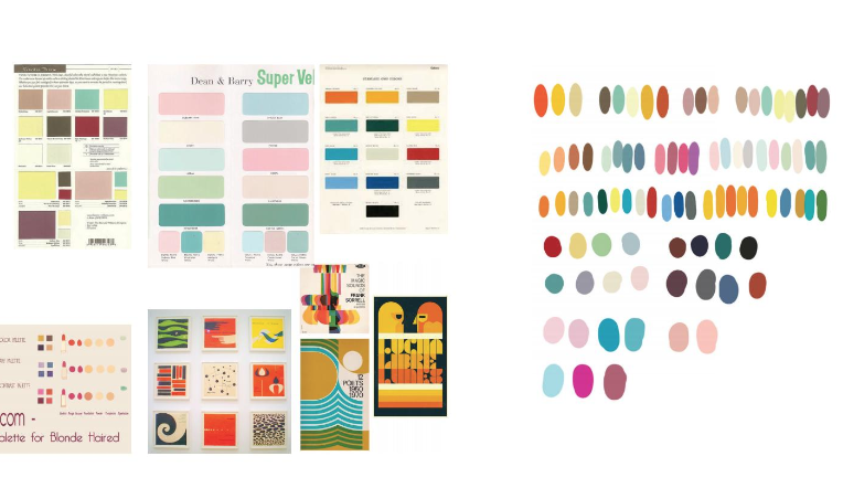
and added color after building a color guide:
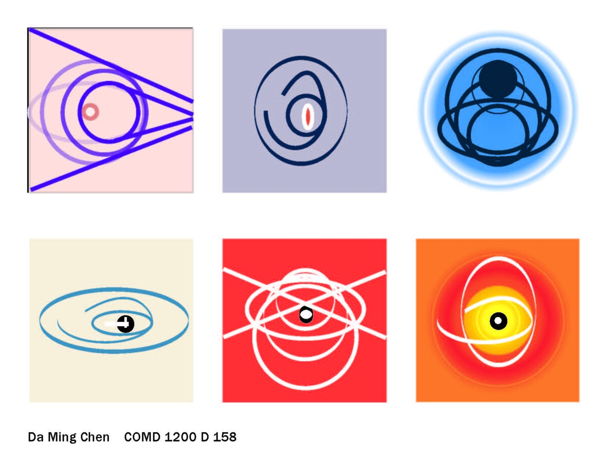
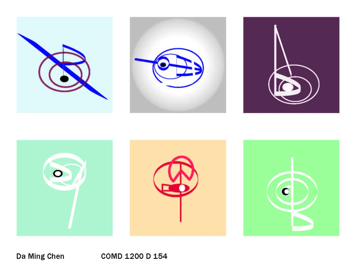
and ultimately, the finished icon:
Integral to this instruction is how symbols–icons really–communicated ideas in different cultures through the data sheets I created:

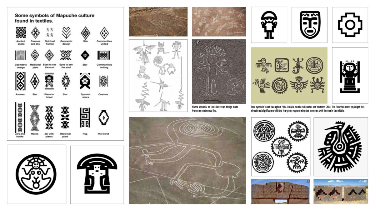
Although students have had significant exposure to image editing software, that knowledge is difficult to retain without daily use. To mitigate this, I assembled data sheets for all the courses I teach, which helped them add color, form and other design elements to their work:
Course: COMD 1340 Digital Photography [Photo 1]
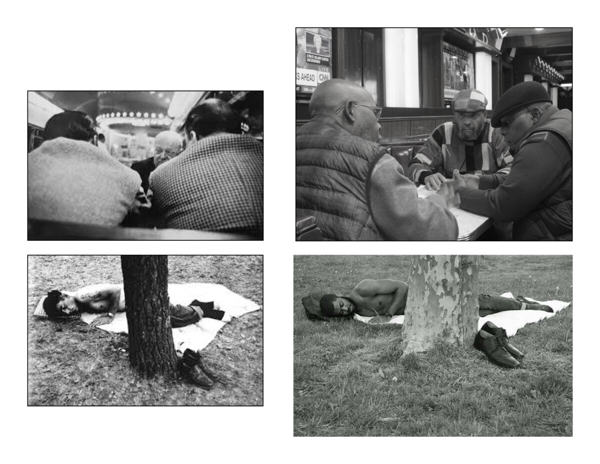
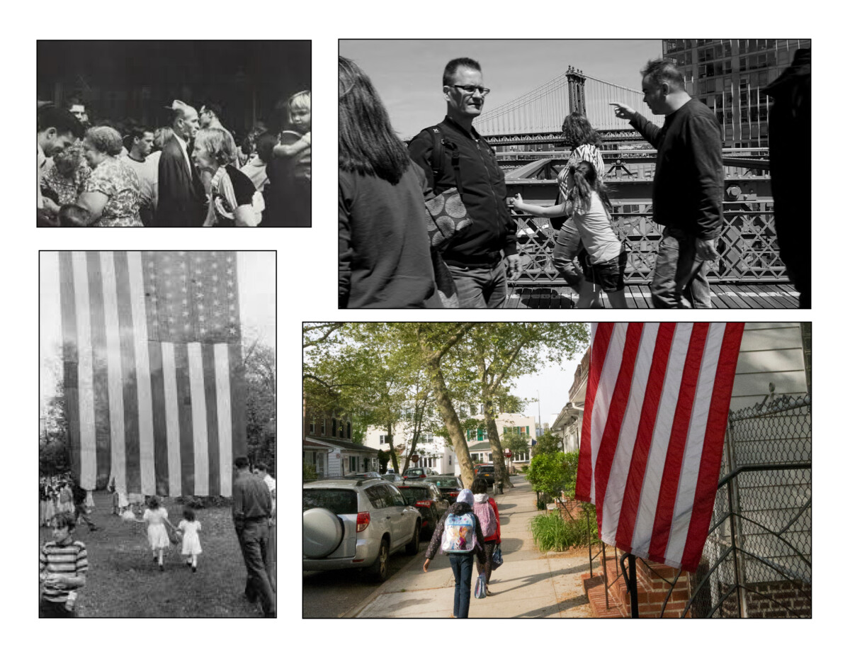
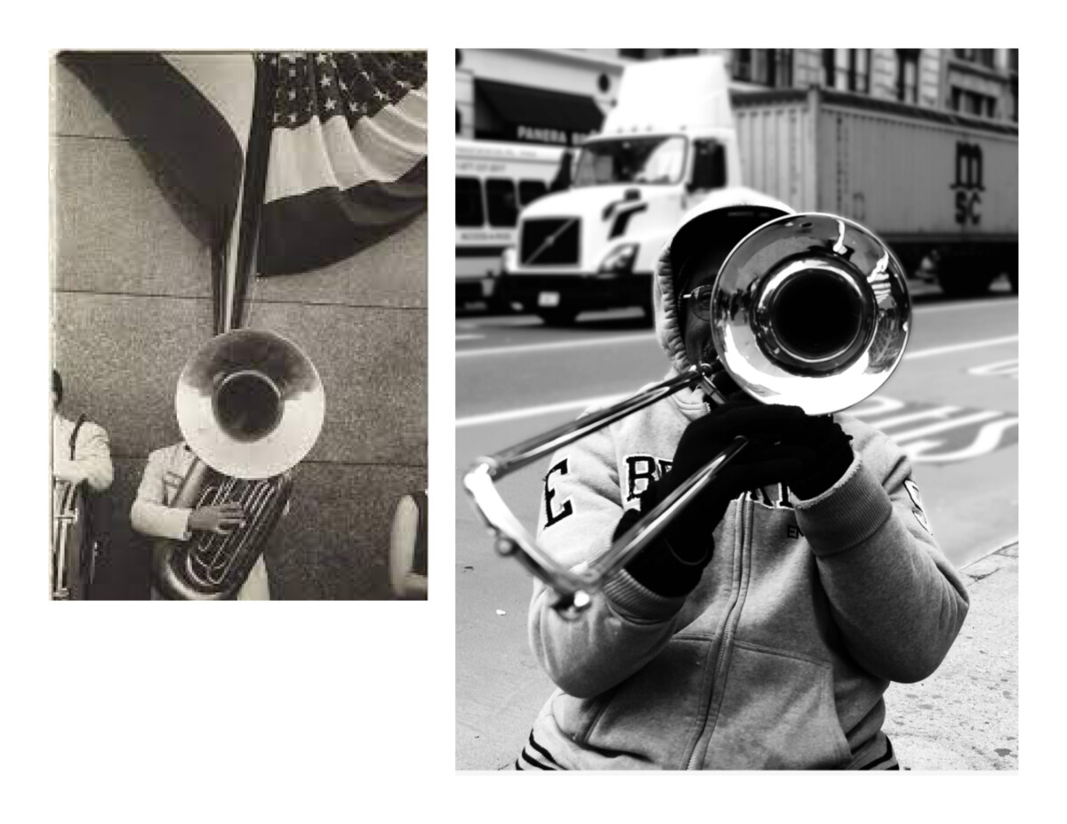
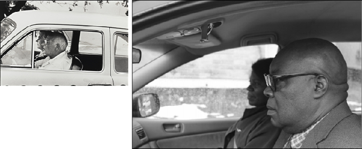
Assignment: Review Robert Frank’s renowned photography book, “The Americans,” select one or two images, research their origin, and reproduce them within the context of your surroundings in Brooklyn.
Background: “The Americans” is a seminal work widely studied in art school programs1. Prior to my art school experience, I had encountered images from the book, but it became the yardstick for image-making in my artistic journey. Robert Frank, a Swiss immigrant, embarked on a journey through the United States, capturing a critical yet compassionate, mortified yet cynical view of our country. The book stirred considerable controversy.
I’ve always advocated for recreating various artworks, whether paintings, sculptures, or photographs, to gain deeper aesthetic insights. As artists, each creative experience is unique. I believed that applying this philosophy to my students’ culturally rich environment would be enlightening, and indeed, it was.
“The Americans” is an exploration of the United States from an outsider’s perspective. Given that many of our students have diverse backgrounds and often feel like outsiders, I believed this assignment would deeply resonate with them. The students captured their perspectives of the Brooklyn they knew, reflecting their vigilance and fearlessness.
The assignment was given as part of the Final Project; and students had seven weeks to complete it. Please see the assignment: COMD-1340_Robert-Frank_assignment
In the interim, they brought images and discoveries to class for their classmates’ critiques. These are six of the most recent; Robert Frank’s images are to the left, the students’ interpretations, to the right.
Reflection: The work the students returned for this project was deeply moving. The students achieved the internal goal of the assignment: to analyze images that resonated with them, and to search for them in their daily lives. At first, some students remarked that seeking an image that was taken far away–in time and place–would be impossible to find. However, since it is a long assignment, with time, students identified with particular images in “The Americans”, and, with camera in hand, discovered that a master’s view of life could also be their own.
Course: COMD 1200 Graphic Design Principles II
Assignment: Design an image that conveys and idea using a graphic representation and a letter.
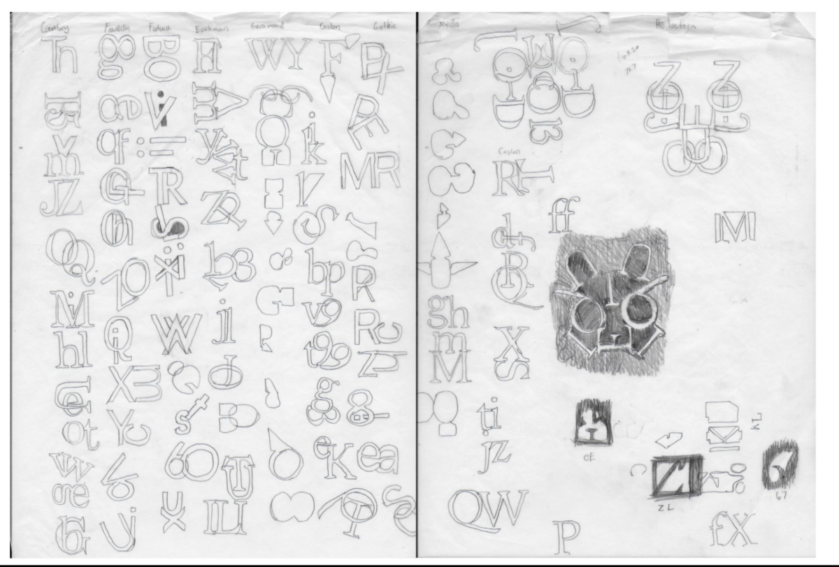
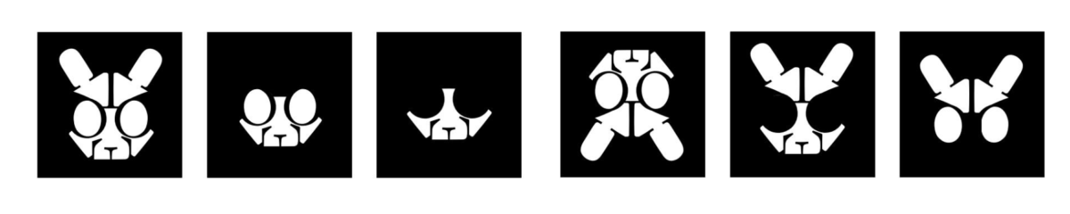
Background: Many logos we encounter consist of images integrated with letters. These images enhance the text implied by the letter, allowing students to make these connections freely and create visuals that trigger associations in the viewer or end user. After assigning the Icon project for several years, I decided to shift from having students sketch images to having them trace images and combine them with a letter. The selected letter should visually represent an object whose name begins with that letter, and it must do so without any embellishments or additions to the letterform. The goal is for the object to be revealed by subtracting its shape from the letter.
The Lesson Plan: Select a letter from the alphabet and combine it with an outlined image, avoiding any additional elements in the letterform. Simply subtract the image’s shape from the letter.
Student work:

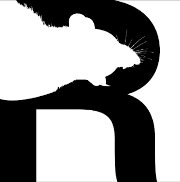

Personal Reflection: This project presents teaching challenges as students sometimes prioritize decoration over the consideration of how the elements interact. In the future, I aim to help students better comprehend the conceptual interplay between the visual and literal elements and how the outlined object interacts with the letterform. Students source their images from an open directory of images, and they should become proficient at redesigning them to fit within the chosen letter’s constraints, selectively excluding unnecessary details.
Course: COMD 1200 Graphic Design Principles II
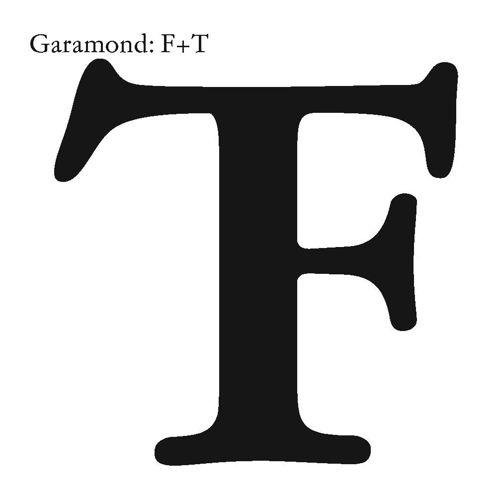
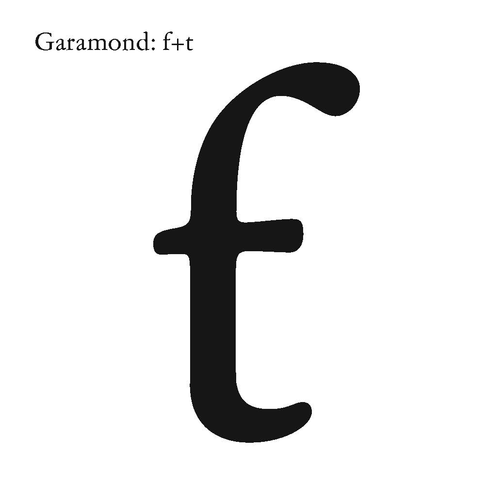
Assignment: Create a typographic ligature, hand-paint it, and animate the letterform.
Background: Letterforms combined to create a logo are recognizable due to our familiarity with the alphabet. However, in teaching COMD 1200, I realized students needed to think of letterforms differently and focus on their visual characteristics in addition to their phonetic attributes.
Personal Reflection: This project transitioned from The Ligature to the 27th Letter of the Alphabet. I introduced students to alternate letterforms and foreign alphabets, prompting them to consider what their 27th letter would sound like and where it would fit in our alphabet. This led to more efficient design work as students began creating both upper and lower case characters. A sample below:
This project also required reacquiring many craft skills that students have overlooked in the digital age, such as measuring with a ruler. I noticed that many students struggled to estimate measurements like two inches or two centimeters. Additionally, they needed to develop sensitivity to the nuances of letterforms, including serifs and thicks and thins, which hand-painting enhanced, fostering a stronger work ethic.
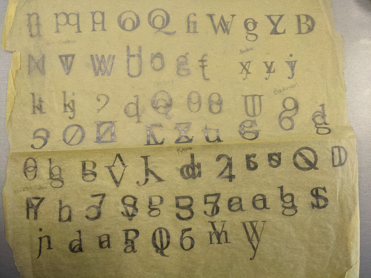
I provided a 9-page file of classic typefaces for students to print. The fonts listed in the book, https://www.designingwithtype.com/, were essential. James Craig, the author was my typography teacher in art school. Along with Rudy DeHarak, my design teacher, both inspired this project’s development.
The scaffolded skills:
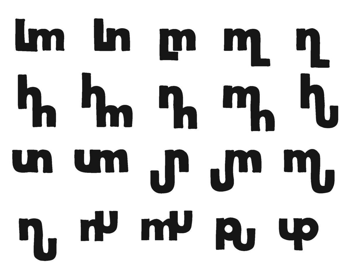
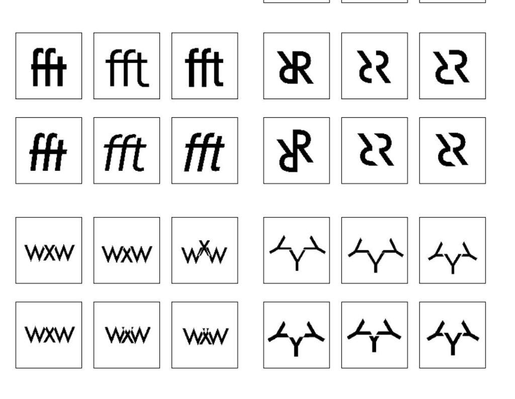
a) Exploration through repetition: students had to design 100 ligatures by combining two letterforms. They traced their letters from the Type Book they printed. Below are a few samples:
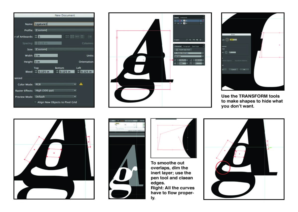
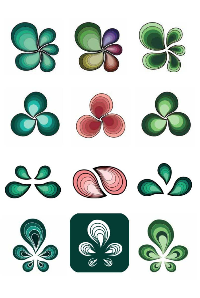
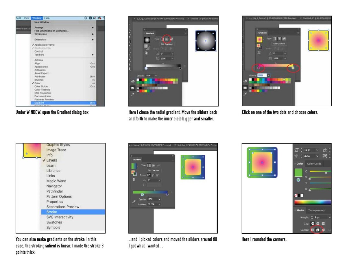
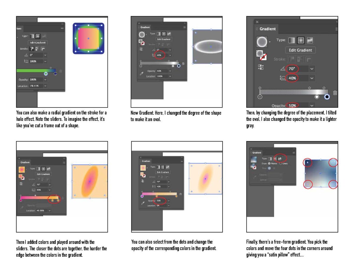
b) Using a “data sheet”–a six-pane how-to I created for the students–they brought their sketches to the computer and refined their ligatures. The data sheet is at the bottom of this entry.
Below are student samples:


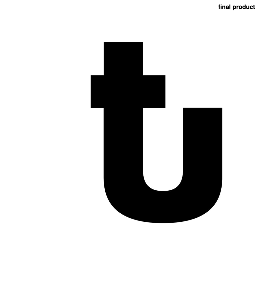
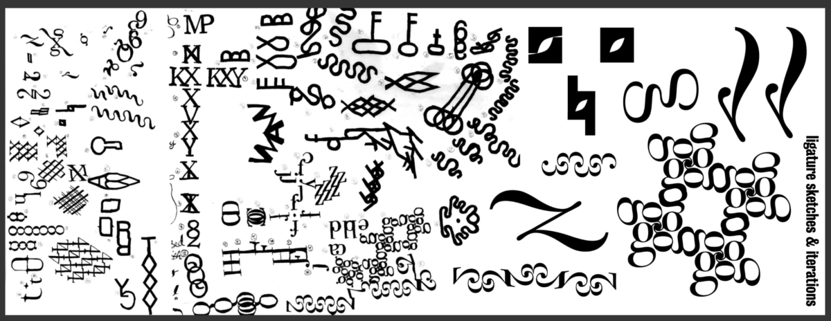

Some students pushed the letterform into a full illustration:
Animating the letterform was a diverse process. I introduced a GIF animation project in which students drew (designed) each cel independently, rather than relying on software filters to transform the image. The project commenced with students studying Eadweard Muybridge’s work, a pioneer of motion picture. They created brief videos of various subjects in motion. After mastering this exercise, students let their creativity flow and enjoyed the outcomes of animating their letterforms.
You can view a frame-by-frame animation of the letter “D” tumbling at https://imgur.com/a/dyF89rU, and here’s one of the whimsical animations created:

Data sheet I created for students to build the ligature in the computer: