museum visit christopher liao
Jeffrey Veregge: Of Gods and Heroes 12/14/2018 also american indians
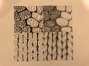
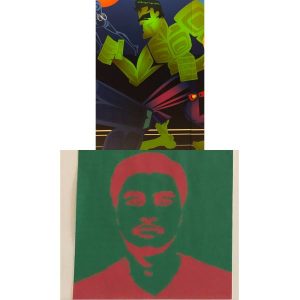
this is hulk the famous marvel superhero with the giant muscles foreground is the green on him and the green squares represent strength on him. each square came from inspiration from the totem poles from native american tribes. the project i will compare this with is project 2 texture and pattern because with the squares represent an uneven pattern cause i chose a difficult object for the project which was all over the place and it had no direction. this pattern makes think that everything has its meaning regardless of pattern
Museum Visit – Cameron Scotland
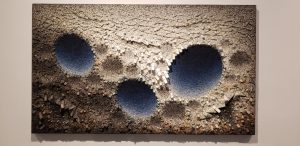
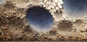
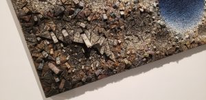
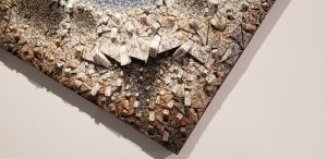
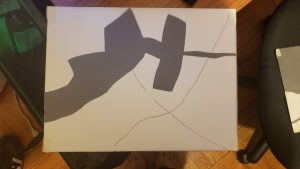
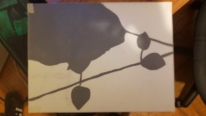
(My piece, close-ups of it, and also my two compositions from the first project)
Museum: The Brooklyn Museum
Date Visited: 12/16/18
Piece Name & Date: “Aggregation 09-DO71 Blue”, 2009
Artist: Kwang Young Chun
I decided to compare the piece I chose to our very first project which focused on obvious and ambiguous compositions as we shot pictures of random places and things outside. There were multiple pieces I would have liked to analyze but this one I found the most interesting and thought would be nice to breakdown in terms of all the things I’ve learned over the semester.
Museum visit
during the visit to the museum was very interesting because I saw different kinds of artwork the most interesting was the hulk and marvel characters I stumbled upon by Jeffrey Veregge: Of Gods and Heroes.
Below the work there is hulk the mighty green super hero.this work shows squares muscles the features of super strength that he has. The green background is ambiguous because inside we do not know what it is. Within the squares on the outside show something to represent native Americans. For project 4 I had green background along with my red to show green is a good color to use
Museum visit- Akshay Patel
Jeffrey Veregge: Of Gods and Heroes
The artwork on the top is of Hulk from marvel. The background is green and shows the hulk however the foreground is hard to tell, it looks like the square blocks shows hulks muscles, which is true. However, those square blocks represent strength, the wings on his arms and legs represent flight showing he can jump high.
The way the background and foreground is by adding physical symbols on the background (the character) which represent actions and have meaning behind each symbols.
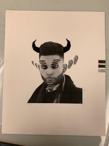
The artwork of Hulk relates to my selfie in a way. Both the artwork and the selfies backgrounds are green. Like the artwork, there are shapes which help create a facial structure on my selfie.
Jeffrey Veregge : Of Gods and Heroes
12/14/18
National Museum of the American Indians
Russeck gallery-Rahel
ImagiNATION- Deliver
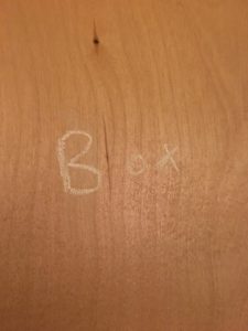
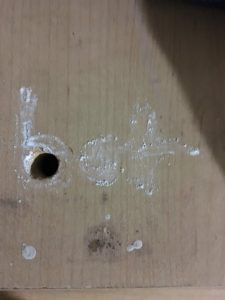

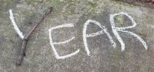
While doing this project I though it would be easy but I was wrong. I barely used chalk for my work so this was new to me and a somewhat challenge. I enjoyed this project finding ways to use chalk.
imagiNATION-Deliver
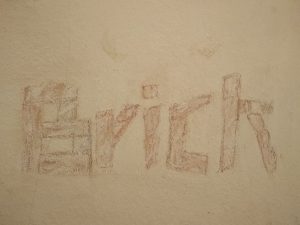
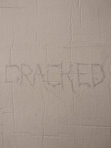
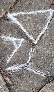
The primary focuses of project 5 were research and discovery. I decided to search around my apartment to find the starting points of my compositions. As I live in a fairly old complex, finding the starting points were relatively simple, but creating a typeface based on that proved to be a bit more of a challenge. I haven’t used chalk as a medium before, so it was difficult to translate what I initially sketched on paper to the wall(s) of my apartment. Overall, I think it was a fun project to do, as it can test one’s imagination.
imagiNATION – Deliver
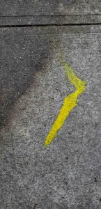
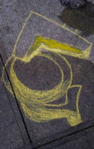
Here are my before and afters for my three compositions. I chose to work in my neighborhood for this project so I could freely go back and forth to the locations for my project if needed but I feel like it limited me slightly, but eventually I did find things to work with of course. The project wasn’t too hard but weather was the only thing that set me back at all so I just learned that I would have to plan more accordingly for future projects that would require similar efforts to complete. I think the yellow blotch was my best composition as it touched on color and texture more than the others although being slightly less readable due to the ‘T’ looking like a ‘J’. All in all the process went smoothly for the most part, disregarding the slight frustrations I had initially looking for places to work, but I’m content with my results and think I did alright this time around. This wasn’t my favorite project but I think it would have been more enjoyable had it been done a different time of year, so maybe I’ll try something like this again in the future.

