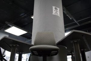
This photograph was taken by me when I worked with my partner and this visually interesting photograph was taken at a low-angle and it is supposed to reflect symmetry. I like it because it is visually appealing to me. You don’t normally see a chair at that angle and I thought it was one of our best shots. This shot is taken at a low-angle which gives the chair power like its looking down on us, it is symmetrical because if you place a vertical line right in the middle you will notice on the opposite sides of the line reflect each other. I also noticed a strong vertical line in the background that is created by the pole which was a great fit to the photograph. I also like how the colors matched as if it was a grey scale; you see different shades of grey, some black and some white.
-
Recent Posts
Recent Comments
Categories
- Homework
- HW-Exhibit Review
- HW1-photo description
- Learning Logs
- LL1-What makes a great photograph?
- LL2-Composition and Camera Angle
- LL3-Composition-Pattern, Angle and the Rule of Thirds
- LL4-Lighting Direction
- LL5-Portrait Lighting
- LL6-Portrait Lighting for mood
- LL7-Shutter Speed and Capturing Motion
- LL8-Painting with Light
- Uncategorized


the low camera angle does make the ordinary classroom look quite ominous.