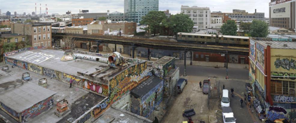
 The photograph was taken by Jeff Liao in Long Island City, Queens NY 2004 titled ” 5 pointz “. The subject matter in this photograph is this location where art bleeds on walls. Graffiti covered abandoned buildings , changing the 7-train landscape to the average commuter. In the image there is a rugged landscape with the subject in the center. There is also a artist present, and working to emphasize the graffiti walls.The purpose of the image is to show the life of the neighborhood and how people reside within. It demonstrates the difference in economic class by the division of the train tracks. Liao is on the side that shows lower class, empty streets abandoned buildings and very little industrial development as deeper into the shot. Also Liao captures the 7-train heading towards Manhattan instead of inner Queens towards Flushing a more low economic part of New York. The mood the image establishes is hopeful. I feel like the people that live here are aware of the circumstance and aren’t afraid to change it for themselves.
Patterns and Repetition is a very important trait of this photograph used by Jeff Liao to demonstrate to the viewer the environment of the photo. For example, all the primary colors re appearing with text in all forms. Next, important tip used is Diagonals coming from the 7-train and the street grid, and buildings to promote a wide landscape. Lastly, very subtly used is Framing, the framing of the artist in his own canvas I thought was very interesting.
Overall, I chose this image because I am from Queens, New York ive seen this landscape as a child and have grown with it. I am very proud of Jeff Liao’s Habitat-7 to show where I come from. Unfortunately, as of 2014 5 Pointz has been demolished and the broken neighborhood still remains…
Image Link:http://www.saulgallery.com/works-by/inventory/jeff-chien-hsing-liao#2


Liao’s New York is very different from the iconic New York of Michael Kenna. I agree that Liao shows the neighborhoods. The most important element of the photo is the long line of the elevated 7 train which cuts the photo in two. It is diagonal and it is also dark compared to the generally lighter tonality of the rest of the photo. I think it is also important how the street on the right comes to an abrupt end at the train.
Patterns and repetition are certainly present but not in a way that dominates the photo. The framing is important but if it was a little different it wouldn’t matter that much. the decision to make the image so horizontal and cut off what I think is the Citicorp building in the center keeps the photo about the lower buildings in the foreground, the neighborhood.