http://www.michaelkenna.net/gallery.php?id=14
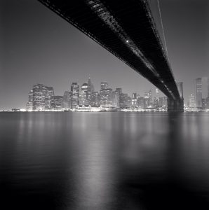
This Photograph is called Brooklyn Bridge, Study 3, New York City, USA, 2006 taken by the photographer MICHAEL KENNA. This photograph was taken in 2006 in New York in Kennas studies of New York. The intentions of the photographer was to capture a National Historical landmark in New York. The Brooklyn bridge is one of the oldest bridges completed in 1883 which connects the boroughs Brooklyn and Manhattan. The photographer captures this moment which tells a lot about the history of New York which seems to be taken from Brooklyn under the bridge which leads to Manhattan. The feeling I get from this image is peace and joyful. When I see this image the first thought I get in “The city of light” or “the city that never sleeps”. I also get a calm mood because the photograph is taken in black and white which seems to be his style in photography. However, the image gives off the vibe that is live because of all the lights in Manhattan and the reflection of the lights on the water.
In the photograph of the Brooklyn Bridge taken by Kenna, I found three of the formal elements from the Steve McCurry video of nine photo composition Tips. The three Elements that I believe Michael Kenna used in the photograph are Leading lines, Symmetry and Diagonals. Kenna uses Leading lines to move the viewers eyes to Manhattan. The object used for that element is the Brooklyn bridge, which seems like a one point perspective shot, and the vanishing lead to Manhattan. The second most important element Kenna uses in this photograph is Symmetry. It appears that there is natural horizontal line right at the center of the photograph. Below that line is the ocean, and above the line is Manhattan, the sky and the Brooklyn bridge which seems to be very pleasing to the eye. finally, He uses Diagonals to create movement. The Brooklyn bridge also seems to be the object that he uses to show diagonals because of the angel the shot was taken from which shows a movement from the bridge to the city. These three elements help create the feeling in the photograph because of how your eyes naturally flows throughout the photograph and you see the image exactly how he wants you to view the image, and the fact that it is so symmetrical, you get a calm and pleasing feeling when you look at the photograph.


This is a lovely photo where we see an icon from an unusual viewpoint. the bridge makes a strong diagonal line and works as a leading line taking the viewers eye towards Manhattan.
The photo isn’t a good example of symmetry. The end of the bridge on the Manhattan side, which is a very strong graphic element in the image, is strongly off to the side. A good test for symmetry is if you can fold the image in two halves and both sides are equivalent.