Week 6: The Next Chapter

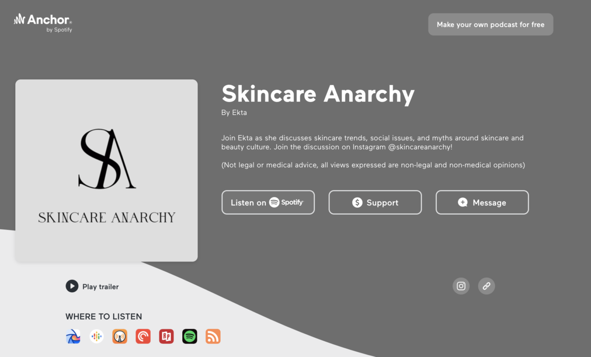
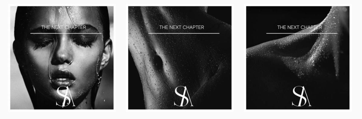
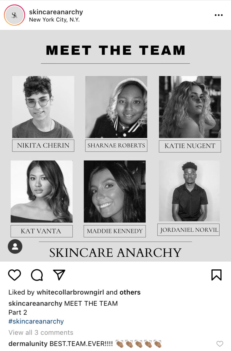
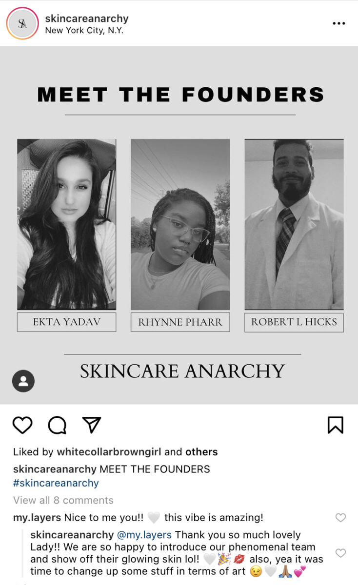
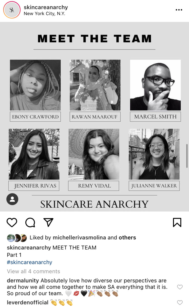
Skincare Anarchy is entering a new chapter. As a result, SA has changed its design. From color, we are just now following a black and white format (or grayscale.) Before the change, the color palette was pastels and off-white colors. The team has been expanding too. I love the work I do for Skincare Anarchy. Ekta former Ceo and founder of SA is very direct and open about what she expects and the goals for the future of the podcast. My internship requires all art or designs to have the companies trademark or logo. Any photograph used is credited by the person/creator. If a designer on the team created it, they are credited as well. Another important detail is that the internship that I am currently working with did not have me sign any confidentiality or non-disclosure agreement. My boss is excited about what’s to come because SA has now hit its two hundred episodes. Excited for SA and how far it has come, EY has decided to show on her main social media platform (Instagram) the team that works for the podcast and its founders. I feel like this makes it official. I’m so excited to be a part of the team because it is very diverse and we are all so talented in our distinguished way.

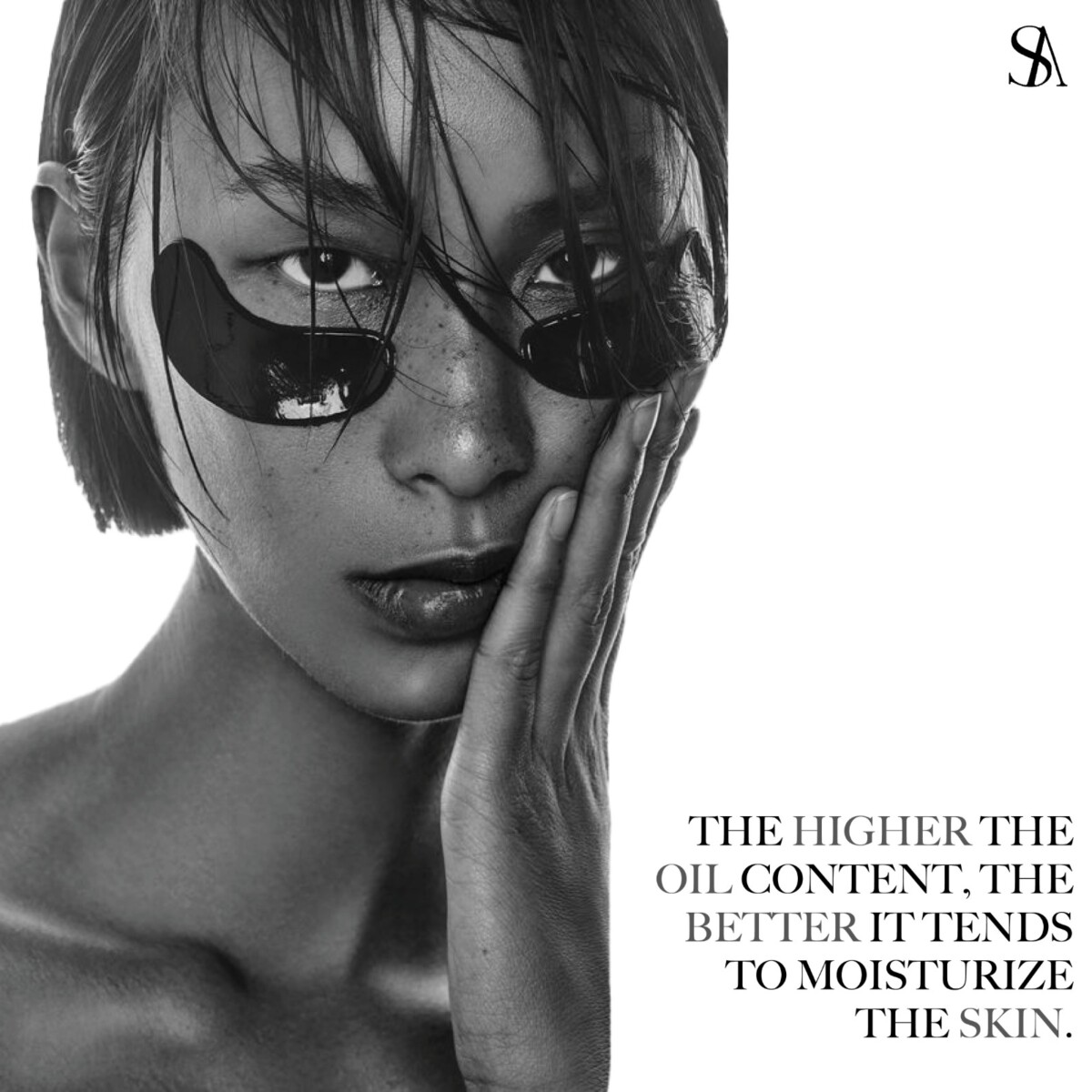
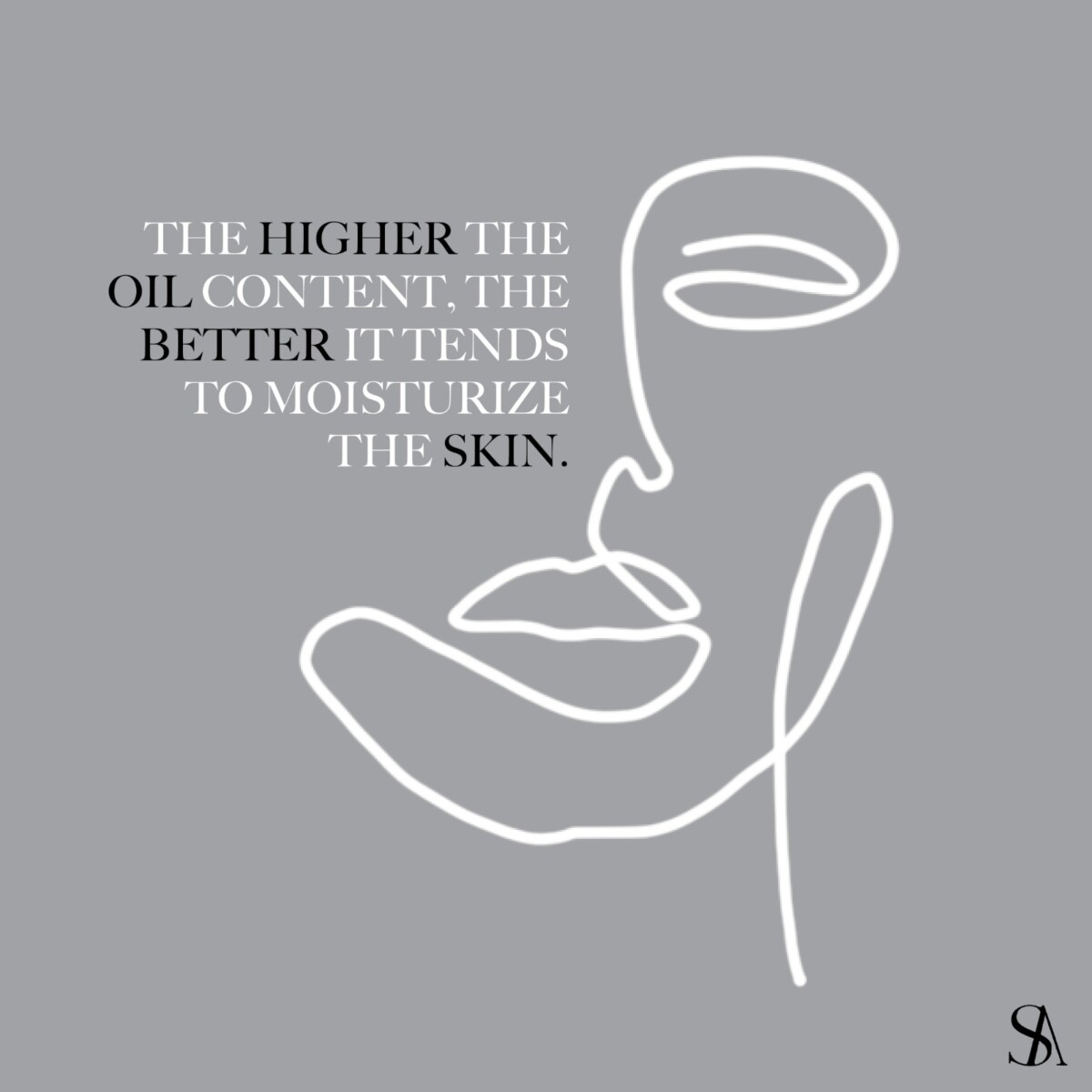
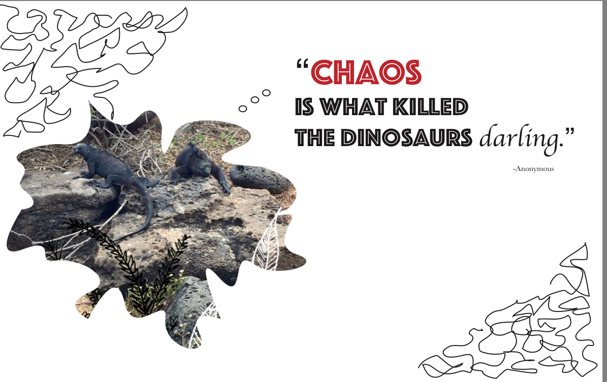
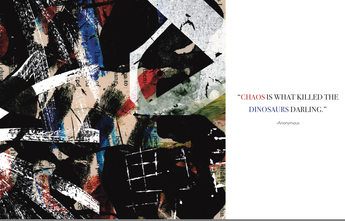
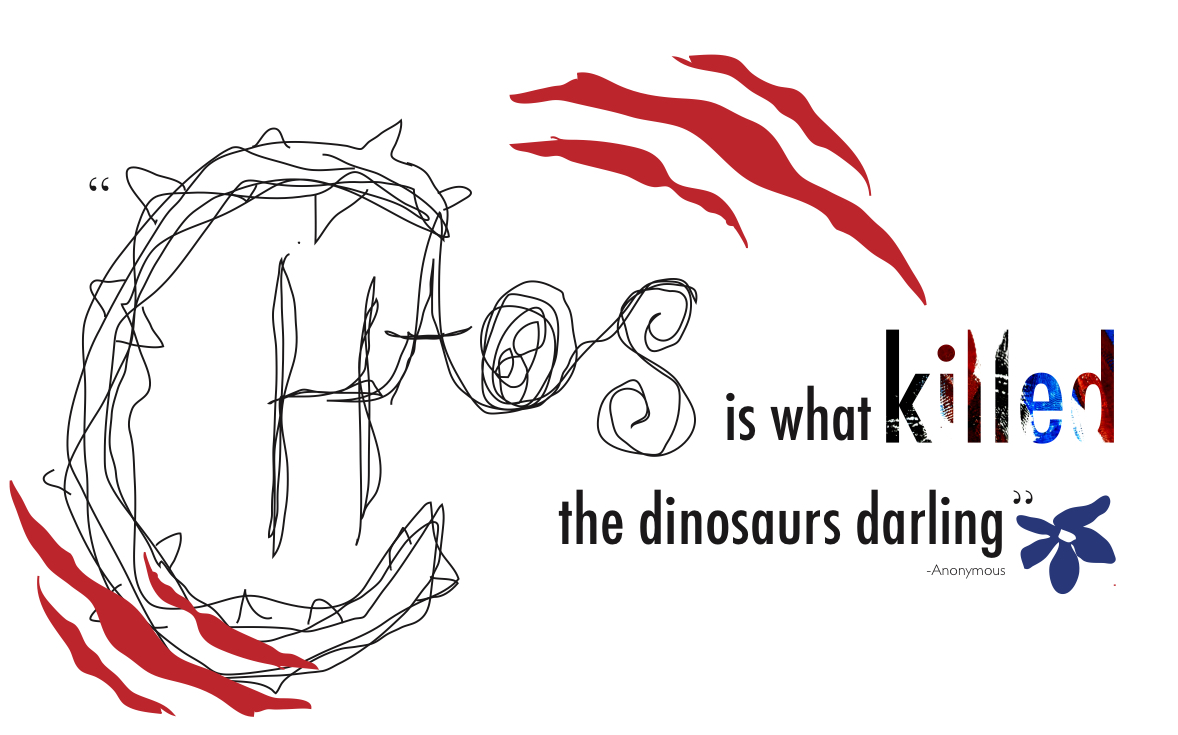
Since SA is all about skincare the topic we talked about this week was Eczema. The research team created a short article and needed some artwork for the newsletter. To make the artwork, I needed to do my own research to find inspiration. Usually, when I create a design I research for about an hour maybe a little more. Especially since the look for SA is very different and minimalistic. This will always be a challenge because I have to keep the color palette minimal and in the grayscale. When I begin to design there’s a lot I want to showcase, so whenever I present a design to the team I give them at least four to five designs so they (Ekta) can choose which they prefer best. For this article, I did a total of five different artworks. Ekta picked the two she liked the most and wanted to showcase both having them alternate in the newsletter.

Week 5: SA Thumbnails

My internship is fully remote. All of the team connects and chats via Whatsapp. Currently, the podcast has been receiving many new guests weekly. On Youtube, three to four videos are uploaded on the channel weekly. Currently, I am assisting and working on thumbnail designs for the videos. Each thumbnail must be in the size 1280×720. The design must include the name of the podcast, the name of the guest, and their company. The design and look of the brand stand very simple and elegant. The typeface used in all of the designs must be serif unless specified otherwise.

Since some of the videos are long I was asked if I could make a second thumbnail that has more of a click-bait-gossipy feel. This was kind of a challenge for me because a lot of thumbnails that are like that have symbols, red arrows and that is not the look of the brand. I definitely had to do some research to get some inspiration on how I can make these designs gossipy but still keep that simple elegant look. After some research, I notice most of the gossip thumbnails have cutouts of the person who will be featured in the video. So I opened photoshop and cut out the headshots from the guest that was going to be on the thumbnail and then on Indesign I began to design different layouts that will showcase the cutout precisely. After trying a few different layouts I sent the final design I thought looked best. My team loved it and it got approved. Now all gossip thumbnails will follow the same format.

Week 4: Networking Event

The event I attended was a zoom conference I found on LinkedIn where many users all around can join and network with each other. I thought this was the perfect event to attend because it was an event for people who have small businesses or freelance. It was a great opportunity to share information about your services, promotions, events and offers you have going on. Many people on Linkedin were interested in the event. However, only twenty people attended the conference. The event began at 9:00 AM EST and lasted a little over an hour. We each went around and presented ourselves with a little bit of our background and our occupancy.

Everyone in the event was very nice and had their own story. It was very nice to hear what were their passions, interest, and where they are now. I was the youngest and only student in the event. After each person had their turn, they’d drop their information and LinkedIn profile in the zoom chat to connect. I was surprised to meet other people like me a graphic designer at this event. For example, Sarah and Kevin are graphic designers that attended the event. Both service and specialize in a little bit of everything such as photography, packaging design, advertising, and more. They talked about their site Zebra Creative. At this site, you can find all of their work. Kevin said they liked zebras which is why they are called, “Zebra Creative.” Kevin and Sarah are both located a little outside of London and said they are willing to travel if they have to for any contract or big projects if offered.

Overall, I am very pleased to say it was a fun experience and a interesting event where I got to meet people with similar and different backgrounds. I gained ten new connections on Linkedin after this event. Pleased to say I started the semester with forty-five connections and now I have sixty-five connections.


Week 3: Interning with Skincare Anarchy

Currently, I am interning for a skincare podcast called Skincare Anarchy. The company (or podcast) focuses on discussing skincare trends, social issues, and myths around skincare and beauty. Weekly, they also feature different guests on their podcast and sometimes have collaborations with different brands. I was hired to work as a graphic designer for SA. The company is located in NY and is worked via remote. The podcast has a total of 188 episodes, a Youtube Channel, Instagram, TikTok, and Twitter.

Recently SA had a collaboration with Dyson. Ekta Y, Ceo, and Founder of SA assigned me to assist the design team. That team focuses on creating layouts needed for social media. However, since I have previous editing experience, the production team that focuses on the Youtube Channel needed assistance for their short video collab with Dyson. EY asked if I could assist and edit the videos and I did. I took notes on what EY wanted the video to show and created two videos that promote Dysons Blowdryer & Straightener. I am very happy EY liked my work and was approved by Dyson to go live.

Happy with the results, EY then moved me from the design team to the social media team, assisting with designing thumbnails for all upcoming videos and art for news articles. If needed, I will also edit any short video that may be needed for future collaborations. To sum, I used Adobe Premiere Pro to edit both videos.

Week 2: Applying to an Internship

Applying for an internship can be very overwhelming. My process for applying was very rocky because I was working on polishing my portfolio. I was on a time crunch to apply for an internship. The moment I finished polishing my portfolio and revising my resume was when I began my search for an internship. I used Linkedin as my main source for applying. I also searched through GoogleIndeed, and the COMD Communications Design Internship Coordination Site as a backup for more help. Since this is my first time applying for an internship, I made it a goal to apply to at least ten internships daily. I am feeling many different emotions because the chances of not getting a response back are very likely since I do not have any background in the field yet.

All internships are different in their way. Some require a cover letter and others did not. Some may ask to see your work and resume or just your portfolio link. Others would tell you to email them directly with your work attached rather than applying on the site. For some that I applied to, this method worked best because I got a quick response back. Overall, the source that helped me find an internship was Linkedin. I believe it is a great platform to use nowadays because all your information is already on your profile unless you need to add something that’s not there or a company reaches out to you privately. Not to mention, my Linkedin networking also has increased a lot in the last year.

To summarize, you’ll never know unless you try. It takes a lot of determination and consistency when finding an internship. Especially the one that’s the right fit for you. However, I am very enthusiastic to begin my first internship and to make those new connections. I hope to gain more knowledge or tricks I didn’t know before. Moreover, have experience in the field.  

WEEK 1: Preparing for an Internship

Preparing for an internship can be kind of scary. You have no experience and have to gather all of your best work into a portfolio. It is my last semester at NYCCT. Now it is time to begin my search for an internship. The process was very stressful and nerve-wracking. I want it all to be perfect. Creating my portfolio did take some time because I was revising my previous work. I always think to myself, how can I make this project better? I believe my portfolio is very different because it shows many deliverables for different platforms. In my portfolio, you will find illustrations, campaigns, branding, and packaging work. Building my portfolio was a process that made me feel anxious because I didn’t have one created and I didn’t know how much work should I have uploaded or was my work even good enough…? 

While I’m taking this Internship course, I am also taking the Portfolio course. The professor for this class has been very helpful in giving me feedback on the projects that I have on my portfolio and the support I needed to not be so hard on myself. The professor also provided very helpful examples. Nevertheless, I still needed inspo so I went on Pinterest to look for more examples and guidance. To create my site I used Adobe Portfolio. I believe this platform made it very simple for me to upload my work and has the best layouts to showcase my work. I also feel like it fits my personality as a designer too.

Preparing for an internship also requires having your resume up to date. While I looked for inspiration on Pinterest for portfolio examples, I also came across some resumes. This made me want to revise my resume. To create my revision I used Adobe Indesign because it is the platform that I feel the strongest using when there is a lot of text involved. Limiting my color usage helped me focus on the structure and layout of my resume. I also made important links on my resume interactive. So if the employer hovers over the PDF it’ll take them to my site, Linkedin, and email. I believe this is a huge game-changer and a time-saver now and for any other future job applications.

The resume on the left is my old resume. The resume on the right is my revised resume.

Lastly, preparing for an internship also requires being prepared for any interview questions that I might have difficulty responding to. For example, what are my strengths? What are my weakness? What’s the companies background and what is its mission? So if the company reaches back to me I’ll be prepared for any next steps or questions they may ask. I like to also have a set of questions of my own to ask the employer. This gives them a sense that I did my research and I’m enthusiastic to learn more.

Overall, I think I will only be applying to internships that are graphic design related (typography, poster, campaigns) because I feel the most strongest and comfortable there since I never had an internship before. I hope to also gain more knowledge and learn things I didn’t know before. However, I don’t want to limit myself because I’m comfortable. The goal is to keep expanding, make new connections and become better with each project/design.

Video Project

The program that I used for the project was iMovie. The process behind it was time consuming. The interview it self was long, and because the clip could only be two-two and a half minutes long, it was a challenge. I liked the process that I had gone through, although I learned it can be time consuming, but it’s fun. I already had some experience before because I have filmed and already and edited videos of other projects. (Tribeca Film Festival)

I really enjoy using iMovie and every time I learn something new. Although, I would love to learn another video editing application, maybe more professional because I do like to learn, it is part of my major too.

Video Project Result: I AM SOHEE

Visual Quotes

VISUAL QUOTES FINAL PROJECT! 

For this assignment we were asked to choose a quotation and create three designs that would enhance its meaning. My idea behind the project was different. The first quote I choose was by Albert Einstein, which said, “Life is like riding a bicycle, to keep your balance, you must keep moving.” Shortly, I then changed it to a different anonymous quote which said, “Chaos is what killed the dinosaurs, darling.” The reason why I choose the quote was because I am a nerd for dinosaurs. In addition, I really wanted to have three very different concepts for each one. Above there is a clickable link where all the quotes can be seen in PDF form.

Design #1:

 For the first design I wanted to use an image of my own and use some illustrations as well with the image combined. This image I took was when I went to the Galapagos Islands. My concept was to show the reptiles (Iguanas) saying the quote. It’s ironic because these creatures are pretty lazy and are much to themselves, and with the, “darling,” at the end makes it seem sassy. I used two different typefaces, (sans serif and serif.) I choose to use the color red because I feel that red is mostly used for signals of danger. Finally, I illustrated the word darling by italicizing it using a serif type face.

Design #2:

For my second concept, I was inspired by my Type & Media class from our “Texture and Image” project. In this assignment we would create our own textures and then combined them in Photoshop using a transparent background to come with this fantastic result. I really enjoyed this project because there was endless possibilities with the results you would receive, making the textures. So for this specific design I used some of my old textures and created new ones, and again like I said, I combined them to create this chaos of environment. I did want to have colors in my textures which is why we see some blue, red and green. Although, I really wanted to have the red in all of my designs because of what I said before in the first design. To make both sides balanced I choose to color the word chaos in red and then dinosaurs blue.  The typeface used is Baskerville, (serif) and Light Gill Sans for the Anonymous.

Design #3:

For my last design I wanted it to be an illustration of my own. “Chaos” is a pencil drawing. The typeface used here is Futura Condensed. The word killed is illustrated with one of the textures I did in the second designed. I wanted this design to have a rough and delicate touch to it. Which is why I have these scratches and then the violet blue flower on the right bottom side. The flower isn’t as perfect which makes it seem delicate. For all my designs I used the application Adobe InDesign.