For this assignment we were asked to choose a quotation and create three designs that would enhance its meaning. My idea behind the project was different. The first quote I choose was by Albert Einstein, which said, “Life is like riding a bicycle, to keep your balance, you must keep moving.” Shortly, I then changed it to a different anonymous quote which said, “Chaos is what killed the dinosaurs, darling.” The reason why I choose the quote was because I am a nerd for dinosaurs. In addition, I really wanted to have three very different concepts for each one. Above there is a clickable link where all the quotes can be seen in PDF form.
Design #1:
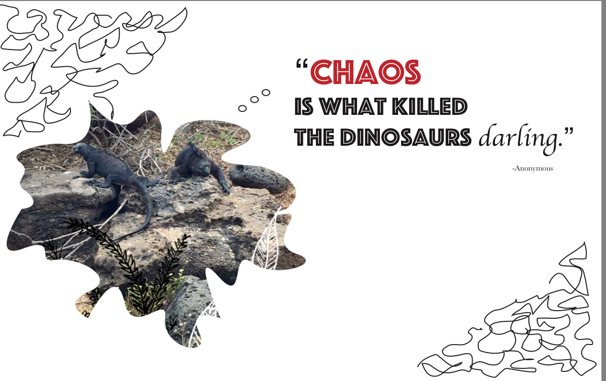 For the first design I wanted to use an image of my own and use some illustrations as well with the image combined. This image I took was when I went to the Galapagos Islands. My concept was to show the reptiles (Iguanas) saying the quote. It’s ironic because these creatures are pretty lazy and are much to themselves, and with the, “darling,” at the end makes it seem sassy. I used two different typefaces, (sans serif and serif.) I choose to use the color red because I feel that red is mostly used for signals of danger. Finally, I illustrated the word darling by italicizing it using a serif type face.
Design #2:
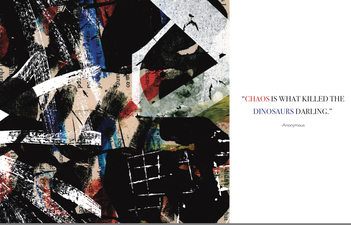
For my second concept, I was inspired by my Type & Media class from our “Texture and Image” project. In this assignment we would create our own textures and then combined them in Photoshop using a transparent background to come with this fantastic result. I really enjoyed this project because there was endless possibilities with the results you would receive, making the textures. So for this specific design I used some of my old textures and created new ones, and again like I said, I combined them to create this chaos of environment. I did want to have colors in my textures which is why we see some blue, red and green. Although, I really wanted to have the red in all of my designs because of what I said before in the first design. To make both sides balanced I choose to color the word chaos in red and then dinosaurs blue. The typeface used is Baskerville, (serif) and Light Gill Sans for the Anonymous.
Design #3:
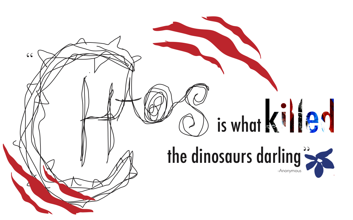
For my last design I wanted it to be an illustration of my own. “Chaos” is a pencil drawing. The typeface used here is Futura Condensed. The word killed is illustrated with one of the textures I did in the second designed. I wanted this design to have a rough and delicate touch to it. Which is why I have these scratches and then the violet blue flower on the right bottom side. The flower isn’t as perfect which makes it seem delicate. For all my designs I used the application Adobe InDesign.

