A New Role & Wrapping Up the Semester
These last two weeks have been very hectic. To wrap up, I created slide show where you can see my journey with SA. On the other hand, finals week is very close and my time with my internship is coming to an end– or so I thought. In the first week of December, my supervisor has reached out to me personally and offered me the opportunity to become Art Director for SA. My ears couldn’t believe it. I began my journey with SA in late September and just in three months I got promoted. This is such a huge milestone for me and I am so grateful for the opportunity. I am so delighted to be a part of the team and keep on growing with the company. It is clear to my supervisor that I understand the look she wants to showcase for SA and for her to trust me and my eye for the design of SA means so much! From the colors to the typography to the images– everything
I believe what helped me create all the art I did for SA was researching the company. In addition, keeping in contact with my supervisor. Towards the beginning she made it clear the look that she wants to showcase for SA and I immediately took note of that. As a designer, my opinion is out of the picture. Ekta is my client ( or I see her that way.) When working for someone I learned that is important to always ask questions and understand what the client wants to showcase. As a result, any art you create can be approved right away. Not doing this can make you keep working on the art until it’s approved. To add, you do not want to present the client work that isn’t what they asked. The look that SA goes for is all in the grayscale (B&W.) SA has an elegant and minimalistic look. Sometimes when I get stuck on a project for SA I look for inspiration and do some research of my own. Then, I collect many images and create a mood board. A great site that helped me find high-quality images for free was Unsplash. Most of these images for all my artwork came from that site.
Altogether, after this next journey with SA comes a paid position. More than anything I did make it clear to my supervisor that any artwork I create, she gives me credit or when it is posted on social media. Now, when she posts the artwork on the main platforms she tags my social media or puts my name. This means a lot to me more than anything. I can’t wait to keep on growing with SA and see where it goes. Big things are for sure coming for SA this new year–I can’t wait!
Week 14: SA is Ranked 100 for Beauty Podcasts
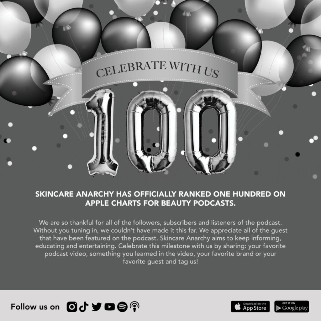
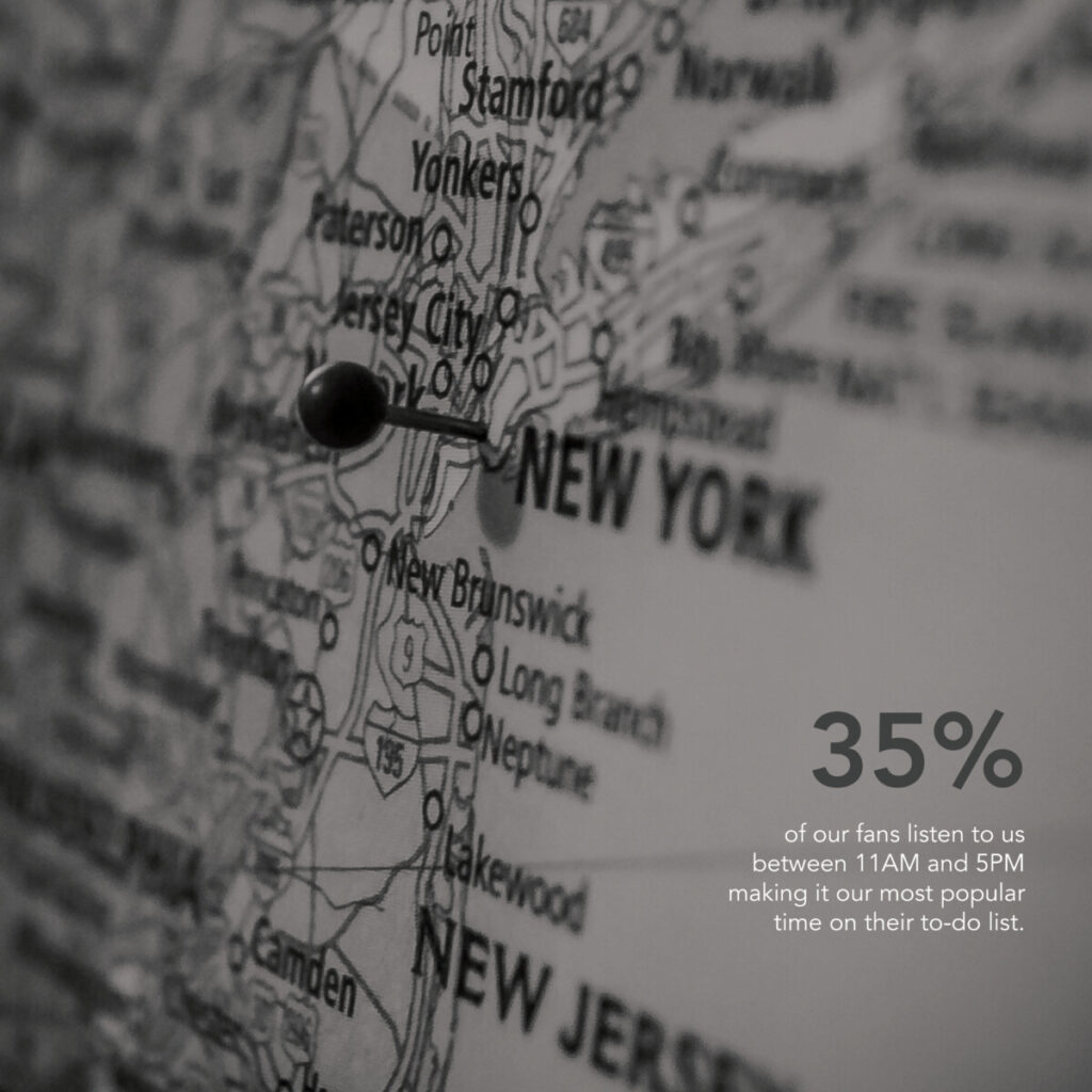
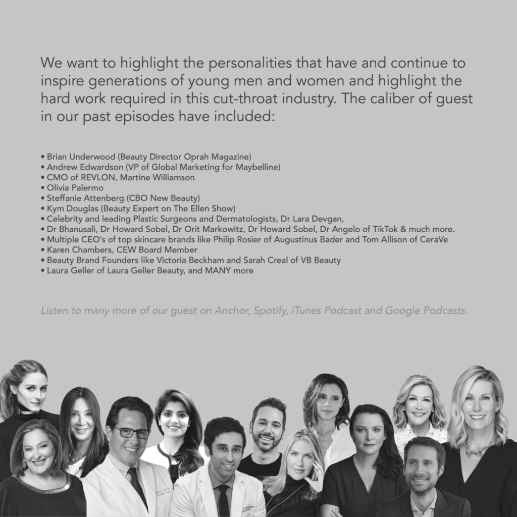
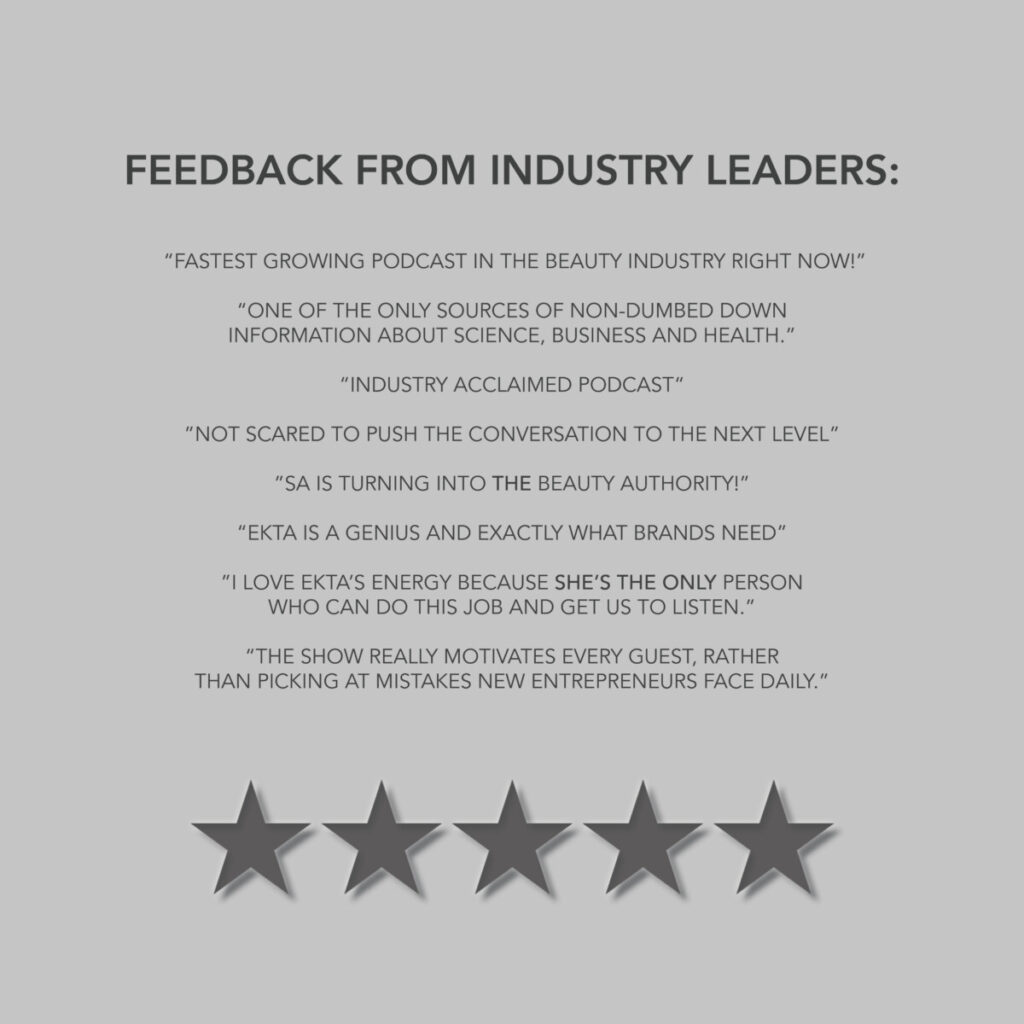
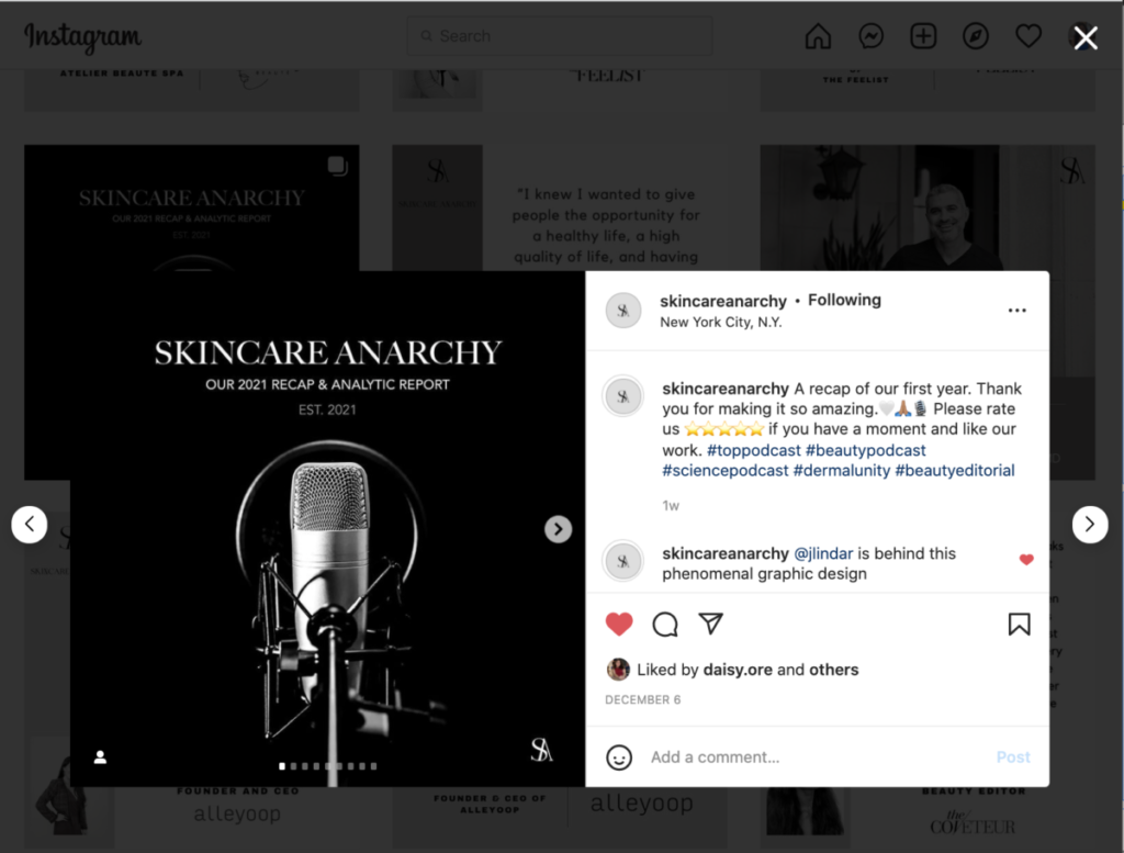
Skincare Anarchy has reached 222 episodes and is ranked 100 on apple charts for beauty podcasts. It has been truly been an honor to work with Skincare Anarchy and to be able to be a part of this moment. I know this means so much for my boss, CEO, and founder of SA. It’s a big milestone for SA. So many hours and time is put into making the episodes for the podcasts. The guest that have been on SA are truly inspiring. We have had dermatologists, doctors, journalists, CEO of skincare famous brands, and more on the show.
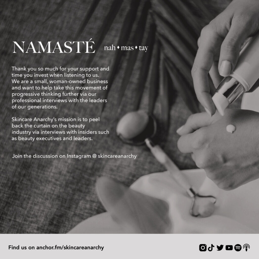
To celebrate SA, my boss has asked me to create artwork to publish this milestone on social media and for SA’s newsletter. This project out of all the artwork I have done for SA has been the one where I did feel the most pressure to make. To add, it has been a busy week for me as well since this all happened right after Thanksgiving. I am taking 6 classes and finals weeks is very close. This project did take me a few days to complete because I have classes and my personal project from school to complete.
Aside from already having all of the information sent to me by the social media team. I had to do some research of my own. I had to create two different types of artwork. One for the newsletter and another for social media. I had to brainstorm and analyze the information that was sent to me to see how was I going to lay out the final designs and in what order. After this, I began to search for the images I needed. I also wanted to include some of the guests that were interviewed in the art, so I had to also find their headshots, edit their photos on Lightroom, and then cut them out on Photoshop. (All of the images in my artwork is founded on Unsplash) As far as color and typography, I have an Indesign file that I have customized to hold the swatches and type I’ll need for any artwork SA may need. After I have all my images edited on Lightroom I save them in a folder and began to design the layout for 6 pages. Once I was done I sent them to the social media team and my boss. Shortly after, they both got back to me and approved the art. My boss loved the designs and has offered to give me a full-time position with SA.
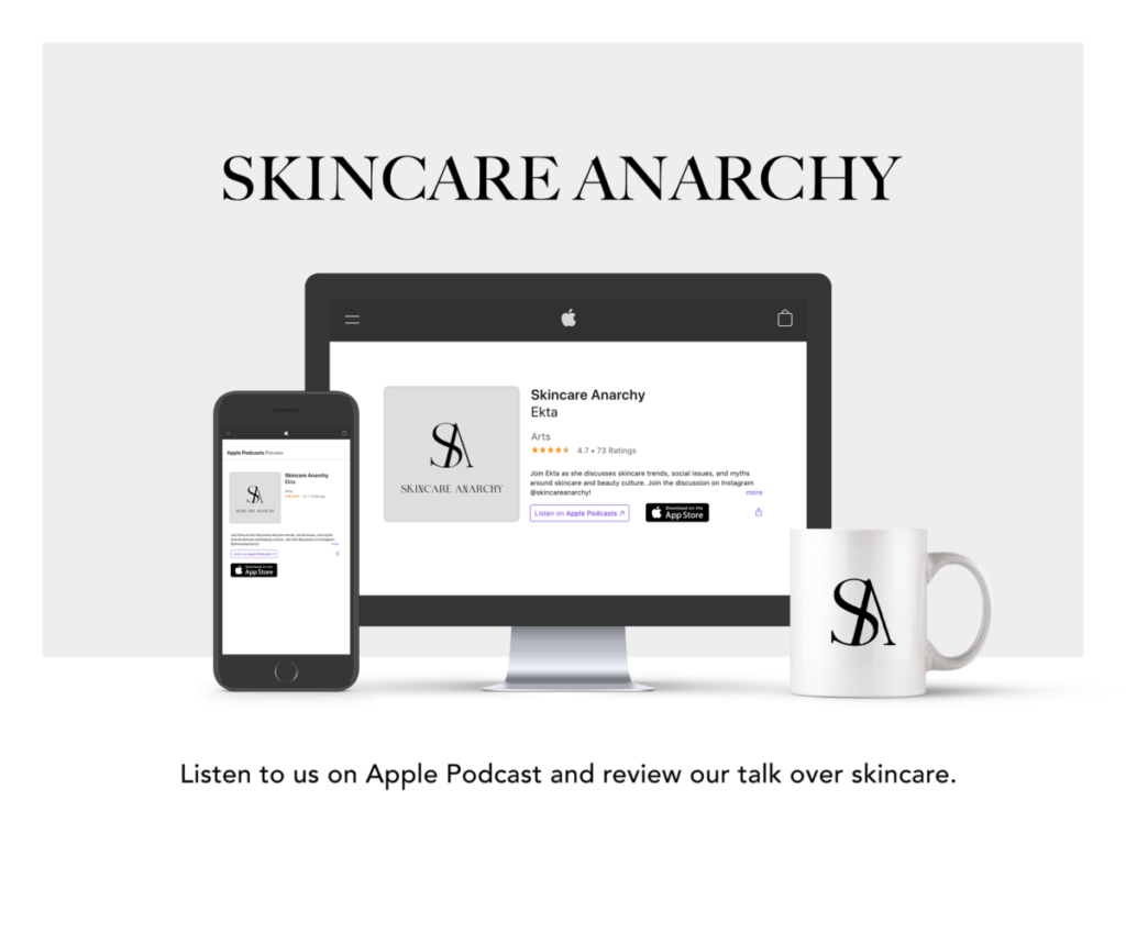
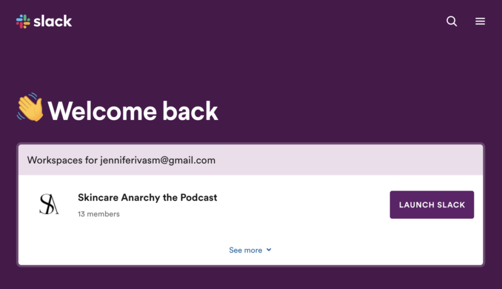
Slack Technologies was founded in 2009 in Vancouver, Canada. Slack is another app similar to Whatsapp. However, Slack is a platform that is used mainly for work or education purposes. Slack allows you to send messages, voice, and video calls. There are two things that I liked about the app that helps everything stay organized. This app can be very confusing if you are new so it’s very important to browse the app on your own time to get to know the features. Slack is available for download on the iPhone, Android, Mac, and PC Windows.
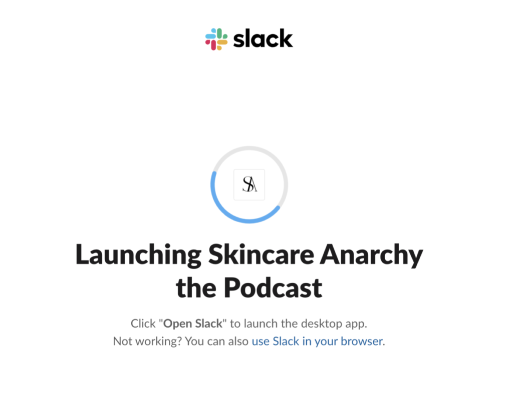
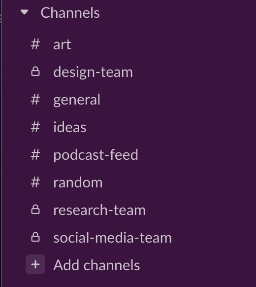
The first feature is called channels. This feature allows you to create different groups and allow the right users to share information, ideas, and any work for that specific channel. For example, my internship was using Whatsapp but now we moved to Slack. The project manager for SA has created 8 different channels. These channels are divided by the role you have. I am included in all the channels because sometimes I do work with the social-media team, research team and sometimes they need artwork for a topic they’ve researched or for the SA newsletter in most cases. SA has two channels named “general” and “random.” All thirteen members are in both. However, you can still message each other privately from being in the channels. On the left, there is a sidebar that allows you to see any teammates you want to message individually. Since I am in a few groups I sometimes have to mute notifications. However, if your name is mentioned you’ll be notified if they use the @ symbol. It’s a great feature to use when you need someone to get back to you ASAP.
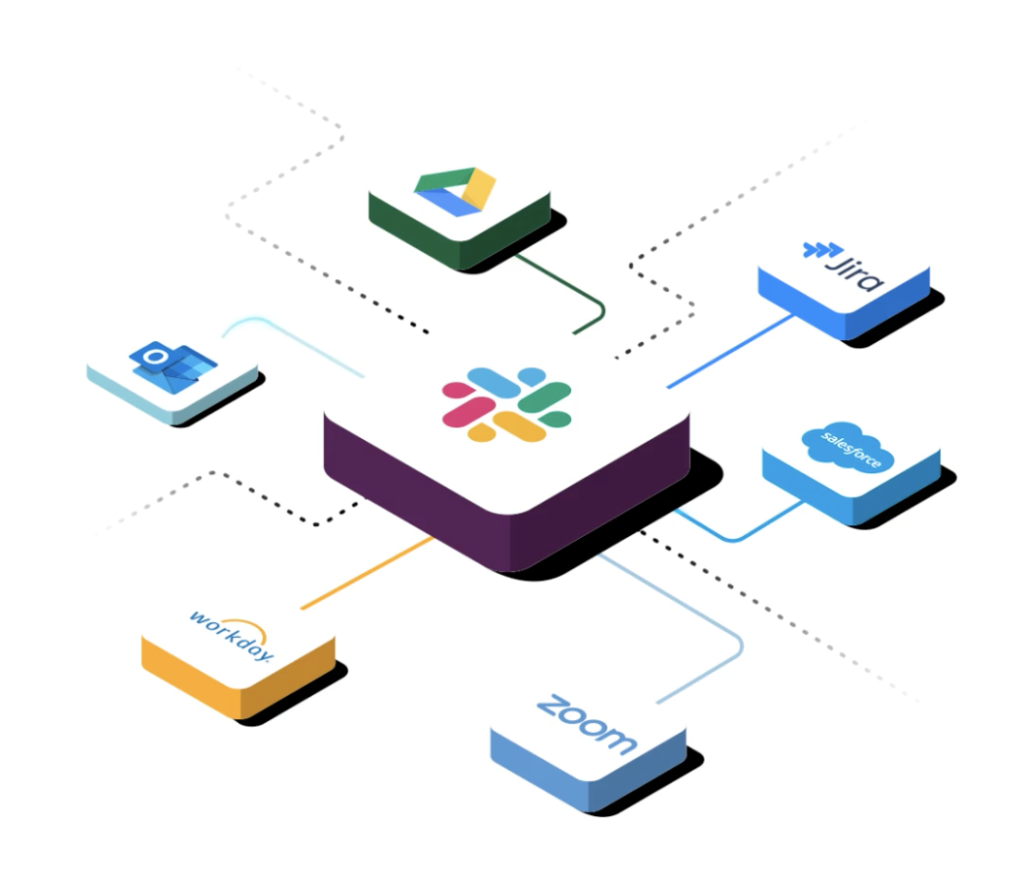
The second feature is App and Integration. This feature allows you to connect other services to your workspace to make it easier to share files without having to leave to open another app. Some apps extensions that Slack offers are Canva, Google Drive, Office 365, and over 2,400 more. There is no additional cost for this feature. Canva and Google Drive are the extensions that I added to my account for this workspace because as a graphic designer this is where SA has information or images I may need to access for certain projects. Again, because Slack offers so much there’s a tab called, ” resources” where you can visit the help center to get more tips and walkthroughs about the app. In addition, Slack offers webinars where you can watch live for more additional help. Overall, You can still send images in any format, PDFs, and documents additionally.
The first time I used this app was for my Communication Theory course. It was very confusing at first. With time I got the hang of the app so when I was asked to join for other courses I was familiar with it. The other classes I used the app were for Senior Project and the AIGA networking event. I believe this app can be overwhelming for some people, however, I think it’s great for work and school relations because it keeps your information organized and anyone can access it in any part of the world as long as they have internet.

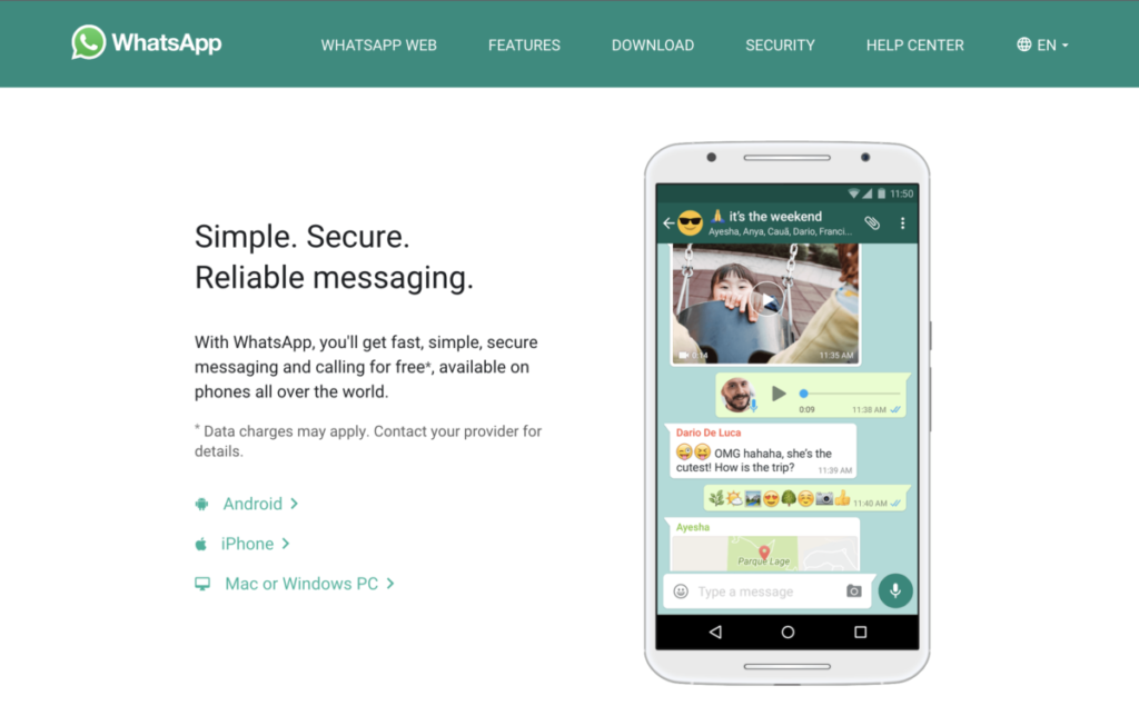
Whatsapp is a popular app that many people use to make voice and video calls, share images, documents, current locations, and other content. The biggest perk about this app is that as long as you have wifi you can do all of these things. I could be in Hong Kong and send my family a call or photos and they’ll get it instantly with no additional fees. The app is available for any mobile device all over the world. You must have a number to connect or create an account on Whatsapp. After that, you’re all set and again, as long as your phone has an internet connection you’ll avoid any SMS fee. It’s a great app to have to communicate with family if they live in another country. This app can be used for work purposes too. After the pandemic, many of us shifted to work remotely. Sometimes we don’t live in the same city. Most people I know have the app on their devices and use it to communicate with one another than regular text messaging.
The app allows you to send important documents such as PDFs, JPEGs, PNGs, GIFs, you name it. You can also send slideshows, videos/films up to 100 MB. So easy to send and receive to whoever you want. All without the hassle of manually emailing the files and waiting for them to load or worst-case scenario having to download another app to share the files. For my internship, Whatsapp was the app we used to communicate and share important information. You can send messages privately one-on-one or create a group chat with up to 256 participants! That’s a lot of people, but the great thing is that you can name the group, mute, or customize your notifications. I know sending long messages can take some time especially when you’re busy with other work. However, the app also has a feature where you can send voice messages. My boss would send voice messages from time to time when she would assign an important task or needed to announce upcoming prime deadlines. If the voice message is long, you can change the speed from 1x to 2x to listen to the recording faster.
If you ask me what I think about the app, I indeed dig it. You cannot go wrong with it in any way. As you can see, there are so many great features that I previously reviewed. The app was released in February 2009. I have been using it since 2012 and with each update I make, constant new features are to be looked at. I relish how it lets me control my contacts, who can contact me and customize anything I want from my name to my status and privacy settings. The app is exceptional for people to communicate with each other worldwide, and it’s free! The app is available for download on the Apple Store (iPhone), Google Play (Andriod), or your Mac or Windows PC.
Week 11: Presentation Techniques
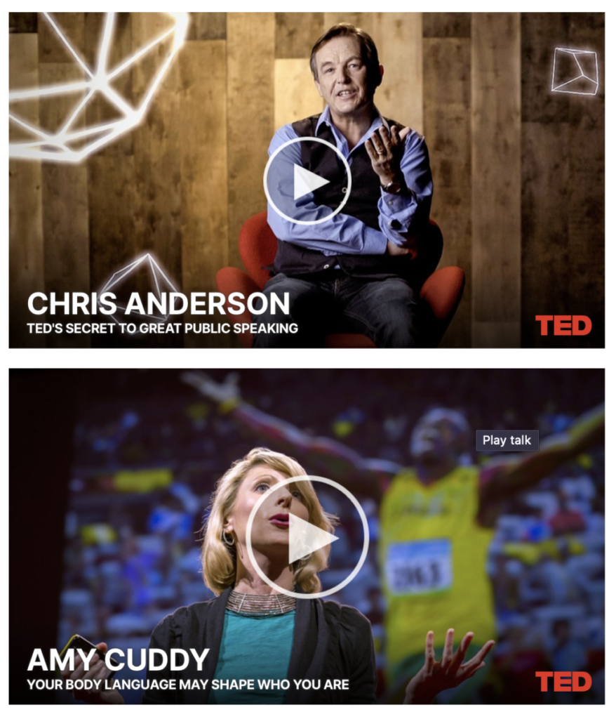
The first Ted talk was from Chris Anderson. Anderson makes four great points about how to make your public speaking a great success. He repeats the word idea a lot throughout the video and says that ideas are how we view the world around us which is why different world views have different reactions. More importantly, he says, ” ideas are very powerful because they shape the human culture.” This is a very powerful quote and as I keep hearing it over and over he is correct. He uses the cat and leopard as an example. When we see a cat we think it’s cute and when we see a leopard we know it is dangerous. This demonstrates why our ideas are so important because if communicated properly, they are capable of changing how some view the world. Anderson then finalizes his Ted talk by telling us to limit only speaking on one idea at a time, to keep in mind the audience, ( ask thoughtful questions) and make your idea worth sharing.
The second Ted talk was from Amy Cuddy. Cuddy speaks on how our body language shapes who we are. She says our body language and the way we posture our body can change our life. She later then goes into the experiment she did and says that social scientists have spent a lot of time analyzing our body langue. Our judgments affect the way our body will react because our reactions affect our body’s emotions. To demonstrate, she shows images of our bodies when we make big movements, it shows that we’re happy, are in control, and have power. Yet, when we are closed up it shows we have less power or we are at a loss of power. Hearing her speak and showing the images of the people with the body postures reminded me of a time when someone asked me if I was okay because my body posture we very closed and when they see me I usually have bigger movements. I was surprised by this comment and immediately fixed my posture. She ends the Ted talk by saying, ” tiny tweaks make big changes.” I agree with this quote because even if they are small you’ll notice a big difference with time. Already after watching this second video, I cannot stop thinking about my posture.
Both Ted talks are very informative and can help for any future presentations. Having strong body language and a main idea when presenting a presentation can make the audience stay focused and allow you to have their undivided attention in the long run.
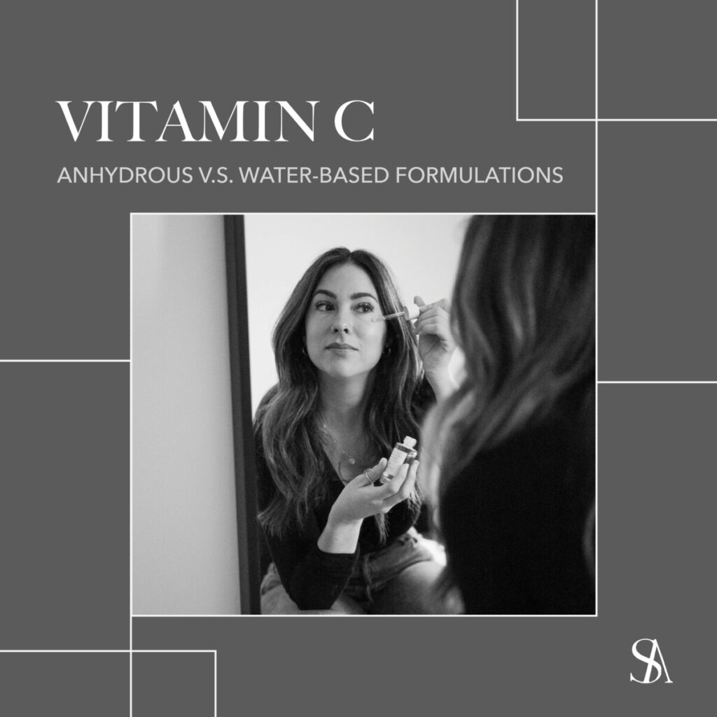
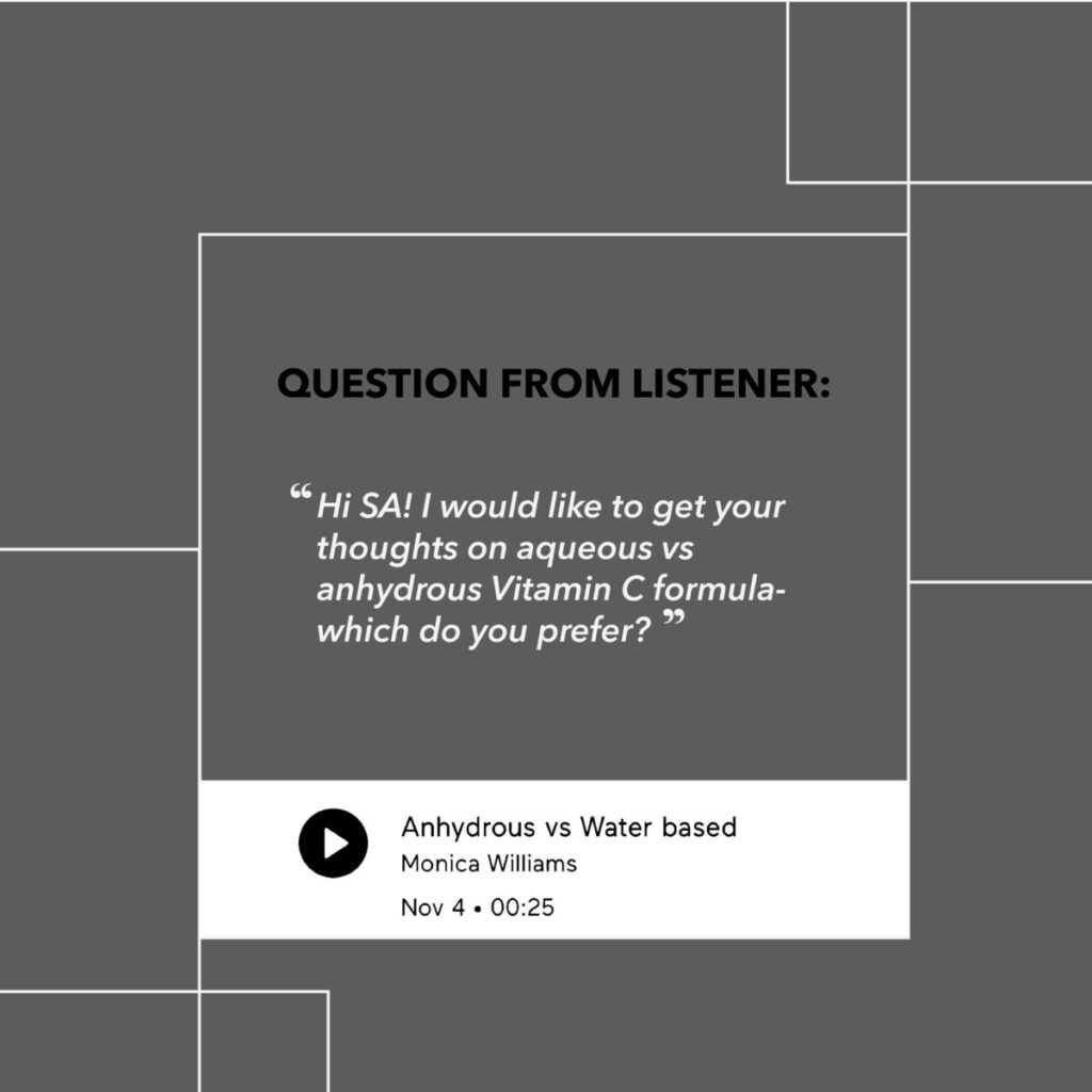
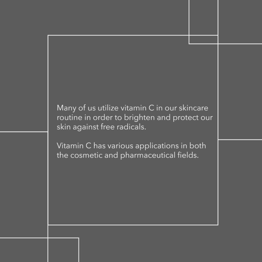
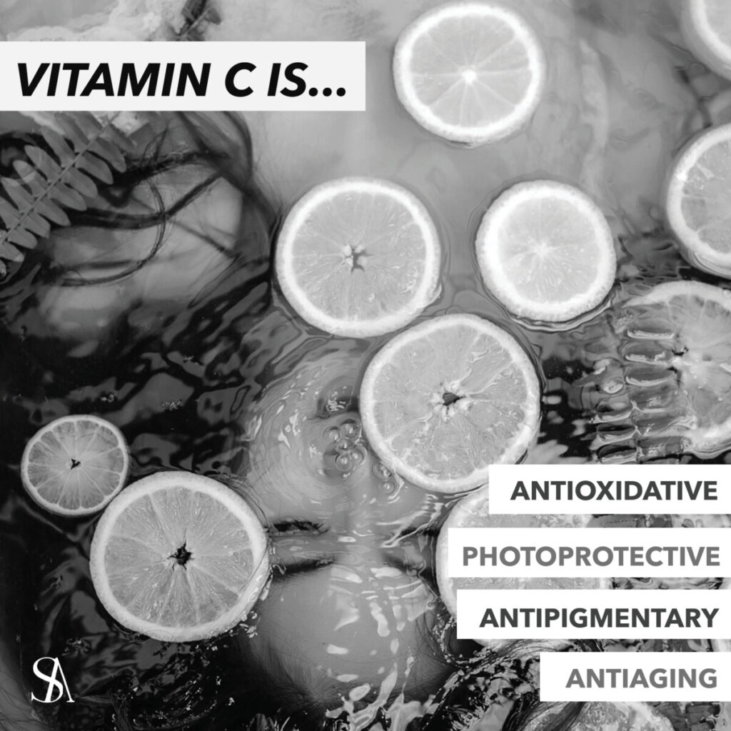
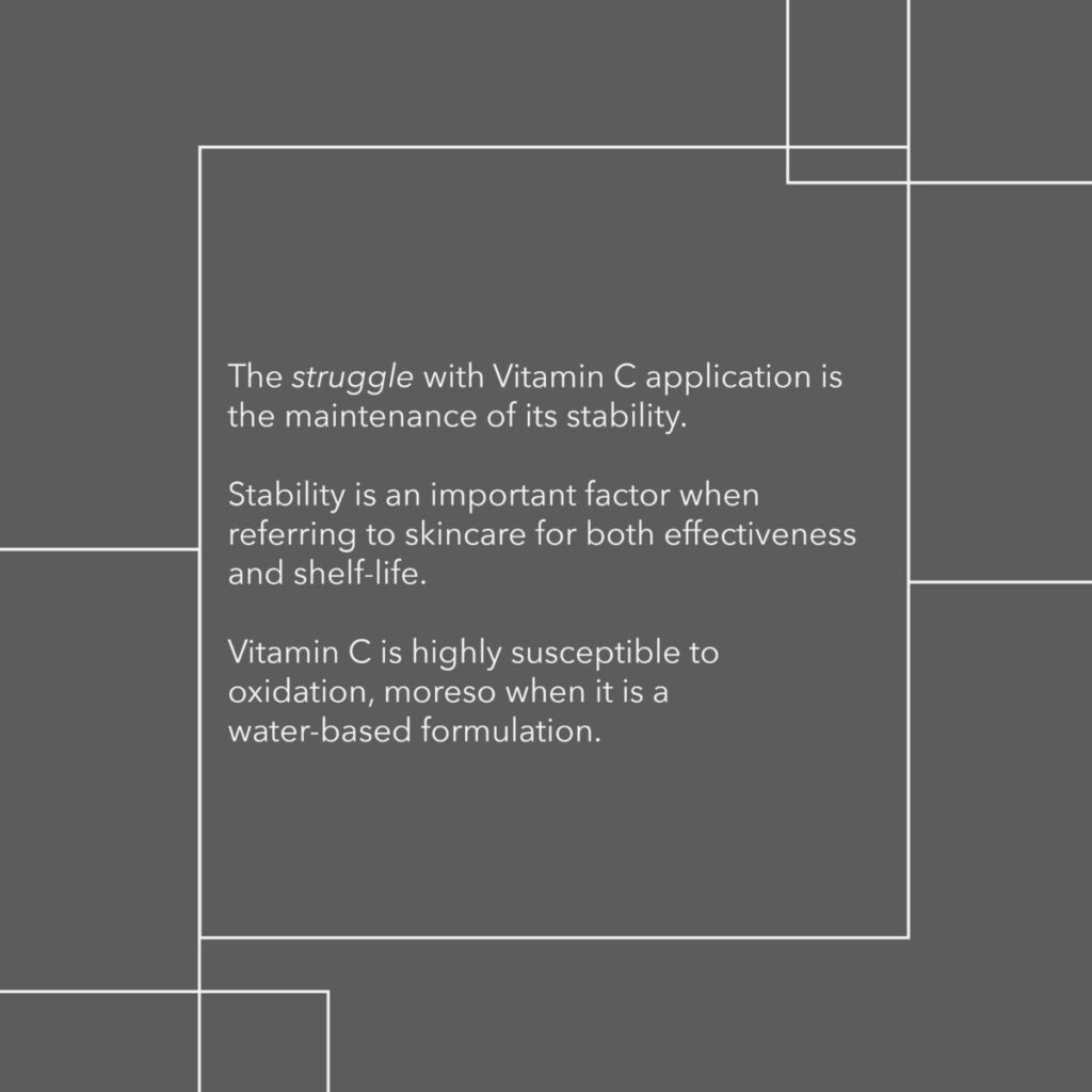
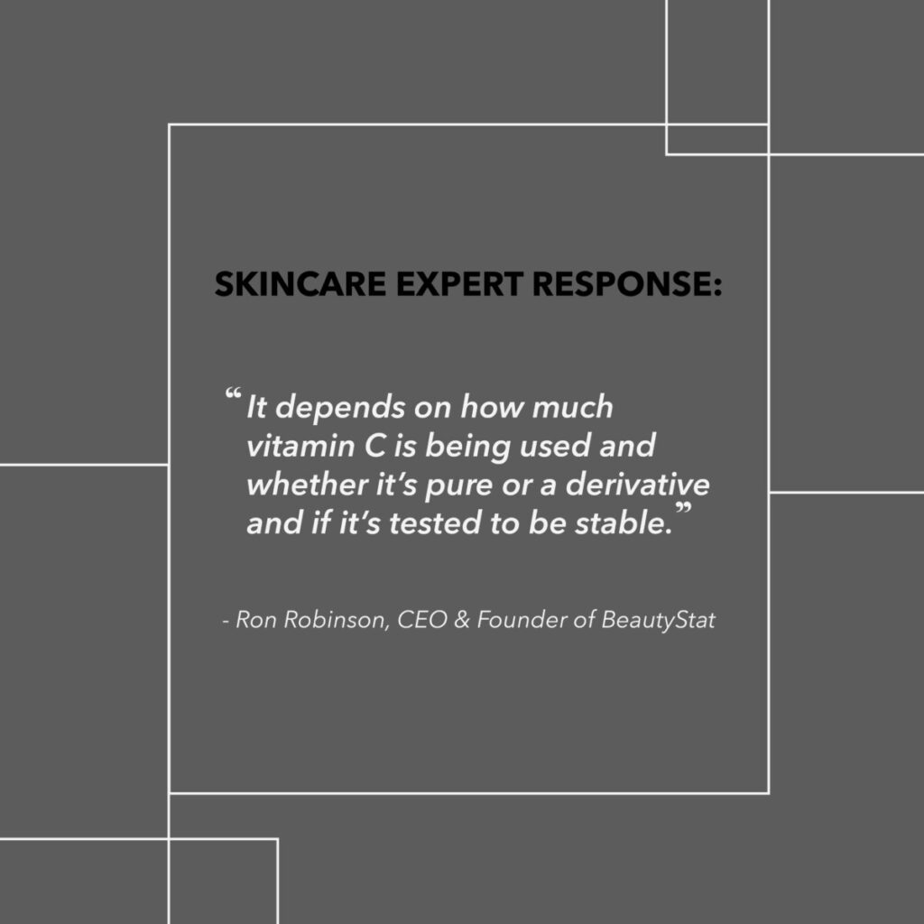
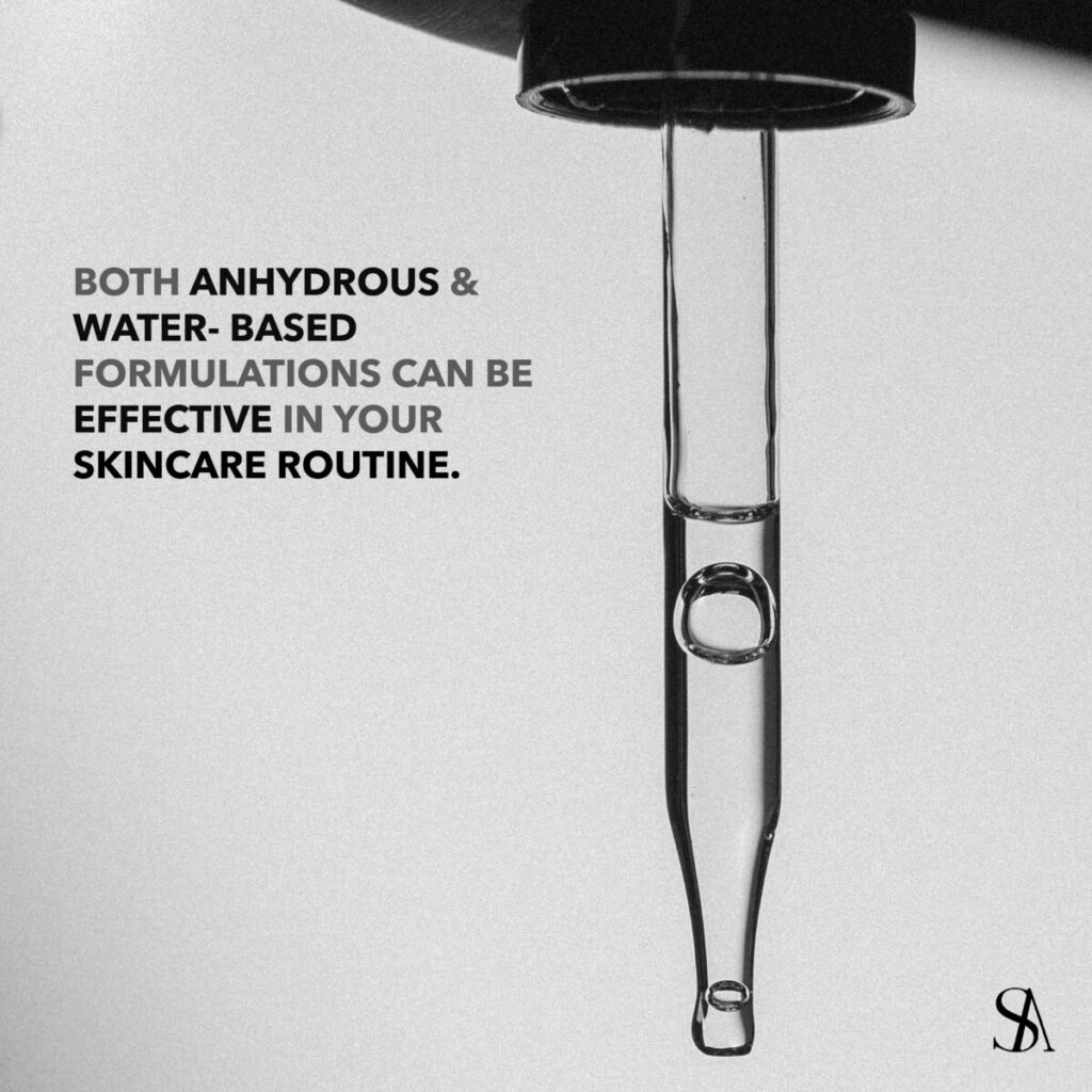
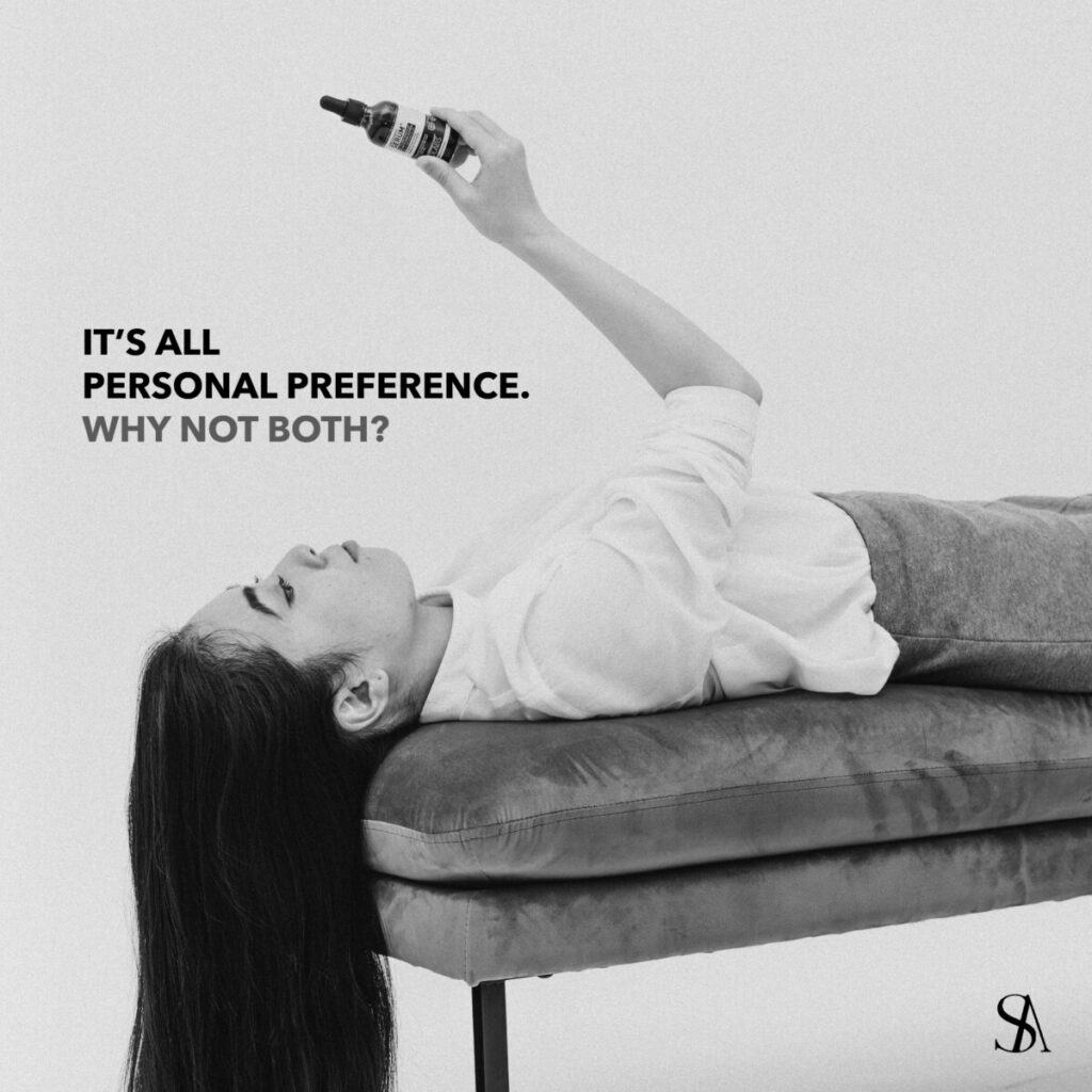
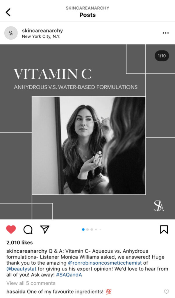
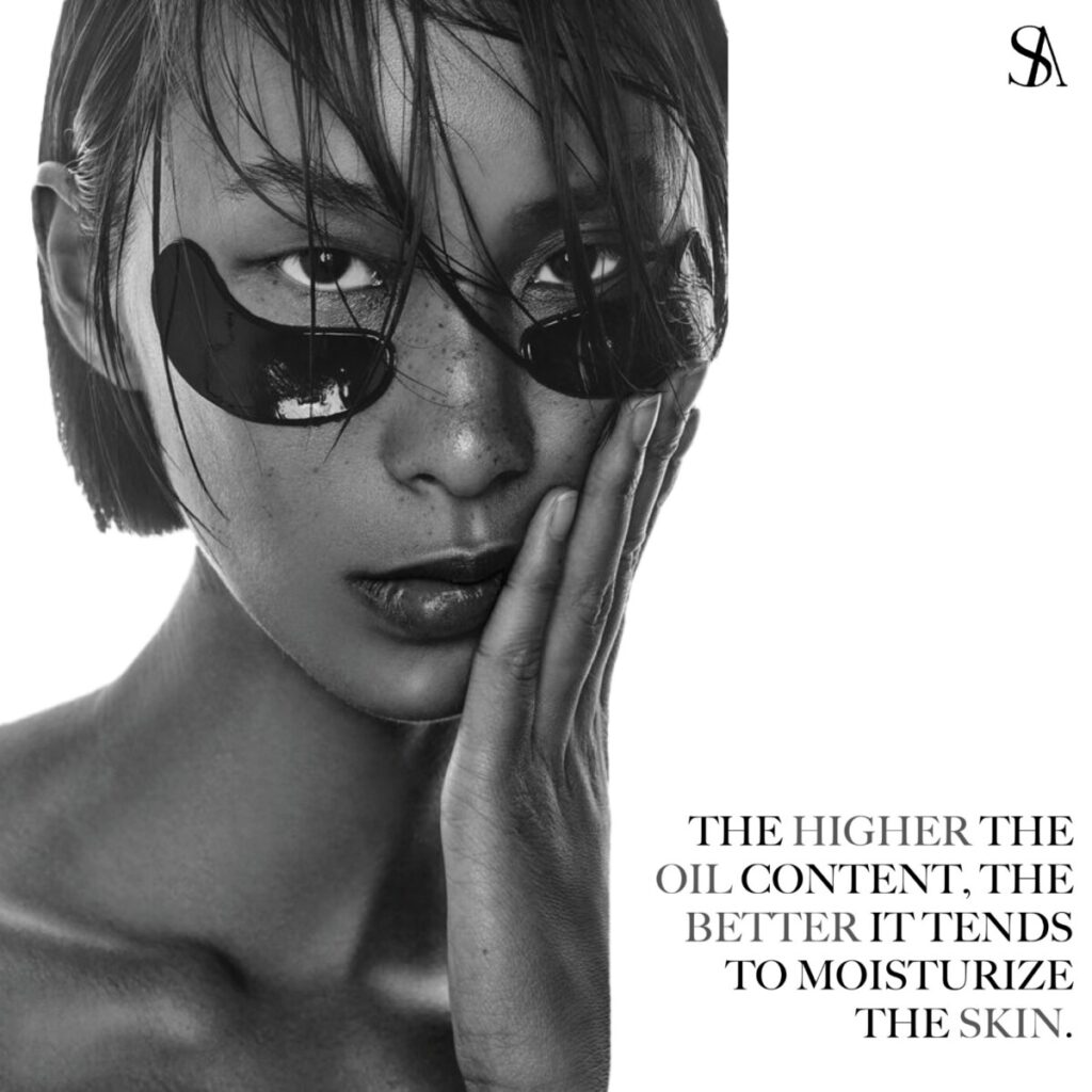
Weekly, new skincare topics are talked about. A post I worked on this week for SA is about Vitamin C. For this project, I work with the research team to create a small thread that displays the difference between anhydrous v.s. water-based formulations. This project did take some time for me to create and design. While the research team worked on the text I researched on finding images that correlate to Vitamin Cand some inspiration on layouts for my design process in a 1080×1080 layout. Once I found the images that I needed I gathered them in Adobe Lightroom and developed the images to B&W. The application I used to create the designs was Adobe Indesign. My boss, Ekta, has an account with Canva. However, to me that application is confusing so I use the Adobe Suite because I’m more comfortable with it. Nevertheless, some designs layouts are already there that I will need to follow if I’m doing a design post for a guest that is coming on the podcast.
As I began to design my pages, the research team sent me the final text for this project. I went over the text to see what information and topics I needed to add and how was I going to organize the information. Once I completed this, I used the color theme tool on Indesign to pick up the color from the images so I can have a sense of the color I was going to use for this project. As I mentioned in my previous posts before SA is in a new chapter where we are now following an all grayscale and B&W theme. All artwork must follow this unless specified otherwise. I used one serif and one sans serif typeface. I created a total of 15 pages of artwork for this thread and only 10 made the cut. After I finished the designs I sent them to my boss and she loved them all. I also sent the research team the designs so they can confirm I added all of the information that should be included.
So far I have created a lot of artwork for SA and this was my favorite work I’ve done besides the video edits that I did in my first weeks of interning with SA. The post has reached a little over 2,000 likes on their main social media page. I can’t believe that many people liked the thread. If that’s how many liked it, I can’t imagine how many viewed it and saved or pinned it.
The virtual exhibit I found the most appealing was the “Artists in Their Times: Korean Modern and Contemporary Art – Since the late 1970s,” by the National Museum of Modern and Contemporary Art, Korea. The virtual exhibit took place in Google: Arts & Culture section. I found this exhibit the most appealing because of how imperfect the art was illustrated. It is indeed modern and the texture gives me comfort. It gives me nostalgia because now most graphics or illustrations are very three-dimensional. The art in this exhibition focuses on Korean modern and contemporary art from the 1900s to the 2000s. The exhibit showcases fifteen sections where the audience is walked through different decades to showcase how the art has progressed over time due to the events that followed around. The goal is to show the audience the development of different media used by different artists in their time.
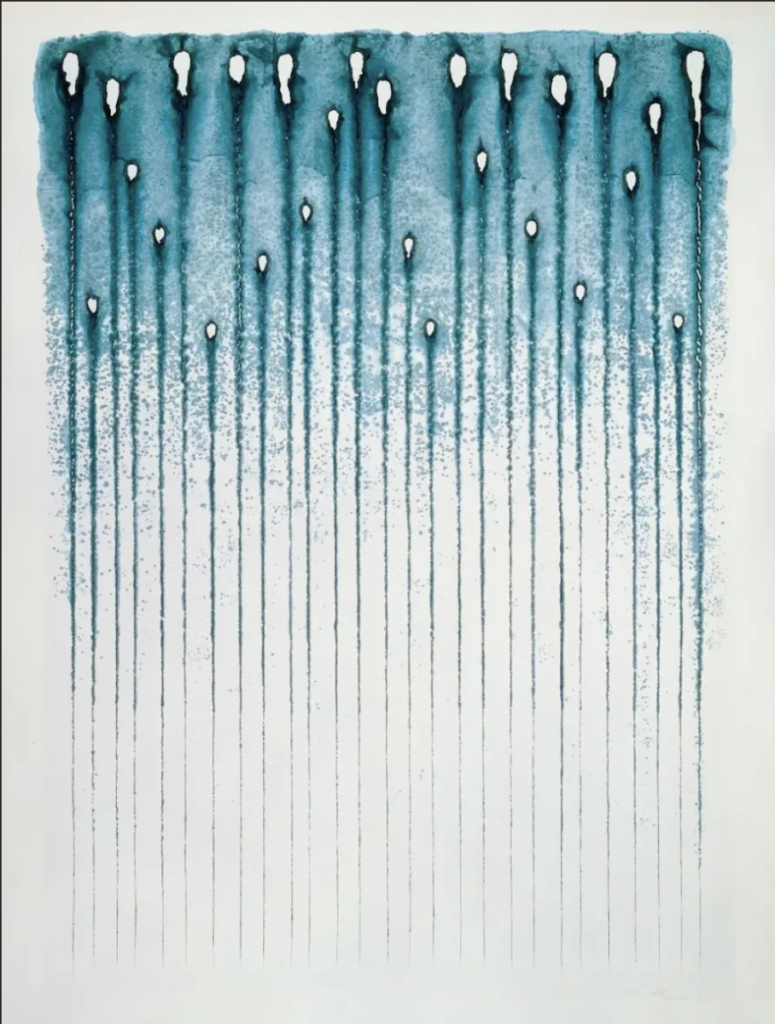
In the 1980s, to create a piece of artwork, artists did not use such material. The three materials that were used were known as jipilmuk (paper, brush, and ink.) One thing I took away from the artwork in this decade was the term hangukhwa. These terms defined the identity of Korean paintings. The medium of ink was already introduced early on, only in this decade, it was expanded. For the piece, Untitled, Kwon Youngwoo used a combination of blue and gray paint mixed with ink and gouache. The mixture eventually infused itself on the Korean paper which created these holes that are seen. Overall, it is an appealing piece. The mixture and the holes on the paper give it a nice texture. I also like the blue-gray color. My favorite color is teal which is why I loved this piece. I trust that the mix of both colors gave the artwork a nice cool earthy tone which makes it feel relaxing and look so effortless. I would hang this in my home if I had a place of my own. The artwork to me signifies as an abstract piece because you can’t identify what it is and that’s what makes it unique itself.
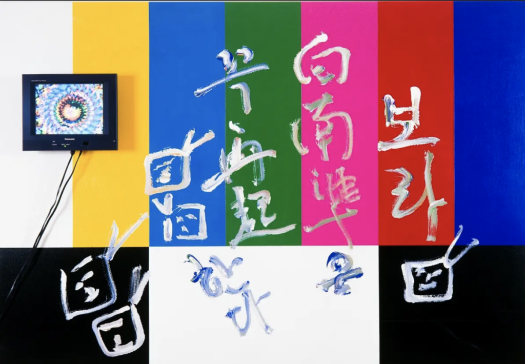
In the 1990s, Korean contemporary art grew in interest daily and became a significant characteristic of art for this period. For this section, the artist showcases their work quite differently. The Korean American artist, Baek Nam-jun’s created a piece called, Rainbow Stripes. The art piece focuses on the cultural characteristics of the East and West and the interactions between each other. Nam-jun pioneered this new art form and called it, “video art,” quite experimental. However, the design is American to me because it reminded me of the 90s in the U.S. Altogether color was bombing all over and it shows that the artist did focus on the cultural aspect of what was going on during this time. Right away, when I look at the work of art I think of television and video. The background in this piece is composed of simple rectangles in various colors, similar to how a TV screen would look. The medium used on top was acrylic. This gives a sense of texture and aggressiveness. I would identify this piece as representational art because you can recognize the background yet, I also get an abstract sense. After all, it connects something visual to the real world.
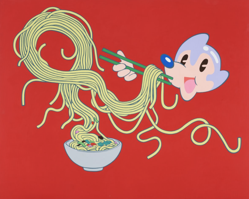
The 2000s was a period of pop culture. There was growth in music, entertainment & film, and fashion. This was a big part of Korean pop culture society. Koreans began to get stronger in their use of media and exposing it in any way they can use it in their daily lives. Artists began to combine one image with another to create new images. Lee Dongi is an artist who created the character Atomaus which is an animated character eating noodles using chopsticks. The character has a familiar face to the Disney character except he has no ears. Usually, I would use a fork but that’s a Western culture and this is Asian Culture. The medium used in the artwork by Dongi is acrylic on canvas. I think the red color in the background gives a nice contrast with the yellow and face of the character. It rapidly catches your eye.
Overall, the virtual tour was effective and I enjoyed the exhibit. This was my first virtual exhibition. I feel that I grasped more attention virtually than I would in person. This is because my attention span can be short or all over the place. Usually, depending on the museum, exhibitions can be big or small. When I go to a museum there is a lot of pressure because you are there for a limited amount of time, they’re so many different exhibitions, and I cannot look at one because there are so many around, it’s hard for me to concentrate. In this case, the website was well organized so if I wanted to learn more about the artist or other artworks they created, I easily clicked the hyphenated links and I was taken to another index. To add, I can visit the exhibition whenever with the hit of a button. I did not feel the pressure to rush through because I was able to view the exhibition at my own pace. All the artwork showcased in this exhibition was vastly individual because each artist had their point of view. It showed the artist in their time and how it affected their choice of media. I would always see art exhibitions from the 1700s-1800s in the U.S. so it was nice to see a different era and the evolution of different cultures and their art.
The networking event that I joined was hosted by AIGA: The Professional Association for Design. This week AIGA was having a career festival that was free for many designers to join. The event was held for two days and held seven workshops throughout the day. The last event of the day was called, “Design Career Mixer.” This one was my favorite. The event took place from 6:15 PM – 7:00 PM EST. This was a great networking event. Everyone who connected had such good energy and gave great advice when they were allowed to speak. Paul Mendoza was the host along with Carmelina Piedra ( a certified career coach.) A total of 57 people joined and after five minutes into the networking event, everyone was divided into a breakout room to network with each other.
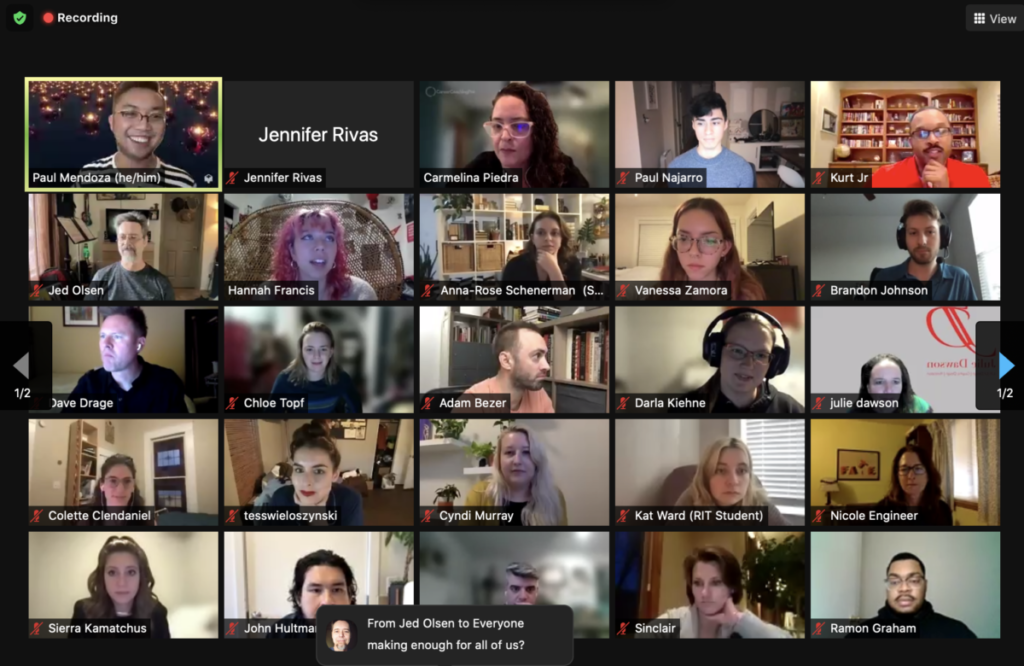
I was in breakout room 18. My breakout room had only one other person and lasted for a total of five minutes. Here I met freelance designer Dave Drage. Drage and I talked a little bit about ourselves and exchanged our info and connected on Linkedin. Dave works in Los Angles, California but is currently home in Colorado. Drage has a great portfolio with several different works such as photography, motion design, and storyboarding. Drage is a senior motion designer and uses the programs After Effects and Cinema 4D. He has created title sequences for some movies and worked with some well-known agencies. One thing I liked that Drage said was that he’s always learning and doing his research. Being a designer is kind of like being a doctor except for the blood part and probably other things. However, they’re similar because you have to always be up to date with what’s going on. Especially the programs that are used. No matter what your role is you are going to always learn and inform yourself.
After networking, we spoke about a very important subject, “The Interview Process.” For example, what to expect when interviewing for a design job, what are the right things to say, the tell me about yourself question, and transitioning roles. Another important subject we talked about was, “Personal Storytelling.” As a person and designer, it’s important to figure out how do we start our story, how much do we share, freelancing, life after the pandemic, how much of our portfolio can be non-traditional. Some viewers commented in the chat and answered each other questions. Others raised their hands to respond and speak. It was only forty-five minutes long but it went by so quickly. I had so much fun at this event and got to learn a lot from many people. I wouldn’t think twice about doing this again.
Week 7: AIGA, Readings on Ethics & Copyright
As a designer, whether you are working for a big corporate company or freelance it is important to practice your “professional standards and responsibilities,” with your designs and clients. The AIGA site has a great page with resourceful information on how you should carry your work, your responsibility when you use other designers’ work, publicity, and the kind of work you should transmit to the public. From the beginning in any class, professors always encourage their students to brainstorm and create their own designs. Even if you want to use photography, it is recommended to take your own pictures. This is because even if the project is for school purposes only, and the artwork isn’t yours, you must give credit. To add, you can use those projects in your portfolio. This is what AIGA also mentions. Looking at this useful page of resources reminds me that if I forget how to create or use a program, I should go back and re-learn it.
At my internship, any art that is created must have the companies trademark/logo. My internship makes it very clear that any artwork or image used is credited. Any person in the design team that creates any artwork is credited. My internship did not require me to sign a confidentiality or non-disclosure agreement. The hours I work with SA can be from 15-20 hours weekly. Even though it’s a podcast for skincare, artwork is needed all the time. I would describe working for SA is like working for a magazine company… deadlines must be met at all times and STAT.
For this week’s readings, I learned what is the meaning of the word ethics. Ethics defines as a moral principle. I would describe it as someone’s behavior towards an action that can be based on any influence or event that it’s presented by. The short clip that was shown in this week’s class from, “The Good Place: The Trolley Problem,” demonstrates a great example that shows a “thought experiment” where the outcome can have many different outlines depending on the choice that you make. As a designer, many different contexts can happen when working on a project. For example, how can your design contribute to your team? These choices will have an impact on whether you make harm to the public or yourself.
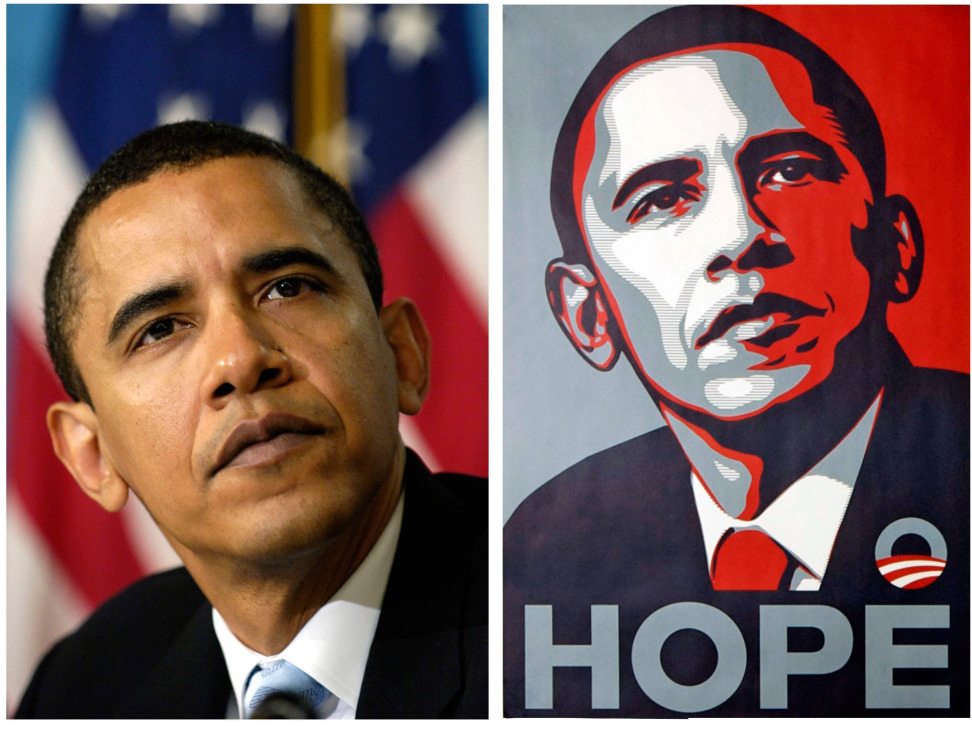
The Fairey Copyright Hope Poster case is a great example. Fairey was in the wrong and tried to hide and delete any electronic document that would prove his claim false. Fairey also did not meet the judge’s deadlines which also impacted his trial. Fairey created the famous and iconic “HOPE” campaign poster. Former President Barack Obama was the face of this campaign. However, this illustration seemed to have been captured by someone else. Altogether, the process Fairey took to create the artwork had a lot of photoshop and a combination of other things. To avoid all this mess, Fairey should’ve given credit. It’s seen that art has a lot of value. This means people will pay for any type of artwork if it is good or if the viewer/public likes it but is it worth it all the risk just to get the money. His ethics weren’t good at all and copyright is a topic we must be informed about and always research to avoid a hot mess like this one.
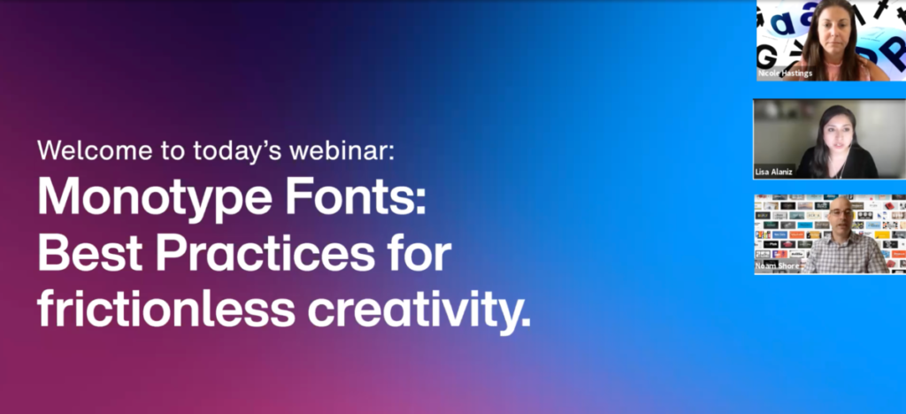
The webinar event that I joined was called, ” Monotype Fonts: Best Practices for Frictionless Creativity. The event was by Monotype and lasted a little over an hour. The event had three main speakers who were: Nicole, the Senior Manager & lead for the Product Marketing team. (She works exclusively for the Monotype Fonts Product.) The second speaker was Lisa, manager of customer success for the Monotype Team (also works exclusively on Monotype fonts.) The last speaker was Noam, Director of Product Management for Monotype fonts. At the beginning of the session, the hosts made it very clear that they would like the event to be very interactive, so they encourage viewers to drop questions, through the Q&A box located in the zoom window. All questions will be answered at the end of the presentation.
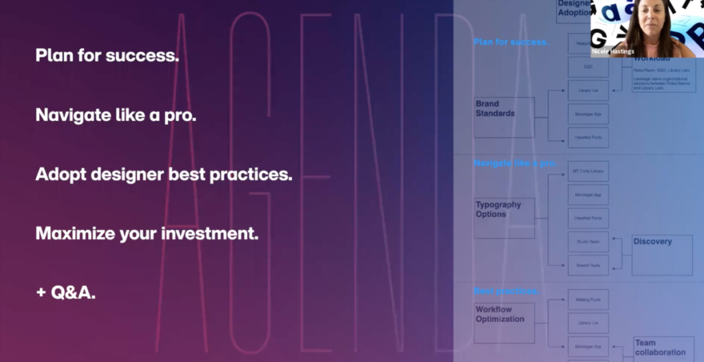
The agenda for this event was broken into four sections. Beginning with planning for success, navigating the monotype fonts, (learning how to make the best use out of that) how to adopt these practices for personal use or in an organization, and lastly, how we can maximize our investment in monotype fonts (pricing.) What I enjoyed about the event is the graphic webs the hosts designed to exhibit the breakdown/processes on how to use the app for any project/organization. As a designer, I think it is very important to study and know your fonts because every brand has its style and “approved fonts” that they use. For example, with my internship, it is rare to use a sans serif font unless specified for a VIP guest. SA’s style has a very minimalistic, clean, and elegant look, so the fonts used are always serifs.
Overall, I think this app would be very useful to organize fonts and with big companies working on a campaign. Especially, if you find fonts or download them from the internet ( even though it is not recommended) the Monotype app makes it easy to organize and upload the fonts, so you can personalize your library to your needs. The app also allows you to assign roles (such as admin, designer, printers, etc.) so you can control who has access and when they can access it. To add, I prized how they included the do’s & dont’s for each topic they talked about. I realized a few things my internship can work on from watching this event. You would think that working remotely would make everything easy for everyone and we all would have access to files but that’s not the case. Sometimes I would have to keep reaching out to one person because the file wasn’t exported as a “package.” or it was not uploaded to the drive and now there is a missing font or image. To conclude, I learned that as a designer working in a team it’s important to plan for success. Have set roles and have a group/team that can share the common workflow. How to navigate with keywords and refine filters when searching. Lastly, how to make the monotype app work for you.

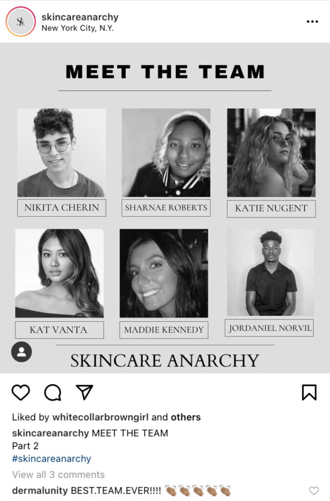
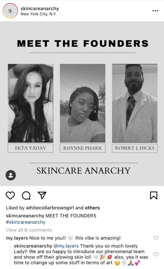
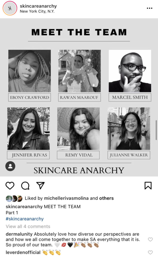
Skincare Anarchy is entering a new chapter. As a result, SA has changed its design. From color, we are just now following a black and white format (or grayscale.) Before the change, the color palette was pastels and off-white colors. The team has been expanding too. I love the work I do for Skincare Anarchy. Ekta former Ceo and founder of SA is very direct and open about what she expects and the goals for the future of the podcast. My internship requires all art or designs to have the companies trademark or logo. Any photograph used is credited by the person/creator. If a designer on the team created it, they are credited as well. Another important detail is that the internship that I am currently working with did not have me sign any confidentiality or non-disclosure agreement. My boss is excited about what’s to come because SA has now hit its two hundred episodes. Excited for SA and how far it has come, EY has decided to show on her main social media platform (Instagram) the team that works for the podcast and its founders. I feel like this makes it official. I’m so excited to be a part of the team because it is very diverse and we are all so talented in our distinguished way.
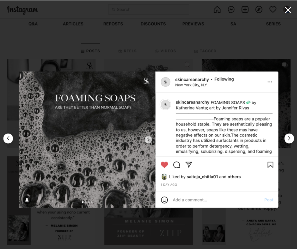
Since SA is all about skincare the topic we talked about this week was Eczema. The research team created a short article and needed some artwork for the newsletter. To make the artwork, I needed to do my own research to find inspiration. Usually, when I create a design I research for about an hour maybe a little more. Especially since the look for SA is very different and minimalistic. This will always be a challenge because I have to keep the color palette minimal and in the grayscale. When I begin to design there’s a lot I want to showcase, so whenever I present a design to the team I give them at least four to five designs so they (Ekta) can choose which they prefer best. For this article, I did a total of five different artworks. Ekta picked the two she liked the most and wanted to showcase both having them alternate in the newsletter.
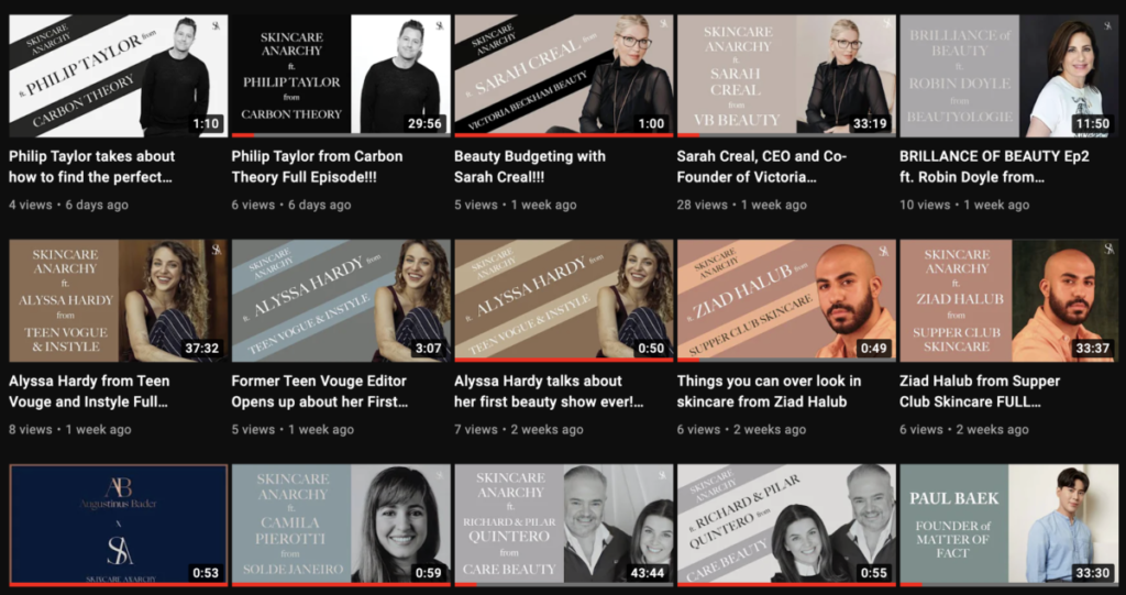
My internship is fully remote. All of the team connects and chats via Whatsapp. Currently, the podcast has been receiving many new guests weekly. On Youtube, three to four videos are uploaded on the channel weekly. Currently, I am assisting and working on thumbnail designs for the videos. Each thumbnail must be in the size 1280×720. The design must include the name of the podcast, the name of the guest, and their company. The design and look of the brand stand very simple and elegant. The typeface used in all of the designs must be serif unless specified otherwise.
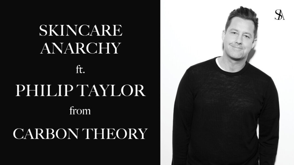
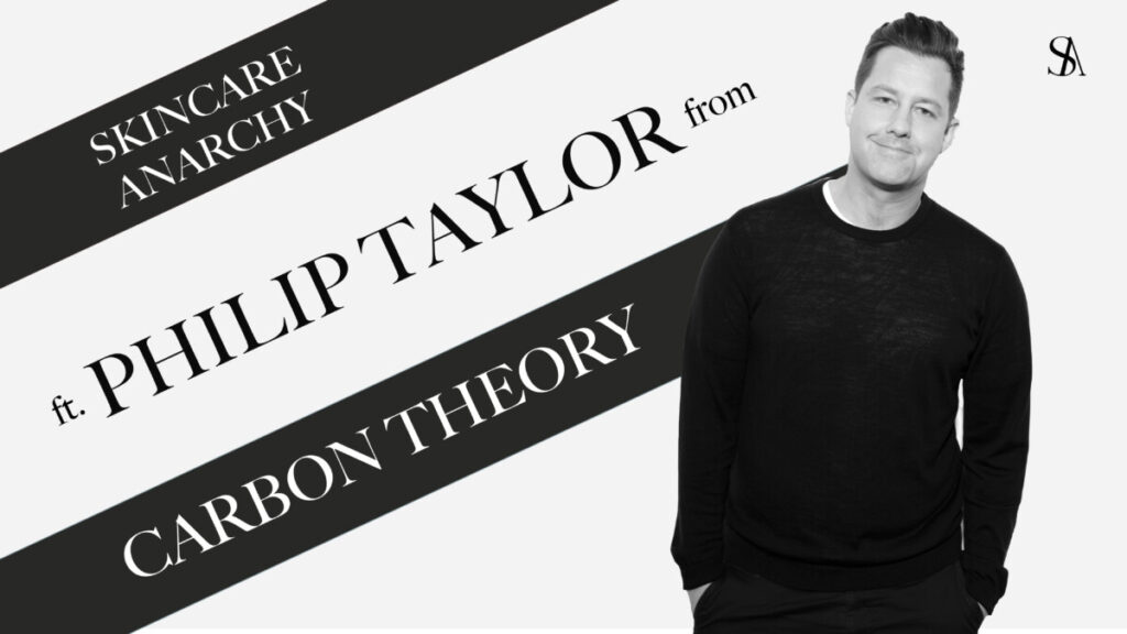
Since some of the videos are more than thirty minutes, I was asked if I could make a second thumbnail. This other thumbnail needed to be in a style that gives a click-bait-gossipy feel. This was a challenge for me because many thumbnails like those on Youtube have symbols, red arrows, and that is not the look of the brand. To complete the second thumbnail I needed to do some research to get inspiration. How can I make these designs gossipy but still keep that simple elegant look? As I researched, I noticed most of the gossip thumbnails have a cutout of the person who will be featured in the video. Immediately, I opened photoshop and began to cut out the headshots from the guest that was going to be featured. Next, I moved to Indesign to create the second design that will showcase the cutout precisely and after trying a few different layouts I came with a final design. I sent the final design I thought was the best fit and let the lead choose from there. Thankfully, she approved it. Now all gossip thumbnails will follow the same format.
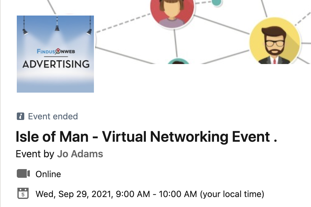
The event I attended was a zoom conference I found on LinkedIn where many users all around can join and network with each other. I thought this was the perfect event to attend because it was an event for people who have small businesses or freelance. It was a great opportunity to share information about your services, promotions, events, and offers you have going on. Many people on Linkedin were interested in the event. However, only twenty people attended the conference. The event began at 9:00 AM EST and lasted a little over an hour. We each went around and presented ourselves with a little bit of our background and our occupancy.
Everyone in the event was very nice and had their own story. It was very nice to hear what were their passions, interest, and where they are now. I was the youngest and only student in the event. After each person had their turn, they’d drop their information and LinkedIn profile in the zoom chat to connect. I was surprised to meet other people like me a graphic designer at this event. For example, Sarah and Kevin are graphic designers that attended the event. Both service and specialize in a little bit of everything such as photography, packaging design, advertising, and more. They talked about their site Zebra Creative. At this site, you can find all of their work. Kevin said they liked zebras which is why they are called, “Zebra Creative.” Kevin and Sarah are both located a little outside of London and said they are willing to travel if they have to for any contract or big projects if offered.
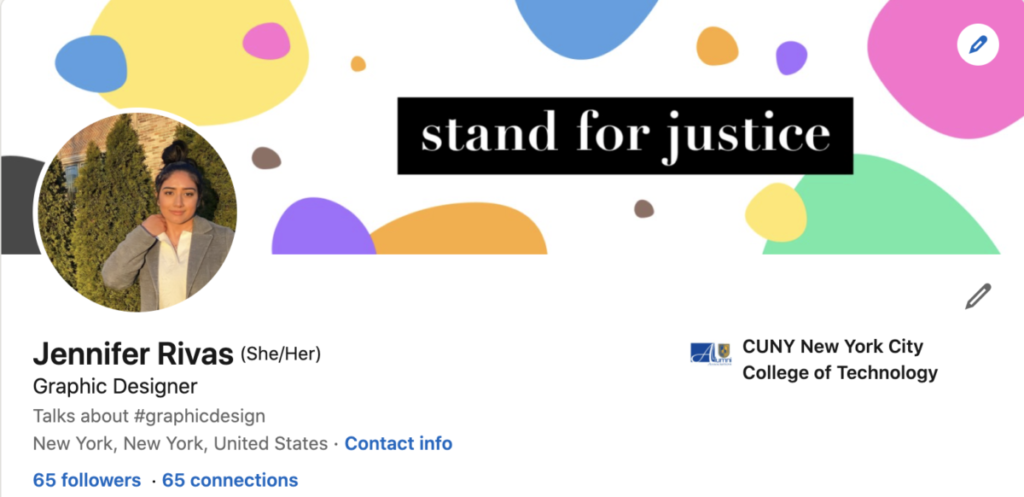
Overall, I am very pleased to say it was a fun experience and a interesting event where I got to meet people with similar and different backgrounds. I gained ten new connections on Linkedin after this event. Pleased to say I started the semester with forty-five connections and now I have sixty-five connections.
Week 3: Interning with Skincare Anarchy
Currently, I am interning for a skincare podcast called Skincare Anarchy. The company (or podcast) focuses on discussing skincare trends, social issues, and myths around skincare and beauty. Weekly, they also feature different guests on their podcast and sometimes have collaborations with different brands. I was hired to work as a graphic designer for SA. The company is located in NY and is worked via remote. The podcast has a total of 188 episodes, a Youtube Channel, Instagram, TikTok, and Twitter.
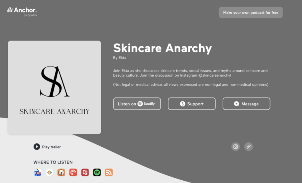
Recently SA had a collaboration with Dyson. Ekta Y, Ceo, and Founder of SA assigned me to assist the design team. That team focuses on creating layouts needed for social media. However, since I have previous editing experience, the production team that focuses on the Youtube Channel needed assistance for their short video collab with Dyson. EY asked if I could assist and edit the videos and I did. I took notes on what EY wanted the video to show and created two videos that promote Dysons Blowdryer & Straightener. I am very happy EY liked my work and was approved by Dyson to go live.
Happy with the results, EY then moved me from the design team to the social media team, assisting with designing thumbnails for all upcoming videos and art for news articles. If needed, I will also edit any short video that may be needed for future collaborations. To sum, I used Adobe Premiere Pro to edit both videos.
Week 2: Applying to an Internship
Applying for an internship can be very overwhelming. My process for applying was very rocky because I was working on polishing my portfolio. I was on a time crunch to apply for an internship. The moment I finished polishing my portfolio and revising my resume was when I began my search for an internship. I used Linkedin as my main source for applying. I also searched through Google, Indeed, and the COMD Communications Design Internship Coordination Site as a backup for more help. Since this is my first time applying for an internship, I made it a goal to apply to at least ten internships daily. I am feeling many different emotions because the chances of not getting a response back are very likely since I do not have any background in the field yet.
All internships are different in their way. Some require a cover letter and others did not. Some may ask to see your work and resume or just your portfolio link. Others would tell you to email them directly with your work attached rather than applying on the site. For some that I applied to, this method worked best because I got a quick response back. Overall, the source that helped me find an internship was Linkedin. I believe it is a great platform to use nowadays because all your information is already on your profile unless you need to add something that’s not there or a company reaches out to you privately. Not to mention, my Linkedin networking also has increased a lot in the last year.
To summarize, you’ll never know unless you try. It takes a lot of determination and consistency when finding an internship. Especially the one that’s the right fit for you. However, I am very enthusiastic to begin my first internship and to make those new connections. I hope to gain more knowledge or tricks I didn’t know before. Moreover, have experience in the field.
WEEK 1: Preparing for an Internship
Preparing for an internship can be kind of scary. You have no experience and have to gather all of your best work into a portfolio. It is my last semester at NYCCT. Now it is time to begin my search for an internship. The process was very stressful and nerve-wracking. I want it all to be perfect. Creating my portfolio did take some time because I was revising my previous work. I always think to myself, how can I make this project better? I believe my portfolio is very different because it shows many deliverables for different platforms. In my portfolio, you will find illustrations, campaigns, branding, and packaging work. Building my portfolio was a process that made me feel anxious because I didn’t have one created and I didn’t know how much work should I have uploaded or was my work even good enough…?
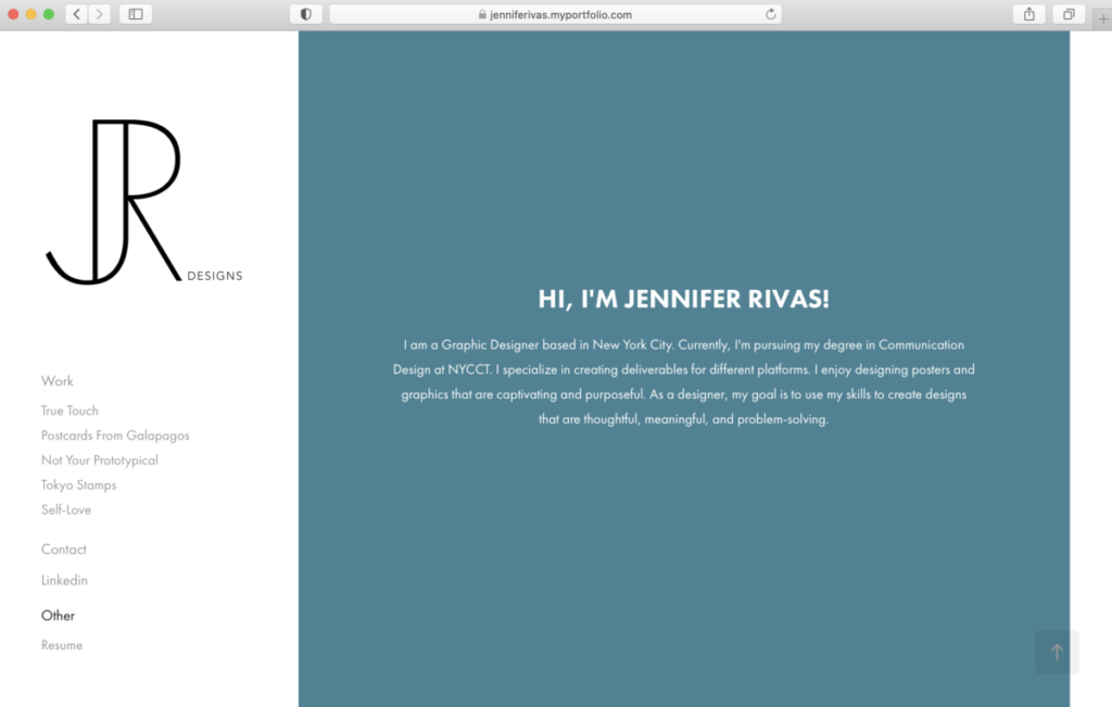
While I’m taking this Internship course, I am also taking the Portfolio course. The professor for this class has been very helpful in giving me feedback on the projects that I have on my portfolio and the support I needed to not be so hard on myself. The professor also provided very helpful examples. Nevertheless, I still needed inspo so I went on Pinterest to look for more examples and guidance. To create my site I used Adobe Portfolio. I believe this platform made it very simple for me to upload my work and has the best layouts to showcase my work. I also feel like it fits my personality as a designer too.
Preparing for an internship also requires having your resume up to date. While I looked for inspiration on Pinterest for portfolio examples, I also came across some resumes. This made me want to revise my resume. To create my revision I used Adobe Indesign because it is the platform that I feel the strongest using when there is a lot of text involved. Limiting my color usage helped me focus on the structure and layout of my resume. I also made important links on my resume interactive. So if the employer hovers over the PDF it’ll take them to my site, Linkedin, and email. I believe this is a huge game-changer and a time-saver now and for any other future job applications.
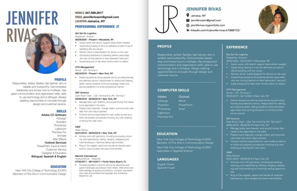
Lastly, preparing for an internship also requires being prepared for any interview questions that I might have difficulty responding to. For example, what are my strengths? What are my weakness? What’s the companies background and what is its mission? So if the company reaches back to me I’ll be prepared for any next steps or questions they may ask. I like to also have a set of questions of my own to ask the employer. This gives them a sense that I did my research and I’m enthusiastic to learn more.
Overall, I think I will only be applying to internships that are graphic design related (typography, poster, campaigns) because I feel the most strongest and comfortable there since I never had an internship before. I hope to also gain more knowledge and learn things I didn’t know before. However, I don’t want to limit myself because I’m comfortable. The goal is to keep expanding, make new connections and become better with each project/design.


