App Review Hootsuite


Hootsuite is a where you can manage multiple social media accounts in one place. It also lets multiple people have access to the same social media apps at the same time thus letting multiple contributors to work together before posting something on social media. For us it works because seeing as we are in different states it lets everyone review what is going to be posted on social media so everyone can agree if it works or not etc. Hootsuite works with pretty much every social media profile we use Twitter, Facebook, Instagram and even Mailchimp. Another great thing about Hootesuite is that monitors mentions of your brand and you can see the feedback to a post and thus seeing it’s effectiveness. This is very helpful because it let’s us know what posts work in getting a lot of interaction and which don’t, and thus we make changes to out future posts accordingly. Another great thing about Hootesuite is the ability to schedule posts for a future time, seeing as many of Live Breathes Futbol customers are from different continents and it different time zones it let’s us schedule a post for say 10AM Central European Time, meaning 4AM local time.

Adobe Capture App Review

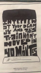
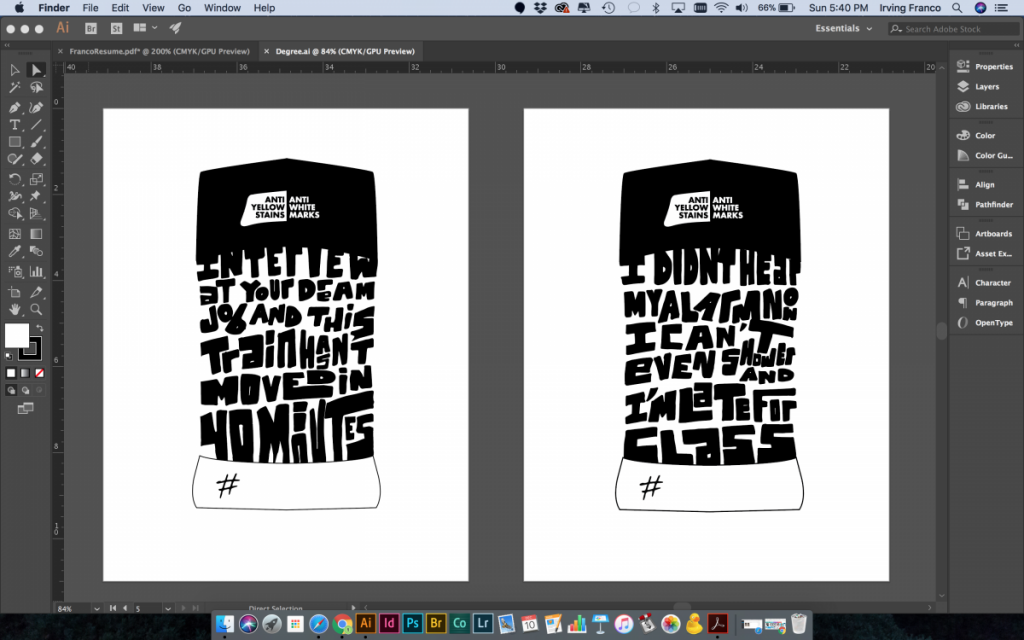
For my communications designs course I was working on an ad campaign for Degree deodorant, we decided to go with a hand written typeface since it’s something that is really popular at the moment and it fit better than just a standard font. The teacher approved of the design and before the Adobe Capture app you would have to scan or take a picture of your work then vectorize it in illustrator. With the Adobe Capture app all you need to do is take a picture of it and it vectorizes it for you. The work then links with your illustrator file online, savings you hours of work.


Social Media – Addicting

Link

The article “Social media is a Bigger problem than You Think” by Mike Elgan was very interesting because it spoke about how addicted we really are to social media, and how the sites are designed to be addictive. It talks about the FOMO (fear of missing out) effect and how that plays a major role into us checking out feeds constantly. Another reason for so many people being on social media is that there family and friends are on social media so like it or not it’s usually the best way to get in contact and keep in touch with them. Lastly the article spoke about how there is a challenge called 99 Days of Freedom and it challenges you to go without Facebook for 99 Days. Even people who don’t consider themselves addicted can’t make it past a few days.

Some image ideas that can be communicated through photography in the studio would probably be social media being a drug and staring at your phone zoned out

Simultaneous Contrast

SimultaneousContrast 


Simultaneous contrast identified by Michel Eugène Chevreul refers to the manner in which the colors of two different objects affect each other. The effect is more noticeable when shared between objects of complementary color.

For this project we had a 4×8 rectangle and cut it in half. On the left side we had to choose a warm color and for the right side we used a cool color. Warm colors are usually light hue, like red, yellow and orange. They call them warm colors because they remind people of the warmer weather. The same principle applies to cool colors. Cool colors tend to range from green through blue and violet.

For the warm colors we hand to make them as light as possible, to do this we picked a color, in my case magenta and yellow and tint the color to make it lighter. For the cool color which were green and violet we had change the shade of it to appear darker but we weren’t allowed to use black. In the middle we used a center of emphasis in a different color to show simultaneous contrast. You can see how the background color affects the shape on top.

Symmetry Design

Symmetry Design

Symmetry is the quality of being made up of exactly similar parts facing each other or around an axis. For this project we had to use an organic shape and use visual thinking to come up with a pictorial symbol and graphic symbols for said organic shape. The pictorial symbols were a photograph, illustration, image related, concept related and an arbitrary design.

We had to use our organic subject, in my case a shark to create a symmetrical design that also included positive and negative shape.

My Personal Flag

PersonalFlag


Personal Flag.

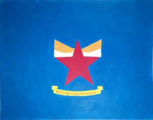
At the center of my personal flag you will find a star with a crown. The star represents my family members and how they push me to become a better person. They encouraged me to go back to school and make sure I am doing my work. The red in the star symbolizes the courage needed to become king. Under the star and crown there is a banner that reads Victoria Concordia Crescit which translates “Victory Grows Through Harmony” in latin. That is the motto of my favorite soccer team Arsenal FC. I relate with this motto because I believe that help can only make you stronger. I used a triadic color scheme of yellow, blue, and red which are the colors of the Colombian flag. There is simultaneous contrast with the red in the star and the red in the banner. You could say the design is symmetrical.

Welcome!

This is the first post on your Learning Blog. Edit or delete it, then start blogging!

The ePortfolio is both a Learning Blog and an Academic Career Portfolio. Use the Learning Blog to document your learning experiences and class assignments each semester. As time goes by, add content to the Academics and Career sections to show your department, graduate institutions, or future employers how well prepared you are for your chosen career.

NOTE: Remember to add appropriate Categories and Tags to your posts. This will help your professors and other visitors find the content they are looking for. The Categories “Coursework” and “Field Trips” and the Tags “OpenLab” and “City Tech” have already been applied to this post. Feel free to make changes!