
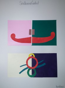
SimultaneousContrast
Simultaneous contrast identified by Michel Eugène Chevreul refers to the manner in which the colors of two different objects affect each other. The effect is more noticeable when shared between objects of complementary color.
For this project we had a 4×8 rectangle and cut it in half. On the left side we had to choose a warm color and for the right side we used a cool color. Warm colors are usually light hue, like red, yellow and orange. They call them warm colors because they remind people of the warmer weather. The same principle applies to cool colors. Cool colors tend to range from green through blue and violet.
For the warm colors we hand to make them as light as possible, to do this we picked a color, in my case magenta and yellow and tint the color to make it lighter. For the cool color which were green and violet we had change the shade of it to appear darker but we weren’t allowed to use black. In the middle we used a center of emphasis in a different color to show simultaneous contrast. You can see how the background color affects the shape on top.

