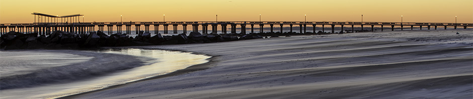
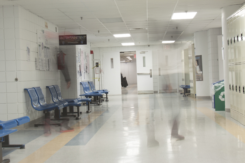
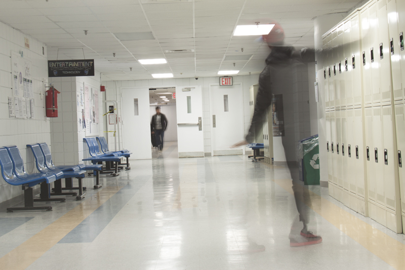
Motion Blur

13412759363_048932c216_o

This image was taken spontaneously. We set up the camera and shot Luisito and both elevator doors opened. The spontaneity made the shot all the better. It’s my favorite shot out of the few that we took. The doors of the elevators appear to fade, almost making a gradient. The sharpness in the photo makes the photo work also. The shutter speed was 1.6.

Joel Fuller

Posted in LL6-Motion Blur | Leave a comment

Stairwell Presence

Out of all the 333 photo my group and i took, this was my absolute favorite. I actually had the privilege of taking this picture. The shutter speed on this particular photo was 3.2 and F11. It displays the rule of third, having the subject off to the right but having the two individuals with motion blur in the middle, creating this ghost like presence giving a haunted feel to it. We had the two subjects run up the stairs to create the motion blur.
IMG_3073

Posted in LL6-Motion Blur | Leave a comment

Motion Blur

IMG_9114


This is my personal best because I made sure the exposure was okay and then tweaked it in RAW. I love the fact that they are transparent and the lights that show through them give the sense of depth. I had both of them stand and prepare to jump while the camera was tilted vertically on the tripod. Aperture 10 and shutter speed was 2.5.

Posted in LL6-Motion Blur | Leave a comment

motion blur

IMG_9046This photo is my personal best. The aperture was 11 and the shutter speed is 1.3. Together with the settings, it created a motion blur. This photo is perfect because it shows two people not in focus at all and they look transparent. Also the left person looks like he is hitting the chairs but he probably isn’t.


Posted in LL6-Motion Blur | Leave a comment

Motion Blur

13412759363_048932c216_o


This was overall my favorite photograph. The amount of symmetry in this image frames him and she’s off to the left in focus. I love how to elevator doors are both closing at the same time. It was taken just at the right moment, it wasn’t planned at all and we were all really happy with the result. We took it and we were lucky. The shutter slow shutter speed really allowed us to capture it.

Posted in LL6-Motion Blur | Leave a comment

Motion Blur

IMG_3191

I think that the low angle perspective in this image is very interesting, the fact that the image goes from light to dark; left to right feels like the people who are blurred are running into a cave metaphorically speaking.

Posted in LL6-Motion Blur | Leave a comment

Motion Blur

IMG_9049      This photo has me as the subject. I love this photo because of the emotion it sends to its viewers. To me it displays a giddy playful feeling. It is like he is glad he passed his Mid term and is going on spring Break! Shutter speed was 1.3


Posted in LL6-Motion Blur | Leave a comment

LL6-Motion Blur

Post a small version of the best photo you took today that uses motion blur. Write a short description of how you achieved motion blur.

Posted in LL6-Motion Blur, Uncategorized | Leave a comment

Gallery Report – Joel Fuller

City stages:
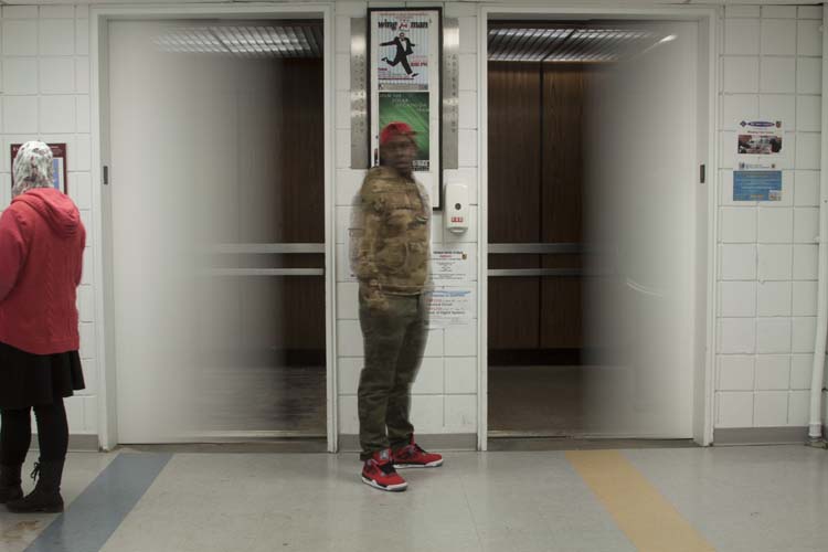
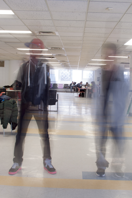
 The artist behind the exhibit photographed subjects in motion. The subject 
matter was the motion of the congested areas. The photographer used a long 
exposure time so you can see the of the people and other moving things in the 
images. The exhibit focused on different areas of NYC that are everyday views. 
From people at home to tourist attractions. 
I got the feeling of movement and consistency. It connected to me because of my 
busy- non stop schedule. 
The photographer used the techniques, eye level, strong horizontal, strong 
vertical and curved, high contrast, rule of thirds, off balance, all framing 
techniques, and both shallow and wide depth of field.

Rijksmuseum
The photographers focus was empty unfinished spaces. He showcased a lot of 
inside buildings that were in the process of being painted or built. He used a 
lot of strong color and a lot of wide shots. I felt empty and imperfect, which 
is what most people feel at least once thorough out  their lives. The 
photographer achieves this by taking wide shots of empty unfinished buildings. 
The techniques used were strong vertical and horizontal, low contrast, 
symmetrical, long and medium shots, and wide depth of field.

Composites
The photos used in this exhibit are some of the first examples of digital 
manipulation. The artist manipulated photos to combine people and animals 
features and create new creatures. All the images were portraits. All had simple 
either black or white backgrounds. It connected to me because I'm a graphic 
designer, and obviously photoshop is major part of my life. The techniques used 
were close up, high contrast off balance, 

The Heart and The Eye - Henri Cartier-Brenson and Robert Frank
Daily life representation. Shows working class people in early 1900s/mid 1900s. 
Photographer captured emotions of people in portraits and still images. All in 
black and white in high contrast for dramatic effect. I empathized with the 
people in these images and also felt proud because they appeared to be working 
hard for minimum wage. It also reminds me of people I know in my everyday life. 
High contrast, rule of thirds, sharp, close up, and medium shot were all used. 
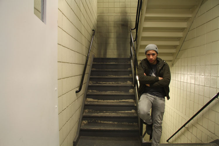
Metro
This exhibit had images of people on trains, birds eye views of people walking, 
and a manipulated image of buildings. I believe the artist was trying to show 
everyday city life in ways many have never see it. The images were very dynamic 
and achieved it's goal. They connected with me because riding the subway is 
apart of my everyday life. I could've easily been one of the people in the shot. 
It also told the true story of being in a public place, yet being in your own 
world. Which is how it is on the train. The images used long shot, birds eye 
view, eye level, high angle, curved line, strong vertical, rule of thirds, off 
balance, medium shot, and wide depth of field. 
Posted in Gallery Report | 1 Comment

Angel Crespi

Digital photography

HW# 6

Matthew Pillsbury gallery was one of the most interesting galleries we visited; his subjects were mainly city attractions that he would capture in black and white. my first thoughts of the exhibit was that it was dark because of the blurred faces and the black and white high contrast tonality, but when observed closely what he is photographing are things or events that make people happy or things that are interesting to a particular area that can’t be found anywhere else.

Wijnandoo Deroo’s exhibit was extremely symmetrical; her exhibit was all about the interior architecture of buildings and museums. Most of her images had strong vertical lines and beautiful curved lines. My first impression of this gallery was that it was very symmetrical and well planned out, the way that Deroo captures the mood of the room she is photographing is phenomenal; it really makes me want to be there at the same place and time that the image was captured.

Nancy Burson’s gallery was fascinating, at first glance an untrained eye would simply think that the portraits from her exhibit are just that, portraits of people. In reality each portrait is an amalgam of people’s faces mixed up to form one cohesive face. I wasn’t very impressed when I first walked into the gallery but quickly gained respect for ms. Burson as the idea of mixing people’s faces so seamless seemed like something that could only be done in photoshop.

The Marie Cosindas was my favorite of them all; most of her images were taken in extremely foggy and dark days. The tones of her work were very dark making good use of shadows and black areas.

Reiner Gerritsen’s exhibition was pretty much like the Matthew Pillsbury exhibition, they both featured cityscapes and urban life. Gerritsen’s long shot of the people riding the train was astonishing, it depicts the many faces that board the train, it is a great representation of life in New York.

Posted in Gallery Report | 1 Comment