Week #1
Hello class,
My name is Giulia Bentoglio, Im a 21 year old student here at City Tech Pursuing my Bachelors degree in Communications design (aka advertisement). Currently, as you might know, im part of this Internship class (spring 2018) with Prof Nicolaou. The search was easy thanks to the recommendations of the professors, but after a week of long dedication calling companies to see if they would hire me to finally get an internship and get my credits for this class, I finally found an internship at Women’s Press Collective. Who are Women’s Press Collective? They are a non profit organization that helps working communities across our country and in New York City, women leaders are organizing independent, community based media, giving voice to the struggles of working women.
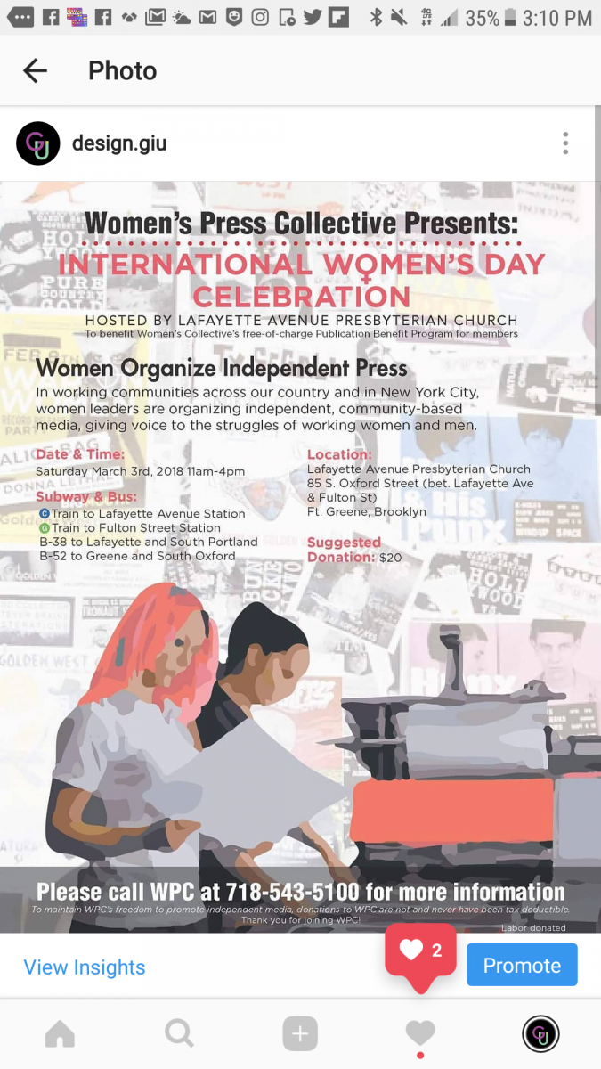
So far I’m really loving it there, I started working last saturday and my manager Lisa is one of the most down to earth people I ever meet. The biggest event of the company , international women’s day is near, everyone is getting ready. So far I have made phone calls to let know people who are interested in the company that this event will be held. Im currently working on a poster so we can give the word out for the event.
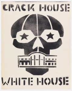
Click here to see the poster project by far (in progress):
Hopefully when I’m done with this project,my manager would let me post it and make it a portfolio piece (click here to see my portfolio) http://giuliabentoglio.design
Before getting my internship, I applied to Caribbean American Weekly, Cat’s eye design. jmc.laughlin,Bronx River art Center and Lord and Taylors.
My steps to get the internship where:
1. apply
2. call them for an interview date
3. go to the interview, be professional
4. Analyze I wanted to be in this internship
I hope everyone here enjoys reading my journey in this 3 month internship. So far I work on Mondays 9am-4pm, Tuesday 9am-4pm, Thursdays (when needed) and Saturday 10am to 4am
Week #2
So this has been officially the second week of my internship in WPC, so far I’m settling in in the work process, I notice they are very old fashioned and keep every important documents in paper instead of PC (we do have PC’s but we only used them to send out emails and to make graphic design work/ typing for the magazine or other works.) Lisa is basically my boss, she is so easy and friendly to get around with so there haven’t been really been an issue of me settling in to the company. So far, I been organizing old card files for the very first time, it is a bit tricky, specially since it my first time and I really don’t want to mess up things on my second week. I will get used to them little by little.
Note: I love the fact that there’s food for us in the office, thankfully I don’t have to walk up a hill to go to the shops for lunch. (there’s a bit of a hill going towards WPC, I take the 4 train and have to take the 9 bus just to get there, around us there’s places but not near the press sadly.)
Week #3
This week in WPC I been looking through cards with the old card system. At first it was frustrating because I didn’t know much about how it worked, specially since I thought it was tedious since I thought it was time consuming since it takes time to look for one card and another, but I gotten pretty much used to it. It’s interesting seeing that there are companies that still use the file system to look for things, I guess in certain ways its safer for everyone involved (since hackers can hack computers now days.) I meet some members of WPC as well, some of them are around my age, while others are a little bit older. It is really inspiring to see people coming to WPC even though it is all volunteered. I have never done an volunteering internship before so this haves inspired to do my best in this internship/ Voluntary job and probably will keep doing so when I’m done with this class.
Week #4
This week at WPC I been getting information about the biggest event for this organization, which is the International’s Woman’s day. Supposedly is kind of an event where they invite people and people make donations for the organization. Everyone volunteers to make it happen as well as people donating food and supplies for the event. Is the first year I work for Women’s Press Collective so I have no idea on how the event will be. Today we went through the cards that we where looking for last week and calling people to invite them at this event. It was very awkward since it is my first time doing this, it was a bit tedious too since there where other volunteers talking on the phone meanwhile I was talking, so you really must focus on the person you speaking to. Many people where busy and wanted to email them or text them some short of flyer. I always wondered if people who had to call for offers where feeling as awkward as the person who they talking to. Turns out they do.
I also been working on a poster to send out by email, so people could come too. I am looking back through WPC history of past posters and notice that they really like using vector images. So, I’m trying to do that meanwhile trying to make it look modern, but not too modern so the company is recognizable. Shame that today I was about to use a old typewriter for the cards but my time run out, hopefully I will next week.
Week #5
This week WPC been preparing for the biggest event of the year, International Women’s Day. The event will be held on Next Saturday and it’s my first time attending. It’s been a very big transition from last week, since this week I finally started doing some design for the event, so I been working on a flyer and a booklet for the event. I been referencing some past work from the past years event. I been working with a coworker and another student that goes at city tech, and together we have created some ideas on how the flyer and the booklet should be. Eventually we finally agreed to make the Booklet like the flyer. I also helped design some stickers for out volunteers for the event, but the printing machine is not working so well. Lets hope the best.
I been also trying to help as much as possible on spreading the word on the neighborhood and to my friends or family friends to come to the event. I have gone through my local beauty salon (on which the owner is my mom’s best friend) and I gave some WPC magazines, so people would get to know us a little bit more. I also gave some to a uncle of mines to give around his workplace, which is a non-profit organization for people with AIDS. I also been going around my college and trying to convince my classmates to attend or at least donate for WPC. Women’s Press Collective it’s all non-profit which means everything we get is by donations. Hopefully I’ll get to see some of my classmates or people I know in the event next week.

Booklet Program For IDW 2018
Week #6
We finally arrived at the most important week of WPC year: International Women’s Day. This year like the past 6 years, we are celebrating it at Lafayette Avenue Presbyterian Church (85 S Oxford St, Brooklyn, NY 11217). I was supposed to go and help to the church on Thursday, but Thursday is the only day I have free and therefore I had to say do some important things at home. Thankfully I was able to go Yesterday (Friday) at 10:00 am. It was pounding with rain and it was cold, everyone was very anxious about the event today. I helped in the kitchen of washing things for Tomorrow (Saturday). I meet a lot of new interesting people that weren’t particularly members from WPC, but people who where helpers from the church. As well as people who were family members from people who where members. So, I got to know a little bit more about my coworkers. The experience Inspired me to volunteer more often if I can. There where a bit of issues, like the distance of the location (Brooklyn) and WPC (Bronx), We definitely had some issues on communicating, never less everyone did their best to put this event together like every year.
On Saturday, the actual day of the event, I arrived around 10:30 am, everyone was getting the final things together, It was my first year at the event, so I did have the option to lay back and see the show, I decided to rather put my presence to help, so I decided to stay in the kitchen helping with the preparations (besides I was an hour and 30 minutes late because of the train). I decided to go to Eataly before going to church and brought a tiramisu for the crew, everyone was working hard on doing this event together, so that was my way to help out or give a little more joy to the crew. I invited some people for my college but only one friend of mines did come, nerveless it was an amazing experience although I did not get to see most of the show. We had about +100 people coming in regardless of yesterday’s weather, raised about 1000 for our organization (since everything is donated), had amazing food (even though the downstairs kitchen was a literal hell, it was so hot in there!), and we had amazing speeches and musicians helping with the event. In the end most of the morning crew helped organize and we had the tiramisu that I brought. It was really satisfactory.

Singing Group For The Event

My Coworker Melissa.
Week #7
My week 7 at WPC (Women’s Press collective) been very chill. The year’s Biggest event for WPC (International’s Women’s Day) is done and over with. There fore now WPC haves been focusing more on looking for old and new contacts to find volunteers that will help with the next project: The press room. WPC is an organization that haves been in Brooklyn about 36 years, but recently moved to the Bronx, so as you can all imagine, we trying to recruit people right now and let ourselves be known into this new neighborhood, as well as contacting old contacts. The press room is basically the basement on the house. Its need major construction so my job for this week was looking through the cards of old contacts (between the 80’s-90’s.) I found a lot of architects, construction workers, interior designers, and thankfully some of them want to help. The luckiest contact we have is a man who now teacher (or owns) an architect school, and he is very famous architect who has worked for a lot of high end places. Of course, we have other options just in case.
At first, I thought it was a little tedious since now days we have the computer to organize everything, But I have learned a lot from WPC old school system of the contact cards. It keeps privacy for everyone and sometimes it can surprise you. I have found a few interesting contact cards like celebrities (who in the past where new actors and weren’t famous) and somehow, they now managed to be at the very top of their careers, or even artist or business people who now own their own business or corporation. It can be tricky although. Not everyone who we contact is needed. Yes, we do want volunteers and people who help but we do want to keep the integrity and the roots of the organization, that means not owning anyone anything at the point that they are the ones who control WPC after.
I also almost had to canvas in the telephone to contact this people for the press room, thankfully I was saved by the bell. I did some canvasing before, but to be honest is one of the skills that I really need to work on. I get nervous talking to people I can’t see on the phone, and it don’t help that I have a big accent. Sometimes I have to repeat myself though the phone, so people can understand, and its really intimidating, not everyone gives you time to speak. Hopefully In the future I get the opportunity to do this again and defeat my fears as well as learn a new skill.
Week #8
Week 8 haves been extremely interesting in Woman’s press Collective. After the international women’s day event that we did ( I missed out on some weeks, I will explain that further in another section in the future) I have been working on a magazine with my coworker Melissa. She is trying to make a newspaper/ magazine representing the new generation of black people, in her articles she talks about Musicians/ artist that she knows. I am having so much fun doing it, However I’m not the only one working on this project. At times Melissa haves Cyndi (another intern in WPC from city tech) works with Melissa. The issue that she got a different style/ way on doing graphic design, sometimes when I work with Melissa I have to constantly change the things that Cyndi did ( because of course, not every graphic designer design the same. )
Then I’m working with with an elder person (who I forgot the name, lets call him will for now) he is a member of a small ethnicity group in Honduras called Garifuna: https://en.wikipedia.org/wiki/Garifuna ,basically, the government in Honduras in very corrupted (military based gov), and they do work for our shady USA gov, of course, USA used them to create hotels and all kind of resorts in the bays of Honduras. Garifuna people happens to live near the bay areas of Honduras, and so this USA corporations are either trying to kick them out of their native land or buy them (of course, paying them little money on what the property actually cost.) Theres a lot of tension, since not every Garifuna agrees on keeping the land, some do wanna sell their property to get out of poverty, some other are too scared to even fight back. The government ain’t helping them, and some people even get killed if they speak out. Therefore, “Will” wants to create a newsletter in three different languages (English, Spanish and Garifuna) to reunite his community and fight against this corporations.
This week I found out that my classmate David is interning too in WPC, I was very happy since he is the only person that I actually know from City tech. we went Canvasing with Lisa, walked door to door in local community stores in the Bronx for at least 4 hours, we explained to people what the organization was about and what we can offer to them, explained that we new in the community and so we needed people to volunteer. It really went well, specially since David and I can both speak Spanish.
Wpc is very old school, They don’t have a website or keep any achieve or files in the PC in other to keep their members private, therefore I usually have to go through the mastercards to find out people or organizations that we need to contact. I thought it was annoying at first, but I have grown used to it, and It haves become a skill I adapted over time. Interesting enough, I have found some hidden jewels, like cards from people in the 80’s and 90’s that now days are famous or have open an organization. I mostly had to do this because we are looking for volunteers for constructing the basement to have space to put our presses. We even got lucky and contacted a very high end prestigious high end architect that is willing to help create the basement (and send his students over there too.)
Bonus: I also found out that one of the volunteers owns a academy that teaches piano, sewing classes and painting for free, if anyone is interested, please let me know in the replies so I can give ya the number (its in Brooklyn btw).
Week #9
This week haves been very busy at WPC. I been working with Melissa on her Magazine (mentioned in last week), and I also been working with Will with his newspaper for Garifuna people. Both are fun to do however, it’s been an extremely new experience working with people and listening to their request. Melissa is about my age, she knows what she wants, so working with her haves been easier since she is a good explainer on her ideas. However, when it comes to the other person (whose name I need to remember), he is a few years older than me, and therefore its more difficult understanding what he’s trying to communicate with me. Therefore, its been a big journey on completing it but hopefully next week around we will have all that we need to complete it (or at least, almost finish it.) I brought pizza and soda last Wednesday to help out with lunch even though I did not have work that day, it was late in the afternoon and lunch time already passed however I’m glad to hear that the pizza was in use for the night time.
Week #10
Im feeling a bit bittersweet writing this because it the last journal entry that i’m going to write about my internship. I love women’s press collective. I love the aura and the people there. I love that I’m able to grow as a designer while being helpful to others, therefore i’m definitely going to keep volunteering after this week is over. Both of Melissa’s Black culture magazine and German’s (finally remembered his name) Garifuna Newsletter aren’t completed so I definitely want to stick around and finish those too projects, Melissa decided to use some of my photography for my magazine so that’s very exciting. I will be posting it on my website at giuliabentoglio.design. Melissa and I have becomes good friends actually, and are planning on hanging out next saturday.
Meanwhile finishing up all this projects, WPC finally managed to get some workers for the renovation in the basement where the press room will be located. Im very happy about that, especially since sometimes the dust in the work gets in the way, plus in summer my guess is that the room is going to be really hot so it’s better if people can spread out through the office. I went out with Lisa canvassing trying to see if they let us a spot at the local market in a bronx park near our office. Richard (friends of mines who is now volunteering too) helped us out by driving us there. We walked and found a quiet beautiful park that I never knew it existed in the bronx so now i’m definitely going to explore the bronx a little bit more this summer. If i’m not wrong, I believe that they gave us the permission to have a table so on sunday I’m gonna go down there and help lissa out with spreading our magazine into the bronx community. This internship haves really taught me to be more humble and patient with people, it really feels good to be able to help other people by doing something you love meanwhile learning new information every day about different communities and the issues that this country have the the media is not covering to the public. I would recommend for any future intern to consider have this internship here, it’s an experience i’ll never forget.
Here is my Power Point Presentation of the overall Internship Experience:
https://docs.google.com/presentation/d/1iCDRuhATb8j13piJyQll-MqIhjg7t7hAEoeZaaOK5PY/edit?usp=sharing
Sincerely,
-Giulia Bentoglio