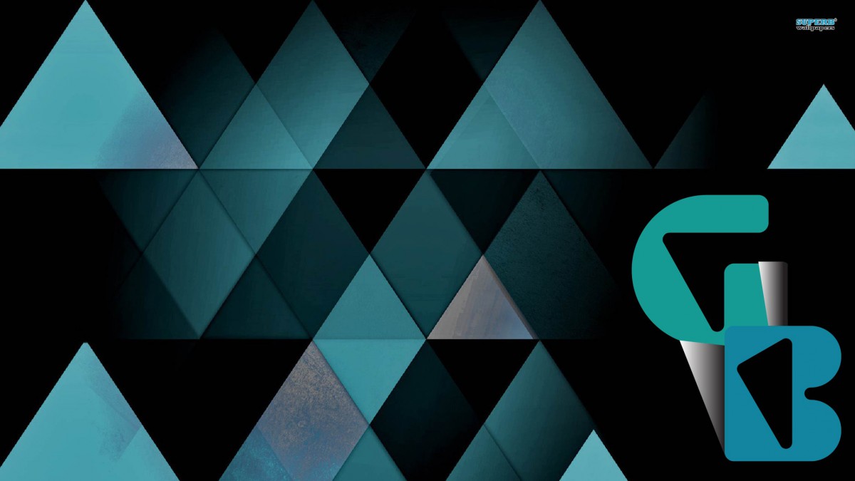
Creating a Logo was an absolute interesting thing to do. Although in the beginning I had no complete idea on how to finalize the idea of the logo. It all began with some small sketches with the idea of making my too capital letters G and B for my name (Giulia Bentoglio). Then latter on grabbed the idea and used InDesign to crate the logo with the letters. I used “Shurinken Boy Std” as my font to make the letters look more abstract. Then I latter used tools such as the pen to create the small white shapes close to the letters. When I was satisfied with my logo art, then I looked up for Abstract wallpapers and found this perfect background that blended in with the logo, creating the final product.