This is A video Project I had to do For Digital Media Foundations Using Premiere CC. I had to interview my good classmate Whong shun, record the interview, edit it , and finally put everything together. This project is one of the projects that I enjoyed the most on doing. Thanks For watching!
Category Archives: Coursework
McDonald’s Logo History Report
Throughout the years , McDonald’s has been one of the biggest fast food chains in the world. Everyone who passes by a McDonald’s, no matter what part of the world they are from recognize their favorite American fast food restaurant just by the golden “M”logo. However, it has not always been like that. Creating a logo takes multiple attempts for the company to finally have a visual identity that successfully communicates.
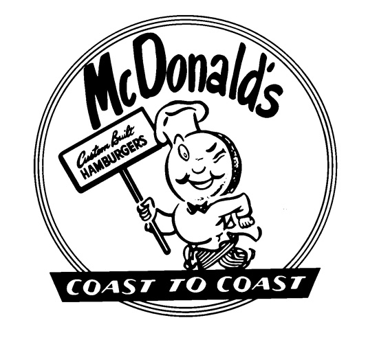
Below is an image of the first official McDonald’s logo from 1948: “Speedy Service” logo.
Speed Service logo: 1948
Speedy Service, as you can see, has a tubby chef called Speedee designed by Richard and Maurice McDonald to help communicate their Speedy service system. Richard and Maurice were the two brothers who opened up the first McDonalds in 1940, San Bernardino, California. Speedee was meant to inform people that their food was going to be served up really fast, and that’s why he was given his nickname. As you can see, the two brothers didn’t even hire someone to do their logo for them, this logo was handmade with ink and paper.
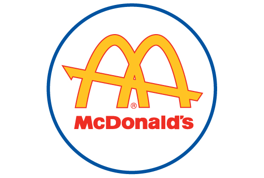
In 1952, the McDonalds brothers asked architect Stanley Meston to draw their logo since they wanted to update their logo . However, then Ray Kroc brought the business in 1961, and he made this design into a official logo. Golden Arches where designed by Jim Schneider,who is currently the vice president of bank of America. Inspired by the arches that every McDonalds Restaurant used to have.
The1961 famous “Golden Arches” logo was introduced
Further Interactions to Present: “Archy McDonald” logo.
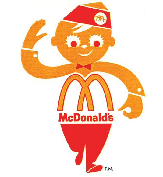
Archy McDonald’s was a logo used mostly for the delivery trucks for their delivery service in 1962. The logo also appeared in McDonald’s first commercial on the same year. By the 70’s the “Golden Arches” had become a recognizable logo for decades to come and would remain so. In between 1975 there have already been ideas to remove Archy and just keep the McDonald’s logo, but it was not really the official logo until 2003.
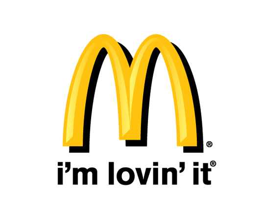
“Im Loving’it” Is been the official McDonalds tagline since 2003-present day. Designed by Heye and Partner GmbH, a company dedicated to create logo’s and advertisements. As you can see this tagline has been pretty much been the most simple but successful in McDonalds. Showing that sometimes the simplest things are the better to understand.
Works Cited
“The Story behind the McDonald’s Logo.” The Story behind the McDonald’s Logo. Future, 19 Nov. 2013. Web. Fall 2015.
“McDonalds Logo.” Famous Logos RSS. Famous Logos, n.d. Web. Fall 2015.
“Our History.” :: McDonalds.com. Mcdonals, 2010. Web. Fall 2015.
Dan, Miyers. “Under the Golden Arches: McDonald’s Logos through The Years.” The Daily Meal. Spanfellrer Media Group, 21 July 2013. Web. Fall 2015.
Filed under Coursework
The Cooper Hewitt Museum
The Cooper Hewitt design museum located in the upper east side of Manhattan is a museum exclusively devoted to historic and contemporary design. In there you could find famous artwork such as posters, sketches of Pixar’s animation, even future models of projects and ideas on how to make our New York City a better place. In my visit on the Cooper Hewitt museum there where a lot of art pieces that intrigued me and my interest, which three of this pieces where “Crack House White house,” “Zürcher Theater Spektakel [Zürich Theatre Festivel]” and “Kaberet.”
Poster, “Crack House White house”, 1991:
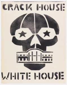
This is a 61 x 48.4 cm (24 in. x 19 1/16 in) poster created by Seth Tobocman and Peter Kuper. This object was donated by Steven Heller and Karrie Jacobs and catalogued by LSA (Linguistic Society of America). It was made in 1991 and the Cooper Hewitt took position of it in 1993, it was a credited gift of Steven Heller and Karrie Jacobs. Its medium is spray paint on tracing paper, which makes it part of the Drawings, Prints, and Graphic Design department. The poster makes the presidential residence blend into the grin of skull. Its typography is very bold, although it’s very similar to a Sans serif, kind of like a broken up distorted Helvetica, which is excellent with this composition since it screams rebellion over the white house, giving the overall message for why the white house residence blended into the grin of the skull.
Poster, Zürcher Theater Spektakel [Zürich Theatre Festivel], 1996:

This is a 128.1 × 90.6 cm (50 7/16 × 35 11/16 in) poster. It was designed by director Benker & Steiner Werbeagentur AG and made for (as the client) Zürcher Theater Spektakel.it was made in 1996 and the Cooper Hewitt museum acquired it in 2010. Its medium is offset lithograph on wove paper. It is a part of the Drawings, Prints, and Graphic Design department. The concept behind this is an odd event in a family dinner. The mother stands on a chair while the father is chained to a table leg, appearing hopeless to his fate, staring straight at viewer from beneath the table. Blocking the other family members faces with colored dots, which intensified our emotions making it harder to understand what is really going on. The Typography in this poster is beautifully matching with the random dots on the other members of the family. It don’t scream to you, yet it’s very noticeable and it catches your eyes, since it’s in bold colors and its hand drawn.
Poster, Kabaret, 1973:
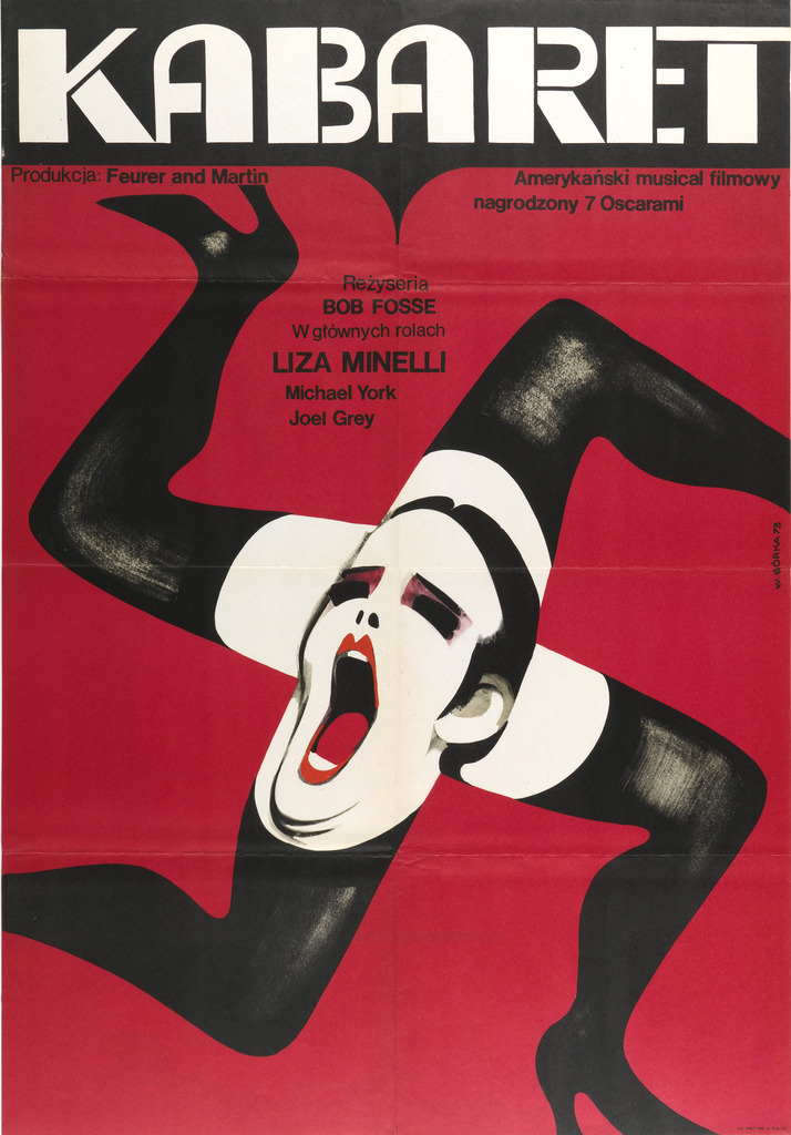
Matt Flynn 005
This is a 83.8 × 58.1 cm (33 in. × 22 7/8 in) poster. It was designed by Wiktor Górka made in 1973 and the Cooper Hewitt acquired it 2010. Its medium is offset lithograph on wove paper, which is printed in black ink (Rze. / 084 / 73.) It is a part of the Drawings, Prints, and Graphic Design department. Wikto Górka, a leading participant in the Polish School of Poster Art, was a master of visual metaphor. Bob Fosse’s 1972 film, “Cabaret,” is set in a German nightclub during Hitler’s rise. In Górka’s visual pun, a strange cast of body parts mixt together to create a single disturbing image. The typography is distracting from the composition, but it also brings balance to it, since this poster was meant for a German nightclub, the letters look as if they were lighten up for a show.
Filed under Coursework, Field Trips, Uncategorized
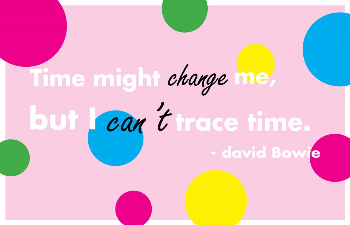
Postcard 3
This is my final Digital Quote inspired by the song “Changes” of David Bowie. I wanted to make this one to feel joyful and full of life, which is why I added so many colors into this postcard. I used In design to create this quote. Overall it was very easy to create this postcards, and it was a fun creative project.
Filed under Coursework
Postcard 2
time 2 :This is the second Idea of my quote, inspired by the song “Changes” of David Bowie. I used a picture of a highway as a background to indicate that as the quote says, we cant trace time, specially when we are in the middle of driving, we tend to get in the middle of a traffic jam! Again, I used Illustrator to edit the words and Photoshop to alter the image.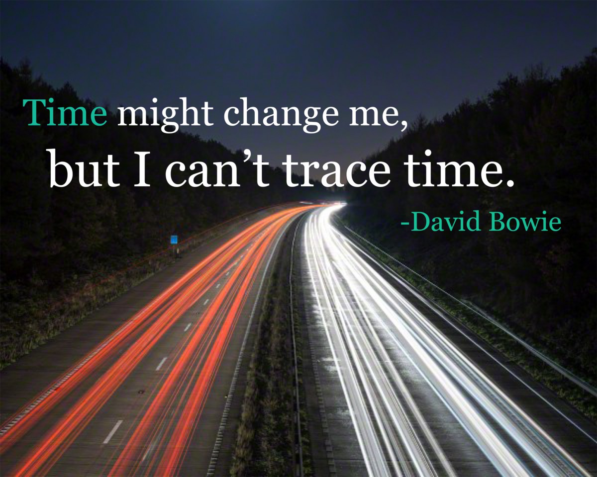
Filed under Coursework
Postcard 1
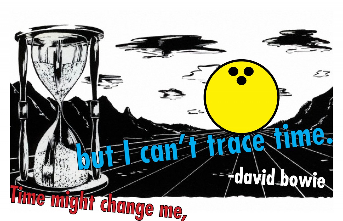
This is one of my Digital Quotes for my Digital Media Foundations class. The quote is “Time might change me, But I cant trace time” by David Bowie from the song “Changes”. I felt like the illustration fitted properly with the message of no one can control time, since it appears to be a gigantic sand clock in the middle of the dessert, and a bowling ball about to destroy that sand clock , depicting that your actions can indeed not trace time. I made this using Illustrator, and changed the image size in Photoshop.
Filed under Coursework
Logo design GB
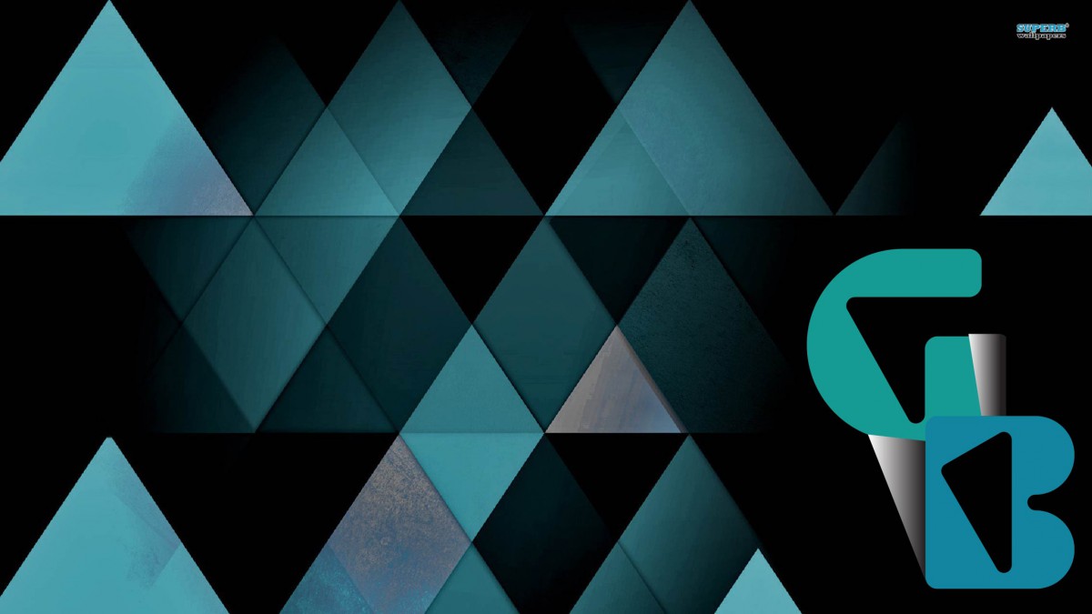
Creating a Logo was an absolute interesting thing to do. Although in the beginning I had no complete idea on how to finalize the idea of the logo. It all began with some small sketches with the idea of making my too capital letters G and B for my name (Giulia Bentoglio). Then latter on grabbed the idea and used InDesign to crate the logo with the letters. I used “Shurinken Boy Std” as my font to make the letters look more abstract. Then I latter used tools such as the pen to create the small white shapes close to the letters. When I was satisfied with my logo art, then I looked up for Abstract wallpapers and found this perfect background that blended in with the logo, creating the final product.
Filed under Coursework
American Airlines New logo: Revolutionary
Forty years is a long wait for a big company such as American Airlines to change something as important as their logo. However, 2014-2015 have been years that the United States have been trying to be up to date with their technologies, and since our country needs to be number one, preferably surpassing Japan (motherland of technology) it was indeed time to change the logo for the most important airplane brand.
The AA typical logo is gone, replaces by the Flight symbol, a red and blue eagle crossed with a wing. But why this big decision you ask? well American Airlines recently ordered 550 brand new planes. New material needs a new face, and whats more patriotic than the American eagle? Plus there was no way that AA would get rid of their famous eagle after nearly nearly 80 years.
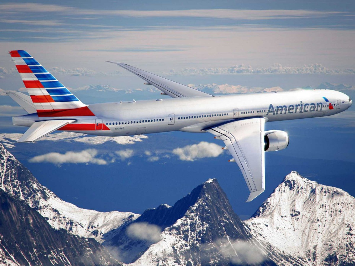
No doubt, not everyone will like the new AA’s reboot. The original brand is stained in our brains for decades. However, it took 2 and a half years to make this American brand more comfortable and up to date for us. In my opinion, changing the logo might as well be a lesson for me as a communication design student: is not all about the typography, sometimes the simpler things are, the better.
Articles:
http://www.fastcodesign.com/1671677/american-airlines-rebrands-itself-and-america-along-with-it
http://www.forbes.com/sites/andrewbender/2013/01/21/american-airlines-makeover-design-pros-weigh-in/
Filed under Coursework
Transparency and Composition Project
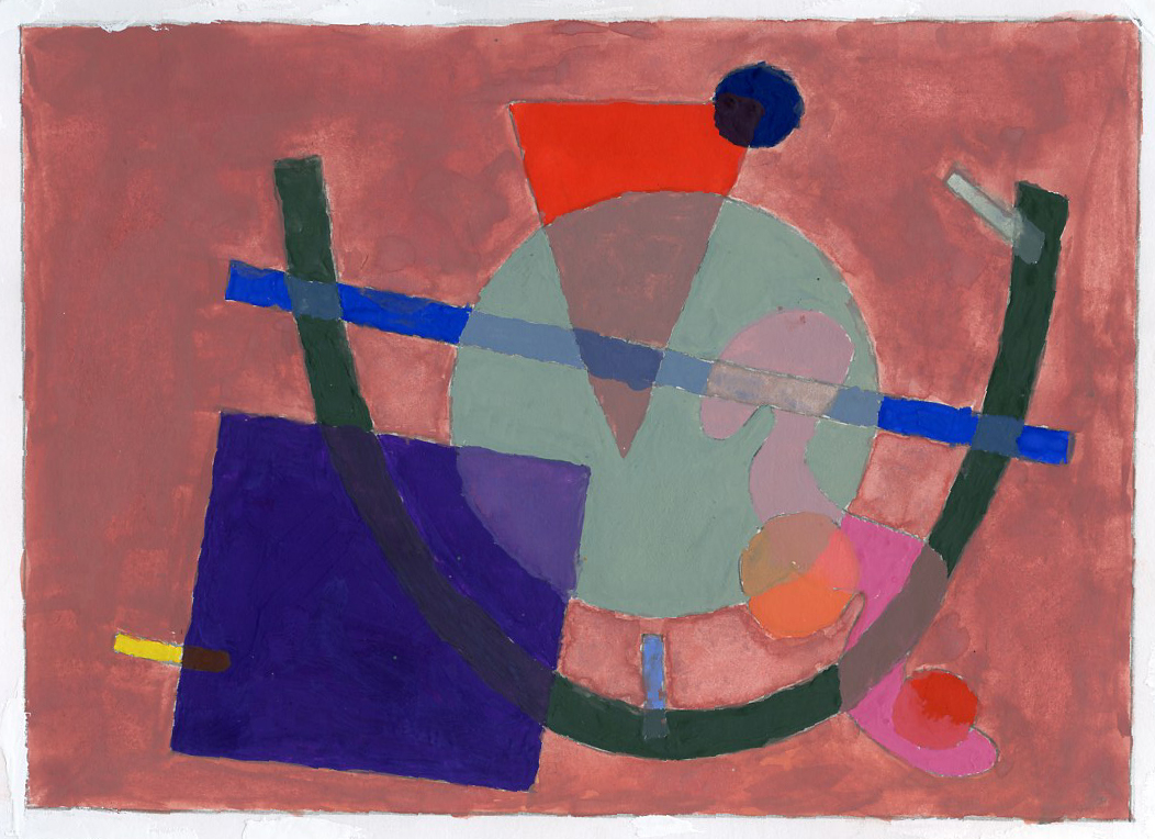
This work shows how can linear expressions can become two dimensional shapes and contain graphic design variables. Using gouache paint, this painting shows transparency in between the different shapes.
It’s amazing how small lines and doodles become one to create an masterpiece. I found this project to be one of the most fun projects I had to do in class, the fact that we where able to choose on which colors we could work with its amazing. It was hard to manage the balance in between each color, and the transparency of each object. But I’ve learned a lot on how to control the colors. Choosing the placements in where the different shapes should go was the hardest part, since it was hard to balance them all out.
Tone was also pretty important, specially in the background, depending on the color chosen , you could blend the background into the shapes, or you could make the shapes pop up. I feel satisfied with this project-Yes, the colors could had been a little been more intense, but the overall project was not as bad as I thought. The hardest part of this project was selecting sections that would blend in with 3 colors. When using two shapes to blend in two colors was essay, however, when it comes with 3 colors it was harder because there was a little bit of space where to choose from. I solved that by selecting smaller pieces like the circles and small dashes to save up space.
Filed under Coursework
Parallel Lines Project
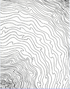
This is a small project from Graphic Design Principles I, Showing parallel lines that show movement between one another, creating the illusion of moving towards one direction.
Filed under Achievements, Coursework, Field Trips

