
Forty years is a long wait for a big company such as American Airlines to change something as important as their logo. However, 2014-2015 have been years that the United States have been trying to be up to date with their technologies, and since our country needs to be number one, preferably surpassing Japan (motherland of technology) it was indeed time to change the logo for the most important airplane brand.
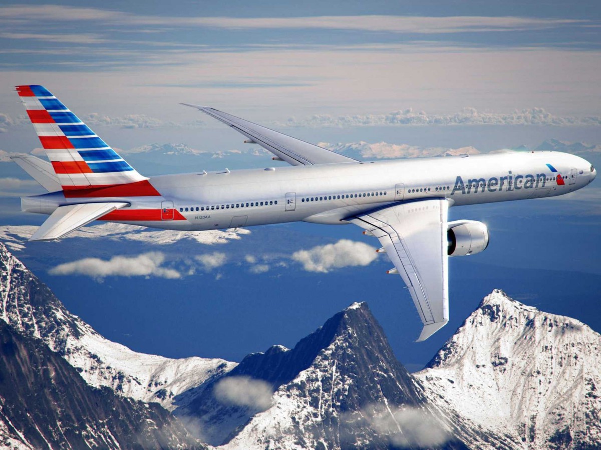
The AA typical logo is gone, replaces by the Flight symbol, a red and blue eagle crossed with a wing. But why this big decision you ask? well American Airlines recently ordered 550 brand new planes. New material needs a new face, and whats more patriotic than the American eagle? Plus there was no way that AA would get rid of their famous eagle after nearly nearly 80 years.
No doubt, not everyone will like the new AA’s reboot. The original brand is stained in our brains for decades. However, it took 2 and a half years to make this American brand more comfortable and up to date for us. In my opinion, changing the logo might as well be a lesson for me as a communication design student: is not all about the typography, sometimes the simpler things are, the better.
Articles:
http://www.fastcodesign.com/1671677/american-airlines-rebrands-itself-and-america-along-with-it
http://www.forbes.com/sites/andrewbender/2013/01/21/american-airlines-makeover-design-pros-weigh-in/

