Tag Archives: Digital Media Foundations

McDonald’s Logo History Report

Throughout the years , McDonald’s has been one of the biggest fast food chains in the world. Everyone who passes by a McDonald’s, no matter what part of the world they are from recognize their favorite American fast food restaurant just by the  golden “M”logo. However, it has not always been like that. Creating a logo takes multiple attempts for the company to finally have a visual identity that successfully communicates.

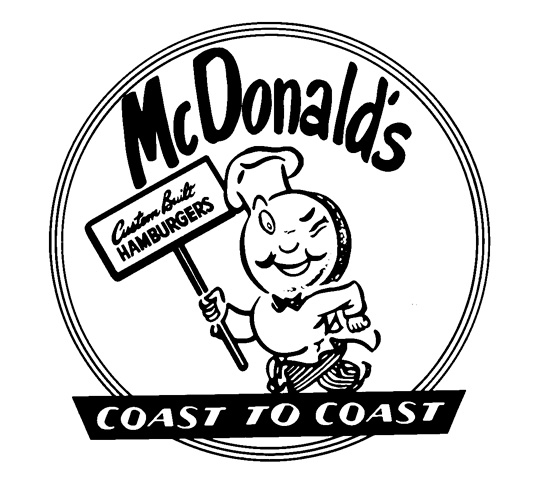
Below is an image of the first official McDonald’s logo from 1948: “Speedy Service” logo.

Speed Service logo: 1948

Speedy Service, as you can see, has a tubby chef called Speedee designed by Richard and Maurice McDonald to help communicate their Speedy service system. Richard and Maurice were the two brothers who opened up the first McDonalds in 1940, San Bernardino, California. Speedee was meant to inform people that their food was going to be served up really fast, and that’s why he was given his nickname. As you can see, the two brothers didn’t even hire someone to do their logo for them, this logo was handmade with ink and paper.

In 1952, the McDonalds brothers asked architect Stanley Meston to draw their logo since they wanted to update their logo . However, then Ray Kroc brought the business in 1961, and he made this design into a official logo. Golden Arches where designed by Jim Schneider,who is currently the vice president of bank of America. Inspired by the arches that every McDonalds Restaurant used to have.

The1961 famous “Golden Arches” logo was introduced


Further Interactions to Present: “Archy McDonald” logo.

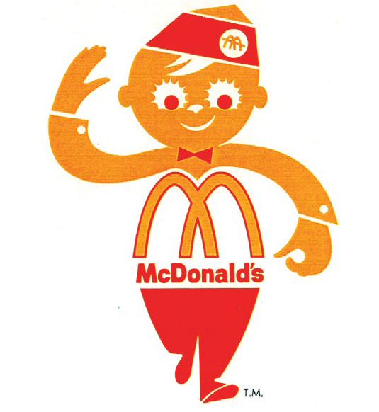
Archy McDonald’s was a logo used mostly for the delivery trucks for their delivery service in 1962. The logo also appeared in McDonald’s first commercial on the same year. By the 70’s the “Golden Arches” had become a recognizable logo for decades to come and would remain so. In between 1975 there have already been ideas to remove Archy and just keep the McDonald’s logo, but it was not really the official logo until 2003.


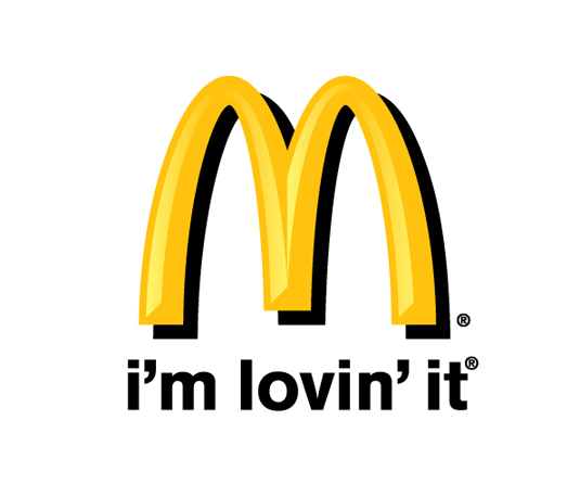
“Im Loving’it” Is been the official McDonalds tagline since 2003-present day. Designed by Heye and Partner GmbH, a company dedicated to create logo’s and advertisements. As you can see this tagline has been pretty much been the most simple but successful in McDonalds. Showing that sometimes the simplest things are the better to understand.


Works Cited

“The Story behind the McDonald’s Logo.” The Story behind the McDonald’s Logo. Future, 19 Nov. 2013. Web. Fall 2015.

“McDonalds Logo.” Famous Logos RSS. Famous Logos, n.d. Web. Fall 2015.

“Our History.” :: McDonalds.com. Mcdonals, 2010. Web. Fall 2015.

Dan, Miyers. “Under the Golden Arches: McDonald’s Logos through The Years.” The Daily Meal. Spanfellrer Media Group, 21 July 2013. Web. Fall 2015.


1 Comment

Filed under Coursework

Postcard 3

This is my final Digital Quote inspired by the song “Changes” of David Bowie. I wanted to make this one to feel joyful and full of life, which is why I  added so many colors into this postcard. I used In design to create this quote. Overall it was very easy to create this postcards, and it was a fun creative project.

Time (bubbles)


Leave a Comment

Filed under Coursework

Postcard 2

time 2 :This is the second Idea of my quote, inspired by the song “Changes” of David Bowie. I used a picture of a highway as a background to indicate that as the quote says, we cant trace time, specially when we are in the middle of driving, we tend to get in the middle of a traffic jam! Again, I used Illustrator to edit the words and Photoshop to alter the image.time 2 fin


Leave a Comment

Filed under Coursework

Postcard 1

This is one of my Digital Quotes for my Digital Media Foundations class. The quote is “Time might change me, But I cant trace time” by David Bowie from the song “Changes”. I felt like the illustration fitted properly with the message of no one can control time, since it appears to be a gigantic  sand clock in the middle of the dessert, and a bowling ball about to destroy that sand clock , depicting that your actions can indeed not trace time. I made this using Illustrator, and changed the image size in Photoshop.

Time (sandclock)


Leave a Comment

Filed under Coursework

Logo design GB

Creating a Logo was an absolute interesting thing to do. Although in the beginning I had no complete idea on how to finalize the idea of the logo. It all began with some small sketches with the idea of making my too capital letters G and B for my name (Giulia Bentoglio). Then latter on grabbed the idea and used InDesign to crate the logo with the letters. I used “Shurinken Boy Std” as my font to make the letters look more abstract. Then I latter used tools such as the pen to create the small white shapes close to the letters. When I was satisfied with my logo art, then I looked up for Abstract wallpapers and found this perfect background that blended in with the logo, creating the final product.

wallpaper finish


Leave a Comment

Filed under Coursework

American Airlines New logo: Revolutionary

Forty years is a long wait for a big company such as American Airlines to change something as important as their logo. However, 2014-2015 have been years that the United States have been trying to be up to date with their technologies, and since our country needs to be number one, preferably surpassing Japan (motherland of technology) it was indeed time to change the logo for the most important airplane brand.

The AA typical logo is gone, replaces by the Flight symbol, a red and blue eagle crossed with a wing. But why this big decision you ask? well American Airlines recently ordered 550 brand new planes. New material needs a new face, and whats more patriotic than the American eagle? Plus there was no way that AA would get rid of their famous eagle after nearly nearly 80 years.

heres-why-american-airlines-is-changing-the-look-of-its-planes

No doubt, not everyone will like the new AA’s reboot. The original brand is stained in our brains for decades. However, it took 2 and a half years to make this American brand more comfortable and up to date for us. In my opinion, changing the logo might as well be a lesson for me as a communication design student: is not all about the typography, sometimes the simpler things are, the better.


Articles:

http://www.fastcodesign.com/1671677/american-airlines-rebrands-itself-and-america-along-with-it

http://www.forbes.com/sites/andrewbender/2013/01/21/american-airlines-makeover-design-pros-weigh-in/


Leave a Comment

Filed under Coursework