Transparency and Composition Project

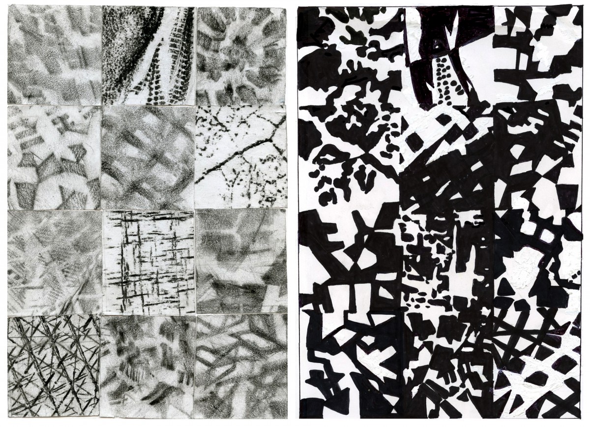
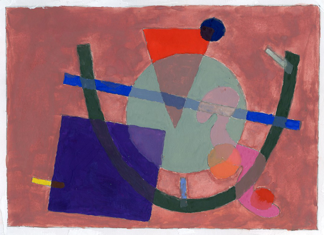
This work shows how can linear expressions can become two dimensional shapes and contain graphic design variables. Using gouache paint, this painting shows transparency in between the different shapes.

It’s amazing how small lines and doodles become oneĀ  to create an masterpiece. I found this project to be one of the most fun projects I had to do in class, the fact that we where able to choose on which colors we could work with its amazing. It was hard to manage the balance in between each color, and the transparency of each object. But I’ve learned a lot on how to control the colors. Choosing the placements in where the different shapes should go was the hardest part, since it was hard to balance them all out.

Tone was also Ā pretty important, specially in the background, depending on the color chosen , you could blend the background into the shapes, or you could make the shapes pop up. I feel satisfied with this project-Yes, the colors could had been a little been more intense, but the overall project was not as bad as I thought. The hardest part of this project was selecting sections that would blend in with 3 colors. When using two shapes to blend in two colors was essay, however, when it comes with 3 colors it was harder because there was a little bit of space where to choose from. I solved that by selecting smaller pieces like the circles and small dashes to save up space.

Leave a Comment

Filed under Coursework

The “Spot” Project

This Drawing includes 3 variables of graphic design: 3: Circles that have mini horns on top, creating a darker shade size: The corners and the middle part of the drawing shrink down in size distance: There is some distance between the smaller spots and the biggest direction:  Dots use direction to create a shape.

ThisĀ project shows how can you use one spot to create an image composed out of 3 variables of graphic design.Ā 
3: Circles that have mini horns on top, creating a darker shade
size: The corners and the middle part of the drawing shrink down in size
distance: There is some distance between the smaller spots and the biggest
direction: Dots use direction to create a shape.


This drawing includes 5 variables of graphic design: 5: Dots that have a darker shade on the top Distance: The smaller dots create distance between the biggest and medium dots proportion: different size of dots  interval: different selections of the dots create different scenes of motion  density: dots create density throughout each other direction:  medium and smaller dots are moving towards the bigger dots.

ThisĀ project shows how can you use one spot to create a image composed out of 5 variables of graphic design.Ā Ā Ā Ā Ā 
5: Dots that have a darker shade on the top
Distance: The smaller dots create distance between the biggest and medium dots
proportion: different size of dots
interval: different selections of the dots create different scenes of motion
density: dots create density throughout each other
direction: medium and smaller dots are moving towards the bigger dots.

This drawing includes 7 variables of graphic design:   7: three lines and some shade  distance: there's a distance between the smaller dots (back) and the biggest dots (top) proportion: there's different size of the dots  interval: each section haves something different going on density: the picture itself its dense because of the scenery  direction: bigger dots are coming at you  scale: different size of dots  size: smaller dots, bigger dots.

This project shows how can you use one spot to create a image composed out of 7 variables of graphic design.
7: three lines and some shade
distance: there’s a distance between the smaller dots (back) and the biggest dots (top)
proportion: there’s different size of the dots
interval: each section haves something different going on
density: the picture itself its dense because of the scenery
direction: bigger dots are coming at you
scale: different size of dots
size: smaller dots, bigger dots.

The ā€œSpotsā€ Project came out to be a challenge for me. Iā€™ am pretty good at drawing things that I create from my own imagination, but taking something simple like a spot, and creating a whole image from it was a real struggle. It makes it more complicated when for each one you have add different variables on each one. Another big issue I had with this project was finding out a way to balance the spots to make it look the way I wanted. Usually when thereā€™s others shapes involved itā€™s easier to create something out of those shapes. However in this case I only had one shape/ spot to work with for the whole design.

The three variable spot drawing was the easiest one to draw (obviously.) The five variable was the most fun one to do, since I’ve already had an idea on how it was going to look like, although it didn’t came out as amazing as I wanted it. The 7 variable was a real struggle, I had no idea on how to work so many variables together as one piece. It didn’t help either that the spot I chose was a bit trickery to work with, since it was composed of lines and shadows. However miraculously I got inspired watching the ā€œGame of Thronesā€ and from there I started working, which it didn’t came out half bad. Although it was a real struggle to not dirty the paper with all that pencil chalk.


Leave a Comment

Filed under Uncategorized

Texture and Pattern Project

 Texture/ Figure/ Ground, 50/50/b/w and pattern.  On the left it shows the original patterns, on the right same patterns , but 50/50 white and black balance in between each square, which makes all squares relate to one another.

Texture/ Figure/ Ground, 50/50/b/w and pattern. On the left it shows the original patterns, on the right same patterns , but 50/50 black to white balance in between each square.

I must admit, this project was extremely fun! From looking for patterns in my classmates shoes (which gave me an opportunity to socialize and make new friends,) to selecting a good size and cutting them and finally placing them together in balance. I guess it was a bit challenging trying to find other patterns other than my classmates shoes, but in the end I feel like the overall left side of this project was an success (Although it was a big hard cutting without scissors but with a blazer.)

Ā The right side of this project was a little bit tricker. I had to balance out each square to a 50/50 black to white, and make every square communicate with one another to make one overall piece. I had to redo this one part of the project for at least 3 times till I finally got it right. However I love the outcome of it, and in the near future I would definitely redo something like this.

>>>Plans for 50/50 black to white patterns<<<


Leave a Comment

Filed under Uncategorized

Parallel Lines Project

This is a small project from Graphic Design Principles I, Showing parallel lines that are giving movement between one another, creating the illusion of moving towards one direction.

This is a small project from Graphic Design Principles I, Showing parallel lines that show Ā movement between one another, creating the illusion of moving towards one direction.


Leave a Comment

Filed under Achievements, Coursework, Field Trips