
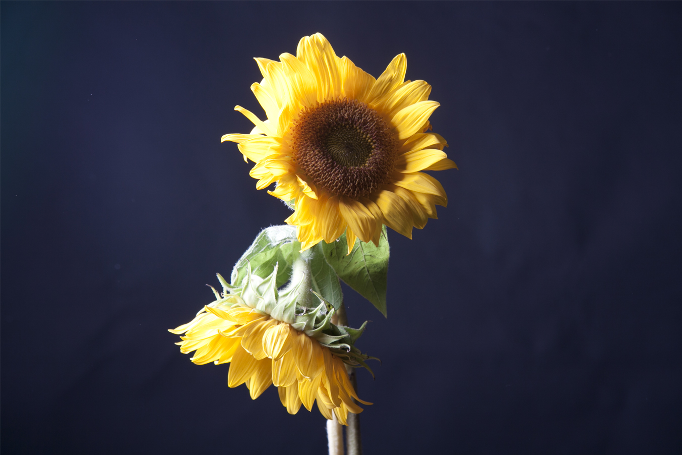
 I like this picture the most because it is extremely focus and it very bright like a happy color. The black background makes the color pop more. The lighting on the petals makes it look more alive.
Learning Log 2
SunFlower Lighting Photo.
 I like a lot how the flower looks like here. The lighting gives it some drama, nostalgic feeling.
The texture its real neat on the petals and the center of it.
Filed under Learning Log 2-Lighting Direction
Learning Log 2: Sunflower
 I feel that this is the strongest picture that i have taken due to the different qualities that this picture has. The way the light reflects off of the flower pedals. and the way you can see the textures on the sunflower. Also with the flower being centered the negative space around the flower makes the flower alot more powerful
Learning Log 2: Sunflower Party

This photo is great. I really love minimal pictures, especially when the subject stands out.
The vibrant flower against a gray background just works great, the lighting is totally focused on the flower and the
dramatic shading just makes it pop even more. I love the yellows in this image, they aren’t blinding but rather the perfect kind of yellow.
Filed under Learning Log 2-Lighting Direction
Sunflower


This picture was actually an accident. If I remember correctly I took this picture when we were moving the light around. This is actually side light. I love how there is a ray of light in the shot and its just so pretty.
Learning log 2

I really like this picture, Im not sure if its my best but there’s something about this picture that makes me smile and think its wonderful.
The picture has some upper negative space as with frame cropping, theres a little bit of more light on the left of the sunflower.
Sunflower: Backlight
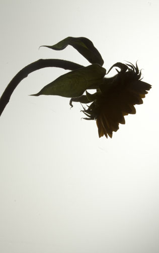
I really like this shoot. The mood of the bended sunflower adds to the backlight composition and evokes a lot of emotions. Although the flower is not completely dark i think it works great.
Learning log 2 – Regina Torres

My favorite picture from today was this one because there was a good use of negative and positive space and also because even though is a radical cropping, it only focuses on the petals, and also the light created some nice shadows.
Chair.
This was my favorite picture from the shooting today in class.
I like how the light its reflected on the chair, making high and low shadows.
The focus in front its sharp, while the other parts are blurry.
The picture has a sidelit lightning.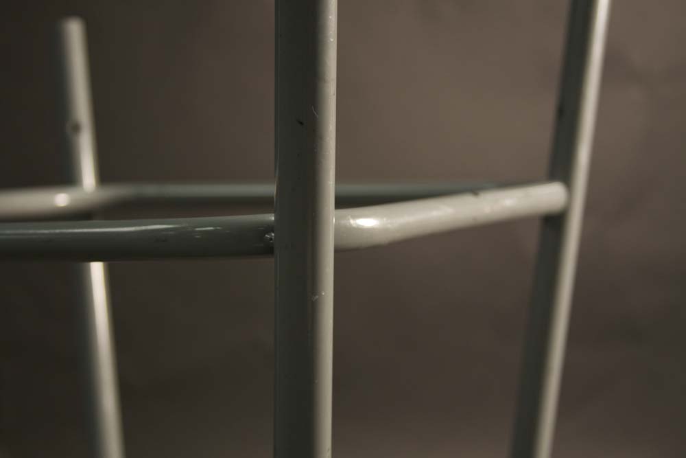
Filed under learning log 1-Composition
HW1
Michael Kenna – Morning Traffic, Midtown, New York City, USA, 2000
1,This is an image that is used to give off a message. With the use of black and white I felt that this image was very powerful, Yet peaceful being that there wasn’t too much going on in the image. I also feel the use of emphasized texture, and lines are elements that make this photo really strong.
2, what I think the photographers intentions were with this picture, were to be able to show us early morning traffic in NYC. What I got from this picture is, being that New York is such a busy city, which normally has large amounts of traffic, This picture was titled morning traffic which appeared to have very little traffic, which isn’t very normal for such a busy city. To me I think that this means that this picture was taken very early in the morning maybe around 5-6am. Being that the streets are empty and there are street and headlights on
3, In this image the photographer created a huge emphasis on the concrete floor in front of him, while having the distance blurred out. While in the distance you can view different light which represent all of the cars down the road. Also the concrete has emphasized texture in which the light from down the street is reflecting off of the wet concrete.
4, I feel that the technical matters help this image. I think that this image was meant to show us a different form of midtown traffic.
5, the graphic elements used in this photograph was a diagonal line. The first thing I happend to look at was the diagonal line in the concrete that I then followed upwards in the photo. And from there it leads to all the different lights from cars and streetlights that were blurred out.
6, What I found that this photograph reviled is that this image may have been taken really early in the morning being that there isn’t much traffic going on, as well as pedestrians on the street. Also I realized that this picture wasn’t taken long after it rained being that the concrete is still wet, in which there are still puddles and since the concrete is able to reflect light off of it.
7, This image has a really peaceful feel to it in my opinion. Being that this photo represents midtown traffic without it being much traffic, it kind of shows how there isn’t too much going on in the photo. Also I feel that the use black and white for this image was chosen so that you can focus on this image without the distraction. Since certain colors might instantly catch your eye and force you to look at it. The use of black and white leaves your attention undivided
8, the main thing that relates this photograph with the other photos by this artist is the use of black and white. Every image in this collection was taken in black and white and I feel that the photographer’s purpose was so that the viewer’s eyes can start off on an even plane when looking at the photo. By this not just one thing stands out as soon as you view the image. This can make different things in an image seem a lot more powerful serious and dramatic without the use of color. Also black and white photos can often give off this sort of classic and vintage feel to it. Another thing is the use of blur. With the certain things being blurred out, your attention is normally focused on everything that isn’t blurred out in the picture.

