Author Archives: Melissa Ortiz-Vasquez

Final Evaluation

This class has been extremely useful to me. I have considered myself a photographer since I was in high school, but I didn’t really understand any photographic terminology.

I’ve found that throughout this course I’ve actually come to appreciate and make use of composition and lighting, things that I didn’t give a second thought to before. Because of that, I find that my pictures nowadays are a lot better and actually have some degree of artistic merit.

I’m also glad I learned about the Camera Raw feature in Bridge. Seriously, I had no idea Bridge was that useful, or that it even had a use. I honestly used to think it was bloatware.

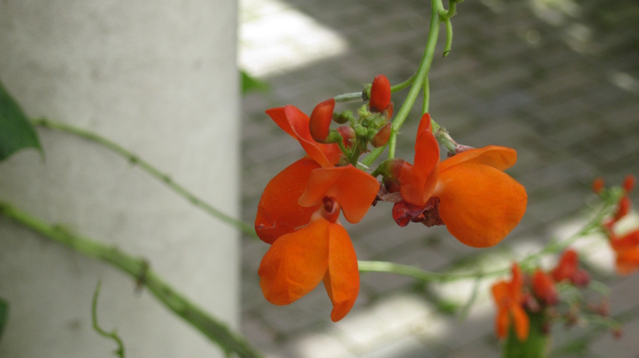
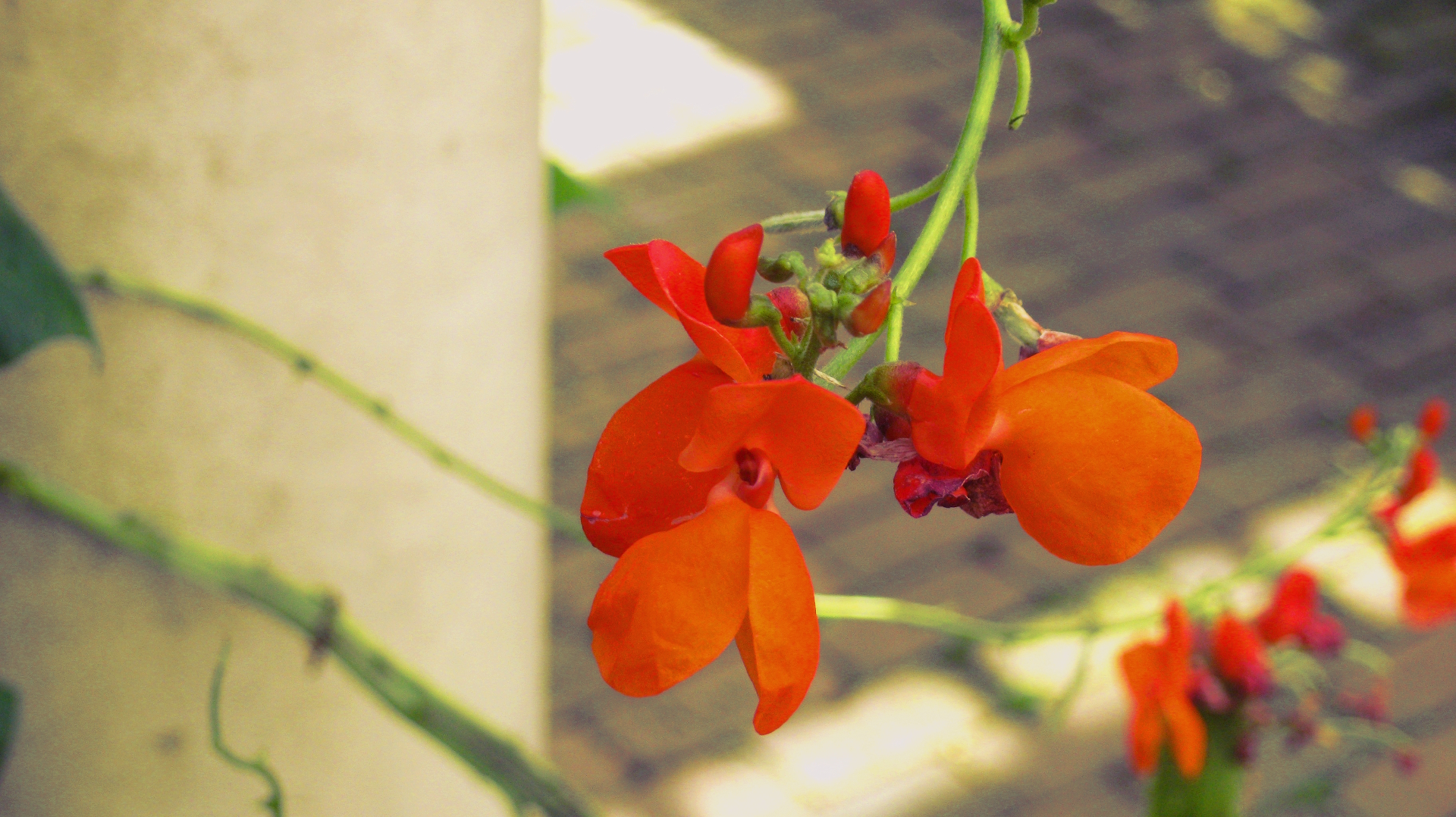
But mainly, what was most important to me was learning how to manipulate my finicky, cheap point-and shoot camera in creative ways and making it work for me. Discovering the macro feature on that thing is the single most important thing I’ve learned about it. I will exploit it to death.

As a designer, I feel like this class is the one that finally taught me to appreciate composition and its relevance in the design field as a whole. Composition is one of the most (if not THE most) important thing to understand when you’re a designer, so I feel like I can put this newfound knowledge to good use. Also, I’m almost certain that my growing ability to take decent pictures will come in handy at some point in my career. It’s always good to have multiple talents.

I feel like this course could seriously be expanded to teach students how to take good indoor shots at home, and overcome the limits of not having professional photo equipment lying around. While outdoor photography isn’t too hard to master, indoor photography presents a whole new set of challenges for those who aren’t used to manipulating lighting and camera settings. Basically what I’m saying is that most indoor shots I see are shoddy, and I’d love to learn how to make it work when I have a cheap camera and limited lighting.

Leave a Comment

Filed under Final Evaluation

Learning Log: Final Project

Working with Regina, we took a look at some of the pictures we took.
She particularly liked the one with the oranges, with its colorful contrast from the drab gray behind it.

I’ve been meaning to work with the theme of bifurcation, and I’ll make use of this type of contrast in order to invoke a feeling of ‘hope’ or a ‘light after the tunnel’ kind of thing.

Leave a Comment

Filed under Learning Log-Final Project, Uncategorized

Learning Log 7: Lights Everywhere

I found this picture to be the best one I thought of.
There’s a balance of dark and light just barely skewed towards the light,
and it almost appears to be a solid object in the picture.
The bright pink is the color that stands out most in a harmonious way against the browns and blacks of the rest of the image.

Leave a Comment

Filed under Learning Log 7-Painting with Light, Uncategorized

Learning Log 6 – Greenwood

During our trip to the Brooklyn Historical Society, our group learned that part of the cemetery was farm land that eventually became land to be sold to build homes on in the early 1800s, but at some point must have been bought out to become part of Greenwood cemetery.

This made me think that the area has an extensive history as being intended for the well-off. Weren’t the poor basically living in the slums in the 19th century?
I thought it would be a good idea to try and capture some degree of luxury in my shots. Some of the statues and elaborate graves in the cemetery indicate that some of the people buried there were either very important or very affluent. Maybe both.


Leave a Comment

Filed under Learning Log 6-Greenwood

Learning Log 5: Portrait Basics

1. What are important factors to consider when shooting a portrait?

When shooting a portrait, the most important factors to consider are the subject and the lighting. The subject needs to be able to cooperate in order to produce the    best possible picture, and the lighting must work for the situation. For example, dramatic lighting is usually a minus when portraits are involved.

2. What is the difference between broad and short lighting?

In broad lighting, there highlights that falls on the side of the visible ear. This works for people with glasses. In short lighting, the highlights fall on the hairline.

3. In a classic basic portrait set up, what is the function of the main light?

The main light is there so a proper portrait can be taken, without exposure being too high or too low.

4. In a classic basic portrait set up, what is the function of the fill light?

The fill is meant to reflect light from the main light so the shadows become softer. Without it, there would be too much contrast and too much drama.

5. In a classic basic portrait set up, what is the function of the background light?

The background light is meant to separate the background from the subject, so the latter stands out more.

————

This was one of the best pictures we took, in my opinion.
I like that the shadows are so soft here, I didn’t think it was possible in a dark indoor setting.
The subject manages to stand out even without a background light.

Leave a Comment

Filed under Learning Log 5-Portrait Basics

Learning Log 3: Pretty Flowers

Out of the 35 million 400-ish pictures I took, this one is by far my favorite.
I even pulled some Photoshop voodoo and added some saturation to it, then proceeded to make it my Wallpaper Of The Week. Maybe even the month, in this case.
Aside from the contrast between the vibrant oranges and greens versus the more understated neutrals, it just makes me think of a greenhouse in some fairy tale castle. I think it’s the column and the vines that seem to wrap around it.
Also, I just have a fondness for macro shots. There’s something about them that just looks so pro to me. Same thing with bokeh.

After applying some Photoshop hex magic, I ended up with this:

Which looks even prettier, in my opinion.

Leave a Comment

Filed under Learning Log 3 - Botanic Garden

Learning Log 2: Sunflower Party


This photo is great. I really love minimal pictures, especially when the subject stands out.
The vibrant flower against a gray background just works great, the lighting is totally focused on the flower and the
dramatic shading just makes it pop even more. I love the yellows in this image, they aren’t blinding but rather the perfect kind of yellow.

Leave a Comment

Filed under Learning Log 2-Lighting Direction

My New Wallpaper

The most successful picture I took today was the wooden texture. It’s a simple extreme close-up of an old stool, but it’s so chaotic and it works really well. There are a lot of different colors present, and even the parts of the wood that aren’t scratched up appear to be of different tones.  On this thumbnail, the differences in color are what stand out the most, but on the full-size version you can really see how deep the scratches are and just how damaged the stool really is. Seriously, how did this thing end up so damaged in the first place?

In any case, I just found my new wallpaper.

Leave a Comment

Filed under learning log 1-Composition

HW1 – Melissa Ortiz-Vasquez

Manhattan Skyline (Study 1) by Michael Kenna

1. What type of photograph is it?
Manhattan Skyline is part of a series of black and white photographs depicting imagery of New York City.

2. What can you tell (or guess) about the photographer’s intention?
The goal of the photographer was most likely to capture an iconic, dramatic shot of the Manhattan skyline in a minimalistic way.

3. What emphasis has the photographer created and how has that been done?
The viewer’s eye is drawn to the subject (the buildings) but the details are hidden away so as to not mess with the visual hierarchy. The photograph may have been taken during sunset so the light of the sun would be directly behind the buildings, acting as a backlight in order to give the buildings that silhouetted appearance.

4. Do technical matters help or hinder the image?
What would normally be a very busy and detailed image is reduced to a simple photograph of a horizontal line of buildings with water below it and the sky above it. Small details are minimized to the point of near nonexistence, which really helps the subject stand out with its sharp edges.

5. Are graphic elements important?
Yes. Because the subject is a horizontal line that extends through the entire photograph, it really is the first thing anyone will see. The distant eye-level viewpoint balances out the photograph by having the buildings act as a dividing line between the water and the sky.

6. What else does the photograph reveal beside what is immediately evident?
NYC is synonymous with the glitzy and glamorous city life you see on TV. This photograph, by being a minimalistic depiction of the skyline, reveals a sort of peace and tranquility that residents may forget within the city limits.

7. What emotional or physical impact does the photograph have?
The photograph gives off a very peaceful vibe with its lack of detail and calm waters. It feels like it’s depicting the city while “asleep”.

8. How does this photograph relate to others in the same series by the same photographer?
Like the others in this series, this photograph depicts an iconic view of New York City in black and white, reduced to a simple snapshot. It’s almost as if the usual city clutter were purposely being scaled down for the sake of those who aren’t used to it.

1 Comment

Filed under HW1