
Author: Ebony Derrick

Design Hero

GIF Animations


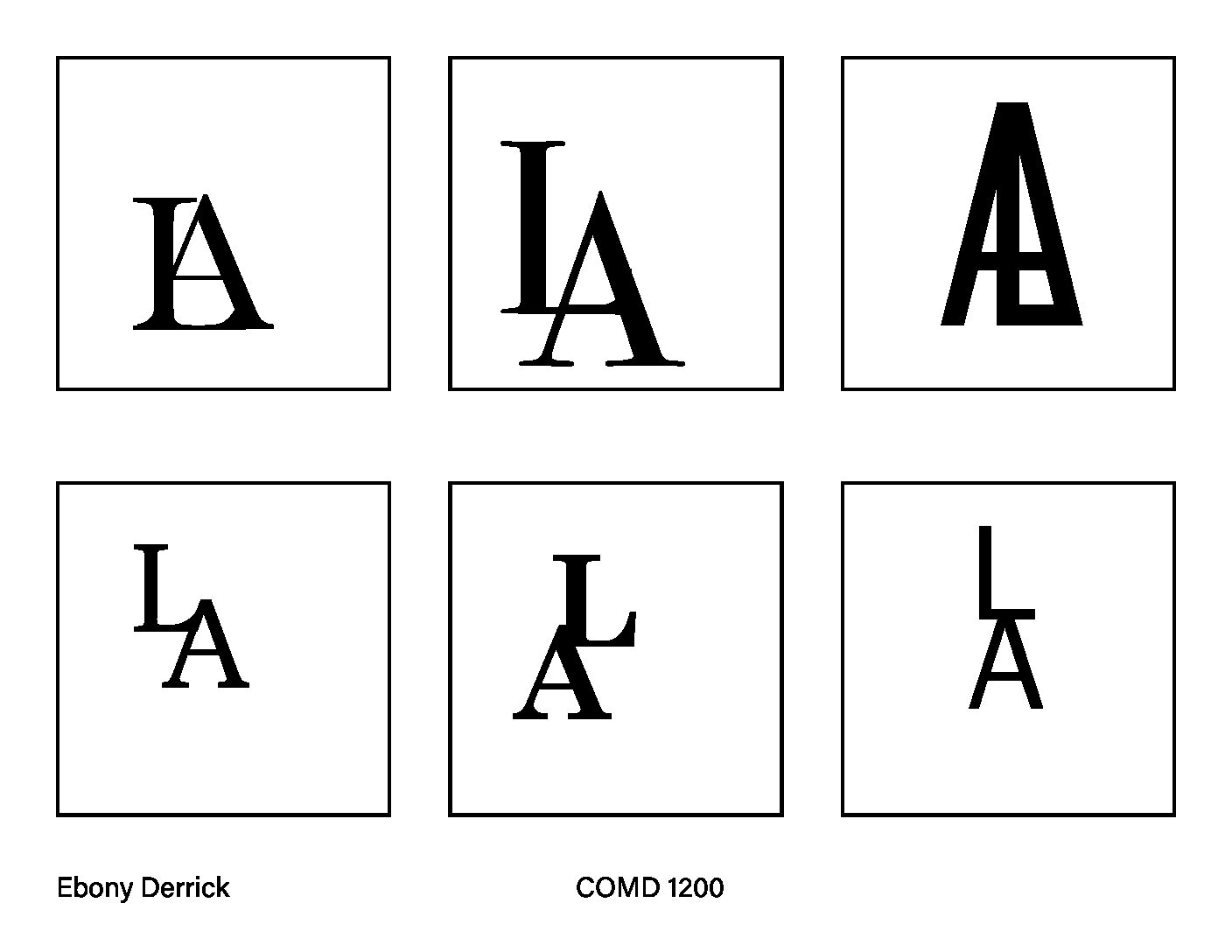
Letter Blending
Icons

Video Project
https://drive.google.com/file/d/1XNUOJbYPy8oFkbD-d7fInHbxLuUPCPzx/view?usp=sharing
My video project resolved around some of the artwork that I’ve created so far as a student at NYC College of Technology. The reason I chose to showcase the pieces in the video was because of how simple and effective they were, the colors and theme of each piece held the entire piece together and worked as a whole. I thought the challenging part of the video was going to be what to showcase throughout it but it wasn’t. The challenging part from my experience was the speech part of it since I speak fast, which sometime causes words to sound differently than what’s being said. I was tempted to type what I had to say throughout the video but I realized that the type would have been distracting from the pieces I wanted to show off. Overall, creating the video was a wonderful and fun experience, I’m willing to learn more about video creation and create more video projects like this one in the future.
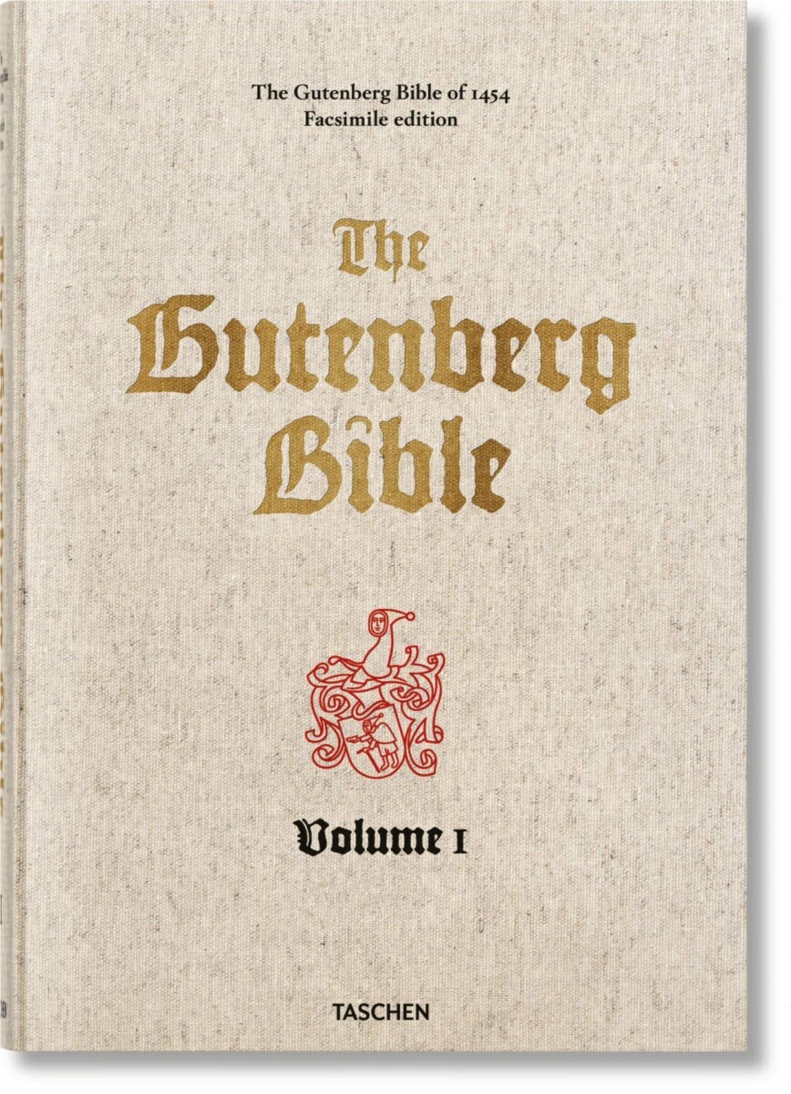
Gutenberg Bible Discussion Response
The font of The Gutenberg Bible has a more medeival time and religious font that was used more during his time period, while in our time period we use more simple fonts that are more simple and easier to read. The print we have today is similar to The Gutenberg Bible in terms of it being printed because we still can’t go back and undo something we print [unless its with white-out] and we use print to have hard copies of documents, bibles, books etc. instead of having to stare at a screen for countless hours.
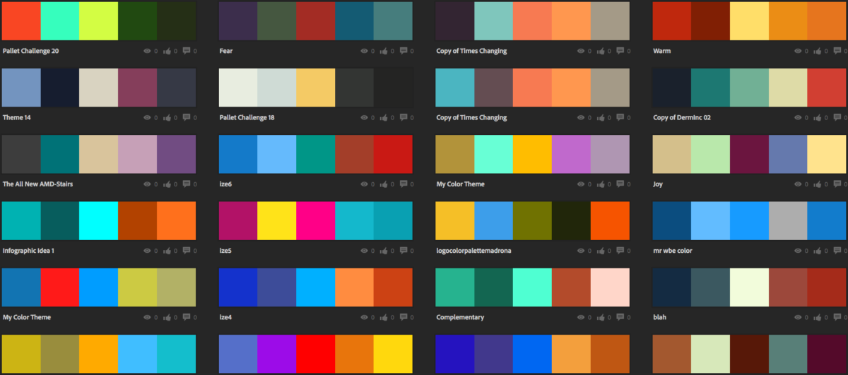
Discussion: Write about something you saw you found interesting from Adobe color’s site
Kamilla Hanapova grabbed my attention the most because the colors went from light grey to almost a black color then changed to a dark green kind of color which was something that I wasn’t expecting since its hard to see on the fashion poster itself.
French Supermarket Commercial and the Allstate Commercial Discussion Response
The supermarket commercial wasn’t effective since it didn’t have the aspects of a commercial like it should have. The crying babies was really taking away of the purpose of the commercial, it was distracting the purpose of it.
The Allstate commercial on the other hand was very effective since it gives out the information it needed to and there wasn’t any background noises taking away from the commercial. It was well planned and thought through compared to the supermarket commercial.
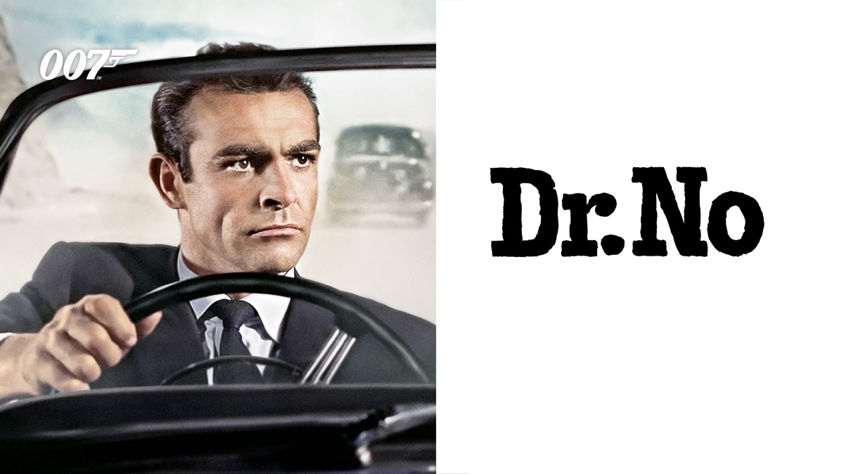
Dr. No, Apple Promo and North by Northwest Title credits Discussion Response
The James Bond video by Dr. No and the Apple video had more in common since they had similar color schemes, especially with the green and the red. The videos use soft colors to represent certain parts of the audio. In the dancing scene of the James Bond video, there were lively colors being used to express the tone of the audio. The videos interact with the color spaces, constantly using changing colors and the moods of the audio to interact with each other as well as using colors that works with each other. The colors from the Saul Bass video also, had similar features as the James Bond and Apple videos such as similar colors and the interaction of colors and movement in sync with the audio of the video. I believe that the way Apple created and used its own promo video is more effective since there was more thought put into it. It also showed a sign of a huge improvement and creativity was put into the video compared to the lady with the hammer video that they started off with.

