Ebony Derrick
Professor Tanya Goetz
May 24, 2021
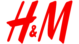
H&M Logo Evolution
Logos are created to grab the attention of the public and make a strong first impression to the public. It gives the brand a unique identity that causes people to notice the brand as soon as they see the logo. The H&M logo is an example of a logo that most people from all over the world would remember as soon as they see it.
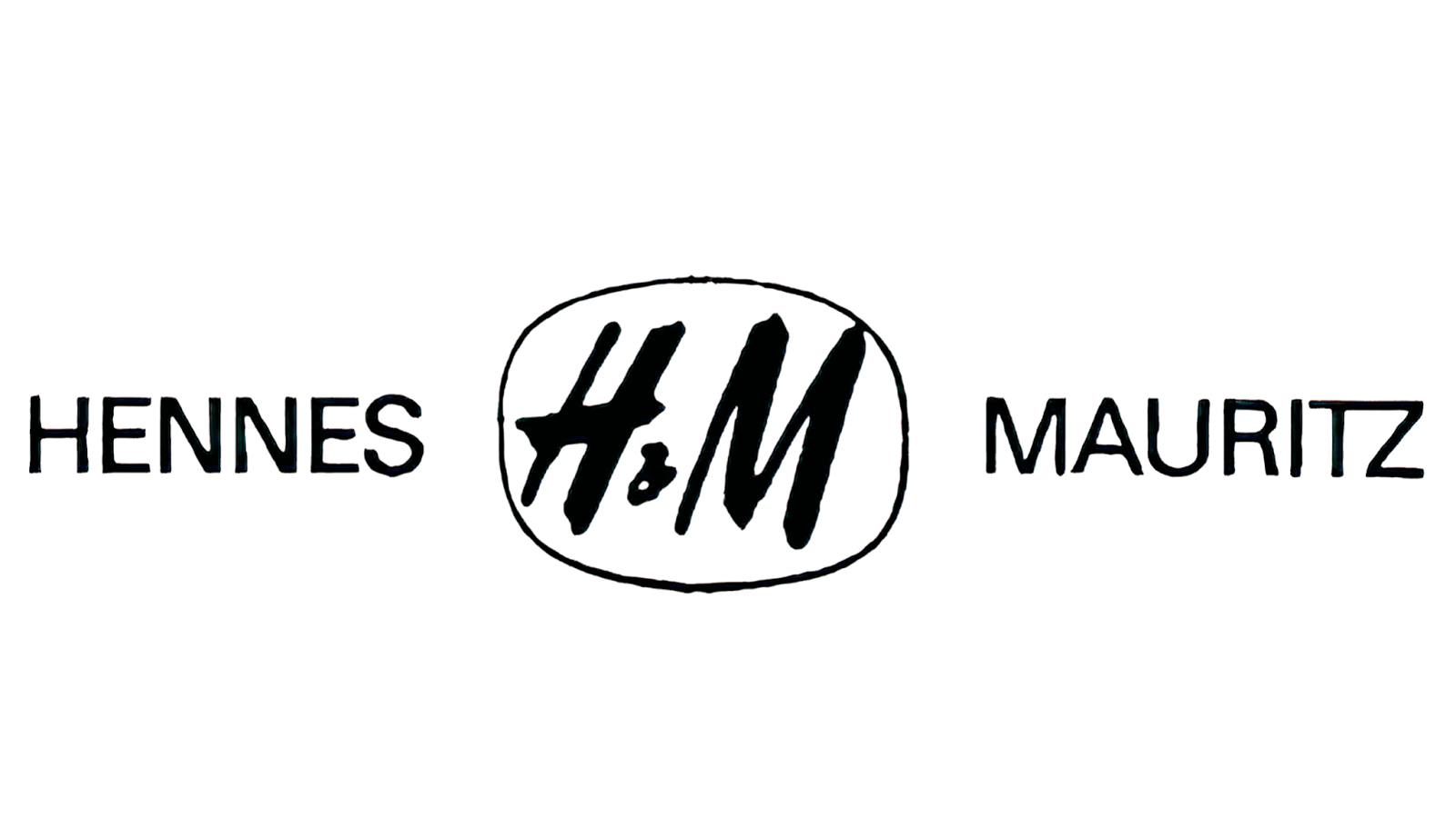
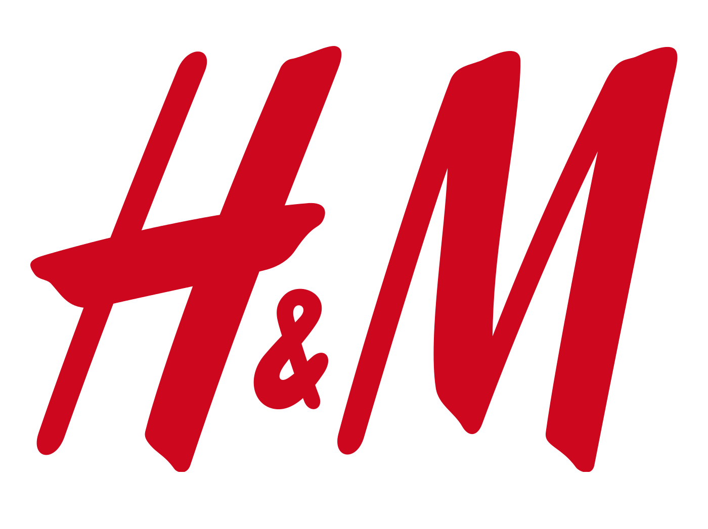
In 1949, H&M was founded by Erling Persson and made its first appearance, but was originally named “Hennes” which is Swedish for “hers”. The clothing company was originally to attract women. The first logo used a bold handwritten typeface, with a black and white color. Then in 1968, Hennes started to work with Mauritz Widforss. Mauritz Widforss was a Swedish American artist that created artwork of nature using watercolor. Hennes bought a retailer Mauritz Widforss, the store sold fishing supplies. Then overtime as they continued to collaborate, they became Hennes and Mauritz, a clothing store that sold clothing for women, men, and children . It caused the logo to change to “Hennes Mauritz”, and the “H&M” logo in the middle in a rounded box, all in black. The company switched from a clothing store meant for just women, into a store meant for everyone. The typeface of the 1968 logo was sans serif, but the “H” had the same design as the original logo. But the logo only lasted for a few months until the company decided to make a drastic rebrand of the logo, making the “H&M” in a cranberry-red or a scarlet-red, which is the first time that color was added into the logo. It uses the same sans serif with the same design on the “H”. The changes of the color and the use of just the letters to create the logo was made to be more friendly and welcoming to their customers all over the world, with more affordable prices and more fashionable items. The final logo refinement was in 1999, the only major change that was made was a color change to make it a little darker to make it look like a more serious and luxurious clothing brand. The brand’s logo attracts customers that want to change their fashion styles but at affordable prices. Though the design was already made to look decent, the font was made to look more straighter and professional.
As the company continued to expand, they currently have five thousand stores worldwide, with over one hundred twenty thousand employees. This makes H&M the fourth valuable apparel worldwide, Nike, ZARA, and Adidas carrying top three. In 2018, H&M created an advertisement that included an African American child model wearing a hoodie that said “Coolest monkey in the jungle”. This advertisement caused two partnerships with celebrities to end, one with G-Eazy and the other with The Weeknd.
Company logos are constantly changing its look, designs, and typefaces to look more modern and appealing. It allows the company to make changes that would help benefit them while catching their audience. For example, after the 9/11 terrorist attack, many businesses had to restart their businesses, which included fashion brands. Many brands had cancelled their orders of collections, causing the New York Fashion week to be cancelled for the first time. From the cancellation, the financial year income dropped from $876 million to $12 million. With the amount of income that the fashion industry has, it’s known that luxury is bought more than necessities.

The first H&M store, in Sweden.

First logo created in 1947.
Remake in 1968.
Changed in late 1968 and lasted until 1999.

The final change later in 1999.
Works Cited
“H&M Logo.” 1000 Logos The Famous Brands and Company Logos in the World HM Logo Comments, 1000logos.net/hm-logo/.
“H&M Logo.” H&M Logo | Symbol, History, PNG (3840*2160), 26 Apr. 2021, logos-world.net/hm-logo/.
“H&M LOSES ANOTHER CELEBRITY PARTNER.” 1 Jan. 2018, web.b.ebscohost.com.citytech.ezproxy.cuny.edu/ehost/detail/detail?vid=23&sid=e531e1a9-4414-43d9-8ee6-9e9e0affa552%40sessionmgr101&bdata=JnNpdGU9ZWhvc3QtbGl2ZSZzY29wZT1zaXRl#AN=J0E065413692918&db=a9h.
“H&M.” H&M Group, 31 Mar. 2021, hmgroup.com/brands/hm/.
“History.” H&M Group, 12 Jan. 2021, hmgroup.com/about-us/history/.
N, A /. “No End of Luxury.” web.b.ebscohost.com.citytech.ezproxy.cuny.edu/ehost/detail/detail?vid=11&sid=e531e1a9-4414-43d9-8ee6-9e9e0affa552%40sessionmgr101&bdata=JnNpdGU9ZWhvc3QtbGl2ZSZzY29wZT1zaXRl#AN=12446910&db=a9h.