As I started my search for a quote to use in my “visually enhanced quote project”. I came across “Be obscure clearly” by E. B. White,which serves as an oxymoron.So I looked up the definition of obscure.Obscure means to keep from being seen or not discovered.

So, my first example of my visually enhanced quote was to portray what the word means using only type. I used black, white and red to keep it simple. “clearly” is set in red, thinner stoke ,italic and much smaller to create contrast from the rest of the type. I set that in red so that would be the first things viewers see. The black veil I created covers some of the words so it appears to be hidden.
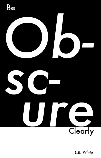
Second example,I did the complete opposite of the meaning of the word obscure.I made the word obscure bigger in size to create breaks in the word drawing more attention to it. So that can be clear and seen, then “clearly” is set small in comparison again to create contrast, reverse of the top with black type and a white background.
Last be not least , the final example consist of a grayscale photo of a door taken by me.In this example I went back to concept of the first one by sticking to the meaning of obscure. I used thin stoke type to keep it simple enough so that the picture is more important. Then I placed “obscure” vertically in the opening of the door,so that it appears to be hidden the shadows. Here is also a sample what it would look like in color.


No comments