In a household with two children under the age of 18, nickelodeon is on the tv screen nonstop. As young as I could remember the nickelodeon logo has been the same orange splat assicoateled with the green slime. I never would had thought it was redesigned so many times let alone had a different name. Nickelodeon was formly called “Pinwheel” and was designed by Tom Corey,Scott Nash , developed by Alan Goodman and Fred Seira. A divison at MTV Network called Viacom wanted to launch a channel dedicated only to children between the ages off six and seventeen. 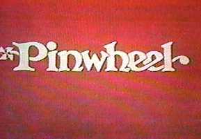
Trying to channel a mind of a child.They thought the use a silver ball flying across the screen would be recognizable. Goodman figured it would get the kids excited everytime they seen it. Soon he realized that didnt quite work so he called up designers in New York City to pitch new ideas. Corey and Tom used a bright orange ,splat with “Ballon extra bold” typeface. Splat idea was genius because the way they used it ,so that this orange blob could transfrom it into anything imaginable.
![]()
In my mind the thought process that went into creating the Nick logo is successful. They want to be recoginzed any and everywhere just by the color and shapes alone. The use of the orange color and the type face of “Nickoldeon” really help with branding because there is nothing that looks like and wouldnt be mistakeing for anything else. And that is an element I would need to use when I’m coming up with concept and designs of my own.![]()


No comments