My internship at ASAP – Microsoft PowerPoint. My internship at ASAP – PDF
Category Archives: Uncategorized
Blog #12
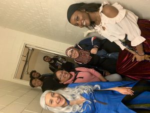
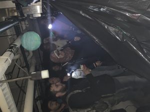
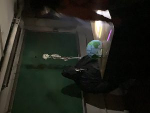
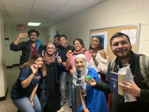
Ever since I started interning here at ASAP I have been part of our Student Engage Committee, or our Student Engagement Team. Everyone in the committee calls it the FUN committee. So while also working on the posts/animation I part take in weekly meetings with either everyone in the committee or just the head of the committee. Which is one of our own advisors Kelly Carmon who has taken on the role of figuring out how to engage our students and lower their stress that can accumulate during the semester. Kelly gave me and our designers the role to design the Escape room that was to happen during our Halloween event. It was our main attraction for the event besides the food. We took on the role of figuring out how to decorate and how to possible frighten 20 year olds. So we decided that we should focus more on the lore of the escape room and the riddles mixed into the escape room. We came up with 12 questions which were rotated based on which group would be attending the event. I used MAYA to create a small version to give an idea of how it should look when we go decorate on the day of the event itself. We used props and turned off all the lights in the basement of our building. Gave each group a limited amount of flashlights. We stood and tried to help our students solve the riddles within the 10 minutes that they were given. By using MAYA to give me an idea of how to light the basement made it perfect for creating the dark areas in the basement. Unfortunately we simply turned off all of the lights and let the students do the work with lighting. The escape room was focused on education while also focusing on Marvel. So the setting and story based around the escape room was Marvel themed, while the riddles and answers were educational while mixing in the infinity stones from the marvel movies. It turned out to be a huge success and our students really enjoyed their time there. So I am glad I was able to integrate MAYA into this escape room. I also dressed up with a plague doctor mask to engage the students and further the idea of the spooky darkness that they were about to enter.

Blog #11
While being the sole animator here on the animation team I realized that its rather hard to get help on certain techniques that I needed to learn during my internship. For example I made a cloud for the Halloween event poster/animation, and it was rather difficult to turn a regular polygonal circle into the shape of a cloud. Now the reason it was difficult is because clouds do not actually have a shape. As drawings people tend to go with a more sphere like shape. Its not a circle but more of a mix of shapes. Its rather hard to describe the shape of a cloud. So thankfully while learning how to deform a regular circle polygon into a cloud turned into a learning experience. I learned I can do it with other shapes as well, but to keep it simple I stood with circle. I asked around to get feedback and I was recommended to put the clouds into the background by making it seem smaller in the space provided. Again being the sole animator and being the only one who uses a 3D space to design things it was rather difficult. I decided to simply make the poster into a 2Dimensional position (the camera specifically) while keeping the rest of the elements in 3D. So the cloud and moon that are in the background are not smaller, but farther. I pushed them back and put the moon on top of the clouds to have a cartoony effect. Again our audience are all freshman students who are still growing into adults. So I am still able to have cartoony effects integrated into my design is not a big problem. This is just an example of how I have to learn on the fly and adjust my projects to how much I know about MAYA. Everyone else on our social media team are our peer mentors and we had a graphic designer that moved to CUNY central earlier this month. So now it is just practically designers with not a lot of experience and myself.

Blog #3

While working here at ASAP, I have been learning mostly office etiquette. Which, while not relating directly to animation, I am learning to work well with coworkers. Like I said before I am the only animator here at the program which is good and bad. I have complete creative freedom here, and I usually ask what they would like to see in terms of posts. So we have come to the conclusion that I shall make 3 major 3D posters for the programs upcoming 3 events. Halloween, Thanksgiving, and Christmas. I have about 3 weeks to finish and render each individual post while also working on things for the Fun Committee. So its going to interesting to say the least. The 3 as I have learned have to be interesting enough to get students to attend the actual events. So this comes to my advantage since I keep up on the latest trends and things that would interests people. I usually spend 2 days at the internship doing 12 hours a week. So normally I would come in the morning around 9 Am, and speak to the administrative coordinator who meets with the director frequently. I also usually speak to the other members of the social media group to find out exactly what they are doing themselves. While we work together they post things on the programs Snapchat and Instagram normally that I usually do not see as we sit on opposite sides of the office. While I am here I am doing a lot of research on what upcoming animators are doing while entering the industry, while also looking at my dreams companies standards. I do this just to be able to look at my work and decide if it is what others consider up to standard. Which is why I had such a hard time making my demo reel completely. I do everything on Maya which is the industry standard for 3D animation. Here I am learning everyday new techniques that would make my work go by much faster and seeing progress.
Banner/Logo
The reason I specifically chose to make my banner like that was because I really like Naruto and also I enjoy my two Initials DG. I made sure give the person who drew that specific Naruto drawing their credit. I also put 3 words that sort have defined my motivation for even going to college.
VIDEO PROJECT (LINK)
I had a fun time shooting this video with Cat. It was a fun experience, even tho we sounds rather serious it was actually an enjoyable time. You can ask Cat, we had no issues filming the lighting, sound, and quality of the video came out rather good. I have no complaints.
Field Trip
The Field trip was actually rather interesting. Mainly because it was a different experience because of the fact that I did not know that printing took so much work and effort to create beautiful pieces. I learned that newspapers are all over the place and busy is the fact that it has a limited amount of space. They make thousands sometimes millions of copies of the same pages over and over and over again. They make so many copies because they are high in demand. Sometimes people do not realize how much copies are made of the same papers and are dispensed and shipped out. This also happens daily! This is not the only form of printing we saw. We saw others that print out the huge billboards people see. He described it as the easier version, since its so far people do not really need to see all the details compared to that of a close up picture. They just need to see the important stuff and thats it. I actually enjoyed going to the UFT building. They seemed to enjoy what they did for a living.
Research Paper John Lasseter
John Lasseter is an American animator and film director who works for the officer of Pixar Animation Studios, Walt Disney Animation Studios, and DisneyToon Studios. John is 59 years old and is currently still working and animating for Walt Disney Animation Studios, and Pixar Animation Studios. The reason I chose this man to do my research paper, was most likely due to the fact that whenever I think of Pixar (which is my favorite animation studio.) I think of John Lasseter almost immediately. He is very known for his participation in very highly rated animated movies such as Toy Story and others like A Bugs Life. Lasseter was born in Hollywood, California and his mother was an art teacher. So you can see where his artistic side came from. While he was growing up his mother only influenced his passion for art and pushed him to do what he would like to do. As a teenager Lasseter seemed to have debated on what to do while growing up. He did have an enormous passion for drawing, he even drew in church, he still debated on what to go into when it came to college. Lasseter went to watch an animated movie, The Sword in the Stone, and because of that Disney film Lasseter finalized his decision to become an animator. He later began his university studies at Pepperdine University, but later continued his studies in California Institute of the Arts. He went into the (at the time) new character animation. After he finished his and got his degree he immediately received a job at Disney for his works during his studies. Mostly for Lady and the Lamp. There he began his career as animator and gained the credit he so deserves.
Logo Research
D/Gombs/Section D306/Week 2 Assignment
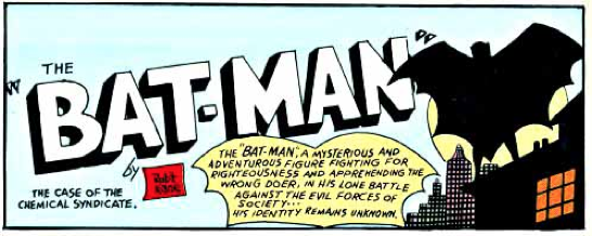 The world’s most famous superhero, Batman, is easily recognizable today by just having a simple black bat logo. Although this is the most known Batman logo today, it did not take one day for it to become this logo. As a matter of fact it took nearly 75 years to evolve into the logo to the left. The Batman logo was created and introduced by the comic legend Jerry Robinson, who was known for the DC comic Batman during the 1940’s. I am not going to talk about the typical bat icon that batman usually has on top of his chest. I am going to talk about the logos created in the late 1940’s for the covers of his comic books. This logo was created by Bob Kane, who is known as THE or one the creators of Batman. Bob Kane was the sole artist at the time for the Batman comics. The first logos were created to sort of hide the whole identity of “The Batman”. Which at the time no one knew was Bruce Wayne. The font Kane chose was rather bold and it was hand written. He also drew the figure of the Batman.
 Later on in the years Batman’s identity was revealed to the readers they gave him a face to match with the name. Same goes for the logo of the Batman which also has his face in between the “BAT” and “MAN”. The font was still bold and the words are split between the head of the the Batman logo. This Logo was created by Jerry Robinson, who is another well known creator and contributor to the creation of Batman. He was hired by

Kane to help with the art of the Batman comics in the late 1950’s.
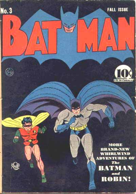
In a couple of years the word BATMAN was first reunited and put as one word (which is something they kept over the years). After this issue which was in the early 1960’s the Batman word is re-written finally and is a little more refurbished, which is something they tried to do to keep the readers at the moment.
(BRIGHT YELLOW IS REWRITTEN ONE)
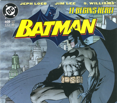
About 30 to 40 years later Batman has received a quite simplistic type of logo. It is a simple all caps font that has the Batman himself behind the logo. This, for the most part, stays consistent even today in the Batman comics. Has no dash or space between it, and the picture of Batman himself does not take up all the attention since the word is bright yellow. Although the original creators of batman might not have much contribution to the logos and covers for the Batman comics
today. They still influenced the simplistic way that the logo for Batman comics have evolved.

SOURCE PAGE.
http://kleinletters.com/Blog/logo-study-batman-part-1/
http://kleinletters.com/Blog/logo-study-batman-part-2/
http://kleinletters.com/Blog/logo-study-batman-part-3/
http://kleinletters.com/Blog/logo-study-batman-part-4/
http://kleinletters.com/Blog/logo-study-batman-part-5/
http://www.cbr.com/who-created-the-original-batman-logo/
https://www.fastcodesign.com/3064602/tesla-is-betting-on-scarcity-not-luxury

