If I had self evaluate myself while working at this office I would definitely say the amount of work I have been putting into my projects here at ASAP. But not to come off as an excuse I have been spending a tremendous amount of time focusing on my Senior Project final project. Having to make, model, and animate everything for a short is not an easy task. Especially since I am one person, and at a real studios there are separate teams entirely to do these things such as model, and and color and light. Having to do everything myself is rather intense. But the projects that I have handled here are not on such a large scale as senior project. I don’t have the pressure of handling such a large task, as I am part of a social media team and we feed off ideas and give each other feedback to be able to put out the most interesting post’s. So this project in particular is the project relating to our advertisement of our ASAP Halloween event that happened on Halloween day. My job was simply to make a 3D Poster that includes things relating to Halloween and give it a “spooky” vibe. When I thought about Halloween and what is considered as “spooky”, I instantly thought about a semi cloudy moonlight night at a cemetery of sorts. So I sketched out a couple ideas including pumpkins and a requirement was to have the ASAP logo included in the poster somehow. So I simply created giant letters in 3D and gave them the colors that the actual ASAP logo contains. I looked up the RGB for them so I got as close as possible for the colors. The pumpkins took a bit to model as it was my first time taking out pieces of a polygon to give it the signature creepy smile. I finally got the logo and put tons of pumpkins laying around the field, my only problem is that the project felt bland. There was a huge problem and it was that I had no background at the moment. So after receiving some inspiration and ideas from the team I went back and added a couple of large trees with no leaves on them. Just to give off sort of a forest vibe to the project. I also had the issue of lighting and coloring the things that are not the LOGO. So I went for a dirt at the bottom of the floor and a gave the trees a lighter brown shade but not too light. Something about it still felt very off to me about this. So I spoke to a colleague of mine and we were just talking about different things that we see in stereotypical Halloween films and “scary” movies. That same night I started messing with some shapes and polygons in Maya and got this nice long and twisty shape that looked a lot like roots. All I did from there was create more roots and added them to the “ground” plane of the poster and created this really weird living plant idea with it. It worked out really well, the roots were given multiple colors. I originally only had green but then there was too much green everywhere, and I tried changing the tones of greens I was using but it still felt like too much. So I went for some dark colors a couple blacks here and there. It worked out really well and I’d say that Im excited to work on the Christmas poster that is our next event.
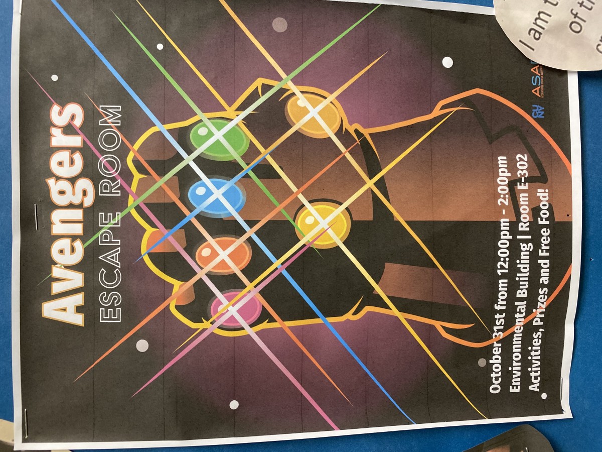
(P.S. I DID NOT MAKE THIS THANOS POSTER, It simply is the other promotional poster done by another colleague.)