D/Gombs/Section D306/Week 2 Assignment
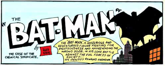 The world’s most famous superhero, Batman, is easily recognizable today by just having a simple black bat logo. Although this is the most known Batman logo today, it did not take one day for it to become this logo. As a matter of fact it took nearly 75 years to evolve into the logo to the left. The Batman logo was created and introduced by the comic legend Jerry Robinson, who was known for the DC comic Batman during the 1940’s. I am not going to talk about the typical bat icon that batman usually has on top of his chest. I am going to talk about the logos created in the late 1940’s for the covers of his comic books. This logo was created by Bob Kane, who is known as THE or one the creators of Batman. Bob Kane was the sole artist at the time for the Batman comics. The first logos were created to sort of hide the whole identity of “The Batman”. Which at the time no one knew was Bruce Wayne. The font Kane chose was rather bold and it was hand written. He also drew the figure of the Batman.
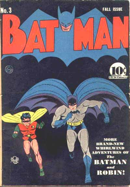 Later on in the years Batman’s identity was revealed to the readers they gave him a face to match with the name. Same goes for the logo of the Batman which also has his face in between the “BAT” and “MAN”. The font was still bold and the words are split between the head of the the Batman logo. This Logo was created by Jerry Robinson, who is another well known creator and contributor to the creation of Batman. He was hired by

Kane to help with the art of the Batman comics in the late 1950’s.
In a couple of years the word BATMAN was first reunited and put as one word (which is something they kept over the years). After this issue which was in the early 1960’s the Batman word is re-written finally and is a little more refurbished, which is something they tried to do to keep the readers at the moment.
(BRIGHT YELLOW IS REWRITTEN ONE)
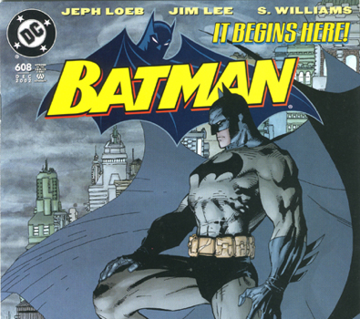
About 30 to 40 years later Batman has received a quite simplistic type of logo. It is a simple all caps font that has the Batman himself behind the logo. This, for the most part, stays consistent even today in the Batman comics. Has no dash or space between it, and the picture of Batman himself does not take up all the attention since the word is bright yellow. Although the original creators of batman might not have much contribution to the logos and covers for the Batman comics
today. They still influenced the simplistic way that the logo for Batman comics have evolved.

SOURCE PAGE.
http://kleinletters.com/Blog/logo-study-batman-part-1/
http://kleinletters.com/Blog/logo-study-batman-part-2/
http://kleinletters.com/Blog/logo-study-batman-part-3/
http://kleinletters.com/Blog/logo-study-batman-part-4/
http://kleinletters.com/Blog/logo-study-batman-part-5/
http://www.cbr.com/who-created-the-original-batman-logo/
https://www.fastcodesign.com/3064602/tesla-is-betting-on-scarcity-not-luxury

