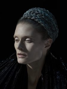
Nadav Kander is a London based photographer, he shoots portraits and large format landscape photographs. He began photographing at 13 years old and has had his works published in magazines such as the New York times, Rolling stones and etc. The photograph I chose from Kander is from a commission he did for Garage Magazine, a magazine dedicating appreciation for contemporary art and fashion. The commission he photographed was for the fashion line Comme des Garcons and Kander used rembrant light as a technique. On the model’s right cheek you can see a triangle and using this lighting technique he used no fill I believe since light and shadows are quite deep. I feel like this lighting technique compliments the subjects features around her cheekbones and slim nose and her outfit. The textures of her outfit are dark and the heavy light and shadow brings out those textures on the head piece and the sparkle on the outfit on her body.
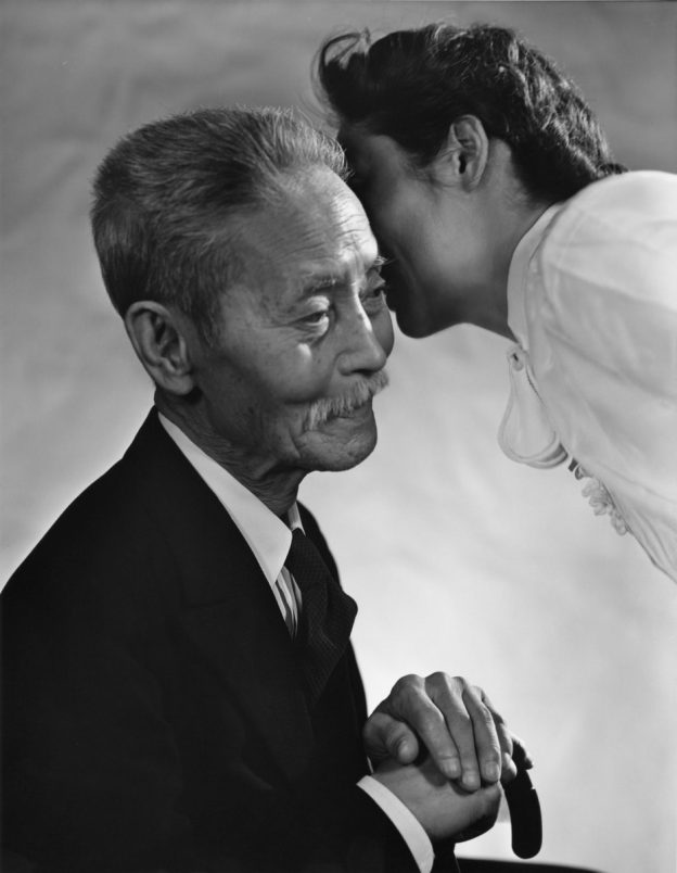
Yousuf Karsh was an Armenian Canadian photographer who was also known for photographing portraits of famous people such as Albert Einstein, Marilyn Monroe, Andy Warhol and etc. He was introduced to photography first by his Uncle when he immigrated to Canada in 1925, working for John H Garo who specialized in portraiture. Yousuf Karsh was known for his dramatic effects of light and shadow using artificial lights. The photograph that I was drawn to the most happen to be this one Yukio Ozaki, former mayor in Tokyo, Japan in the 1950’s. The lighting is on the soft side from diffusion of light possibly and I like how he incorporated 2 people, Yukio Ozaki and a women whom may be someone close to him or his wife I presume. It’s difficult for me to tell if she is leaning to tell him something or give him a kiss, which is also something I like from this photograph because it makes me question the story behind the photo, why not just Ozaki himself? Was this an unintentional moment to photograph or was it done on purpose? Is there other photographs of just Yukio Ozaki and what made Yosuf Karsh pick this one to show? I like the composition of the photograph, there is a balance of between the subjects and negative space around them that emulates light. There one thing I notice from this photo though and that is that Karsh’s subject’s face seems to be out of a focus a bit while more sharp and focused on the details of Ozaki’s outfit, hair and his hands layed on top of his cane and focus on the women’s blouse and hair as well. 


What I’d like to emulate in the upcoming portraits are emphasizes of light and shadow when using rembrant light without fill and taking a look what stands out from a subject, is it one of their features or their outfit? Would I like them to look directly at the camera or down or elsewhere, and I mention this because the photographs I was drawn to by these two photographers, their subjects are looking down and are not facing the camera.


The Kandar photo you selected is so elegant. wow. And as you say it is a fantastic example of Rembrandt light. The key triangle is really clear. It is also an example of short light. the model’s face is in a 3/4 view and the light is falling on the side of her face with the features.
As you point out the narrative is intriguing in the Karsh photo.
the two photos you picked really bring out the similarities between these two great portrait photographers despite the difference in the time period in which they worked.