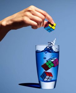
Marcel Christ and Greg Shapps’s photographs of liquid in glasses both show the ability to capture object and in a glass in a surrealistic manner. Shapps’s photo is still more natural and is a product of extremely good timing and well-placed lighting. While Christ’s photo is much more heavily reliant on photoshop and post-processing. The emphasis in each photo is also different and reflects that consideration. In Christ’s photo the viewer is much more concerned with the outcome of the liquid being poured into the glass, and the organic tree form it creates. Meanwhile, Shapps’s emphasis is about the anticipation of the Rubix cube entering the glass and creating the splash that is seen below.
Inspiration: Yousef Karsh & Nadav Kander
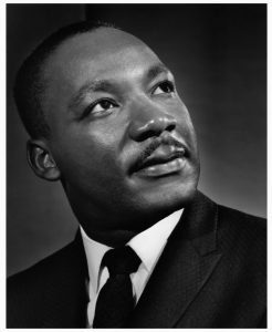
Although operating in different decades the work of Yousef Karsh and Nadav Kander, bear many similarities. Both of their careers as portrait photographers were based on their iconic photographs of activists, world leaders, and thinkers. Kander’s work is noticeably more modern, the aesthetics of his portraits break convention and push the boundaries much more than Karsh’s do. In many of Karsh’s portraits, the subject appears to be lit from one a single light and more often than not is not making eye contact with the camera but rather looking behind or away from it. This gives his photos a very pensive quality to capture the personality if those he photographed.
Kander’s subjects are similar in that they also don’t typically make direct eye contact with the camera and are of similar status and intellect. But his lighting is much harsher, overall have more contrast to them, giving his subjects this elevated, almost heroic look. This can be seen in his portrait of Barack Obama, where Obama stands in profile and is lit using short lighting (which is almost close to rim lighting)

Richard Foster
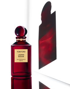
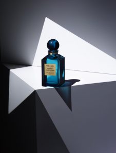
After taking a look at Richard Foster’s work, the ones who really stood out to me were the ones of fragrances. He uses the colorful reflections of the fragrances as an elemental design in his work. The shadow is in color instead of the usual black shadow. The composition of his background typically depends on the shape of the fragrance bottle.
In the Tom Ford Fragrance shot, the main light is coming from the left side and is pointing slightly up to cause the colorful shadow on the white “mirror”. There also is a backlight to successfully separate the fragrance from the background.
In the Richard Foster Bottega fragrance, the light seems to be coming from the back of the product. This then forms a colorful shadow in front of the fragrance. The shot itself is taken from above at an angle to be able to capture the shadow.
In the last Tom Ford fragrance shoot, the lighting seems to be coming from the left side up above. This then causes a shadow on the other side of the fragrance which gets bent down due to the edge of the table or platform. There is also a fill light in front of the product which allows the viewer to see the front of the fragrance along with the name.
Michael Paul Smith
It is always intriguing to see how people make their passions a reality, especially those that are not very common. Before Michael became a model maker and photographer he had a list of continuous jobs. He stated that you will learn from everything you do in life and eventually use it. I can not agree with this more, sometimes in life, we do or learn things that we feel we will never use again but to our surprise eventually, we do. His mailman job led him to an understanding of how towns were built and it allowed him to understand where to photograph his models. The most impressive thing about Michael is that he is no fancy photographer with fancy gear. He uses a standard handheld digital camera and natural light. The light ranges from a standard desk lamp or light shining through a window. Michael uses forced perspective to create his backgrounds. Even though he was not technically trained, Michael relied heavily on his eyes to create the desired perspectives. This was a reminder of how important understanding the basics is.
Gregory Heisler
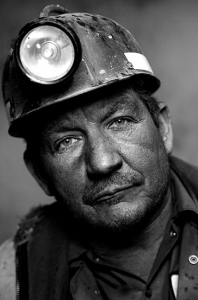
It was very interesting to see the work of Gregory Heisler. He is very talented and is able to range his composition from traditional portraits to fun an whimsical. The portraits that really stood out to me were the ones of the miners. Immediately I notice that there is a light that flashes right in front of him because there is barely any shadow. The only shadow visible is on the left-hand side which is probably caused by the tilt of his head. The lighting choices allow you to see the details on the miner’s face which look worn down due to his profession. The subject’s eyes are squinting as if he is looking directly at you expressing his hardships. There is also a light coming from above which is highlighting his hat. I greatly enjoyed looking at Heisler’s work and look forward to following him from here on out.
Glass Photos
In the glass photo of Marcel Christ it seems like the photo is taken from a lower angle. The glass is light up evenly all around allowing you to be able to see through the glass clearly. The milk splash was definitely photoshopped in to look like a tree (which I’m guessing it is to give an organic feel). Tha background is well light to give a bright optimistic outlook on the milk product.
In the photo by Gregg Schnapps, the glass is shot against a colorful background which gives the photo a little more playful atmosphere. This was a good choice given the product in focus which is a Rubix cube toy. The background is also lit in order to be able to properly separate the glass from the background. The photo is taken head-on with the glass allowing you to see right through the glass. There is also a light placed 45 degrees over the glass which causes a shadow under it. The third light is set up above the hand in order to bring it into focus.
Even though both photographers focus on movement in the glassware, they are very different in moods and shoot set up. I was able to find more of Marcel’s work but unfortunately, I wasn’t able to find more of Gregg Schnapps so couldn’t make more of a comparison.
Final Project Proposal
My final project will be bringing awareness to gum etiquette. I will do this by photographing people blowing, chewing and playing with their gum. The tagline will state “gum criminals” and followed by “the obnoxious gum popper” of the “uncontrollable gum blower”. It basically brings focus to all the things people do with gum that annoy others. Fist I will photograph in a light background studio, people looking “bad ass” while chewing gum and some of someone flirtatiously playing with their gum. The other photos will consist of a profile view of people blowing gum. The version will be of a dark background with someone popping a bubble gum bubble in peoples ear. The only light shining will be on the subjects faces.
Inspiration Gregory Heisler
The work of Gregory is really interesting because for each category of images that he’s taken they all show the exact feeling of what he meant to take. You can see that his pictures are very detailed, they show a lot of emotion and many different expressions through out each image. Most of his images are portraits and are black and white which in my opinion show more details , specially in peoples faces and their expressions. My favorite pictures are the ones under the quiet category because they show more emotion through the peoples faces and postures.
Inspiration Gregory Heisler
The work of Gregory Heisler is really interesting because most of his photos have a lot of emotion. Like it captures the moment that a person is having. The photograph that I chose is ( ed bolszetian portrait ) What I like about this photograph is how the background light is around the old man and the black inner corners. In this photo, the face expression is on point. He looks like he’s going through some serious situation because there is a strong light on half of his face. I like how the right side of his body is dark but not so dark that you can’t see anything. That darkness is what gives this photo a more dramatic look because we can still see it in the dark.
Inspiration Richard foster
After seeing the work of Richard foster I have noticed that all of his work looks clean. He plays a lot with the lighting and controls really well the reflection of the object. He uses different colors in the background how we did in class. One of my favorite projects is the Tom Ford fragrance (Tom Ford, Jasmin Rouge). There is two bottle of fragrance. One is in the front and the other is behind. I like how he has the front bottle clearly and even you can see the glass. For the second bottle, you can’t see the bottle, but you can see a nice reflexion on black. What makes Foster a really good life photographer is how he takes the object of a product and make it interesting. Even if it is only glass. Also, his work shows how one color can be united with the product and make a more interesting concept.

