The work of Gregory is really interesting because for each category of images that he’s taken they all show the exact feeling of what he meant to take. You can see that his pictures are very detailed, they show a lot of emotion and many different expressions through out each image. Most of his images are portraits and are black and white which in my opinion show more details , specially in peoples faces and their expressions. My favorite pictures are the ones under the quiet category because they show more emotion through the peoples faces and postures.
Category Archives: Uncategorized
Inspiration Gregory Heisler
The work of Gregory Heisler is really interesting because most of his photos have a lot of emotion. Like it captures the moment that a person is having. The photograph that I chose is ( ed bolszetian portrait ) What I like about this photograph is how the background light is around the old man and the black inner corners. In this photo, the face expression is on point. He looks like he’s going through some serious situation because there is a strong light on half of his face. I like how the right side of his body is dark but not so dark that you can’t see anything. That darkness is what gives this photo a more dramatic look because we can still see it in the dark.
Inspiration Richard foster
After seeing the work of Richard foster I have noticed that all of his work looks clean. He plays a lot with the lighting and controls really well the reflection of the object. He uses different colors in the background how we did in class. One of my favorite projects is the Tom Ford fragrance (Tom Ford, Jasmin Rouge). There is two bottle of fragrance. One is in the front and the other is behind. I like how he has the front bottle clearly and even you can see the glass. For the second bottle, you can’t see the bottle, but you can see a nice reflexion on black. What makes Foster a really good life photographer is how he takes the object of a product and make it interesting. Even if it is only glass. Also, his work shows how one color can be united with the product and make a more interesting concept.
Gregory Heisler
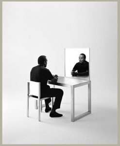
This image by Gregory Heisler is of OJ Simpson, he sits at an empty mirrored desk with his hands folded staring into his reflection. There is a nice range of gray, deep black and bright white focusing the eye on the subject’s gaze onto himself. The desk is at a 45-degree angle away from the photographer, which creates a nice light in the mirror that further isolates Simpson. He wears all black, which further contrasts the image on the soft gray sweep & metal looking chair, this also frames the subject. Light reflected off the back of the chair brings the eye to the bright area on the mirror, leading to Simpson’s gaze. He investigates himself like he is wondering what his life turned into.
Glass!
Marcel Christ
The image is on a bright field setting. I think the light is being shined through a surface to help spread light. The image is shot at a low angel to make an interesting halo with the cup opening. Christ uses photo collaging to make the milk splash up from the bottom of the cup. This could have taken at least six images to put together for this one interesting image. While the primary tone of the image is very bright and clean the details in the cup rim and bottom really bring the work together.
Greg Schapps
Image is shoot on dark field set and lit from above. This is a sharp contrast color image with motion. The use of a neutral tone blue to contrast the mini rubric cubes was smart and captivating. The image is shot straight forward to emphasis the motion of the water as it settles from the splash. The contrast from the lower half the hand helps to keep the eye focused on the cup and contents.
gregory heisler
gregory heisler is a portrait photographer who shots in black and white. His photos are very powerful. He captures feeling to the point that the photographs speaks to you in a deeper sense. He have his models to pose for the pictures and the settings of the photographs really effects the mood and the storytelling that goes behind the pictures. I think I will use his photos as inspiration for my final projects. Using only black and white photos can help me to set the mood of anxiety throughout my photographs
Final project proposal
Im doing my final project on anxiety. Anxiety among students are a very serous and common problem. In my photos I will have students pose and they are being choked by an invisible hand from the back. And they’re head being pressed by hand. I will have other photo, where the students will be still in the picture but their face will have blur due to motion that represent the thoughts and anxiety they have to experience
The article im using to link my project is https://www.mercurynews.com/2018/04/29/a-push-for-mental-health-care-at-colleges-depression-and-anxiety-really-eat-up-our-kids/
http://www.collegian.psu.edu/news/campus/article_7d4bc4e4-435b-11e8-a275-73a5fdb251f2.html



Final Project Proposal
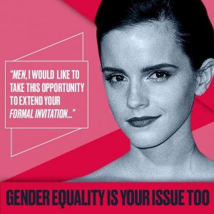
For my final project I decided to do a campaign about What does being a woman mean to you? And my target audience are women of all ages.This idea was inspired by my gender studies class, when our professor asked us this question in the beginning of the semester and asked to write a short essay about it. So I want to do the same thing but in a series of photographs of women. I will ask them what does being a woman mean to you? And ask them to give me one word and show that in their portrait.
My audience are women of all ages.
My ideas/style for the ad would be similar to the he for she campaign and #likeagirl campaign.
Niko Final Project
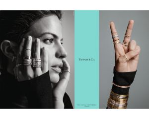
For my final project I have decided to test my abilities and push myself I do a magazine ad for Tiffany & Co. and Saks Fifth Avenue. I will have to admit doing this shoot would be a challenge because this is a something I have tried to before and failed to meet the overall object. However, I am not going to give up and will success this time.
My target audience would be for individuals 20+ due to the fact both of these companies’ retail very expensive and high-quality items targeted to those who have a large number of funds and mature customers. To show this aspect of these retailers, I would need a model who has a mature look to their face somewhere around the age of 25-35.
In terms of the lighting and set, I would most likely use a white background because, I can make the background itself white or grey which both of these retailers use in their campaigns. The lighting for this would incorporate a one to three light setup. I would be using a 32in octabox and 40in beauty dish to create some very unique quality of light.
Final Proposal
My final proposal will be on “DOLE” which is a worldwide team of growers, packers, processors, shippers and employees is committed to consistently providing safe, high-quality fresh fruit, vegetables, and food products, while protecting the environment in which its products are grown and processed.
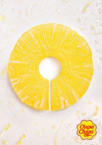
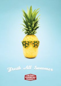
Since they sell fruits, I would like to concentrate on a specific fruit which is pineapple and do advertisement posters on “Benefits of Pineapple” based on this brand. Here are my images that I find inspiring for this project.
My auidence is people ages from 20 – 35 who are more likely to enjoy eating fruit. My images will include people and still life for my ideas. I would like to do cheerful and playful for my photographs. The lighting will be bright with shallow depth of field. The color of the background will be pure and light colors.
Here is the link of an article which explains the benefits of pineapple

