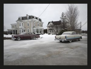
Michael Paul Smith’s photographic style consists of creating scenes using macro photography that do not appear as such. He does this through careful placement and camera angles and the result is nearly indistinguishable from the real thing. Smith’s illusion of scale is that seems easy enough to do, but from previous experience is extremely difficult. Regardless I still appreciate his craft in using smaller objects to create the “bigger picture” so to speak.
Author Archives: Sean McSherry
Inspiration: Greg Heisler
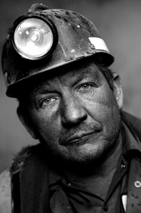
Greg Heisler’s portrait photography can be easily characterized by its deep emotional quality and high contrast aesthetic. In the shots, his subjects are almost always making direct eye contact, which helps establish this aforementioned emotional connection. This quality is very apparent in his portrait series featuring photographs of coal miners. The portraits are composed so that the subject’s facial expression is all the viewer really has to engage with.
Inspiration: Richard Forester
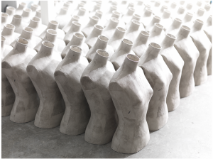
Forester’s still life photography is very influenced by flat, geometric shapes. Created by either the figures in his compositions or shadows cast by those figures, or a combination of both. One photograph of his that I think illustrates this perfectly is his perfume photography for Stella McCarthy. In this photo, the perfume bottle is seemingly suspended in a flat white plane. Dimension is created by the shadow made through the refracted(?) light from the glass. The shadow itself also creates an interesting shape which helps balance and stabilizes the composition. An example where the object itself in the photograph creates the movement and pattern in the composition is in his series of photographs of mannequins.
Inspiration: Marcel Christ & Greg Shapps
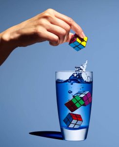
Marcel Christ and Greg Shapps’s photographs of liquid in glasses both show the ability to capture object and in a glass in a surrealistic manner. Shapps’s photo is still more natural and is a product of extremely good timing and well-placed lighting. While Christ’s photo is much more heavily reliant on photoshop and post-processing. The emphasis in each photo is also different and reflects that consideration. In Christ’s photo the viewer is much more concerned with the outcome of the liquid being poured into the glass, and the organic tree form it creates. Meanwhile, Shapps’s emphasis is about the anticipation of the Rubix cube entering the glass and creating the splash that is seen below.
Inspiration: Yousef Karsh & Nadav Kander
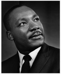
Although operating in different decades the work of Yousef Karsh and Nadav Kander, bear many similarities. Both of their careers as portrait photographers were based on their iconic photographs of activists, world leaders, and thinkers. Kander’s work is noticeably more modern, the aesthetics of his portraits break convention and push the boundaries much more than Karsh’s do. In many of Karsh’s portraits, the subject appears to be lit from one a single light and more often than not is not making eye contact with the camera but rather looking behind or away from it. This gives his photos a very pensive quality to capture the personality if those he photographed.
Kander’s subjects are similar in that they also don’t typically make direct eye contact with the camera and are of similar status and intellect. But his lighting is much harsher, overall have more contrast to them, giving his subjects this elevated, almost heroic look. This can be seen in his portrait of Barack Obama, where Obama stands in profile and is lit using short lighting (which is almost close to rim lighting)

Final Project Proposal
Main Topic: Ore Ida
Focus: Product
Audience Description: Young urban adults 20-30 who have forgotten about the great taste of OreIda French fries, and avoid frozen food because it isn’t healthy.
Tone: Fun & Fresh
Tagline: Seeing Things?
My photos will have a surrealistic and bright look and feel and will show French fries taking the place of common household items. (See inspiration from Olivia locher)
4 shots planned
French fries as shoelaces (Shoestring/regular)
French Fries as earrings (curly)
French Fries as a phone cord (curly)
French Fries as a picture frame (crinkle cut)
Gallery Hopping
Apperture Foundation: Prison Nation
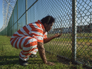
The United States has the highest rate of incarcerated people per capita in the world. The exhibition Prison Nation, as the name implies explores the theme of prison and incarceration in the United States. The selection of photographs in the gallery shows many different sides to life in prison and the prisoner’s themselves. Prisoners and Ex-convicts are often stigmatized as being morally incapable or lesser humans, rather than being put there by a failed legal system. One of the photographs that I was most intrigued by was Troy Holding a Guinea Fowl Chick, GreenHouse Program, Rikers Island Jail Complex, New York by Lucas Foglia. I love this photo because it humanizes the prisoner. (Troy) The moment captured here shows that not all prisoners aren’t these hardened dangerous menaces to society because even they can appreciate the little things (literally)
Yossi Milo Gallery: Grand Tour – Facades
The current exhibition at the Yossi Milo Gallery explores the different facades of churches around the world. Regardless of one’s religion, I don’t think it’s up for debate that some of the greatest architecture in the world exists because of churches. The series of photographs are extremely crisp and detailed and highlight the complexity of the architecture. What makes these photos even more impressive is that they are each made up of thousands of close up images.
Benrubi Gallery: Leaning Out

The exhibition /Leaning Out/ on display at Ben Rubi Gallery shot by Jeffrey Millstein celebrates aerial photography. Personally, I’m not very impressed by aerial photography. I find it to be like a cheat code, of course, people are supposed to be wowed by aerial photography cause humans don’t fly and we never see that point of view. There was, however, one photo from the exhibition that I was fascinated with (pictured above.) The reason why I enjoyed this photo, in particular, is because it’s not your cliche aerial photo of NYC instead it shows a directly vertical perspective. The rooftops of some of the buildings in the photos are instantly recognizable (at least for someone who pays attention to architecture and trespassed on rooftops.) I thought it was very interesting to see the difference from rooftop to rooftop, it is a very uncommon way to appreciate the architecture of a building.
Philip Lorca-diCorcia’s Hustlers
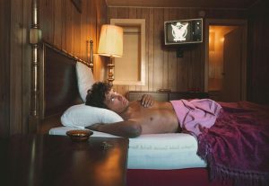
In the 1990s, photographer Phillip Lorca-diCorcia changed photography with his series “Hustlers.” The series depicts (what may seem like candid moments) of male prostitutes lives. However, each photo in the series was very well thought out and used studio lighting, while looking natural.
My favorite photo from the series is Mike, 26 years old, $40. The scene depicts Mike, the male prostitute lying down in a dingy motel bed as he gazes up pensively at the ceiling. This photo very much reminds me of the book Women by Charles Bukowski. It feels very 80s, due to the model’s haircut and the antiquated television in the background. The lower third of the composition is framed by the nightstand, which runs off the bottom edge of the frame to give the photo depth. It also leads us into the scene and to the model’s face. The upper third of the composition, shows a lamp, the TV, and the door to the bathroom.
The lighting arrangement of this photo creates an overall somber mood. The model’s face appears to be lit from a studio light placed at the corner of the bed adjacent to the nightstand. My reasoning for this is because of the glare you can see on the wood panel wall near the lamp in the background.
Pregnancy Photography
Annie Leibovitz’s portrait of Demi Moore for Vanity Fair and Awol Erizku’s portrait of Beyonce are similar in that they both capture famous female celebrities during their pregnancy. There are many differences between these photos but I still think each is successful in communicating their given message. Leibovitz’s portrait is much more dramatic and simple. It forces the viewer to focus mainly on Demi Moore’s emotion and appearance. She is portrayed nude against a neutral background is lit in a Rembrandt style of light at a 4:1 ratio. Her body is in profile while her face is turned in 3/4 view. This allows the viewer to fully engage with Moore’s expression while also highlighting the shapes and curves of her pregnant body. One could say she looks hopeful in the photo, (which any pregnant mother should be.)
This is in stark contrast to Awol Erizku’s portrait of Beyonce. In this photo, Beyonce is clad in lingerie and is posed against a background of colorful flowers. The overall tone is much less dramatic than Lebovitz’s. This is also due to the much softer less contrasting lighting. Beyonce is posed similar to Moore, with her body in profile but her face is fully facing the camera. The flowers that surround Beyonce also portray a different narrative, one highlighting the beauty and nature of birth/pregnancy. While Lebovitz is more concerned with the viewer’s connection to Moore Erizku’s has undertones about the theme of pregnancy.
Richard Avedon & Jonathan Mannion Comparison
Richard Avedon’s work has a very recognizable visual style. All of his subjects are (usually) composed against a plain (white) background and are high contrast. His style creates emphasis on the subject’s emotion and personality. Mannion’s portrait of Jay-Z is reflective of Avedon’s style because it uses a plain background and is high contrast and as a result shares the same emotional quality as the portraits done by Avedon. While this may not be correct to say I feel Mannion’s work doesn’t really differentiate himself from Avedon in any way. Besides the more contemporary subjects and more frequent use of color.


