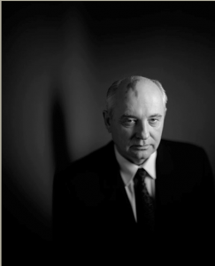
One of my favorite portraits by Gregory Heisler is from his simple series. His subject is placed more on the right side of the gride not really in the middle which worked with the choice of lighting he uses and the dark background. The lighting he used is I believe short or broad light because the right side of his face most of it has a light on it and the left the side of his face barely or has no light shining on it. The model’s expression is more of a serious kind of sad but more serious expression which worked out well with the lighting styles that Heisler used.
Author Archives: Noura Mahmoud
Richard Foster
Richard Foster’s work is beautiful he made still life photography look excellent with just perfume bottles, lighting, and colors. I believe he uses gels or adds the colors and angles the product in about a 45-degree angle to get the right reflections without this ugly glares. And that’s what he showed in his Prada fragrance campaign. For his Tom Ford campaigns, he used a live projection in one of his images for Tom Ford and I liked how he projected the image to just slide through the background showing the beautiful colors the through the bottle to a black background where it focused on the perfume bottle. Where his other Tom Ford image he angled the bottle with less light and fill which made the background dark but the product light with reflections and shadows. Same to what he did for the first Tom Ford campaigns the Stella McCartney perfume bottle is also angled the same way or almost the same way but the lighting and choices where different. It looks like the light is in front of the perfume but not directly shinning at it because of its reflecting in front of the bottle with a little shadow and glare but not this weird glare. Overall, Richard Foster’s work for these campaigns is really beautiful and my favorite is his Tom Ford campaigns. He made still life photography look good with just one item by creating shapes and colors so there is much more going on than just a regular product shot.
Michael Paul Smith
Michael Paul Smith’s work is amazing in the fact that he makes toy cars look like they are real life like cars. He sets up his cars on location on a table then takes the image up close i believe but he ends up with amazing results that amazed me. When I first looked at his work I thought these were real life cars that he shot. But then I saw the image under it of the toy cars set up in the way he took the image to make it look life like and also looking closely his work shows a 1950s feel based on the cars he photographs.
Philip Lorca-Dicorsia
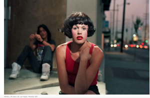
The photo that I chose from Philip Lorca-Dicorsia’s series is Marilyn, 28 years old, Las Vegas, Nevada Photograph. In case for composition Philip Lorca-Dicorsia took the photograph of Marilyn and positioned the camera so the the subject is right in the middle of the gird. Also liked that everything else is out of focus and the subject is in focus cause that’s the main focus. And having another person sitting next to but a little behind and not in focus but you can clearly see him really bring the whole photograph together. Philip Lorca-Dicorsia used a front light and a back light because you can see the light in her hair and separating the subject form the background. Looks like he also used front light because the light is directly on her face, it’s very light and bright to me.
Liebowitz/Erizku
Annie Liebowitz photograph of Demi Moore pregnant portrait shows more of a dramatic look. And that helped with the dark background and the fill light on her face that gave it more of a dramatic look. And the Beyonce photograph by Awol Erizku also had a dramatic/serious look with similar lighting styles, to be it looks like Erizku used front light and a fill to get this results. Both images have contrast. But I believe that Liebowitz’s image of Demi Moore has a strong and sharper contrast then Erizku’s Beyonce photograph. Which might have to do with the fact that Liebowitz’s image has no background except the dark background and the fill light making Demi Moore the main focus. Unlike Erizku’s image that has so much going on with the flowers behind Beyonce making us not only focus on her but on the background as well.
Final Project Proposal
For my final project I decided to do a campaign about What does being a woman mean to you? And my target audience are women of all ages.This idea was inspired by my gender studies class, when our professor asked us this question in the beginning of the semester and asked to write a short essay about it. So I want to do the same thing but in a series of photographs of women. I will ask them what does being a woman mean to you? And ask them to give me one word and show that in their portrait.
My audience are women of all ages.
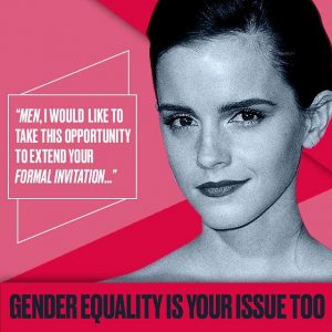
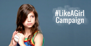
My ideas/style for the ad would be similar to the he for she campaign and #likeagirl campaign.
Marcel Christ and Gregg SSchapps
Marcel Christ’s glass photo is a beautiful glass photo because the milk splash doesn’t only show a perfect reflection but also in my eyes the milk splash looks like a tree. However, Gregg SSchapps took a different approach to his glass photo. SSchapps’s photo is more darker with more colors. His photo has more of a sharp contrast especially the blue color in the cup and the lighter blue background which brings it together. Marcel Christ chose to pour the milk in the glass and took the photo while that was happening which captured this beautiful motion. Also his photo is lighter than SSchapps’s with the reflection of on the bottom of the glass. SSchapps’s photo also shows reflection on the glass but with a dark shadow on the side. Unlike Marcel Christ, SSchapps chose to drop the rubik’s cube in the water to get this motion and took the picture while the forth one was in mid drop and showing the hand dropping the rubik’s cube
Richard Avedon & Jonathan Mannion
Richard Avedon photographs are some of the beautiful works because of how his subjects always standing out whether if its there expressions or their body language. Avedon’s portrait style of work is black and white on a white background which shows a lot of contrast in his subjects. Jonathan Mannion is a photographer for hip hop for two decades now. He photographs rappers, artists, designers, and actors. Most of Mannion’s portrait work style is in color and black and white. Which is similar to Avedon’s style. For example, Mannion uses some techniques that he learned from Avedon which is shown in his portrait of Jay Z. He photographs Jay z in front of a light background which made him standout because of the contrast. Most of his portraits are high in contrast and his subjects also standout like Avedon’s style.
Yousef Karsh, Nadav Kandar
Yousef Karsh is an American-Canadian photographer in the 20th century who is best known for his portraits of celebrities at the time. Karsh portraits are in black and white old school simple but beautiful work. His technique, is photographing them in a simple way whether if its looking straight at the camera or looking away smiling, no smiling but it all worked out and looks beautiful. And also his images has a smooth finish. One of the portrait that I love from Karsh’s work is the Audrey Hepburn, 1956 portrait. Its one of the first and favorite portraits that stood out to me, because its not like typical portrait of the subject just looking at the camera and smiling. She’s facing side ways not really smiling and closed eyes which to me shows elegance, beauty without even looking at the camera. Similar to an off guard pictures which I Love looking at and sometimes taking as well.
Nadav Kandar portraits were more new and with color and some black and white. The subjects in his portraits have serious expressions. Similar to Karsh, Kandar also photographed famous individuals. He uses light and shadows in his work and even some blurs like the portrait of Brad Pitt III, 2008 or Bobby Gillespie III, 2013; blur of hand movement across his face. Kandar’s portraits are not just colored or black and white portraits, he showed reflection, shadows, lighting, and colors on the faces, close ups, and zoomed out. The lighting wasn’t too much on their face but you know that some portraits did have lighting in one side of the face. My favorite portrait form his work is from his Solitary Portraits series and its called, Erin After Caravaggio,2004. The reason its my favorite because the subject stands out even though its not a close up, she’s on the grass looking at the water, with her eyes closed with her reflection. To me the image looks a little dramatic, serious, colorful and just beautiful.
Dawoud Bey
Dawoud Bey uses serious expressions in his photographs of the high school students. They all have eye contact, his photographs of the students is based on their personal lives on their stories and who they are or what they have been through. the lighting of his photos are focused on the face not harsh but just right for this series. The background is out of focus and which makes the students in the foreground more in focus. Like you can see their stories in their eyes there face is serious but their eyes is talking. The ideas that I got were not a lot but some ideas were the person would be siting on the floor and looking at the camera with a serious face, or sitting on a chair with eye contact but with a smirk on their face.


