My favorite portrait of Gregory Heisler in the Tab of Miners. I looked at all the picture and decided to photo 9 from the miners. This image was so interesting to look at because of the eyes. He has the straight face of being miners and the image has a lot of contrast. His eyes are most interesting part of this image. The eyes looked astonished and there is a really powerful focus. The is no background focus which great for the image. The hat is creating dark shadow above the eyes. The dirt on his face helps again to the eyes only. The lighting styles are front light which hitting right in the face. If I had to point out the what I look at first is his eyes, light on his head and then dirt on his face and finally his beard. The no expression face is actually attractive to look at it.
Author Archives: Anmol Kaur Dhamrait
Richard Foster
Richard Foster’s photography style is very elegant and clean photography. His photo with Stella McCartney is simple with reflection and a little bit of color. He works with light to have a greater contrast in his images. The shapes and negative and positive shapes are working for Tom Ford. Prada Fragrance is caught your attention because of color and reflection. He doesn’t create a mess it’s just to the point. He creates a focus on the model and plays with color. He is the best in taking still life of the fragrance. He also masters motion using contrast. He gets close up shots and uses shapes to focus on the product.
Final Project on Lactaid Milk
My final project will be on Awareness on Lactaid Milk. My target audience is people who are lactose intolerance. I want an awareness campaign on Lactaid Milk. I want to do still life and portrait photography. I want the images to be informative and cheerful also to excite the audience about the product. It’s definitely literal to explain the product. My images will include the Lactaid milk all products.
I want Lactaid Milk to be shown as happy and healthy living. Educating people on what the milk has and not have. I will use taglines to educate people more about the milk. I will need milk and gallon of milk and blue background. The light needs to be bright in order to see the white color milk.
For example, 75% of the population of the world is a lactose intolerance. All the taglines will be on facts about milk.
Marcel Christ and Gregg Schapps
The two glass photos by Marcel Christ and Gregg Schapps are different and similar at the same time. The difference between these two photos at Marcel Christ is pouring the milk into the glass and Gregg Schapps is using color full Rubik’s cubes. Marcel is using diffuse reflection to create a reflection. It makes the reflection paper and the milk is also blending in with white background. The milk is pouring in the into the glass and it makes abstract shapes with that. Gregg is using direct reflection to produce a full glass of water with a splash of Rubik’s cubes. Both are similar images because it contains same content of glass and milk and water. In Gregg’s images, colors are balanced and pleasing to look at it. Both photographers achieve means of direct and diffuse direction.
Micheal Paul Smith
Micheal Paul Smith is an interesting photographer. He amazes everyone with his style of photography. I love how toy cars and detail structure surround looks so real. Level of perception his photos have is so surreal because it looks like a real location where cars would be standing. He makes everything by hand which creates placement and scale. He knows how to angle every shot according to the location. He adds extra materials on roads to create a real experience. Looking at his photos can inspire me today use any objects nears and create a location to shoot. He is an expert in that but He changes our vision to create photos like his. He is changing the perspective of this of photography. His idea of using toy cars and detail models is very innovative and it evaluates on our vision to shoot in a different way.
Chelsea Galleries
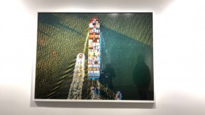
Last week, we visited Chelsea art galleries and we looked at many photographs. I loved three photographs which interested was Benrubi Gallary which was at 521 W. 26th St. The exhibition was leaning out and photographer Jeffrey Milstein. I was amazed to see how bird’s eye view photography. I never imagined a ship would so interesting to see from the top view. It is so colorful and it allows us to see how color harmony works in our surroundings. Benrubi Gallary enhance my vision of photography. It has from all around to get the most out of the ship.The colors are vibrant and require a lot of light to get this kind of shot.
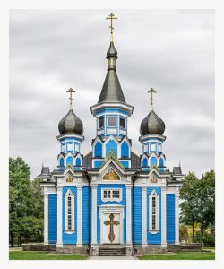
The second image which got my attention is this one at Facades at the Grand Tour at the Yossi. It was amazing to see how this image was taken by Markus Brunetti. I was amazed by the color and how the photo is taken at the center. The most amazing thing is every detail is captured in the photo and for a photographer, it is an achievement. The light is perfect for this kind of shot because of you able to see each detail in the image. Again I mention the color is very hard to get in outside location. For architect this the best example to idealized this building.
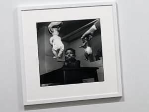
The photograph is taken By Gordon Parks. The image has a different angle from where it is taken from. It is a very unusual composition of this image. The kid in the image is looking very thoughtful and the two babies are handing in front of him. The image has al lot curiosity because you want to understand what is going on. The light has created a contrast effect on images which focuses on the babies and the kid.
Philip-Lorca diCorcia
My favorite photo of Philip Lorca diCorcia’s hustlers’ collection is the one Chris 28 years old leaning on to the poles. The composition is really interesting to look at. Chris is looking down and holding the poles and from there you have perspective in the picture from the doors and the poles. The light is hitting on his body which casting a shadow on the wall. Chris’s positioning the head down questions where he just wondering or being thoughtful about life. There is a street where the white color car is parked has a street light which projecting the building. It is casting blue light and the wall with many doors is orange. Lorca also plays with complimentary colors. I love this image because it has everything in one frame usually having sky and two building. I feel Lorca is very curious about unusual things and then turns them into the content of the photo. I like the composition and shadows which makes it interesting to look at it.
Inspiration: Leibovitz and Erizku
The two photos of celebrities are similar and different. First of all the two portraits are pregnant celebrities. Demi Moore by Annie Lebowitz and Beyonce by Awol Erizku. The difference between these two portraits is lighting. Demi Moore is using two lights one on top and another one at the right side of the frame. Annie just tried to focus on Demi because there are no background elements. The light does justice to the portrait and the positioning of the body grabs the attention of the viewer. However, the portrait was very controversial because Demi’s nude portrait for Vanity Fair made headlines because she was seven months pregnant.
In contrast, Beyonce ‘s pregnant portrait is using natural lighting. The light didn’t give a lot of contrast on the positioning of the body. The background of flowers is distracting to focus on the portrait. Beyonce’s expression is also not the strongest compared to Demi because she is posing with the confidence. Beyonce’s expression is very thoughtful. Also, the green veil is distracting light which is hitting on the face. It could’ve been simpler like Demi Moore’s. However, they both are different photographers. Demi is standing and Beyonce is on her knees. Although Beyonce’s portrait was not so controversial than Demi Moore because of time periods. Erizku used a lot color in the portrait but Annie had the plain background to show the light and shadows on the portrait.
Avedon and Jonathan
Richard Avedon’s portrait style is a natural portrait of people. For example, he takes photos of people with outside lighting. He takes the natural emotion of people. His photos have a lot movement to make the audience stay on the image. He has dramatic shots and candid shots of people. You can engage with his images and have a lot questions about the storytelling of the portrait. Jonathan Mannion was assistant of Avedon and has brought the style of bringing the emotion out. He obviously has color in his photography. He uses modern-day problems to bring it out to the world. A lot of his work has different kinds of culture. He uses natural light and Rembrandt lighting with storytelling.
Karsh and Kandar
Karsh was a famous photographer from the from the 20th century. He photographed famous people from Winston Churchill to Sophia Loren. His work of portraits tells a story of that era of time. His style of photography is he brings the moment out of a person through there eyes. He had an understanding of light which is still recognizable in today’s time. Many of his portraits have a different movement of eyes which is intriguing to the eyes. Also, his portrait has an attitude which can relate to the audience. The mood of the photos depends on what kind of personality. One photo, I loved is Nelson Mandela because there is this sweet connection which he pulled out of Mandela which he has his hands together for prayer and eyes are filled with happiness.
Kandar was a famous photographer who takes a portrait of people. His work shows more emotion. Each portrait has personalities that show various types of emotion that people don’t talk about on regular basis. His photography is very informative and collectible pieces which have to mean. He uses a lot of contrast to convey and draw people into his work. It tells us what people are going through in this world. For instance, Saqid Khan’s portrait is black and white but has a lot of contrast to show the personality. There is the impact of negative and positive because of split on the face. Both photographers have famous work of portraits but I would like to emulate the contrast and light in photography in upcoming assignments.


