Monthly Archives: April 2018

Final project proposal

For our final project, I chose ” Why a cup of coffee in the morning is good for you” and the brand that I chose is Nescafe. NescafĂ© is a brand of coffee made by NestlĂ© and it has a unique blend of Arabica and Robusta. I like this kind of coffee because is easy to make, and it has a good taste. Some of the ads that I have seen from Nescafe for me they are great, but I feel like they look almost the same. I wish to change that by taking new photos and giving them my own style.

These are some of the examples that I chose for my project:


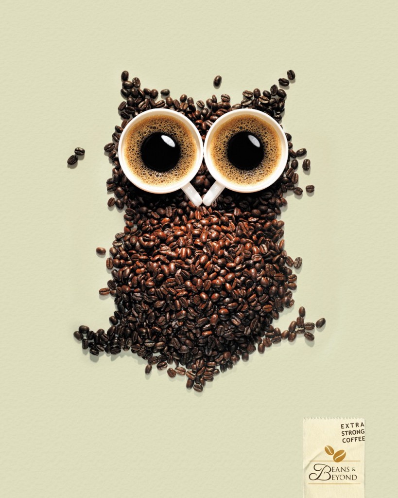
This is the first ad and my favorite that I chose as an example. I like how they took two cups of coffee and with the beans create an owl. Animals can show the emotion of a product than having people in their ad.


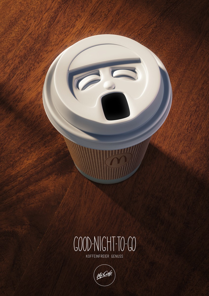
The second ad is really interesting because the cup of coffee has a face. I think that the lighting is perfect for this shot because it looks like the day is starting. I wish I could try that in my project. Also, the typography is good for this shot because it doesn’t disturb the photo.


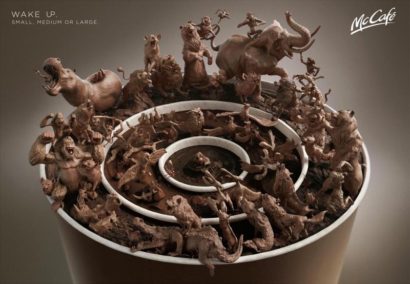
For my final ad, I chose a more creative shot that it has a lot of photoshop. It has three cups and each one show the level of your coffee. It’s almost like the first ad that I chose but they have a different concept. If I create something like this I would use animals toys.


How my audience will be people who drink coffee in the morning, I will only take photos of a cup of coffee and for a dramatic look, I will try to use beans. Also, for my shot, I will use a soft light because it shows the beginning of the day.

Inspiration: Marcel Christ and Gregg Shapps

For our homework, we have to compare and contrast their work. The first photo is from Marcel Christ. He’s a short film director and still life photographer.

The work of Marcel Christ is really pleasing to see. What I like about this photo is how he took the right time to take the perfect shot. When a liquid is pouring in a glass you don’t really think that it will make cool shapes, just the water going crazy in a glass. But, in this glass is different because the milk is forming a tree shape and is totally understandable because milk is good for our bodies and this photo is like saying “milk is life”.


The second photo by Gregg Shapps ( specializing in Product/Still Life and Healthcare) is interesting because the color of the water is really blue and when we were taking photos of a glass of water our water was not blue. Somehow I think that this photo could have some photoshop because the cubes don’t look like they were inside the cup of water.


In total, I think that these photos have something in common. When they pour/drop their objects into the glass, they want that splash for the photo to look more interesting. That is the only thing I think that they have in common. Their work could look the same but they have a different concept. Base on Marcel Christ’s work, his work is more like chemistry and forming shapes with liquid. However, Gregg Shapps has already the object to take photos.


Avedon and Mannion

The natural lighting in this image is emaculate.

Richard Avedon uses natural lighting in most of his portraits. His subjects use their face to convey a message to him. The emotion and the feeling in their face sets the mood for the portrait. With his portraits being about sex, money, drugs and/or emotion, Avedon gives chance to the subject to use the body as a symbol for their life. For example, the lighting on the image is great. Even though we know they are not in black and white, the image takes you for a great ride while making us still interested.

Johnathan Mannion uses front lighting in his projects of urban icons and album covers. When taking an image his artists uses various emotions in their body movement. His use of natural lighting when taking an image outside is emaculate. Being able to use the light of the outside to get the strong lighting on their hair and body is a special skill. I enjoy learning that Mannion was responsible for all the artists album covers images. I listen to most of the albums that he produced.

Philip Lorca – Dicorcia Hustlers

The photographs which Dicorcia took, were set it up with a couple of lights. But I feel like is the strongest one from all of them is the third photograph, where there is a woman standing out with rembrandt light and full of background with a blurry effect. Even though he used one light, he made the composition and the photograph stronger with other elements. Also the subject really pop-out and can seen separately from the background. I am not sure if the blurriness was necessary for this photograph, because the light on the subject is strong enough, which will not make the composition busy on the image.

Leibowitz and Erizku

LEBOWITZ AND ERIZKU

Annie Leibowitz made an image that celebrated pregnancy with Moore’s courage on showing how she is still beautiful with pregnancy. This photo was the first mass-media picture to sexualize pregnancy. The photograph was used for provocative magazine cover, and purpose was to change the culture even it was a relatively private affair. Use of lighting was rembrandt light, and low background light to pop-out the subject more to the viewer. The highlight on her face and the gestures that she made, does show the power of the emotion or the message of the content.

Awol Erizku went to the next level on his career when he became the photographer behind the most-liked Instagram post, from Beyonce. The composition is made out o floral arrangement, wearing an underwear and a green veil to best showcase her impressive baby bump. The use of lighting was broad light. But also we can see that Erizku used hair light, background light, because there is no shadows which does not make any contrast in the image. The difference from Lebowitz’s photo is, Erizku made the contrast with other elements which are surrounded Beyonce and also with colors.

Dawoud Bey – Class Pictures

Dawoud Bey is an American photographer and educator renowned for his large-scale color portraits. In this video, we explore some of his pictures which he took in a classroom with students. In my opinion, some of them represents “Utility” but most of them represent “Utopia”. The portraits that he took was in close-up and really close in to the frame. The subject in the photograph looks directly in to the camera whcih make seem like the subject is making an eye contact. Also, it makes the emotion that they are trying to show, more powerful for the viewer. Gestures and the light are also the important parts of the portraits. His point was giving the message with the content of the photograph.

Marcel Christ and Greg Shapps

Marcel Christ’s photographs are truly insane and nerve-racking. His photographs are shown in the apple backgrounds. He uses color-smoke and color-dust and photographs them in motion. They are truly beautiful. Most of his photographs has a dark background so the subject is literally the only thing in the picture. He catches the moment when it’s running away and it’s completely breathtaking. Greg Shapps’s picture are mostly taken in the healthcare business. In his picture, we see people interacting with healthcare workers. They look very secure and they feel like they’re being helped in this picture. Most of his photos has a cold look with a tint of blue that makes you feel cold. That helps to create the mood that you’re looking into a hospital bed. His photos are also very grainy. I’m not quite sure what he is trying to portray by that but I feel like his photos would have been better without the grains. They make it look old and fatal which doesn’t help with the mood of feeling safe and secure in the hospital environment.

Michael Paul Smith

Michael Paul Smith is a photographer who creates scenes and photos by using props and small objects. The subjects in his photographs are mostly vintage car’s toy model. His photographs are truly stunning. His style reminds me a lot of Carl Warner. His photographs looks very vintage. I’m not quite sure if he shoots film or digital but it looks very film-like. The colors, grain, light leaking all makes me believe that he shoots with film.

Carl Warner, Clare Barboza, Marcus Nilson

Carl Warner’s photographs are very surrealistic.  Most of his photos are food-landscape. In the beginning when I started looking at his photos I assumed that the artist creates collage by mixing and blending various different photographs. But then I realized that he created the whole landscape in a studio with fruits and vegetables and then photographs the setting. It is truly stunning and the work that goes behind creating those photographs makes it much more appreciative for the audience.

Clare Barboza is also a food photographer. Her photograph has the vintage-ish, hipster type look. She uses colorful objects in her photographs but they have a dark feeling to it. Even though foods are colorful I think she desaturates the photos a little bit and uses small amount vignette on the corners.

Marcus Nilson’s photographs are out of the ordinary in some extent. It doesn’t look like he plays around with the food to find the perfect piece of fruit for the photos. He gives off the hnt of street photography in food photography. He shoots it as it is. His photos are raw and the breaks the rules of photography a lot. There’s chaos in his photos.

Philip-Lorca diCorcia

Philip-Lorca diCorcia is an American photographer who studied fine arts at School of the Museum of Fine Arts, Boston. HIs photographs are quite amusing. There’s a cooler color tone throughout most of his photographs. There’s a tint of blue present throughout most of his photographs. The lightings in his photographs are stunning. He knows what he wants to be lit and what the audience should look at and he uses light to have our eyes move around the photos and see them in order or how he wants us to see them. The subjects portrayed as a curious topic throughout his images wether it is portraying life as a mockery or society as a joke the photographs are very successful when it comes to raising question in the viewers’ mind.