COMD 1340 D087 Fall23

Robin Michals | COMD 1340 Photography 1

Page 11 of 13

Week 1 HW

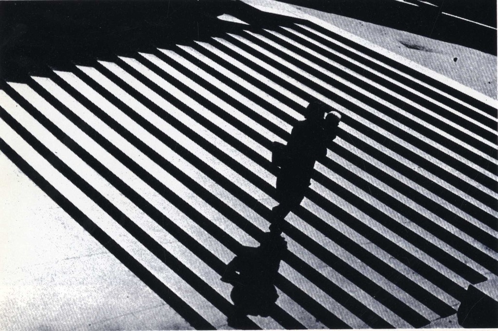
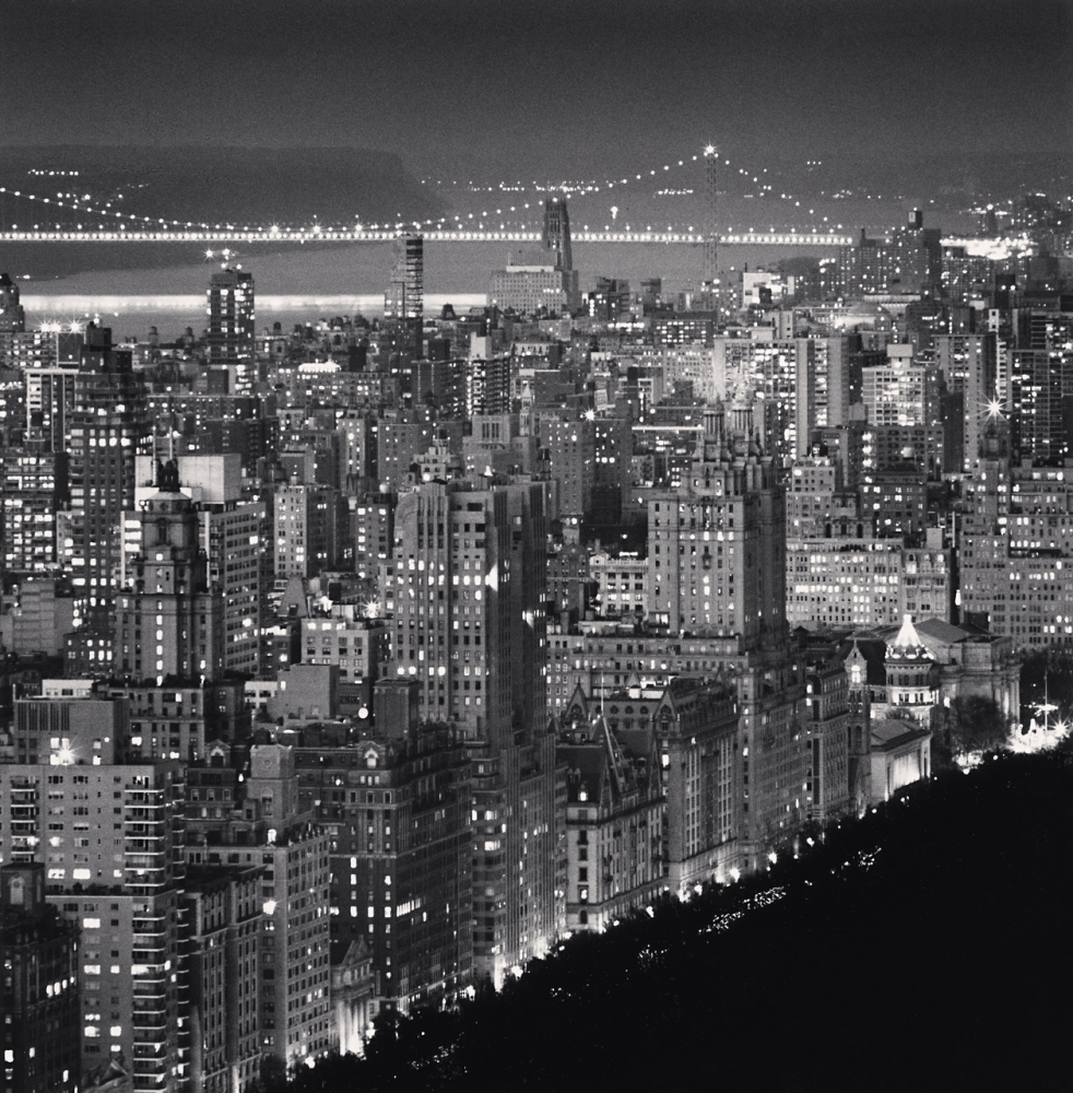
  1. This picture I chose was taken by Michael Kenna and it’s a shot of upper manhattan and the washington bridge. One thing you will notice is that the photo is in black and white and I got to say I think it compliments the view with manhattan and all its lights. It really tells the truth that this city never sleeps. I think the intention of this shot was to give a good look at the city at night to show the bright lights it has. The black and white kind of makes it look like this photo was taken in the 60’s. I feel like the purpose of this image was to show manhattan in the night. One thing Iike about this photo is that it shows the upper side of Manhattan and you see a lot of the old buildings that have probably been here for like 30/50 years. The bottom of Manhattan has a lot of newer buildings and a time square, so showing the top side of Manhattan gives people more looks to Manhattan then the parts that are always advertised in the media. It gives me a griminess mood like old 80’s comic books like the Teenage Mutant Ninja Turtles.
  1. For this photo I got to say the three elements that it shows are Leading Lines, Patterns, and Diagonal. I said Leading Lines because the way the photo is set and how Manhattan looks makes you focus your eyes to the top right. I said Pattern because the noir look makes the buildings bleed out to each other, but still comes out unique because of the building lights and the different sizes of the buildings. And Last I said Diagonal was because in the front you see Manhattan going bottom left to top right and behind it you see the Washington bridge going top right to left. It gives off the sense of movement and the different paths of New York.  

https://www.michaelkenna.net/gallery_images/b87a7b0@2x.jpg

HW 1-Photo Description

A photograph that was listed that I think is visually engaging is “Welcome to Imperial” by Thomas Holton. The photo appears to be a light up sign that could be placed at a bar scenery or even a local bowling alley, the sign gives the theme of some amusement that takes place at nightime. I believe the intention of the photographer was to take a photo that could easily grasp attention to the eye because of the dark background and the bright word display can catch someone’s attention easier than colors that blend well together.  The purpose of the image may be to attract more people to this location or have people be more aware of this location.  The mood is very vague and gives a feeling of enticement,  possibly even  fun due the audience not knowing where the location of the sign is or what the sign may be hinting towards about the location.

  Three of the formal elements from the Steve McCurry video that are most important in the photo I selected are leading lines, frame within a frame and figure to ground. The reason I chose this photo is due to it being an eye catcher and its dark background yet vibrant colors at the same time which gives the photo contrast displaying, figure to ground. The ceiling also appears to have leading lines that connect to the outer frame of the board  which will guide the observer to the light up sign that says “Welcome to Imperial” without the artist having to be there to do so. Frame within a frame could also be seen in this photo, if you look closely around the bold words you see a rectangle outline around the sign that provides an outer frame on the words to make it more bold in contrast to the background. 

HW2: Hula Hoops

Imagine that you have a hula hoop. Put it on the ground (during the day in a place with good light) and do not step out of it. You could also think that you are in one of those social distancing circles that have been drawn in some parks. Take 10 photos without leaving the circle. Use every strategy that we have discussed in class: angle of view, close ups and long shots, negative space, filling the frame, diagonal lines, leading lines, to make the most interesting and varied photos possible from that one place.

Find two more spots and repeat for a total of 30 photos.

Post to Flickr and put in an album.

Due Tuesday, September 12 at 12 pm noon.

Lab: Week 2 – Composition

2 pts. Work with a shoe. Take a series of photos of that shoe from different angles and with different cropping until you get 20 photos of it that really look different. The goal is to take as wide a range of photos of the shoe as possible. The way to get this wide range is by using different ways to compose and light the shoe. The shoe should be the main element in every photo.

Shot list:

Framing

  • Long shot
  • Medium shot
  • Close-up
  • Extreme Close-up

 Angle of view

  • Worm’s-eye view
  • Low-angle
  • Eye-level
  • High angle
  • Aerial or Bird’s-eye view
  • Oblique angle

Focal Length

  • Wide Angle – zoom out
  • Telephoto – Zoom in

Line

  • Horizontal Line
  • Vertical line
  • Diagonal line

Balance

  • Rule of Thirds
  • Balanced/Symmetrical
  • Off-balance/Asymmetrical

Space and Perspective

  • Shallow Space
  • Deep Space

Put your 20 best photos of the shoe in an album on Flickr.

Inspiration: The Shoes of Our Lost Icons are Still Full of Life

Week 2 – Composition: The Frame

Photo by Mel D. Cole

The Frame

Cropping: how much information is in the frame

  • a long shot
  • a medium shot
  • a close up
  • an extreme close up.

Angle of View:  describes the camera position in relationship to the subject. The angle of view may be:

  • a worm’s-eye view
  • a low-angle
  • eye-level
  • a high-angle
  • a bird’s-eye or aerial or overhead view
  • oblique angle
Tram on Sukharevsky Boulevard, 1928. Alexander Rodchenko.

Angle of View Examples By Alexander Rodchenko

Lab: Week 2 – Composition

HW 2: Hula Hoops

« Older posts Newer posts »