Robin Michals | COMD 1340 Photography 1

Category: HW1_Composition (Page 1 of 3)

soraya HW1_Composition

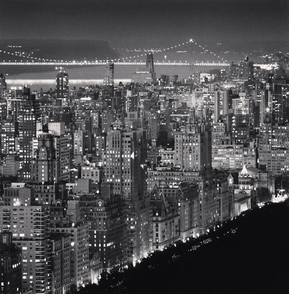
The photo I chose is Carnegie Hall and CitySpire Center, New York, New York by Michael Kenna.This is a photo of a skyscraper located in midtown manhattan.The first thing I noticed about this photo is how the shades of color go from dark to light, a negative and positive space.This photo gives me a calm and dark feeling.A photo you can just stare at and analyze every detail captured.I think the intention of the photographer was to show how high the skyscraper is compared to other buildings around the city.Another thing that I noticed is the reflection of the skyscraper on the bottom, it looks like there is water causing the reflection in the photo.The colors of the photo also fits the aesthetic of New York so well at night time when you can see all the lights from the buildings shining.

Three elements that are the most important in this photo are figure to ground, symmetry, and patterns and repetition.Figure to ground helps create a mood of the photograph because the light background brings more attention to the dark shade of the skyscraper.It also gives the look of the sky in the background since skyscrapers are so tall it seems like you can see the sky.Michael Kenna also uses symmetry in the photograph that creates a reflection feeling.If you flip the photo horizontally or upside down it is balanced.Patterns and repetition is shown in the photo with the little dark and light windows across the building.

Hw #1: Composition

Artist: Suzanne Stein
Photograph: After School

Stein captures a scene on the L train to Brooklyn after a school day in this picture. The photograph has many aspects, such as the hands holding onto the pole and the vague faces in the background. However, the image focuses on the mom holding up her child while she leans her head on her chest. The mom looks tired, with low eyes and a blank expression. However, she holds her child up while she rests. Stein’s intention with this vision was to depict New York City life, especially for mothers and families who take public transportation. The way everyone stands so close to each other shows how packed the train is; on top, you can tell it is winter based on how they’re dressed. The image looks gloomy, and the lighting makes everything look gray and almost dirty. As someone who takes the train in winter and as the image’s viewer, it hits close to home. After a long day, the last thing you want to do is walk through the cold streets of NY to wait for the train, then have to stand up the whole time, too. Unfortunately, that’s the reality of living in the city. Stein wanted the photograph’s viewers to see the tiredness on everyone’s face and feel the image was exhausting. A mom who had a long day and a child who had a long day standing on the train together.

The main element I see in this photo is the rule of thirds. The photo’s subject is not placed in the center of the image but more on the left side. If there were a grid over it, the mom and her child would fall onto one of the intersections, which perfectly shows the rule of thirds. Along with that element, there is a sense of patterns with the hands gripping the standing pole. The arms are closer to the camera, and the hands are stacked on top of one another, giving you a sense of a pattern. It is ideally different but similar enough to where it grabs your attention. The last element that brought the image together is leading lines, simply because of the pole again. Its placed right in the center of the photo. The right side just has random arms coming in while the left has faces and emotions which lead you to the subject. 

https://www.suzannesteinphoto.com/New-York/i-DmNVLTb#

Week 1 HW

  1. This picture I chose was taken by Michael Kenna and it’s a shot of upper manhattan and the washington bridge. One thing you will notice is that the photo is in black and white and I got to say I think it compliments the view with manhattan and all its lights. It really tells the truth that this city never sleeps. I think the intention of this shot was to give a good look at the city at night to show the bright lights it has. The black and white kind of makes it look like this photo was taken in the 60’s. I feel like the purpose of this image was to show manhattan in the night. One thing Iike about this photo is that it shows the upper side of Manhattan and you see a lot of the old buildings that have probably been here for like 30/50 years. The bottom of Manhattan has a lot of newer buildings and a time square, so showing the top side of Manhattan gives people more looks to Manhattan then the parts that are always advertised in the media. It gives me a griminess mood like old 80’s comic books like the Teenage Mutant Ninja Turtles.
  1. For this photo I got to say the three elements that it shows are Leading Lines, Patterns, and Diagonal. I said Leading Lines because the way the photo is set and how Manhattan looks makes you focus your eyes to the top right. I said Pattern because the noir look makes the buildings bleed out to each other, but still comes out unique because of the building lights and the different sizes of the buildings. And Last I said Diagonal was because in the front you see Manhattan going bottom left to top right and behind it you see the Washington bridge going top right to left. It gives off the sense of movement and the different paths of New York.  

https://www.michaelkenna.net/gallery_images/b87a7b0@2x.jpg

HW 1-Photo Description

A photograph that was listed that I think is visually engaging is “Welcome to Imperial” by Thomas Holton. The photo appears to be a light up sign that could be placed at a bar scenery or even a local bowling alley, the sign gives the theme of some amusement that takes place at nightime. I believe the intention of the photographer was to take a photo that could easily grasp attention to the eye because of the dark background and the bright word display can catch someone’s attention easier than colors that blend well together.  The purpose of the image may be to attract more people to this location or have people be more aware of this location.  The mood is very vague and gives a feeling of enticement,  possibly even  fun due the audience not knowing where the location of the sign is or what the sign may be hinting towards about the location.

  Three of the formal elements from the Steve McCurry video that are most important in the photo I selected are leading lines, frame within a frame and figure to ground. The reason I chose this photo is due to it being an eye catcher and its dark background yet vibrant colors at the same time which gives the photo contrast displaying, figure to ground. The ceiling also appears to have leading lines that connect to the outer frame of the board  which will guide the observer to the light up sign that says “Welcome to Imperial” without the artist having to be there to do so. Frame within a frame could also be seen in this photo, if you look closely around the bold words you see a rectangle outline around the sign that provides an outer frame on the words to make it more bold in contrast to the background. 

New York Street One

The photographer is Suzanne Stein and the photograph name is DSC09136.jpg. The subject is in the middle of the frame. However, the focal point in the photograph is the “RENTS TOO HIGH.” The location is somewhere on New York City Street. The intention of the photographer is to capture the street life of New York City. The photograph reflects the issues people face today. The purpose of the image is to showcase that the rent is getting high in New York City. The subject in the photo seems to be homeless. They’re carrying a skateboard, a pan, a hiking bag, sneakers, sleeping bag and walking with three dogs. There’s writing on the wooden boards, “RENTS TOO HIGH” ironically matches the mood of the photograph. The wooden boards shows that it could be either an abandon building behind it or being used to hide the construction of a commercial building. Also, the photograph has a lot of dark tones in it to showcase an overcast and brooding mood. One of the three composition principle being used is symmetry. Each side of the subject has “RENTS TOO HIGH” beside them. In addition, there’s leading lines on the street floor that views our attention to the two dogs. Another element being used is rules of thirds, the “RENTS TOO HIGH’ is placed on the right and left third. These elements help bring a balance in the photo.

« Older posts