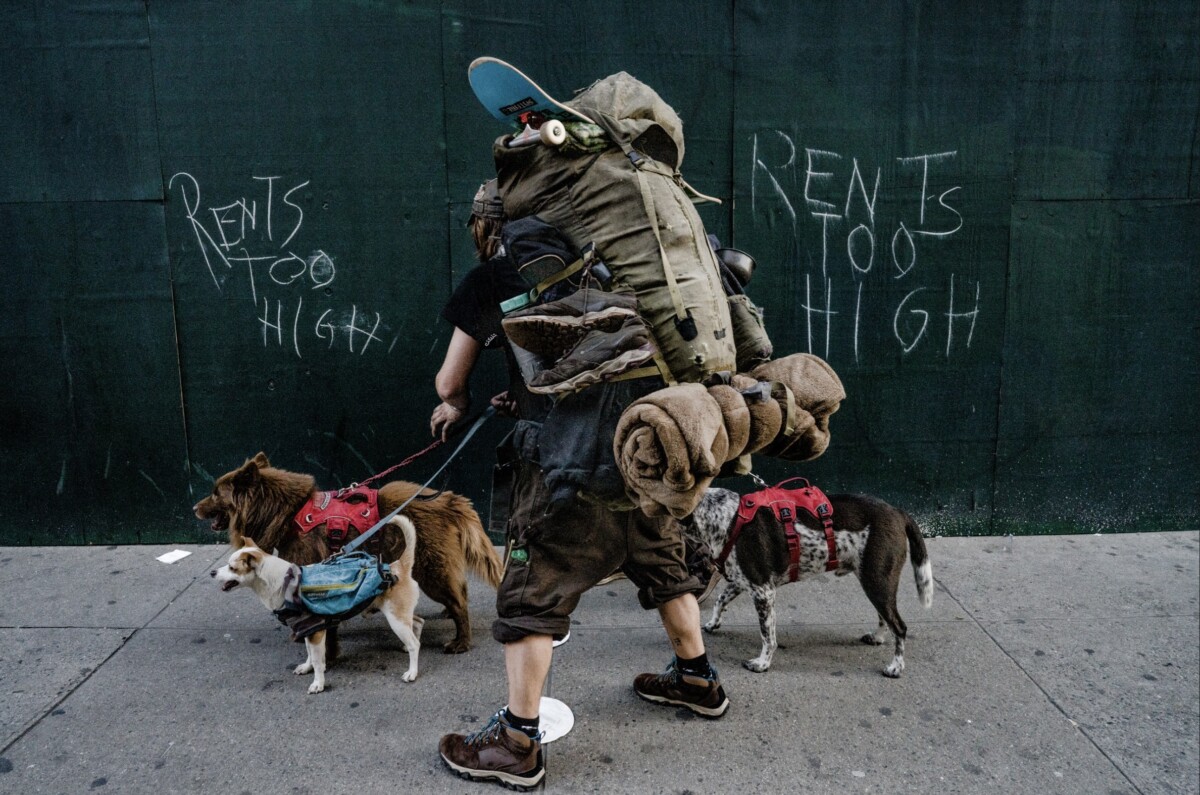
The photographer is Suzanne Stein and the photograph name is DSC09136.jpg. The subject is in the middle of the frame. However, the focal point in the photograph is the “RENTS TOO HIGH.” The location is somewhere on New York City Street. The intention of the photographer is to capture the street life of New York City. The photograph reflects the issues people face today. The purpose of the image is to showcase that the rent is getting high in New York City. The subject in the photo seems to be homeless. They’re carrying a skateboard, a pan, a hiking bag, sneakers, sleeping bag and walking with three dogs. There’s writing on the wooden boards, “RENTS TOO HIGH” ironically matches the mood of the photograph. The wooden boards shows that it could be either an abandon building behind it or being used to hide the construction of a commercial building. Also, the photograph has a lot of dark tones in it to showcase an overcast and brooding mood. One of the three composition principle being used is symmetry. Each side of the subject has “RENTS TOO HIGH” beside them. In addition, there’s leading lines on the street floor that views our attention to the two dogs. Another element being used is rules of thirds, the “RENTS TOO HIGH’ is placed on the right and left third. These elements help bring a balance in the photo.
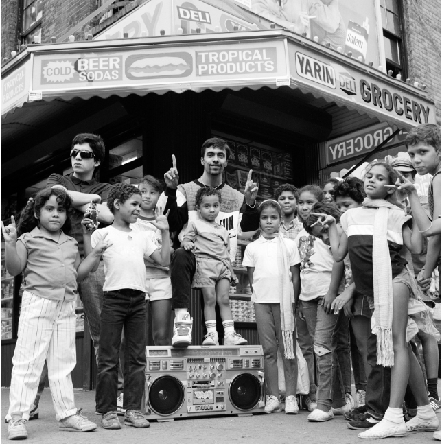
The photo I chose is “Lower East Side 1988” shot by Janette Beckman for her ‘US YOUTH’ collection. This photo captures a playful moment between a group of kids in front of a Bodega in the Lower East Side with their boombox in tow. I believe the intention of the photographer was to showcase the Latino youth in the neighborhood during a time when the Lower East Side was predominantly black and brown. During the 80s it was also a very difficult time for residents of the Lower East Side as they were dealing with rampant drug use and crime. The photo shows the other side of the neglect of the neighborhood – the innocent kids enjoying one another. The feeling this image invokes is joy and the community.
One of the formal elements I’ve noticed in this photo is the Figure to Ground in the contrast between the kids and the Bodega and the awning behind and above them. I also noticed the Diagnols along the edges of the awning and the store windows behind the kids. Another formal element I see in the image is some Symmetry. With the boombox directly in the center and the kids around it, it creates a sense of balance that is pleasing to the eye. These elements help convey the playfulness of the neighborhood kids with a background that is quintessential New York City. If it weren’t for the boombox, you can barely tell that it was taken in the 1980’s. This shows how some areas in New York City can look almost frozen in time. This photo speaks to me as someone who grew up in New York City with a father who owned a Bodega which was the backdrop to my own life for so long. This image is peak New York.
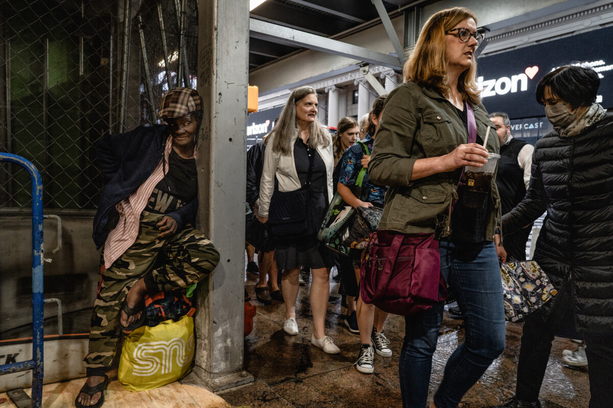
The photo I chose is DSC01142 Suzanne Stien from the New York Street collection of photographs. What the image displays is an underground train station, I’m unsure of what station it could be; possibly Times Square 42nd Street, but it’s packed with a total of 8 people walking in the same direction and one woman standing in the corner looking at the people passing. It does seem like she is looking at the woman with glasses, but I think the photographer intended to contrast two sides of New York in one image. One seems to be the working class of New York with many people heading in the same direction and the other potentially homeless. The mood of this picture can be described as busy, one side doesn’t look busy but more absorbent, and the other side looks focused.
One of the three elements the photo shows is Rule of Thirds because it depicts both sides of the spectrum. One side, dimmer and in a corner, and the other of a lady, looking like she has somewhere to go. Ironically enough the person on the left seems to be looking at the woman with glasses or if anything, her direction. Another element it depicts is leading lines. It appears to be positioned by the photographer to draw a sense of direction, and with the people walking in that same direction it makes it more powerful. And that leads to my last element used, diagonals. The picture was taken inside of a train station and the way it was photographed as mentioned, gives it tilted lines and controls the environment. These elements each provide much more depth to the photo with its sense of direction. The elements add much more weight with the contrast from two sides of New York. One side, with less light and not much going on, and the other side, with many people but super busy looking.
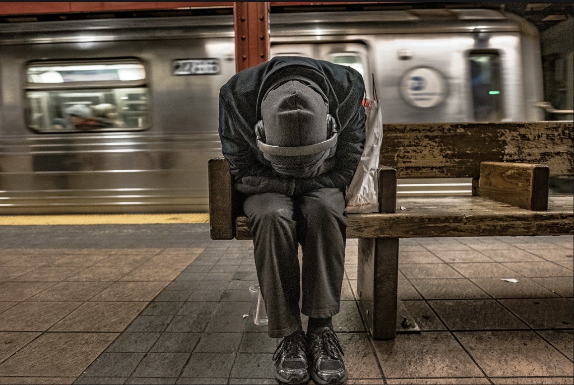
The photo I chose doesn’t seem to have a title besides “ DSCF0930” by photographer Suzanne Stein. This photograph comes from her New York Street One collection and really caught my attention.The subject matter appears to be the person sitting on the bench while hugging themselves as if seeking a sense of comfort or maybe even hiding. The location of the photograph is the New York City subway, probably the 6th ave subway. What I perceive to be Suzanne’s intention while taking this picture and the majority of her New York Street collection is how New Yorkers live. The city that “never sleeps” with its “big city lights” is depicted in movies and other photographers. However this photo highlights what many people can tend to go through. The person portrayed may be overworked or genuinely tired, perhaps cold judging by the gloves and clothing. As a New Yorker, I have dealt with this too. Nights can be especially overwhelming and I end up drifting into a nap on the benches missing my train. The mood the photograph gives off would be isolation. Despite there being more people in the background, they display individuality. No one is engaging with the person sitting on the bench, and even then the person seems to be holding himself as if wanting to seek shelter. Posture indicates they probably want to be left alone. When I look at the photo, I don’t necessarily feel sad, but sympathetic, to try and understand the person.
I would argue that frame within a frame is conveyed and does help to convey mood and feeling in this photograph. While there is no door frame or window to frame the subject, the bench does seem to frame them. The bench seat really hugs the subject isolating him from everything despite their being open space around him. His body provides an outline as if enclosing him. The almost “unfinished frame” helps with setting the isolation mood, and even a feeling of being trapped. Brings the subject to the center and our attention as well. I definitely think that if the subject was perhaps standing, it would have a bit less of an impact as compared to when they are sitting, looking so vulnerable.
Leading lines, despite them being a bit small allow us to pinpoint what seems to be the subject matter. We have the floor tile lines lead us to the person. We also have the yellow line in the back and the lines located on the train, lining up from the back him. We even have the pillar, as if pointing down, watching it completely disappear. We get to appreciate the background, but no matter how much we look around, we always look back to the person. I could possibly try to state that symmetry is also shown within the subject, but the pillar does slightly throw me off and the bench is all on the right. However, the asymmetry is possibly the best so far, really sets the tiring and also overwhelming feel of New York life.
Figure to ground could possibly be one for the fact that there really is a contrast between subject and background. For one, the subject is focused while the background train is blurred. Whether or not that is intentional, it does also allow movement within the photo. As if the train is departing, leaving our subject alone in the train station. Furthermore, the contrast of color is something to notice. While our subject isn’t necessarily wearing the most vibrant outfit, it’s perhaps the darkest while being surrounded by other more slightly vibrant colors. His outfit color really makes us view him more, making us barely notice the white bag next to him, despite it being very light in contrast to his clothes. The cup below by their feet as well is ignored despite the slight bright color of the straw in contrast to the floor and their shoes. While the yellow and red colors are more popping colors, we can almost ignore them.
Overall, the image really brings out the struggles of people. This one in particular i could connect with. I liked the composition of this image. I feel like if the train was not included, it would have been slightly more dramatic for the fact that the subject would be in what would look like a void. Empty space and no filler in the background. It’s something done in many images and would also convey the mood more, however the train gives it movement and a beauty thats slightly indescribable. In general, I do like this photograph.


Recent Comments