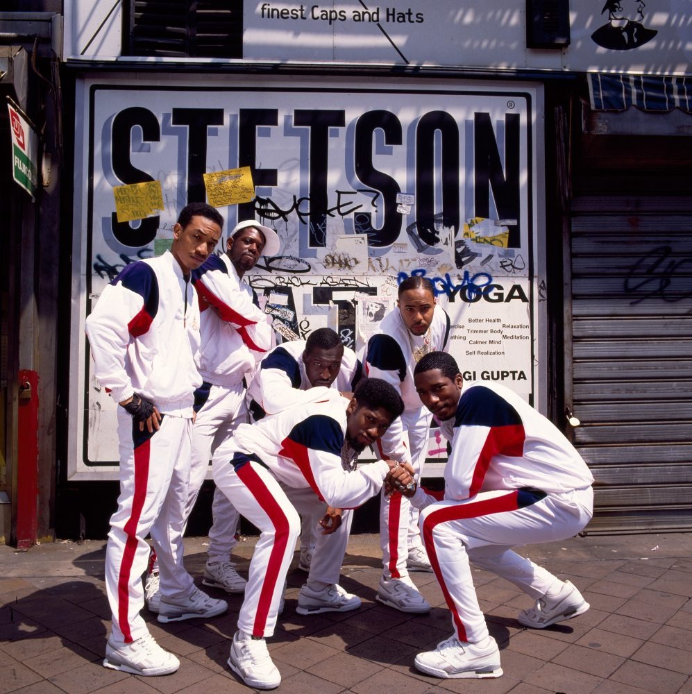
I had chosen Stetsasonic Brooklyn 1988 by Janette Beckman. For this photo a lot is going on in it, it’s a group photo on a street side in Brooklyn. One of the first things I noticed was the matching clothes and how the red kind of functions as a two-way arrow kind of making your eye go up and down the image. There’s also a lot of shade, contrast, and darker tone pigment which is kind of combating the white clothes. If I were to guess the image would intend to give a sensation of unity or our neighborhood camaraderie. If not I would take a fair guess to it being a show of pridefulness for being a Brooklynite.
The key elements to this photo would be the figure to ground, pattern, repetition, and finally the rule of thirds. The White and the darker-toned colors work as a sort of pattern within the photo and a good way to withdraw interest throughout it. However, because the gray backgrounds contrast with those colors, it helps keep the sense of passive sort of emotion for the subjects. The mix of the people within it being crouched and standing up creates more points of interest within the image is very collaborative with the colors, people, and the background.







Recent Comments