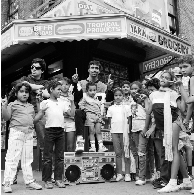
The photo I chose is “Lower East Side 1988” shot by Janette Beckman for her ‘US YOUTH’ collection. This photo captures a playful moment between a group of kids in front of a Bodega in the Lower East Side with their boombox in tow. I believe the intention of the photographer was to showcase the Latino youth in the neighborhood during a time when the Lower East Side was predominantly black and brown. During the 80s it was also a very difficult time for residents of the Lower East Side as they were dealing with rampant drug use and crime. The photo shows the other side of the neglect of the neighborhood – the innocent kids enjoying one another. The feeling this image invokes is joy and the community.
One of the formal elements I’ve noticed in this photo is the Figure to Ground in the contrast between the kids and the Bodega and the awning behind and above them. I also noticed the Diagnols along the edges of the awning and the store windows behind the kids. Another formal element I see in the image is some Symmetry. With the boombox directly in the center and the kids around it, it creates a sense of balance that is pleasing to the eye. These elements help convey the playfulness of the neighborhood kids with a background that is quintessential New York City. If it weren’t for the boombox, you can barely tell that it was taken in the 1980’s. This shows how some areas in New York City can look almost frozen in time. This photo speaks to me as someone who grew up in New York City with a father who owned a Bodega which was the backdrop to my own life for so long. This image is peak New York.


The kid standing on the boom box is priceless. The boom box really is an icon of an earlier time though they were everywhere this summer as NYC celebrated the 50 of hip hop.
You summarize the photographer’s intent well. It is an image of community gathered under the awning of a bodega, often the social gathering point for a block. Funny, I call my corner store a bodega even though the owners are from Tunisia…
The photo is close to symmetrical and is certainly balanced. I think it is organized into three horizontal bands: the lowest with the boom box, the middle with the kids heads and the top with the awning. The dark under the awning helps set off the tallest of the crowd.