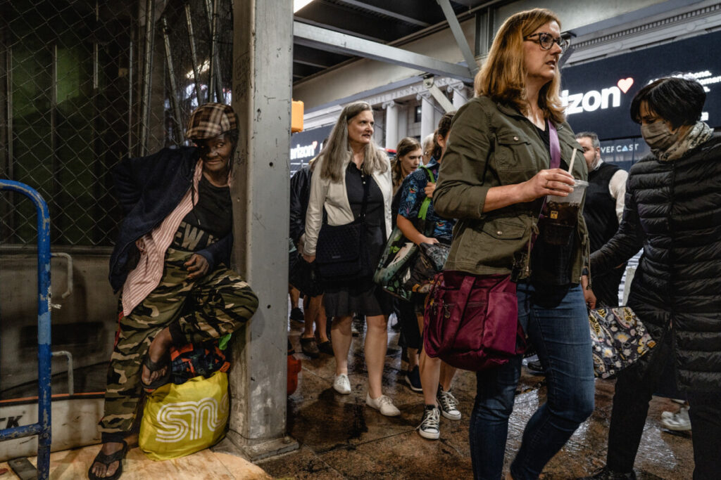
The photo I chose is DSC01142 Suzanne Stien from the New York Street collection of photographs. What the image displays is an underground train station, I’m unsure of what station it could be; possibly Times Square 42nd Street, but it’s packed with a total of 8 people walking in the same direction and one woman standing in the corner looking at the people passing. It does seem like she is looking at the woman with glasses, but I think the photographer intended to contrast two sides of New York in one image. One seems to be the working class of New York with many people heading in the same direction and the other potentially homeless. The mood of this picture can be described as busy, one side doesn’t look busy but more absorbent, and the other side looks focused.
One of the three elements the photo shows is Rule of Thirds because it depicts both sides of the spectrum. One side, dimmer and in a corner, and the other of a lady, looking like she has somewhere to go. Ironically enough the person on the left seems to be looking at the woman with glasses or if anything, her direction. Another element it depicts is leading lines. It appears to be positioned by the photographer to draw a sense of direction, and with the people walking in that same direction it makes it more powerful. And that leads to my last element used, diagonals. The picture was taken inside of a train station and the way it was photographed as mentioned, gives it tilted lines and controls the environment. These elements each provide much more depth to the photo with its sense of direction. The elements add much more weight with the contrast from two sides of New York. One side, with less light and not much going on, and the other side, with many people but super busy looking.


What a powerful photo! Amazing choice. It really does show two sides of New York. And as you state, it looks like the person on the left is looking at the people rushing by, they in turn do not see them.
the photo is firmly divided by that post into 1/3-2/3. And yes if the main subject is the person on the left, which I think it is, this is an example of the rule of thirds. I think the fact that the left side is darker while the right side has more light also adds to the story of the destress of the person on the left and the indifference of the people passing by absorbed in their own worlds.