Class Info
- Class Date: Thurs. Nov. 19
- Class Time: 8:30AM-10:00AM
- Class Meeting Zoom https://zoom.us/j/6459468086
Meeting ID: 645 946 8086
Topic
- Intro to project 3
- Visual Hierarchy: Giving levels of importance to the difference elements that are part of a design.
- Examine this PDF with Visual Hierarchy Progression. Every page uses the exact same text, but the hierarchy changes once we start applying different principles (For example a basic change in type size can make a difference in the way the viewer looks at the design)
Objectives
- Learn about visual hierarchy and how these design principles can improve or change the way we see and read.
- space
- type size
- spacial zones
- color/reverse
- alignment
- added elements (lines)
- variations in type (bold)
- dynamic compositions (diagonals)
- others
Activities
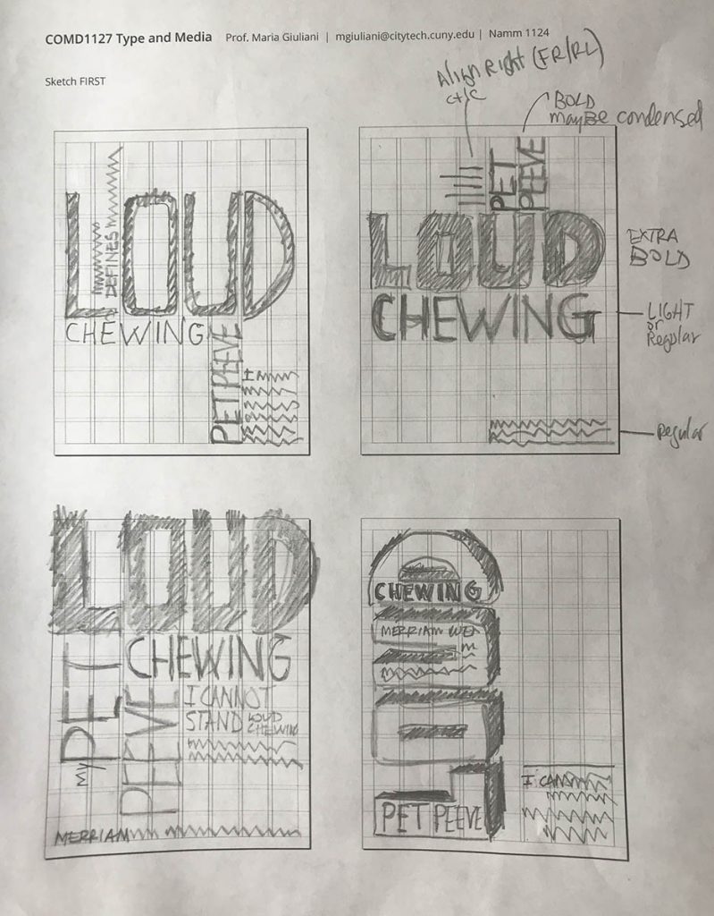
- Sketch> When sketching consider the following:
- Use type only
- TWO typefaces max. (but with extensive families ok)
- Black and White
- Follow the grid
- Emphasize your visual hierarchy
- Emphasize contrast with scale (something must be BIG, something must be small)
- Must consider and apply what was previously covered in class: Type selection and variations, alignment, word and letter spacing, line height, expression, etc.
- Look at sample below
- Content:
- The words: Pet Peeve
- Definition of the word Peeve
- Title of your Pet Peeve (different for everybody)
- Your personal text: One to Three sentences explaining your pet peeve
- Content:

To-Do After Class
- PART 1
- Complete sketches started during class – upload hierarchy sketches to media library as jpegs
- Sketch. Here is a PDF with the printed grid. It will help you to determine where and how to place content. As well as to start thinking about typographical style.
- See Example

- PART 2
- Refine you Grid layout upload jpg with visible grids and guides showing


